Kindred Yoga: background
Kindred Yoga is a yoga studio established in 2010, located in downtown Sanlitun. They recently moved to a bigger space due to the increase in customer number. They are looking forward to rebrand their space, creating a new look for their opening.
This yoga studio’s clients are mostly composed of middle aged men and women. They are looking for a logo design that can fits with their brand, which can be used for creating related products.
Logo design inspirational ideas link:
https://padlet.com/juliewang3/63p4mw33d548euqj
Logo design inspirational ideas resources:


These three inspirations were my favorite inspirations. They include the brand name, typed using different fonts, making the logo straightforward. I liked this idea since it would be more likely for the viewers to remember the brand. I applied these inspirations to my own ideas for several purposes and ways. First of all, combining “kindred” (brand name) with “yoga studio” serves the purpose of not only making the name itself stand out through the use of a calligraphic font (inspired by the third inspiration), but also gives the viewers an idea of what it is about (words added using the first and second inspirations, simple font). Secondly, for “yoga studio”, the fonts were inspired by the first logo: a well-spaced type using a basic font keeps the logo clear and simple. It also uses the blank space effectively, enriching the logo at the same time with additional elements. However, this logo has successfully kept the simplicity through not exceeding the number of elements involved, which was what I sought for. Lastly, the second inspiration helped with providing an idea of what the geometric shape should be, surrounding the logo’s main content. I finally chose to use a circle, without the arrow and by making the stroke thinner.
using a thinerWhere the ideas come from:

Choice: Kindred (yoga studio)
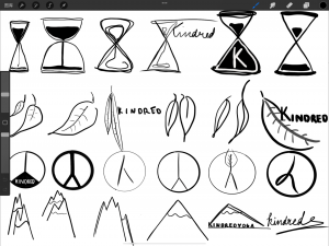
Idea generations:
- 30 “1min/idea” sketches + (6 refinements + 6 versions of each among the first 30) = 66 sketches total :


- Panda book award:

Through this design practice, I learnt certain principles of designing logos: for instance, the representation doesn’t necessarily have to show the object the brand name means. Or, a logo can indeed be simply the company name typed using an appropriate font and appropriate spacing.
- Final refinement (final logo version)

- Mockups:


Mockup – sports shirt (pdf version)
Mockup – tote bag (pdf version)
I chose to use a tote bag, a mug and a sports shirt since they are closely related to sports/ meditation activities such as yoga.
Design process evidence:
First draft for first logo refinement set into mockup – paper bag (before feedback modifications):

FEEDBACK:
- Change the border into either abstract or circle (avoid ambiguity: half abstract half circle)
- Look for similar font type to replace the lettering (created with procreate)
- Add “yoga studio” to make it clear to viewers what the logo represents
- Fonts ideas generating (resource: https://www.dafont.com/ ):


- Image format conversion:


- Affinity: vectors

Tips for designing a successful logo reflection (top tips review):
- The logo is face: its job is to create recognition for the brand. Its job is not to visibly show the product. The logo does not show any sign of the product, only presenting what it consists of (the company’s job). It creates a deep impression when the font used for the company name and the one used for the words “yoga studio” contrast, since they convey the both information (company name & purpose) at the same time.
- Keep it flexible: the logo should be recognized at a tiny size (favicon) or if its distorted. As mentioned above, the logo remains recognizable. However, improvements can be made to make the shape even more apparent when it is reduced on a large scale.
- Sketch 20 ideas: the more rough ideas you can sketch, the more likely you will come up with a strong idea. Keep it quick and simple. (please view “Inspirations evidence” to see the first early stage sketches).
- Be geometric: start with simple shapes: this will ensure your logo is simple and functional. Even though many of the first sketches don’t contain simple geometric shapes but representations of certain objects instead, further refinements were made based on the ones that included this type of elements.
- Start with black & white: this will ensure your logo is successful in its most basic and doesn’t require colour/effects. All first sketches were generated using pencil and white paper, presented on paper. This method has benefited the design process since the designer doesn’t have to deal with mockup colours which won’t necessarily fit with the design. Furthermore, by using basic tools, the logo stays simple.
- Use negative space effectively: make your logo consistent and use the negative space to strengthen your aesthetic/ message. This indicates further refinement of the current logo (e.g., better letter spacing / distance between words).
- After having tested the recognition, I am able to confirm that one is able to redraw my logo a certain time after having seen it. While the logo is a circle, the letters enable people to think of the brand even when seeing the logo cut vertically in half. This method proves that the logo is distinguishable to a certain extent.
Final logo version explanation:

Kindred final logo (pdf version)
Feedback related:
After the first draft of the first logo feedback, the half abstract half circle shape was finally modified into a simple circle, to keep the logo look simple while avoiding ambiguity.
The words “Yoga studio” were added below the brand name.
Kindred was typed out, a font found in dafont.com, the most similar one to how the word was drawn when generating ideas.
Content (decisions) related:
- I chose to use a circle to draw out the logo since it makes it as clear and simple as possible. This also helps with catching the eye of viewers on whats inside the circle (content), since it would be what they would most likely focus on when looking at the representation.
- I chose to use a calligraphic font for the brand name since it gives a sense of relax, especially because the representation shouldn’t make the viewer feel any stressful sensations due to the purpose of the company.
- I decided to put into use a simpler font, perfectly spaced between the letters for two reasons. First, if the letters take up a certain amount of space, the viewer’s eye would be more likely to be caught by what the representation tries to prioritize. Secondly, since “yoga studio” is less attractive to the viewers from an aesthetic view, they would at the same time be able to memorize the company’s name (making the brand name stand out slightly more than “yoga studio”).
- I made the decision of designing the logo in black ink since, as the top tips for a logo design indicates, the most successful and strong logo should be able to be memorized & represented to the viewers at first sight/ from a viewer’s perspective. This also facilitates the company when they would like to make products using the logo, since black and white tend to fit well with the majority of colours.
Poster:

To conclude, next time, I would have done differently the tasks below while designing the logo. Firstly, I would have directly work with vectors while creating the logo instead of procreate (facilitates the task when putting in mockups). Then, I would have use more geometric shapes when generating ideas (creates better outcomes than simply representing certain objects). Furthermore, I would have also found the font directly, downloaded it, then typed the words on the document since it is nearly impossible to find a font that 100% juxtaposes with the one drawn by yourself.


Recent Comments