Client Name:
Kindred Yoga Studio
Background information:
Kindred Yoga Studio was established in 2010. It is a small yoga studio in downtown Sanlitun. They recently moved into a new, bigger space as their client base has grown. Kindred is looking to rebrand to create a fresh look in time for the opening of their new space.
What is the service?
Yoga studio/yoga classes
Context
Kindred is located in Sanlitun, they established in 2010 to promote health and sustainability through yoga. They are relatively small but have a growing client base so they moved to a bigger studio and are in need of a new logo by the time they open the upgraded space.
Target Audience
Kindred is a boutique yoga studio based in downtown Sunlitun whose main client base consists of women aged 22-40 (60%), men aged 27-42 (30%), and other (10%). Kindred is a small studio that caters to a dynamic, diverse community of health-conscious people with middle-to-high disposable income. Typically, Kindred’s audience is interested in:
- Healthy living (eg exercise, healthy eating)
- Sustainability (eg low-waste, vegetarianism, low CO2)
- Ethical lifestyle (animal adoption, conscious consumerism)
- Wellbeing & spirituality (essential oils, Buddhism)
Keywords
Sustainable, ethical, harmonious, and focuses on well-being and spirituality
Design Problem: Kindred has a fast-growing client base and needs a new, fresh-looking logo to rebrand their company. Most of their clientele are between the age of 20 and 40 years old, who is a dynamic and diverse community. This means the logo should cater to all audiences and be health-conscious.
Solutions to the Design Problem: Since what kindred wants to achieve with the new logo is rebrand their company to promoting health and good condition, I wanted to design a logo that is symmetrical and geometrical, to promote harmony in doing yoga.
Examples:


Also, I could design a logo that contains an object that represents what kindred promotes. A common example of this is the lotus flower, which in yoga means purity and awakening. Also, the fact that its a flower can represent the ‘sustainability’ and ‘health-conciseness’ that kindred wants to promote.
Examples:


I can also make a more literal representation of what yoga is, for example, different yoga poses. The advantage of this is that a viewer will automatically know what the company does just from the logo.
Examples:


All these three ideas, a geometrical design, a representation of what kindred does, and a literal depiction of it can solve the design problem because they address what kindred wants to do with their rebranding and expansion to a new space. Also, they address the values kindred wants to promote with their new logo.
Padlet of Inspiration:
What makes a logo successful?
Design Process:
Thumbnail sketching:

I chose 3 major concepts from my research and brainstorming process to put into affinity and experiment with different variations. These 3 major concepts were:
-Meditating yoga pose emitting some type of aurora
-Lotus Flower
-Dolphin
I chose these 3 concepts specifically because they represent an aspect of yoga or a key value that it holds. For example, the meditating pose represents peace and tranquility and can let an audience know what the company is straight from the logo.
The lotus flower and the dolphin are similar in that they represent things relating to yoga like purity and awakening; however, I prefer the lotus flower over the dolphin because it is more symmetrical and simple.
With these 3 ideas in mind, I put them into affinity and made different variations for them, experimenting with things like line thickness, negative space, shape, etc, As seen below:
Meditating yoga pose emitting some type of aurora:

Lotus Flower:

Dolphin:

Initially, I had chosen the dolphin idea to be the ‘final’ concept I would be going with. I liked it because it played on the idea that the logo doesn’t have to directly relate to the company, which is feedback I had received from Mr. Griffen when drafting ideas. Although the dolphin might not directly relate to yoga, it symbolizes many things that a yoga company like Kindred would like to promote; harmony and spirituality. With that, I went off the sketches that I drew and experimented with different aspects like spacing, font placement, water elements, and a frame/border. Here are some notable itterations I made:

I placed the text on top of the dolphin and then used the cut tool to cut it out. I eventually decided that this was a bad idea, because the text would be hard to see from far away, and it is too much going on in one spot; the font needs to be separated from the dolphin.

This is the first iteration of the dolphin where I added water at the feet to make it look like it was jumping out of the water. However, after feedback from Mr. Griffin, him and I both agreed that the water looked out of place. It feels unbalanced and there is too much happening near its tail.

For this iteration, I decided to put the dolphin logo on top of a black circle and then use the cut tool to cut it out. This is the best and the closest draft I had to an actual logo, compared to the previous two, because it was clean and simple. I also like the circular enclosing because it ‘finished’ the design and filled the empty space around it. It created a nice balance of black and white.
After some more experimentation however, I chose to narrow in on the lotus flower design as my final design concept instead, because I felt that it was the most flexible and could be most easily recognized by an audience with its unique shape and simplicity. I also chose this logo because a flower can tie back to the keywords for my clientele like sustainability and harmony.
The actual shape of the flower went through a couple of iterations, beginning with a lopsided one that resembled a sideways letter K:

However, I decided to make the flower more symmetrical and moved on to this basic shape of a flower, which had no negative space:

I created this by stacking 5 petals on top of each other and rotating them to form a flower. I then played with the stroke settings and saw that it gave an effect of negative space:

I then played with the stoke thickness until I hit the right balance of negative space; I made it thicker because I thought the previous flower would not be as easily recognizable from far away:

I also added a base to the flower to connect all five of the flower petals and bring them together. Without the base, I noticed that the bottom part of the flower felt empty and looked as if the whole thing was going to fall apart.
Now that I have an illustration designed, I needed a proper font that says: ‘Kindred Yoga Studio’ to complement it. Originally, I chose a fancy font that is curly and eloquent:

However, after feedback I had received from my peers and Mr. Griffin saying that the font was ‘too curly’ and expressive for a yoga studio, I decided to choose a more toned-down font that resembled handwriting:

This font is better for my clientele’s business because the handwritten style of the font gives a calm and soothing feel. I think this font resonates better with Kindred’s goal to “promote health and sustainability through yoga”, rather than the dramatic and expressive style of the font that I had originally chosen.
Evaluation:
What creative choices were made to make my logo effective?
The logo is the face: It is important that my logo creates recognition for the brand, instead of visibly showing the product. The idea is that an audience will look at the logo and immediately think of the keywords associated with the product, like balance and harmony. This is what makes my logo a good embodiment of the brand.
Keep it flexible (Positive and Negative Space) – As seen in some of the earlier iterations of my logo, I did not create a good balance in my logo for it to be recognizable when shrunk down:
This is essential because an audience may most of the time view the logo from far away or squint at it on their phone. With this in mind, I played with the stroke setting to reach this ‘balance’ of positive and negative space. This addition of negative space also adds a layer of depth, making the middle pedal look like it’s in front and the rest opening up behind it, which adds aesthetic appeal to my logo:

Sketch 20 ideas – This is the part of my design process that I wish to do better. I spent too long during the drafting period on adding detail to certain designs and ended up with fewer designs than I would have liked. Also, following the advice of Andrew Draplin, I started working on Affinity too quickly, where my hand wasn’t as ‘free’ as it was on paper. I should have worked on paper for longer to generate more ideas before I started using Affinity.
Be geometric – My design is geometric in that it is symmetrical and made up of the same simple shapes, spaced and aligned evenly using the align tools.
Start with black & white – I made sure to follow this rule throughout the whole project, in order to focus on how the design and shape of the logo looked, and not be distracted by color. In the end, I decided to keep it black and white because there would be too much going on if I modeled the color to an actual lotus flower, where each petal is some different shade of a color.
Succesful Logo Test: Recognizability
I showed the above logo to a friend that has study hall with me; he had no prior knowledge of my project. I showed the logo to him for 10 seconds and then had him redraw it from memory. This is what he drew:

Considering that he isn’t the greatest artist and only saw the logo for a few seconds, I think this is a good indicator that my logo is successful in that it is easily recognizable and can be remembered after an audience sees it.
How well does my design respond to the design problem (stated in the beginning):
Recalling back to the design problem and back to the solutions for the design problem, like a symmetrical logo, a logo that represents an aspect of yoga, or a logo that literally depicts an aspect of yoga, I can conclude that my final logo is successful in addressing the design problem. This is because my logo is symmetrical, geometric, and represents an aspect of yoga through the lotus flower, which includes two of the three design solutions I had originally come up with.
Improvements From My Formative Assessment (Panda Book Awards Logo):


Comparing my first attempt at a logo before I had learned anything about logo design to my most recent one, I noticed a lot of areas that I improved in. For example, my PBA logo is more of an illustration, not a logo. There is a lack of negative space and geometry, which means it would be hard to recognize from far away, and even more difficult for an audience to look at it for a few seconds and remember it. There is also little consideration for the context of my clientele, because the PBA is primarily targeted towards adolescents, but my more realistic illustration of a panda does not compliment that. In comparison to my recent logo, I learned to use different tools like the align tool and cut tool to create a more simplistic and geometric design. I also learned that the logo doesn’t have to directly relate to the company, which allowed me to branch out and explore different possibilities for the design. Thus, for the reasons above, I have improved as a graphic designer throughout this unit.
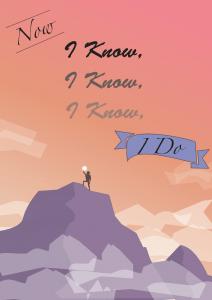
Logo Mock-up:


Presentation Poster:
![]()
Reflection:
I believe my logo design was successful in addressing the design brief. Initially, by understanding that a logo does not have to directly relate to the company, I was able to explore and experiment with different logo concepts. I created a logo that compliments my clientele’s values and keywords, with the use of symbolism in the lotus flower of purity and harmony, and selecting a font that was calming and soothing to look at. I also created a logo that is easily recognizable and remembered, through the use of symmetry and negative space. I know this is true because of the successful logo test I did with my peer in study hall, when he managed to redraw the logo quite accurately after only seeing it for a few seconds.
One thing I could’ve done better during the drafting process was to remember ‘quantity over quality’. I spent too much time during the earlier phases trying to make each draft look good, and ended up with fewer concepts than I would have liked. If I draft more ideas, I will have more flexibility to choose the ones that I like. I will remember this for future design projects.