Propaganda Poster -Kevin Kang-
My Propaganda poster:

Title: Go gym or die weak
Rationale:
As an avid gym-goer, my philosophy was that getting started in the gym is the hardest part. However, once you start, you will start to fall in love with the gym. Therefore, the purpose of my poster was to make people join a gym for the first time and experience the euphoria gym brings. The first technique I used was color. I used three colors: Red, black, and yellow. I kept the colors as simple as possible to ensure the viewers didn’t get distracted and could directly absorb the intended message. I chose red as my most dominant color since red symbolizes power, anger, and strength. All my texts were in red and I wore a red t-shirt and visors to emphasize connect red with the gym providing strength, power, and a place to unleash anger. The second technique was ethos. Although I attempted to make myself credible by enlarging my bicep through photoshop, some people might still be skeptical and disapproving of a message from a stranger. Therefore, I included a quote from Socrates, a very famous philosopher, to support my claim and make me sound credible and reasonable. The last technique was pathos. People don’t go to the gym despite knowing the health benefits which means persuading with logic and statistics about the health benefits will be ineffective. Therefore, I decided to use emotions, especially anger, with my poster. Anger was the best emotion to manipulate since other emotions do not connect the best with gym. My first usage of anger was used with a false dilemma. My bold text reads “go gym or die weak”, purposely presenting only two options with “dying weak” as the other option to provoke anger in people as it makes them feel insignificant and worthless. Their anger will be amplified as they read the next text which reads “you are weak and pathetic.”. However, criticizing the reader with no encouragement makes the poster less effective as it might only discourage readers. Therefore, I included the text “prove me wrong” to make me sound like a jerk that the readers would hate and want to prove wrong. Readers’ hatred and anger towards my bold and belittling statement would motivate them to join the gym and become a person that can prove me wrong. Additionally, everytime they feel unmotivated, they will remember my harsh remarks and gain motivation again. Overall, the poster I created successfully provokes anger while maintaining credibility, allowing more motivated people to join the gym for the first time and inexplicably promoting longevity in the gym.
Lamp product Design -Kevin Kang-
Daddy Long Leg Lamp
How did my lamp design go from this:

to this:

And finalized with this?:

Well, Let’s see how my lamp design went from a 5 year olds drawing to a polished product!
The beginning: Padlet, Mindmap, and Identifying the audience
Before I started anything, I first set two goals for this project. My first goal was “Quantity> Quality”. Our last project was glasses which meant although you can get creative, it’s very hard avoid the typical glasses frame we all know. However, this one was about a lamp which would let me explore different options. If I focused too much on quality, I would have to give up on quantity which would limit my creativity and options and therefore, I decided to really commit to quantity> quality. My second goal was to really know my audience. Last time, my audience were South Koreans which is a huge audience with different needs. This time, I tried to make the audience more specific so my product is actually useful for their needs. In the beginning, I tried to get as many ideas and inspiration as possible and identify my audience and their needs.
My Padlet:
As you can see, my padlet is more focused on the inspirations for the design aspect of the lamp instead of the function.
Mindmap:
For my mind map, I focused more on the functions of the lamp since my padlet is heavily focused on the design aspect of the lamp.
Identifying the audience
Identifying the audience or the user of the lamp was important because a good product should enhance a person’s quality of life by helping their struggles. Making a bright lamp for a person living in a sunny area with already enough natural light coming into their house would not be the best option. Instead, making an affordable and bright lights for financially struggling people in darker areas would be a better option as it helps both of their struggles. Therefore I have made categories to help identify what my user needs. This is a generalization and therefore might not be fully accurate nor be the same for everyone but is a solid guide that should work for most people.
Age:
-
Super Young (1-4): If the users are this young, parents are mostly like looking for a lamp for uses like a nightlight since babies tend to be scared of the dark. Therefore, the lamps should prioritize the safety and design of the lamp over function. The lamp’s design should aim to have designs that calms children. The lamp’s material and design should also be safe and avoid using toxic materials, fragile materials, easily overheating materials, heavy materials and avoid sharp edges that could stab or poke curious children.
-
Young (5-10): These users are still quite young and immature yet they will start to receive work from school around this age range. Parents will likely buy lamps that will help them do homework at night. However, since they are still young and immature, the design of the lamp would be important along with the function. The designs would be helpful if they are from popular kids shows like Spongebob, and Paw patrol.
-
Early Teens (11-14): This age range is when the workload intensifies since students will be getting a lot of tests as well as homework to prepare them for high school. Although the aesthetics of the lamp would be important since early teens love to decorate their room that shows their unique character, the importance of function greatly increases. Therefore, the brightness and the aesthetic of the lamp is important.
-
Late teens(15-19): This age range is when the workload is intensifies more from early teens because students will now be in high school. Therefore, the function would be more important for this age range. The lamps should be bright, and durable. However, aesthetics are still quite important.
-
20+ older: By this age, the aesthetics won’t play a big role anymore. Instead, people will look for a functional lamp that is cheap.
Room environment:
-
Modern style: Clean and sharp, visually pleasing and somewhat fresh
-
Old style: Nostalgic and antique
-
Big desk: Space for the lamp is not limited but the lamp’s light should be able to cover the entire desk.
-
Small desk: Space for the lamp is limited but the lamp light does not need to be as bright and wide.
Interests:
-
Nature: Animals, plants, insects, and the environment
-
Sports: Basketball, Football, baseball and many more
-
Space: Black hole, the sun, planets, stars, moon, and the galaxy
-
Fashion: Gucci, Balenciaga, Louis Vuitton
My user for my lamp:
I believe making a lamp for people like myself would be the best because I know the needs of my self and therefore would also know what type of lamp people like me would really need.

This is what my desk looks like. It is very big and long and I want to use the entire desk. The red part represents the only part where the lamp could be since that’s where the plug is. The yellow part represents the maximum distance that my lamp could cover. The blue part represents the area that my lamp cannot cover. Therefore, even though I have a big desk, I often find myself only using the yellow part of the desk. The problems with my old lamp would be that it would take up too much space, has long wires, and was not capable of providing light for the entire desk, forcing me to use only a small bit of the desk.
User’s need:
-
Bright
-
Has little wire
-
Does not take up too much space
-
Lamp covers a lot of area
Settling with my final lamp design: Sketches, and inspiration
Different lamp sketches and inspiration:
1. Ross lovegrove’s design process: According to Ross lovegrove, he gets his inspiration from nature because he loves the “natural growth patterns and the beautiful forms that only nature really creates”. He is also inspired by the unbridled way of growth in nature and how nature grows things without being restricted by form. From his process, I can learn to also design my lamp that isn’t restricted by the typical lamp form but create something unique. Lovegrove’s process of designing the car was also inspired by a streetlamp. I could also use that process and try to find inspiration from things that are even completely unrelated to the lamp because as Lovegrove mentioned, this process will allow my ideas to grow without being restricted by the idea of lamp.


2. Hoopoe bird sketches:


When I first saw the picture of Hoopoe bird, the red bright mohawk was very noticeable. I wanted to focus on the mohawk because I felt that was identity of the Hoopoe bird. Therefore, my first design was a lamp of the Hoopoe bird where its mohawk would light up. This design would emphasize the Hoopoe bird’s mohawk. The second one was a mistake. I thought because of Hoopoe bird’s vivid color and distinct look, the bird would be considered endangered animal. So to spread awareness, I created a lamp that would show a cage when you light up the lamp. But oh well, apparently the Hoopoe bird is a very common bird.
3. Sycamore seed sketches:


This lamp design was inspired by a thing called sycamore seeds. They have sharp edges that is reminiscent of a mace. Therefore, I thought it would be cool if there was a hanging lamp that could have the shape of a sycamore seed. As you can see, the lamp design above has the sycamore seed as the light and shows that it can move and stretch to a designated location. I also decide to make it portable and detachable just in case the lamp wouldn’t be long enough to reach the other side of my desk and I can just detach the sycamore seed and bring it to the other side.
4. Mommy long leg:


Mommy long leg is a character from a horror game. In the game, she is able to catch the main character easily from far distances without having to move her body because her limbs and necks can stretch and bend. If you translate this into the context of lamp design, it would mean the light is able to reach far distances without having the stand move. Therefore, I sketched a lamp where the only the head would extend to reach further distance.
5. Crimson Typhoon from pacific rim:


This robot in pacific rim is one of the strongest because of its three arms. It’s strong because each arm can do different tasks but also they can work together to do the same task more effectively. I though this would be a good inspiration for my lamp. I took the concept of three arms and translated that into my lamp having three different heads with three different light. Therefore, when they are all separated, they can all shine different directions. But when they are together, they can shine the same direction but much brighter.
6. Dreamworks logo:


I have watched a lot of movies and this dreamworks logo was always so beautiful to me because of the moon was so vivid and luminescent in the dark sky. Therefore, I thought having a moon shaped lamp wasn’t going to be too bad and it would be perfect if it was a hanging lamp so it could look like the moon is actually floating above you. I also made it extendable so it could cover the other side of my desk.
7. Super monkey:


The super monkey is known for doing a lot of things and has the ability to shoot bright lasers out his eyes. Therefore, I took inspiration from its vivid color of red and blue, the bright light coming from his eyes and his ability to do multiple things. By putting a clock on lamp, I can reduce the space for a clock and have a single lamp instead.
8. Square Magnet:


One crucial feature of the square magnet is that magnets will always serve its function even when separated or connected. Therefore, I made a lamp design inspired by this square magnet. The initial form of the lamp would be 4 boxes with 4 light heads in each box connected to each other creating one bright light. However, they could be detached into separate boxes and used wherever you want. As you can see from the sketch, one box is shining the right side, while the left side is shining the left. The box can also be attached to the stand and increase its vertical.
9. Toilet paper:


This was just one of those fun ideas during my quantity>quality process where I implemented the stretch feature and mixed it with toilet paper.
Different lamp sketches and inspiration for my final lamp design:
1. First sketch of daddy long neck:

My initial design of daddy long neck was really similar to my super monkey design where I took the color and the shape from. I did remove the bandana and made each eye adjustable so users will have more control over where the light will shine. The red button on top would be the switch to the lamp and the display on the body will show the user’s time, temperature, and date.
2. 3d sketch of daddy long neck:

For the sketches on the right, I used the Orthogonal drawing practice video in DX. I drew the lines to match up the front part and the top part so it is proportionate to each other. For the left side, I have drew a 3d version of my lamp by using the method used in the Isometric drawing video in DX. I also have changed the design a little bit to give more control for the eyeball. That way, users have even more control to where light shines. At this point, my lamp still didn’t have the stretch feature.


Finalization of my lamp and its sketches: Vector design, and presentation
Vector design:
One of the feedback I got from my sketches were that all the shapes were very rough and not clean. In order to improve, I decided to use affinity designer to make a vector version of my lamp much cleaner. I used the line tool as well as the shape tool to create equal shapes of circle and rectangle.

I posted this version on the teams chat and got more feedback for it. The feedback was to finish up the drawing, add the color, and remove the lines so it could be used for my presentation. So I did just that

It was during my vector designing that I made huge changes. First, I made changes to the color itself. I made the colors more vivid and bright because the previous designs had a dark color which would not fit the dark surrounding lamps are usually in. Therefore, making the lamp brighter makes it look cleaner and better in the dark. Another big change I made was the stretch feature. As mentioned before, one of my user’s need was that the lamp needed to cover a wide area. My previous design in the 3d sketches did not have the ability to cover a wide area because it was stationary. So I wanted my lamp to move. However, I also didn’t want the entire lamp to move because that would not meet the space-friendly requirement. Therefore, I decided to only let the head move by taking inspiration from the mommy long leg sketch I did.
Presentation activity:

This was one of the presentations given to us as an example. Here is my analysis:
Good features of the poster:
- It shows real life application and what the product looks like when it’s actually used.
- Not too much text
- Good display of the features
Bad things about the poster:
- Too much picture distracts the viewer from the actual product

Good features of the poster:
- Perfect balance of text and image
- Good usage of colors for the background and the text so that the text as well as the lamp looks much more visible and brighter compared to the dark black background.
- The small amount of text is still very concise and has all the info a user would need.
Making my final presentation:
My first prototype:

I first took two inspirations from the two posters up there. I first made an illustration of daddy long leg in a real life application by placing him on the desk like the goggles poster. Then, I made the background purposely dark so that the light coming from the lamp would look more bright.
For the font, I wanted it to look like the ones on the Ginko lamp. I wanted my fonts to have a neon look. So I first typed Daddy long leg and used outer glow as well as inner glow to give that neon feeling.


However, I still felt like the fonts didn’t look the way I wanted. I wanted to fonts to really look like neon signs shining in the dark. I achieved this effect by first creating a rectangle. Then, I applied Gaussian blur to the rectangle making it look like this.

Then, I put this behind the daddy long leg which gave me the bright neon vibe I was looking for.

The daddy long leg design was taken from the earlier vector drawings I made.

The light from daddy long leg’s eyes were created through similar methods of how I created my font. I realized that the gaussian blur effect played a big role into making things look like light in the dark. So I first created a yellow triangle.

Then I used the gaussian blur tool to make the edges less sharp and got the light I wanted.


Then I created real life objects to illustrate daddy long leg being used in a real life situation.

My second design:

In my second design, I improved a lot of things. I first added more objects to illustrate the situation I am in.(A person who has a long desk full of stuff) Then, I changed the shape of the triangle to emphasize the brightness of my lamp. For the model of daddy long leg, I did the same thing with all my other neon designs. I first took the model from the vector design and layered the same design underneath. Then, I put the gaussian blur on the model below. As for the texts, I included features of the lamp that a user might be looking for.
3rd design:


I first added a “for users with” to highlight how this product will solve problems for which type of people. I also added a measurement to show users how long it can stretch without explicitly telling them. Then I created a second page showcasing going into detail.
This was the feedback I received:
” The overall style is fun and looks great. The first poster is a little busy, BUT the 2nd poster is super clean and clear. You should look closely at both posters and find ways to improve the alignment and spacing – make all the text a little smaller (you can go as small as 12pt for the small text). Clear the edges from text – make a bit more margin space around the edge of both pages so the text doesn’t go right to the edge. Make the name of the lamp slightly smaller and place it in the same position on both pages.”
-Mr. Griffin-
-
“Overall style is fun and looks great”: This was a good relief for me because I wanted my poster to be interesting and not boring.
-
“The first poster is a little busy, BUT the 2nd poster is super clean and clear. I 100% agree with this feedback as I also believe the amount of images and text between the 1st page and the 2nd page is huge. 1st page looks too full while the 2nd page looks too empty. I needed to fix this issue.
-
“You should look closely at both posters and find ways to improve the alignment and spacing – make all the text a little smaller (you can go as small as 12pt for the small text).”: Although I agreed with making the text smaller, I tried 12 pts but felt it was too small next to the daddy long leg model. So I decided to decrease the font size moderately. As for the alignment, I disagreed with the feedback because I purposely made the two texts misaligned so they can stand out on its own.
-
“Clear the edges from text – make a bit more margin space around the edge of both pages so the text doesn’t go right to the edge. Make the name of the lamp slightly smaller and place it in the same position on both pages.”: The issue with the text being next to the edge was easily fixable. However, I disagreed with the second feedback. I wanted to the two posters to flow as one poster with the first page showing the name and design and the second page just getting into details. However, putting the name of the lamp on each page would break the flow as it looks like I’m giving a new presentation for a different product. Therefore, I decided not to change.
Final design:

I first decreased the font size of daddy long leg to 75 and the text next to daddy long leg model to 20. I tried my best to align the text next to the daddy long leg model. As for the “for users with”, I purposely put the list from the longest to shortest so that although the texts weren’t aligned, it would still be visually pleasing. As for the second page, I put a description of the LDC display and its features to make the page feel less empty.
Evaluation:
I think the final product I created is almost perfect for the specific user I chose in the beginning. First, the LED in daddy long leg’s eyes are very bright. 500 lumens in each eye is bright enough for outdoor walking which shows that no matter how far the desk is, my lamp will be strong enough to shine on it. Secondly, the neck stretch feature. The neck stretch feature allows the user to freely change direction on where the light shines without having to move the body of lamp. So instead of moving the lamp, the user can just pluck the head and move it to a designated location. Third, the LCD display. Not only does this lamp give you light, it also gives you the time, date, and temperature. Since my users were for people with occupied desks, this lamp alone removes the space needed for clocks and calendars. This lamp kills three birds with one stone. Fourth, the material of the head. Lamps will usually get heated when used for a long time. However, my product is designed so that the users have to touch the head to control the light. Therefore, I created a blend for the head’s material so that it would not get hot even with long uses. Lastly, the design. I think it has very pretty colors and are suitable in almost any environment. Overall, I think this product suits all my user’s needs.
Eyeglasses Product Design Reflection – Kevin Kang-
Link to my poster just in case you can’t see very well at the end:
My padlet link:
My mind map:
Glasses Prototypes:
1. NBA Merch glasses (Atlanta Hawks): Show your support for your favorite NBA teams in classy fashion!

Feedback:
- Are there any special features other than NBA logos?
- Will you add any specific functions to the NBA merch glasses?
- Maybe change the form of your glasses like something circular?
Reflection:
A common feedback I received was people asking if there were any special features to the NBA merch glasses. When I was making this design, the only purpose I had in mind for these glasses were to just show support for your favorite team. It would be the same thing as getting a poster or a jersey of your favorite team but in glasses. And fans could wear these to the games and show support while supporting the Franchise financially. However, a lot of people couldn’t see the purpose right away which makes the design not understandable, failing Rams ten principles of good design. Therefore, I decided to leave the idea of NBA merch glasses because I could not find an appropriate and affordable feature to add to the glasses.
2. Futuristic AR glasses: The future is now. Capture your beautiful every day moments with these AR glasses. Need to call an uber with both of your hands occupied? Don’t worry, these glasses got your back.

Feedback:
- Love the futuristic concepts and how the design reflects the purpose of the product!
- I like your AR glasses and nice idea of the camera feature.
- How are you going to make it?
Reflection:
I loved how most of my classmates liked the innovative idea of AR glasses. I tried hard to focus on the futuristic concepts and make a glasses we would all want to wear in the future. I liked how people also noticed the feature of the camera on the glasses since that was one of the specific functions I put. I feel like these cameras could capture those little, yet beautiful moments that happen daily. However, a classmate proposed a problem. They asked how are you going to make it? This was a problem because the main feature of the AR glasses would have to be the screen that projects the AR. However, making an AR screen would be impossible with the technology provided. Therefore, by making this design, I would basically be making a normal goggles design. Therefore, I decided to leave this idea.
3. Climate Change Awareness Glasses: Spread the awareness of climate change with these glasses made from 100% recycled plastic!

Feedback:
- How does the climate change glasses work? Is it just a regular glasses with different color?
- Nothing special
- Will you add any specific functions?
- I really like the climate change glasses
- How would the stuff on the side of the glasses be painted into the glasses?
- I like the idea of spreading awareness of climate change.
Reflection:
Personally, these glasses designs were my favorite. They had vivid colors, good message, and beautiful illustration on the frames. However, a lot of the feedbacks were rather negative mentioning how the glasses are not special and don’t have any specific functions. I felt like the function of these glasses are to spread awareness of climate change but I also understood where their feedback came from. Another feedback I got was how the stuff on the side of the glasses will be painted into the glasses. This was a very good feedback because I think those drawings make the glasses special and unique. However, with the technology we had, the only thing I could do was engrave the shapes and pain the colors in. This would make the colors less vivid which kinda ruined the bright and clear ocean vibe I wanted. So I decided to drop this idea but still wanted to find an glasses where the glasses could represent something valuable to certain people.
My normal glasses:

Side view

Front view

Top view
Measurements:
Glasses lens:
Horizontal: 4.5 cm Vertical: 4 cm Across: 4.6 cm
Frame:
Nose bridge: 2 cm Hinge from front view: 0.5 cm Hinge from side view: 0.5 cm Glasses frame: 9 cm Ear hook: 4.5 cm
The “Korean red devil” glasses:

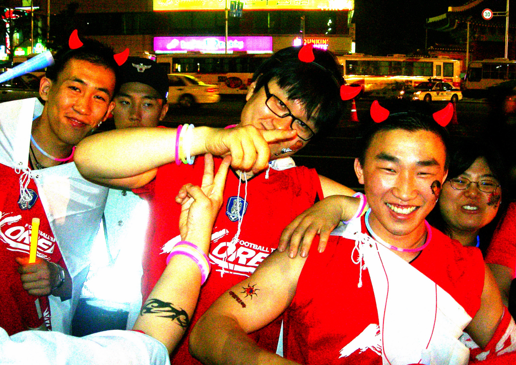

Inspiration:
These designs were inspired by one of my most favorite historical(?) events in South Korea. South Korea has always been a country that performed poorly in FIFA world cup. However, to everyone’s surprise, South Korea’s team in 2002 made it to the Semi-Finals which was the first time the South Korean made such progress. This caused a massive celebration in South Korea where people would wear these red devil head bands to show support. Therefore, my glasses were inspired by the devil headband and the Korean flag. The glasses frame of the devil represents the devil headband of 2002 and the colors of red, blue, and black represents the colors found in the Korean flag.
Cardboard Version:

Reflection:
First of all, the size was the biggest problem. I haven’t really took size into consideration when making the design so I definitely need to fix the size. Other than that, I think the glasses shape came out really clean and the nose bridge was much better than I expected.
Peer review:
“Great design. I think you could add the year “2002” onto the glasses frame to better emphasize the 2002 world cup” -Yul Kim-
This was a great feedback and idea. I think the red devil itself may not be clear enough for people who don’t know the story behind the red devils. Therefore, by adding 2002 onto the glasses, this might better emphasize South Korea’s 2002 world cup run.
“So what I like about your glasses is that you have colored them and they look reallly nice ecpecially the devil one. Some questions I had however was what is the black line in the middle of the rims of the devil glasses, and also what material will these glasses be as well as what is the final size of the glasses as i know the ones that you laser cut were very small. Another suggestion might be to make the devils bridge thicker as it looks like it will break if wind blew on it” -William-
This was also great feedback. As for the black line part, I wanted that black line to represent the black stripes in South Korea’s flag. Seeing that it failed to represent or at least resemble the Korean flag, I am going to either edit it so it becomes more clear or just get rid of it. As for the size of the glasses, I think I am going to make the glasses a bit bigger than my actual glasses since I find my own glasses comfortable. For the material, I need it to have a certain color so I think I will have to give up the option of recycled plastic. I also definitely agree with making the nose bridge a bit thicker. One of the problems of the prototype was that the nose bridge was extremely fragile due to its thinness. Therefore, I will try to make the nose bridge a bit thicker.
The Spongebob star glasses:

Inspiration:

My inspiration came from this scene in Spongebob. I wondered what type of glasses would make this performance even better. I came up with star shaped purple glasses that matches the sparkling purple outfit of Spongebob. I also made the nose bridge look like clouds which fit the sort of space/sky outfit spongebob had.
Cardboard Version:

Reflection:
Again, I need to work on the size. However, there was a bigger problem which was the nose bridge and how big each stars were. I noticed that while trying these glasses on, the nose bridge felt uncomfortable and the stars were kind of stabbing my skin. Therefore, I needed to fix the nose bridge so it sits better and the stars to be less sharp and smaller so it doesn’t feel painful or uncomfortable.
Feedback:
“Some suggestions i have might be to change the Bridge of the star glasses because i do not think it will have good balance if its flat” -William-
This was great feedback. I definitely agree with William on changing the nose bridge shape of the star glasses as it’s uncomfortable. Therefore, I will try to fix the nose bridge and make it curvy and smoother.
Other designs:


Cardboard Version:


Reflection:
Both of these glasses design came out really good with size being the only problem. However, I felt like these glasses lacked uniqueness and felt lame compared to my other glasses. Therefore, I decided to abandon these ideas.
Glasses frame design:

Cardboard Version:

Reflection:
When I was first designing these frames, I did not check how normal glasses frames looked like. Therefore, after trying my cardboard frames, I realized that the shorter the lowering part is, the more uncomfortable it was for my ears. Therefore, I will try to make the lowering part longer.
Final Stages of Design:
- Refined version of the 2002 red devils:

So I took feedback from Yul to add “2002” onto the glasses so people who don’t know well about the red devils or may not realize the meaning without the numbers can understand more clearly. The numbers were a great addition as it added more uniqueness and meaning to the glasses. I also changed the design of the ear frames to make them sit better on my ears while being less painful. I changed the sizes of the glasses so it would be a bit bigger than my actual glasses.
2. Cardboard 2002 red devil glasses:
The refined version came out great. The sizes were amazing as you can see by the side by side comparison. No parts including the hinges looked big or awkward. The numbers came out pretty clean as well, clearly representing the “2002” I wanted. However, I felt the ear frames were a bit weak and fragile, making it uncomfortable to put on the glasses and wear them. Also, the big size of the eye lenses made the glasses feel tight. Therefore, I increased the size of the glasses to make them bigger and also increased the height of the ear frames so the ear frames would be much stronger.
 Colored 2002 red devil glasses Front view (Prototype)
 Colored 2002 red devil glasses Diagonal view (Prototype)
 Colored 2002 red devil glasses Side by side comparison with real glasses front view (Prototype)
 Colored 2002 red devil glasses Side by side comparison with real glasses side view (Prototype)
 Colored 2002 red devil glasses Side by side comparison with real glasses diagnoal view (Prototype)
3. Refined cardboard design:
I made the ear frames a bit thicker and higher and increased the size of the glasses to have a better overall fit on my face. Everything else was perfect and it was looking good and fitting well. However, I noticed that the nose bridge would fold every time I wore the glasses possibly due to the nose bridge being short. I didn’t know if this problem could be solved by using a harder material so I decided to try the design with wood.
 The old cardboard design side by side comparison with refined cardboard design front view
 The old cardboard design side by side comparison with refined cardboard design side view
4. Wood design: In order to see if the nose bridge would fold, bend, or break even in hard material, I decided to use wood. I printed the exact same design and measurements as the refined cardboard version, glued my ear frames which was going to be my method for the final product, and tried them on. To my worries, they were a bit tight so I pushed a little harder and while the nose bridge didn’t break, the ear frame broke due to the pressure. Therefore, I decided to fix this issue by making the glasses wider instead of only making the nose bridge wider. I did this because I grouped my entire glasses together on designer which mean in order to change the nose bridge, I had to build the whole glasses again. Therefore, I decided to just make the glasses wider to give more room for my ear frames.
 The wood design with its destroyed ear frame.
5. Final prototype: For my final prototype before I printed out my design with acrylic was out of cardboard. This time everything was perfect. Good design, comfortable fit, no broken ear frames, and no bending of the nose bridge. So I was ready to print out my real design. However, this was the day when Mr.Griffin was absent and we weren’t allowed in the fab lab. I had to hold my tears and work on the blog post that day. However, the worst scenario happened because after that class, school started online which meant I wasn’t even able to get my hands on the final design nor photos. I was sad and had to work with the digital design I had for the rest of the project.

Glasses:
Width: 18 cm for the entire wide frame
Height: 9 cm including the horn
Ear Frames:
Width: 14 cm
Height: 3 cm
Poster:
The first page: This page introduces the context of the glasses and its price. The price is 8000 korean won which is roughly 6.35 U.S dollars. I really wanted to write the whole thing in Korean since the first page is supposed to be a newspaper/advertisement for these glasses from a Korean company. So writing it in Korean would really give the poster its unique and authenticity. However, this would mean Mr.Griffin wouldn’t understand and therefore, I wrote in English. I still kept the dates and the names in Korean.

The second page: This page shows the features of the glasses such as the LED lights, or the QR code.

The last page: This page shows what the glasses look like on a human being. I was sad because I really wanted to take photos with my own glasses. However, I just decided to edit the glasses in. And don’t worry, I got consent from Ray to use his photo.

Pet rock Reflection
Pet rock designsL
When we were first collecting bad design ideas, I looked through the padlet to see what others put. There were a lot of bad design ideas like the baby mop or the kosk. But one design really caught my eyes. It was the pet rock. I looked at it and was immediately able to not only analyze the problem but come up with a solution.
 This one is considered the orignal pet rock and is the only one that you can buy off the market right now. The price of this pet rock is 30$.
Other Designs:
 Here, we have different rock type for the pet rock except the rocks have eyes and resemble a family.
 This rock also has human facial features with different colored hairs.
 This one features very colorful rocks with eyes.
 This one has rocks that resemble monsters for children.
 This rock has animals painted on it, possibly for awareness of extinction or adoption.
Who is this product targeted for?:
- Teens who want cute little pet rocks for decoration or accessories.
- Children who are suffering financially or mentally that wants to get something off their chest without telling actual people.
- Children who want pets but are’t financially or mentally ready.
- People who want to buy collectibles and accessories for their favorite brand, team, or game.
Design problems:
- Its price: The price is way too expensive even with its beautiful and cute packaging. The problem is more emphasized when you realize most of its customers aren’t rich adults but children/teens or adults who are trying to just buy a cute little decoration for their room. And even for those rich people, spending $3o for a piece of rock just seems like a waste of money Therefore, $30 seems too much for its targeted audience.
- Its tedious design: According to Dieter’s 10 good design principles, a good design needs to be visually aesthetic. This one fails horribly at this principle since every pet rock have the same design and color making every pet rock not unique. This problem also corroborates with the first one since no one would pay $30 for a decoration where the design is the same for all product, you have absolute no customization, and the design is not even visually aesthetic but just a rock. And teens, the targeted audience, nowadays put a heavy emphasis on visuals and decorations which is why they spend a lot on phones cases, laptop cases, and stickers. Therefore, in order to reach its target audience better, they need more designs that are eye-catching.
- Its usefulness: According to Dieter’s 10 good design principles, a good design makes a product useful. And although you can’t really expect much usefulness out of a decorative product, this one just has no use at all. A figure of your favorite football player might show your love and passion for a certain team and some decorative lighting might make the mood of room much brighter. But a rock as a decoration simply has no use and almost fails as a decoration as well.
- The confusing usage: A good product also needs to be understandable. This product almost leaves every viewer confused since what are you expected to do with a rock. They call it a pet rock but the rock can’t react, eat, or move.
Observational drawings:

Mindmap:

Visually Aesthetic:
a. Customization: Hair, color, and clothes
b. DIfferent brands: Apple, Gucci, Prada, Nike, NBA, FIFA
c. Different age rocks
Innovative:
a. The rock can interact with other rocks
b. An app for the pet rock
Useful
a. May work liker google home
b. AI pets
c. A very safe and unhackable camera that parents could use to watch their kids
d. A cuter and more personalized version of siri
e. Alarm clock, music, and talk
2D Drawing:

Here, you can see my attempt at drawing the pet rocks in 2d. This one is for the NBA teams and the NBA players. I tried designing Paul George, Trae Young, and Lebron James.
3D Drawing:
Since my product was pet rock, making a 3d design of a rock was incredibly hard. Therefore, I focused more on its packaging.
 This design was inspired by barbie doll packaging. This packaging unlike the others stand up straight. This packaging will mostly be used for slim and long rocks.
 This one is inspired by a snow globe. It has a plastic packaging around the rock so the customers can see the entire product. It’s also a NBA pet rock.
 This one is similar to the packaging one above. However, this design focuses on the color element.
 This one is just a plain simple box packaging.
 This one is one of my ideas of the super deluxe package where it includes 2 random pet rocks.
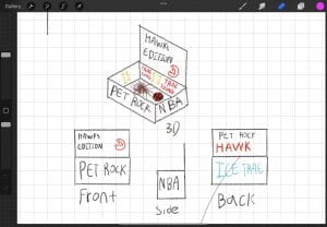 This one is the most detailed pet rock box I created. I showed what it looks like from 3d, top, side, and back. I also included what the inside of the box would look like.
Final Presentation:
Smiley product design
2 buckets challenge
My padlet:
My design:


Visionary Security Logo design -Kevin Kang(G10)-
“Visionary Security” logo design
Table of contents:
- My padlet
- My initial thoughts and inspirations
- San Diego teams
- My 20 quick designs
- Moving onto a new company
- About Visionary Security
- Visionary security designs
- Peer/Teacher Feedback
- Final Design
My Padlet:
2. My Initial thoughts, designs, and ideas:
When first given this task, I wanted to work on a logo for a company or thing that I enjoyed. Therefore, I naturally looked at NBA team logos. Recently, i fell in love with the NBA and thought it would be really cool if I either create or improvise an NBA team logo. I originally planned to improvise the hawks logo since it was my favorite NBA team and the Hawk’s logo looked very plain and bland compared to other teams like the Mavericks or the Nuggets. After trying out some different designs, I realized that the Hawk’s logo while being very simple is actually really good. I also realized that improvising a logo of an existing NBA team would be much easier since I already have a foundation to work with. I wanted to challenge myself and decided to make my own team and its own logos. I searched up the popular cities in the U.S that doesn’t have a NBA team. San Diego caught my attention. It was a good place to start a new NBA team. It had sufficient amount of population meaning the team could have a lot of beginning fans from San Diego. There are a lot of competition with other teams in California like Golden State Warriors, Los Angeles Clippers, and Los Angeles Lakers but California is one of those cities where a lot of foreign people and celebrities live. Foreign people might influence their foreign family and friends to support the team and celebrities have a lot of influence on their fans. Therefore, there is enough room for this team to grow. I then looked for the team’s name.
3. San Diego Teams:
San Diego Beaches:
After settling with a specific city, I looked for the team’s name. I noticed that San Diego was known for their beautiful beaches. Therefore, I decided to think of things that were related to beaches. Some of my ideas were: San Diego Sanders, San Diego Sharks, San Diego Horizons, San Diego Wavers, San Diego Seagulls, San Diego Krakens, and San Diego Sailors.

San Diego Sharks:
One of the first things that came to my mind when thinking about ocean was “finding nemo”. It really inspired me to respect the ocean and its diverse marine life. Anyways, I still remember being scared by the shark scene. Therefore, I decided to think of a team name with a shark. San Diego Sharks. It sounded relevant and catchy so I decided to work on it. However, I noticed one crucial mistake. There was another team with a similar name: San Jose Sharks. Therefore, this idea went to my reserves.
When creating a type design of San Diego Sharks, I went on dafont.com and looked at the horror section. I found this font called “help me” which I thought was perfect for my design since “help me” is what a person would say or feel if they are getting attacked by a vicious shark.


Font inspiration: 
San Diego Sanders:
When I searched up sand, a sand castle was one of the few things that came up. I liked it because it was related to sand and sand castles itself was related to beaches. However, I did not want my team overlap with Bernie Sanders who is a popular politician. I wanted my team to show up first when you search up Sanders. I also felt like a sand castle design would overlap with Sacramento kings and therefore, left this one.
My prototype design:

San Diego Horizons:
I personally didn’t like this one as I believed it might overlap with the Phoenix Suns since both team names were related to the sun. Therefore, I left this one.
San Diego Wavers:
I think design was one one of my favorites. I think the team name and this design really capture what beaches are. There was a problem though. Wavers meant, “shake with a quivering motion and become unsteady or unreliable.” This made the team look like bunch of cowards which was not what I wanted to represent. So I tried to go with just San Diego Waves but that one didn’t sound catchy and it also overlapped with this team. Therefore, I had to leave it.
Inspiration design:

My Prototype design:

San Diego Seagulls:
This one was inspired from all the bird teams in the NBA: Atlanta Hawks, and New Orleans Pelicans. I realized that the most visible and common animal in the beaches are seagulls and it even had the “s” in the front making it sound catchy. Then, I ran into a problem again. There was already another team with a very similar name: San Diego Gulls. Just like the sanders situation, I didn’t want any overlap and therefore left this one.
Inspiration:

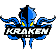
San Diego Krakens:
I thought Krakens were mythical and extremely strong which was the right feel that I wanted my team to radiate. Besides, I guess krakens were slightly related beaches. This design was a good inspiration because the color contrast made it really look mythical and strong. It also illustrated distinctive features so that people would know that this is a Kraken and not an octopus.
Inspiration:
My prototype designs:

San Diego Sailors:
While looking for more ideas, I saw this image with the title, “best things to do while visiting San Diego”. I thought sailing was perfect for the San Diego beaches because it was common in beaches and San Diego. So I came up with the name San Diego Sailors. I believed San Diego sailors was the best one. It fit all the categories I was looking for.
1. Was it related to beaches? Yes because people sail at beaches.
2. Does it sound catchy? Personally, I think so.
3. Does it start with a “s”? yes
4. Does it overlap with anything else? Nope, not a single team that has the word sail or sailors.
My prototype designs:


4.My 20 Quick Designs:

5. Moving on to a new company:
After experiencing some difficulties with my NBA team logo design, I wanted to look for another company that I could work on. So I spent some days, looking for inspirations. One day, I was on YouTube watching the kill-count series from dead meat which was about a guy going over a horror movie talking about the story and showing the kills in the movies. I really enjoyed this series because it showed the story but also the efforts and all the designs that the producers put into making films. Anyways, I was watching the kill count for purge(2013).

And the main character has a luxurious home and seems to be a rich businessman. James(the YouTuber) then explained that the main character owns a security company that everyone pays for the purge. That’s when an idea sparked in my head. A security company. In real life, crime happen on daily basis. Therefore, I thought a good security company was going to be lucrative business. So I settled down with a security company idea and began looking for more ideas.
I was settled with my company and now I needed to find what my company’s focus was going to be. Was it going to be unbreakable doors? Bulletproof windows? I was still lost. Then again, one day, I was scrolling through Instagram when I saw a similar meme to one above. That instantly gave me a good idea. A 4k security camera that could record in 60 fps. Technically, this would be almost impossible to create right now but it would have been revolutionary if it existed. So I settled with my company’s vision. A 4k 60 fps security camera that can also record slow mo and night vision.
The meme:

6. About Visionary Security:
Client Name: Visionary Security
Background: Visionary security is a security company that mainly sells their home security products such as door cams, door locks, cameras, and sensors. They are a brand new company and their headquarters are located in Silicon valley, California. They are most famous for their innovative cameras that can record videos in high quality and frames and has the ability to even record in the dark. Their cameras also adjust to its surrounding so when the environment is a bit darker, their camera lenses will expand and when the environment gets brighter, their camera lenses will shrink. Their cameras work like our eyes and is why the company is called visionary security. The company believes their security camera provides clear footage like our vision but also consider themselves visionaries since they always look to advance in the future.
Audience: Their audience is mainly focused on the people that live in California. California has the third highest robbery rate out of all the U.S states which means living in California without proper security could result in robberies. And since California is home to a lot of big companies like Wells Fargo and celebrities who need good security. a security company will easily thrive in a place where the market for security is booming. Visionary security intends to replace famous security companies like ADT or RING and to do that, they have brought down the prices so even the poor people could afford their services.
Keyword: The three keywords that represent this company are eyes, vision, and security.
7. Visionary Security designs:
 This is the original first design
 This is the design that is inspired by the product that visionary security sells which is a security camera. I still wanted the the idea of using the red ball to represent the camera so I used it for my app interface
 This is inspired by the ADT logo. The ADT logo is an octagon. This logo is a pentagon.
 I don’t remember what inspired me. I think it was just a random idea.
8. Teacher&Peer feedback:
Peer feedback:
- Keywords feedback: Eyes: “Works great. It exactly reminds me of an eye.” Vision: “Same as well” Security: “It has a sturdy feel which works great to represent security” My opinion: I agree with him.
- Logo feedback : “It works great because you use simple shapes to create a logo that clearly represents your company My opinion: Yes, I intentionally kept our logo very simple because again, our company’s goal or concept is very simple. “We are a security company and we protect your security.” I did not any color either since I wanted my company to be just simple.
- Feels similar to security but also feels something like medical. Suggestion: Make the eyes look more abstract since the keywords are very vague. My opinion: I don’t really agree with the “make the eye look more abstract” part. I feel like our logo should be very clear since I want to give an impression that our company’s goal is very clear.
Teacher feedback:
This was the initial logo that I shown to Mr.Griffin.

He noticed that my “visionary security” looked a bit off and realized that it wasn’t aligned. So he clicked some buttons and tried to align them. However, it kept looking a bit off. So he suggested me to first delete the bottom line “we envision your future and security” and then put security at the bottom. So I tried to do that. The problem was, I couldn’t really understand how to adjust the type font so the security wouldn’t be flipped. I went to Youtube and watched this video. I didn’t really follow his steps but I did get a general solution out of his video.
I decided to make a new artistic text frame, type security at the top, and space the word “security” until it reached the bottom. Then, I pressed reverse which reversed the word.

So my new logo was now made. However, the problem was, I think what made my previous design unique was that it didn’t fit that generic logo in a circle. Therefore, I decided to use two types of logos for different purposes.

This logo was going to be used for smaller uses like paper bags, and business cards.

This logo was going to be used for bigger purposed like trucks, and t-shirts.

This was my app logo.

This was my app interface
9.Final Design:


Visionary Security logo
Client Name: Visionary Security
Background: Visionary security is a security company that mainly sells their home security products such as door cams, door locks, cameras, and sensors. They are a brand new company and their headquarters are located in Silicon valley, California. They are most famous for their innovative cameras that can record videos in high quality and frames and has the ability to even record in the dark. Their cameras also adjust to its surrounding so when the environment is a bit darker, their camera lenses will expand and when the environment gets brighter, their camera lenses will shrink. Their cameras work like our eyes and is why the company is called visionary security. The company believes their security camera provides clear footage like our vision but also consider themselves visionaries since they always look to advance in the future.
Audience: Their audience is mainly focused on the people that live in California. California has the third highest robbery rate out of all the U.S states which means living in California without proper security could result in robberies. And since California is home to a lot of big companies like Wells Fargo and celebrities who need good security. a security company will easily thrive in a place where the market for security is booming. Visionary security intends to replace famous security companies like ADT or RING and to do that, they have brought down the prices so even the poor people could afford their services.
Keyword: The three keywords that represent this company are eyes, vision, and security.
Typography and Lettering project
Our first task was to find songs that we would use for our design. The very first song I thought of was “talking to the moon” by Bruno Mars. There wasn’t any particular reason, but I thought the lyrics for this song were pretty cool, and I have been listening to it recently. Then, I wanted to have a rap music option since I usually listen to many rap songs. So I decided to pick out some artists known for their lyrical talent: Joyner Lucas, Cordae, Kendrick Lamar, etc. I just went with Kendrick Lamar since he is a rap legend, and even English IB courses are studying his music for his lyrics. Then, I had to choose between “DNA” and “Humble.” which were two of the most popular songs that Kendrick produced. I originally wanted to do “Humble” because that was my favorite music. However, I realized that “humble”‘s hook contains many swear words that would make it school inappropriate. Therefore, I just switched it to “DNA.” For my third song choice, I wanted to do one from my childhood, a nostalgic and heartwarming song. Without hesitation, I chose Spongebob because my entire childhood (until middle school) was about Spongebob. I used to love the show and watch it every day. It helped me through bad times and made me laugh my worries away. Therefore, I chose the song “It’s the best day ever,” by nickelodeon which is a song that I still sometimes listen to.
Now that I got all the music I might want to design, I had to choose between them. And to do that, I decided to create some rough drafts of each one and see how they turned out. The factors that I considered while choosing for my final songs were:
- Did it look creative?
- Did it have any areas that I could work to improve and refine?
- If I were actually to design that song, would I have multiple ideas on its appearance?
- Do I enjoy making the design?
I thought question 4 mattered the most since you can only produce the best quality work if you enjoy the thing you are doing. As I was working, I started to like the SpongeBob song more. I liked how Spongebob has a bright atmosphere and can put a smile on a person’s face. I also loved working with bright and tropical colors. My two other songs were pretty dark and gloomy, which made it less enjoyable to work on. Therefore, I made my final decision to go with Spongebob. However, I will explain the process for each song.
“DNA” by Kendrick Lamar
The very first thing that I did was just create rough drafts on what type of fonts and colors I could use for this song. Since this song is pretty dark and hard, I wanted to avoid bright font colors. I also wanted to incorporate red since DNAs are related to the human body and black since some of the lyrics in this song are pretty dark. These were some of my rough drafts:
In this rough draft, you can clear see that I tried using different font sizes as well as different font color and effects to create emphasis on certain words. I thought in this song, the words “loyalty” and “DNA” were very crucial. Therefore, I used a color red. For DNA, I used a wet paint brush effect in an attempt to imitate the blood splatters since DNAs are in our body. When writing “loyalty”, I wanted to express the classiness of loyalty. Therefore, I used a Montagu Slab font which makes the word “loyalty” look fancy.


For this rough draft, I took inspiration from the typography design on the right.I really liked this example because my song also needs emphasis on one word only which is “DNA”. Since this work also puts emphasis on one word “attention”, I thought it would be a great example I can follow. Therefor, if you look at my rough draft on the left, you can see that I have the black background and white font setup for a clear contrast. This would make the texts more easy to read. Agin, I also used the color red for “loyalty” and “DNA”. However, this time, I took inspiration of the neon light effect on the right and applied it to my rough draft. If you look at “DNA”, you can see that I air-sprayed weak red around the “DNA” to create a neon light effect.


This one is the roughest draft where I just play around with the fonts again. This time, I tried a horror font called “Another Danger” that I found on dafont.com. I think the font had a similar look as the design on the right which was also one of my inspirations.
Then, I decided to level it up and tried creating a more advanced rough draft:


On the right was my inspiration for my refined rough draft. It showed usage of scale, movement, and negative space to effectively create the symbol of “DNA” by only using the word “DNA”. Looking at this image, I wanted to create a rough draft where I would instead replace the “DNA” spaces with the lyrics. So I created a refined version of my rough draft. On the right, you can see that I filled out the Outer part of the DNA with my lyrics and used purple and red to color the inside of my DNA. However, you can notice that the refined rough drafts still does not look good. It’s because halfway through, I started to lose interest in making this design because the message in the song “DNA” was too broad for me to capture in one design. It failed my 4th criteria for picking the right song. Therefore, my exploration with “DNA” ended with this final design.
“Talking to the moon” by Bruno Mars
For my second design, I decided to work on “talking to the moon” by Bruno Mars. I first looked at the album cover for this design since artists usually have symbols or colors that match the message they are trying spread.

I think this album cover gave me the general color of the song. After looking at this, I wanted to have a yellow moon instead of gray or silver and have a dark background to represent the loneliness that the person was feeling. After finding the general color, I wanted to look for inspirations.


This was my first rough draft. From this design, you can tell that I got inspiration from a lot of the designs. To create that light effect from the “attention” design, I again used an airbrush tool to color around the yellow moon to make it look like it’s shining. For my background color, I used a really dark blue because using black made the background look like space. Since I wanted the background to be a dark night, I just used a really dark blue. However, you can see that my font itself does not have any features to it. Again, while making this design, I ran out of ideas and how to improve more. In addition, I really wanted to do spongebob because I was starting to get nostalgic after thinking about the show. So I immediately dropped this song and started working on Spongebob instead.
“It’s the best day ever” by Nickelodeon
I first looked at the music video again to understand the general theme, color, and mood of the song.

So this is a screenshot of a scene in “It’s the best day ever” music video for spongebob. I took a screenshot at this moment because I think it really captures the atmosphere of the entire song and provides me with a general direction on where I should start. From this image, we can see the sun and Spongebob both smiling. This creates a happy, positive atmosphere where the listeners begin to smile with the characters. Then, the bright color of red, orange, and yellow only help the bright mood of this song. Therefore, I wanted the lyrics typography for this song to have a cartoony feel with positive and happy vibes. Then, I started looking for fonts.

While looking for the font for “It’s the best day ever”, I saw a photo of a graffiti and it instantly caught my attention. I thought it was exactly what I was looking for. It had that cartoonish feel and was radiating with positive vibes. However, this picture was not enough. I did not want my typography for “It’s the best day ever” to be in cursive because that would make the song appear fancier even though it’s a children’s tv show song. So I decided to look for more graffiti arts that was more suitable.

“Wow”. Those were the words that came out of my mouth when I found this. It was perfect. It had no flaws in my opinion. This font was so entertaining and was radiating positive vibes. I also loved this font because it was a new font. I believe that typography is special because it allows creativity to roam around. It does not have specific requirements and allows beautiful fonts like this one to spawn. After finding my font, I decided to work on my rough drafts to see whether I needed to find new songs.

This was my initial rough draft. Compared to all my other rough drafts, you could definitely notice that I put more efforts into it. It’s because I had so much fun making designs for spongebob. For this design, I was planning to put the lyrics inside spongebob’s mouth but I realized that his mouth was too small. Also, I didn’t like how terrible my spongebob looked. So I decided to put more emphasis on the typography more.

In this picture, you can see that I was practicing the font but also creating another rough draft idea. This time, I just wanted to draw a big yellow sponge to symbolize spongebob without actually drawing spongebob.

This was my refined rough draft. You can see that I really tried my best to achieve that tropical, ocean feel with that bright blue. However, the background felt empty and I really needed more improvements. Luckily, it was time for feedbacks.
PEER REVIEW, AND FEEDBACK FROM CLASSMATES AND TEACHER:
CLASSMATE FEEDBACK TIME:
So my feedback partner said the 3 keywords for my design were Tropical, vivid, contrast. He said my design had a tropical feel which made me happy since that was what I was going for. He also said that my colors were very colorful and vivid which created a good contrast.
The design elements he saw in my design were line, shape and texture. The only part I agreed with him was the shape part. I didn’t think my edges had any textures nor lines.
The design principles he saw in my design were balance, contrast, movement, and pattern. I agreed with pattern and contrast because the bubbles were my pattern. I also thought blue and yellow were a good contrast. However, I did not see any movement or balance.
He said my song style felt like tropical feeling pop song. I mean, my song isn’t a pop song but still, I felt good knowing I achieved the tropical ocean vibe.
He also liked how I didn’t have any empty spaces and did a good job with contrast and brightness.He said the design reminded him of a clear sky. I again, didn’t agree with what he said. I believed that my only problem was the amount of empty spaces I had. I wanted the blue background to represent an ocean, not a clear sky so I definitely needed to work on that.
TEACHER FEEDBACK:
The first feedback that Mr.Griffin gave me was to change my color fill.

My original typography had black coloring the insides of each alphabet. However, Mr.Griffin said if I changed the inside to yellow and instead make each alphabet black, it would look a lot more neater.
And it did. It looked much more cleaner and professional(?).
I was having trouble with the empty space I had on my background. I initially thought of drawing the main characters of Spongebob like patrick, Mr. Krabs, and etc. However, I worried that the drawing would take all the attention away from my typography design. So I asked Mr.Griffin for feedback and advices. He also agreed that the drawing would take the attention away. He also mentioned that drawing the actual characters would give away too much hint on what the typography design represents. Instead, he told me to add elements and designs that explicitly illustrate Spongebob. So we went on google to search for elements, designs, or things that just illustrated the general art style of Spongebob.
Background for spongebob:

This picture caught my attention because of the small bubbles in the background. Every time a scene changes or a character moves, little bubbles spawn in the screen. I thought the little bubbles would perfectly illustrate the general style of Spongebob. So I decided to add them to my background. I then spent more times gathering things for my background.

These were the cloud flowers that I also added to my background.

From this picture, I also added the rocks with white and purple plants as well as Spongebob’s house and the silver metal building at the back.
FINSIHED PRODUCT:

In this design, I used bright colors to represent the childish show of Spongebob. I used movement to represent the waves that you often sea in oceans. The bubbles were used as my pattern in the back ground. I think I did a good job with the colors because it really does a good job communicating my song. The bright colors really highlight the friendly, bright, and positive vibe of the song. I liked how my font turned out because it looks more like lettering than typography. I think it adds more authenticity and does the better job delivering the emotions of this song to the audience.