Erya

"I have no special talent. I am only passionately curious" - Albert Einstein

Blogpost #4: Reflect and Share

Product  (<- video)

This product works with the successful process of converting wind kinetic energy into electric energy then in to light energy. This can be seen by when turning the fan using wind which is connected to two gears that spins the motor which will transfer electric energy to make the led light up.

One area that I think was very successful in the process was the fusion model I made. Although the holes don’t fit at first, but after drilling the holes bigger, I discover the distance between the two gears fit perfectly. I find this very important because if the distance was too apart or too close, the whole project might not work since the gears weren’t able to move properly.

One part I think was not the successful was the overall appearance of the project. It is not very appealing. It is able to see all the wires, gears and motor working and does not look that professional. However it does shows the process of energy transfer which reaches the aim of the project.

Something that can improve next time is the appearance and the overall look of it. By making it more appealing will have a better result to achieve the aim.

This project have impacts on the environment and to its client. It shows how renewable energy is transfer into usable electric energy  in a reduced version. It also a toy/ device that can be played by children or others to learn the transfer of energy.

Reading Reflection #3

Since my last reflection, I am currently reading the book Everything, Everything by Nicola Yoon. I would rate the previous book 8 out of 10 and really recommend it because to people who have an interest in fantasy book. There is also mysteries and adventure in it. It is a book that is very informative and rich in content. I found the text very engaging that it uses a third-person perspectives. Also I really like the structure of the book. Each chapter might talk about one of the main characters and how each of them have a different story line. By connecting the lines will make an answer to the mysteries.

Blogpost #3: Create and Improve

After determining the materials required( fan, generator, gears, led, wires), I was able to use cardboard and put all the thing together. This is the model that I made:

I got advice from Mr Michie that using a really big gears and let it spin the smaller gear will allow it to spin faster

I discovered that the gears were too unstable when they spin. It always tilt side ways which does not let it work properly to spin the generator fast enough to make electric to light the led. Also another thing I realize is that the iron rod, which is connected to the fan, is unable to spin fast and flexible enough to generate electric due to the cardboard put around it which provides friction.

By having feedback, I used fusion to create a more stable and hard support for the gears. This might hold the puts together better. This is the model I made on fusion:

G9 Project v1 Erya

After the 3D model finished printing, I realized that the holes printed were too small for the iron rod and the motor to go through. I receive feedback and were suggested that I can drill the holes bigger. This is the finished model:

The rod, motor and the gears fits perfectly together. Also the rod is able to spin freely with little friction reducing its speed. This allows the smaller gear to spin the motor faster to create more electric to power up the LED.

Blogpost #2: Develop and Plan

Ideas:

– A device using kinetic energy and turning it into electric or other energy.

– A toy/ device

– Maybe include the use of renewable energy

Sketches:

sketch #1 (It’s very blurry when I make it big)

The idea of this one is creating a toy or device shows the transfer of kinetic energy to elastic potential energy. By pulling downward the the fabric (or something else) to store elastic potential energy, and when release, the ball on top will fly into the air and show gravitational potential energy  when it reaches the highest.

Material:

  • elastic fabric/ anything that is stretchy
  • a ball that can bounce

Sketch #2

This is an idea of creating a device that use gravitational energy and transfer it into mechanic energy and then into kinetic energy when the fan spins.  When weight is added to the platform, it goes downward and pulls the string which is connected to a device that allows the fan to spin. This shows the transfer of energy.

Material:

  • electric fan
  • string
  • gear

Sketch #3

Using renewable energy of wind and convert it into electric energy in order to charge a phone. There will be a fan (or something) the connects to a device so when the fan spin, the energy will transfer into electric energy and be able to charge the phone that is connected to it.

Materials:

  • fan
  • electric generator/ motor
  • blade that stores energy

Socratic Seminar Reflection

  • In the formative socratic seminar I only show a general understanding of the text. Thus something that I need improve is to go more deeper and discover the literacy devices being used  and the effects it have to the reader and to its theme.  I should also try to cite number pages to give evidence to my claim.


  • One of the feedback from the rubric and my peer is that I was too quiet and should engage with more ideas, “Be brave to just jump in and share your idea.” Therefore one of the goals for next time will be involve in the conversation and share more ideas.


  •  Goals to improve for the next one is to contribute with ideas that lead to further discussion, linking and have connection with the general text. Also speak clearly of my idea in a formal style.
  • One of the feedback from the rubric was my language was “informal through out.” This is why I need to improve my speaking to be in a formal style.
  • Steps to achieve these goals will be doing a well preparation. Making sure I have a good and deep understanding of the chapters and the text.

Blogpost #1: Define and Inquire

Making a device that transfer energy.

Ideas:

– A device using kinetic energy and turning it into electric or other energy

– A toy

– Maybe include the use of renewable energy

Purpose:

  • Educational
  • Understand / shows the process of energy transfer

Users:

  • Children or anyone

Precedents:

  • Wireless Power Transmission –

This device conduct electric without wires and simply to use and create. It can be use to light a bulb etc.; however, it

Does not transfer energy from one to another and can only conduct electric.

Pros: Simple to make if have all the materials. Its connecting the wire with all the resistor, transistor and the led together, and by changing the distance between will allow the led to light.

Cons: It requires specific materials such as 27k resistor, 2N2222A transistor that will make it work.

  • Music box

It uses kinetic energy by turning the handle and stores elastic potential energy. The energy is then transfer  into sound energy.

Pros: Theres lot of different transfers of energy in this device and be able to see the process of energy transferring,

Cons: It might be difficult to make the core parts inside and needs to make it able to see in side.

  • Solar hand-crank generator lamp

A lamp light by giving it mechanical energy by turning the handle, The mechanical energy is then transfer into electric energy, then is transfer into light energy to come out. Thermal energy will also be transfer as a waste energy.

Pros: It shows various type of energy transfer.

Cons: It might be hard to make and design.

  • Solar mobile charger

This is a device that use solar energy and transfer it into electric energy to charge the phone.

Pros: It’s using renewable and also can charge a phone.  It’s simple to create with all the material needed.

Cons: It requires sun to work and material used are all pretty specific.

  • Popper toys

Rhode Island Novelty 2&quot; Poppers- Buy Online in Qatar at qatar.desertcart.com. ProductId : 17500548.

This is a toy which when bend in, will give it elastic energy and when release the energy will transfer into kinetic energy as it pop up. As it is in the air, kinetic energy will then turns into gravitational potential energy as it reach the highest. When it drop down, the energy transfer back into kinetic energy.

Pros: It shows energy transfer through playing this toy and easy to make.

Reading Reflection #2

I am still reading The Well of Ascension. I’m currently on chapter 22.

The development of the novel haven’t change a lot since my last reflection. The characters are facing a problem of defending their city from other two forces. Solutions were slowly carried out and progress made was little. The author includes a lot of details of individual character instead of the plot.  The author wrote two different situation going on in the main plot and getting it go together, sharing ideas and information among the characters. This novel was written in third-person limit that we can only see things from the main characters.

Food Truck Logo

Client name: La Cantina

Background: La Cantina is a startup food truck business located in Melbourne, Australia. Currently opera

ting from a vintage van, they serve a range of fresh, contemporary Mexican food at public locations or private events.

Audience: La Cantina is targeting a health and flavor-conscious audience in and around the city of Melbourne. They are able to cater to various functions, as well as public events such as festivals. La Cantina sees its food as affordable, fresh, flavorful, and healthy. La Cantina’s audience and people who live in Melbourne are typically interested in:

  • Outdoor lifestyle
  • Multiculturalism (many different nationalities live in Melbourne)
  • Healthy living (eg exercise, sport, fresh food)
  • Fresh food
  • Sustainability (eg low waste, low CO2, sustainably sourced food)

Context: La Cantina require a logo for caravan signage, aprons, and a printed menu

Keywords: Fresh, Mexican, sustainable

Made with Padlet

Rough Ideas:

These are 20 quick sketches including the elements of taco, Mexican, fresh and sustainable. I came up with ideas in the form of logo mark with only using pictures to represent. I also did logotype by rearranging the format and font of the name La Cantina.

This is the first detailed design I finished on Affinity. It combines a fork, a spoon and a plate with a chili in the middle representing the inside of the plate. It also somehow shows a smily face. However, I am not really satisfied with the resulting look of this design.


This is the version that I upgraded after receiving feedback from my partner. She suggested that bolding the outer line of the plate might have a better effect. This does make the plate more stand out and realizable, however, it somehow looks more like a face smiling with a hair like semi-circle on top.

I gained feedback from my teacher, Mr Griffin, on coming up with other ideas. the feedback was making a lot of quick sketches base on one idea or maybe finding new ways of combining more different elements. I decided to use taco as a base and my aim is to make it simple and easy to recognize.

This is what I got after creating the basic idea. I personally really like this design because how it’s simply and a combination of taco and the client name. Yet I did more versions in different way and finding for a more efficient way of presenting it.

I tried to put the logo on the bag. It turns out to be a little bit plain that everything seems like to be inside the circles and nothing on the out side. It might be better by moving the name to the out side.

It would be better if I add things in the inside to make it not plain. I also need to try adding the key word of: fresh and sustainable in to it. A leave or a lemon might show fresh and plants or flowers can show sustainable.

I’m missing key works like fresh and sustainable so I might need to add those element in. A leaf or a lemon can show freshness and plants can show sustainable. The design is aligned to most of the advice. Places that I need to improve on is making the logo not too plain and make it stand out more .

I think I did well on using black and white colors to show the logo, where colors doesn’t really effects the logo. Somewhere that needs to be improved is to make it more recognizable. I think the design is a bit plain and not that outstanding.

Finished design:


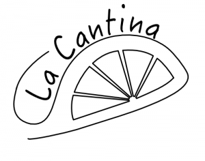
I think by adding the lemon embodies fresh elements and feelings.

Lyrics & Type

Made with Padlet

The song I chose is called High by Alyssa Reid. The reason I chose this song is completely random. I randomly selected a song in my music list. The reason I chose this line of lyrics is because I personally think that, when listening to the music, this line gives the most meaning of the song. Also it’s what makes me remember the most clearly.

This one is the first idea I came up with. It is not quite finish because I changed my idea to another one. I used the same font type but changed the format, also adding color to it according to the feedback my partner gave me. She suggested that it might be more engaging for people to see and not that boring. According to this feedback, I choose to let the letters stay black but instead adding decorations with color around it. I also added a border to make it not that abrupt.

After finishing the first design, I realized that it doesn’t really communicates the style of the song. I then got feedback from the teacher, suggested that changing the font might have a better effect. I decided to start another new idea, so it allows me the compare the two pieces to see which one is better.

The first draft of the second idea I come up with is these two:

The design on the left I added a bottle to represent ‘drug’ and added circles in the background. The font isn’t a specific font style, I just roughly wrote a brief form that might fit the lyrics. The design on the left is something I came up with while sketching the first one. The font I use is Butterzone. After finishing the word ‘drug’ I realize that this doesn’t really work, so I went back to the first one.

This is the final poster:

This is the PDF version:

Lyrics Poster

Strengths & Weaknesses

  • The style of the song is a pop music. I decided for the final poster that the letters should all be in capital and same cap height. It has a straight base line and all meats the cap line at the top. I am aiming to create a sense of pop by making some words more stand out while some remains smaller.
  • I chose to use different font style for important words like ‘vein’ and ‘drug’ in this point to communicate better. making the letters more outstanding and different from each other gave a clearer message.
  • One design element I used a lot is line. The letters were mainly made by line element. It was also used to make decorations. Also shape element to create the background and bottles. This helps by giving a visual message which communicates the style of the song.
  • One thing that might be helpful is to use more design principles. Using negative space or cropping.

Reading Reflection #1

I am currently reading The Well of Ascension. The second book of the mistborn series.

The book is mainly about how the main characters is trying to overthrow the empire and building a new system to make everyone equal. Also defeating the power that will eventually destroy the world. The rest of the novel have already been suggested in the first two book, and kind of gives the reader of a general idea that what the characters will be facing, but also having twist in the plot giving surprise. I personally thinks that the text sometimes is a bit confusing that each character is apart and doing their own things, then at the end came back together and closing the mystery. The novel included irony to show that how different level of people is treated unequal and unfair.

« Older posts

© 2024 Erya

Theme by Anders NorenUp ↑

Skip to toolbar