James

"I have no special talent. I am only passionately curious" - Albert Einstein

Final Set Evaluation

These are my final set of street photos. I took these photos because I wanted to capture the colorful and interesting parts of the city, just like Fred Herzog did. Herzog is famous for his street photos that show everyday scenes in a beautiful way. In my photos, I tried to show the mix of modern buildings, and traditional elements, and the busy life of the city. The lit-up buildings, crowded streets, and unique store designs all help show this. Like Herzog’s work, these photos focus on color, how things are arranged, and the lively energy of the streets, making them good examples of street photography.


This is my favorite image. I took this photo aiming to capture the striking contrast between the futuristic architecture and the natural surroundings. The composition centers on the two modern, sleek building with their rounded edges and golden illumination cutting through the foggy night sky. I framed these structures with the lush green trees on either side of the pathway, leading the viewer’s eye towards the illuminated SOHO sign in the foreground. The steps and the people on them add depth and a sense of scale to the scene. In attempting to follow Fred Herzog’s work, I focused on the vibrant lights and the urban environment. Herzog often captured the essence of city life with vivid colors and a nostalgic feel, showcasing everyday scenes with a human touch. I tried to incorporate this by including the people in the foreground and capturing the bright lights of the buildings.

However, I realize that my photo doesn’t fully achieve the warmth and lived-in feel of Herzog’s work. Herzog’s images often tell a story and evoke a sense of time and place through the small details and the presence of people going about their daily lives. My photo, while visually striking, needs more of a human element and story. To improve, I need to include more elements that depict everyday life and interactions, perhaps by focusing more on the people and their activities within the urban landscape. Additionally, capturing the scene during a time with more natural light might help add the vibrant, nostalgic quality present in Herzog’s work.

This photo is my least favorite. I have tried to make it resemble architecture, but it doesn’t really work. Firstly, the main subject-the fish tanks-appears cluttered and lacks a clear focal point, making it difficult for the viewer to know where to look. The nets placed across the tanks add to the visual clutter and draw attention away from the fish. Additionally, the lighting is uneven, creating glare and reflections that obscure the contents of the tanks.

To improve this photo, I would focus on a specific area or tank to create a clear subject. Adjusting the angle to minimize reflections and glare would enhance the visibility of the fish. It would also be beneficial to remove any unnecessary items, like the nets, from the frame to reduce distractions. Using a shallow depth of field could help isolate the subject and create a more visually appealing composition.

First Set Evaluation

  1. Connection to Fred Herzog’s images

Fred Herzog is renowned for vibrant street photography, capturing the everyday life and architecture of urban environments. My images share a connection with Herzog’s work through their focus on urban landscape, public spaces, and other architecture.

2. Storytelling

These images collectively tell a story of urban exploration and the juxtaposition of modernity with natural elements. The progression from daytime to nighttime scenes suggests a journey through the city, observing different facets of urban life and design.

3. Order of images

The images are arranged to guide the viewer from a scene, natural environment to a striking, modern architectural marvel. This order reflects a narrative of moving from tranquility to the bustling energy of the city at night, mirroring the transition from day to night.

4. Strength of the images

Diversity of Subjects. The images capture a variety of urban elements, from architectural details to abstract sculptures and night scenes.  Composition – Each image is well-composed, with thoughtful use of lines, shapes and space. Contrast – The contrast between natural and man – made elements is striking, creating a dynamic visual experience.

5. Developed Skills and Application

Composition: Improved ability to frame and balance elements within the shot. Lightening: Understanding of natural and artificial lightening and how to use them to enhance the image. Storytelling: Ability to create a cohesive narrative through a series of images.

6. Development as a Photographer

I’ve developed a keener eye for detail, composition, and the ability to convey a story through my images. My technical skills, such as understanding exposure and focus, have also improved significantly.

7. Something that works well

The contrast between the serene, green environment and the bold before I edited, modern architecture works well to draw the viewer’s interest and maintain engagement. The varied subjects and thoughtful composition create a visually appealing series.

8. Areas for further development

Experimentation with Angles: Trying more unconventional angles and perspectives. Post-Processing: Enhancing skills in photo editing to bring out the best in the images. Human element: I will encompass more human subjects to add a relatable aspect to the urban scenes.

9. Goals for Next Set of Images

In my next set of images, I aim to capture more candid moments involving people, experiment with different times of the day ( maybe in night time ), and explore varied architectural styles. I will also focus on refining my post-processing techniques to enhance the final output.

10. Changes for next time

Planning: Spend more time planning the shots and scouting locations. Equipment: Experiment with different lenses and equipment to achieve varied effects. Interaction: Engage more with the environment and people to capture more dynamic and lively scenes.

By addressing these points, I hope to continue growing as a photographer and produce even more compelling and thought-provoking images.

Fred Herzog Artist Analyse

The artist I have chosen to take inspiration is Fred Herzog. He was a German-Canadian photographer know for his pioneering work in color street photography. In the 1950s and 1960s, this is a time when art photography was almost exclusively associated with black-and-white imagery. He began capturing the vibrancy of urban life in Vancouver during the 1950s and 1960s, focusing on the everyday scenes and moments that were often unnoticed. His use of Kodachrome is influenced by film and allowed him to highlight the rich, saturated colors of the city’s streets, showcasing the beauty in the mundane. I would like to replicate his photos that depict the authenticity of people’s daily lives and the significance of our surroundings and interactions. Herzog’s work’s reveal how the ordinary became extraordinary through the lens of colors and composition.

The images displayed is a perfect example of Fred Herzog’s work inspires me.This photo captures a nightmare street scene, illuminated by the vibrant neon signs of a various businesses. The saturated colors and dynamic lighting bring the scene to life. I like how Herzog’s transforms a seemingly typical city street into a visually striking and colorful landscape.

This is my favorite photo. One objective I would utilize to describe Fred Herzog’s work is immersive. His photos draw viewers into the scene, making them feel as though they are part of the moment captured. This immersive quality is achieved through his use of color, composition, and attention to detail. The vibrant colors of the architecture makes it interesting to look at.

Park Images

First photo my intention was to capture the angles and lines of the roof. The photo shows a colorful wooden celling with beams and planks arranged in a detailed pattern that lead’s the viewer’s eye in different directions. The angled shot makes the structure look dynamic and spacious, while the bright colors and good lighting highlight the wood’s texture and design.

Second phot the image is taken from behind a chain-link fence. The fence in focus, while the background is blurred after I edited. The background is field, with trees and people in the distance. The image has a vintage feel to it, with muted colors and a slightly grainy texture. It has a mysterious feel to it.

Third photo is a Kylin flexing his muscles in front of the arches. The mix of him and arches create an interesting juxtaposition, and since the subjects face is turned away there is some mystery.

Fourth photo, arches are in the center of the front of the frame, creating an interesting geometric pattern. The people seemed to have walked under it. Black and white makes the contrast stronger.

Fifth photo, features a Leo taking a picture with a camera, surrounded by lush green trees. The focus is on him, though they are slightly blurred after I edited, giving a sense of movement and action. The background is bright and vibrant, with sunlight flittering through the foliage. The composition is capturing a candid movement.

Six photo is taken from a low angle, making the apartment buildings and power lines seem tall and imposing. The power lines cut through the center of the frame, drawing the eye upwards towards the sky. The buildings are the main subject of the photo, and their repetitive pattern of windows and balconies creates a sense of uniformly.

Seven photo is a black and white that was taken vertically, of a Thomas sitting on a structure with immense buildings in the background. It captures the contrast of the buildings with nature and the human subject.

Eight photo captures a group of people walking on a path in a park-like setting. The framing is interesting, with a large structure overhead creating a strong diagonal line. The composition leads the eye towards the group, who are central. The sepia tone creates a vintage effect.

Nine photo is in a warm tones, creating a vintage effect. It is of a Thomas sitting on a structure with colossal buildings in the background, creating an interesting juxtaposition.

Last photo is black and white photograph, likely taken with a wide-angle lens, capturing a stark urban scene with two distant figures walking away from the camera on a wide paved path. The high contrast, between the bright highlights and deep shadows emphasizes the starkness of the concrete structures and the figures isolation. The road has leading lines that end in the concrete blocks, making the viewer think what is behind it.

Statement of Intent

My intention is going to be taking photos of architecture that stand out. This could be a single special structures, buildings or monuments that will look interesting.  My purpose is to make the audience feel wonder about this structure what makes it special and why I chose it as a subject. I aim to have a sense of mystery and curiosity in my photographs.

Here are some examples:

Mind Map


Present

These are my 5 best shots of the identity project.

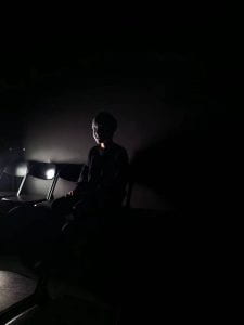
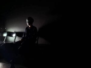
My intent was to show darkness and how a little bit of light can make it seem more mysterious. The faces are hidden in order to signify how lack of light hides and how it can cast even greater shadows and mysteries. In this photos, I show my friend Ethan who walked in the black box to meet friend. There was nothing in the black box. He waited long time but nobody come. So he tried to go out but the door suddenly locked.  He tried to open it but it didn’t work. He went to the glass and look at his reflection, try to what to do. He turn back and he saw mask on the chair, which was there nothing before.  He put it on and there was a light. But later the light was faint and disappearing. The lightness shows what we know, although it is not a lot. It does not really show the person’s face, making the viewer guess more.  It only shows Ethan shadows. 

I have experimented with wearing the mask and dragon shirt.  However, my teacher gave me a feedback and said mask doesn’t show persons face because it is hidden and for shirts there is dragon which distracts from the main elements. Using this, I decided to take photos of very simple elements with dark and some light.  Main element  ( dark , light & blue light ). 

My concept for these images is to show a person trapped in some sort of dark place  ( black box ) with only some light. It brings together what I learnt from light and shadows, utilizing the best angles possible to create mysterious shadows from a small source of light.

The artists that inspired my presentation was Man Ray.  He used masks, shadow as well as black and white to create mysterious and interesting photos.

The light creates shadows in the image, outlying the subject. It often simply lights up a small part of Ethan. The eyes are drawn to the mask or the person standing in the frame. There is where I want viewer’s eyes to go. The light color is not really consistent in the images. One is blue and another is white. The viewer may be a little bit perplexed, especially as to what the sequence of images might be about and what happens at the end.

Crirtique

favorite

least favorite

The first image subject is framed quite well, with light behind him that casts equal shadows. It’s nice composition because it shows that top is black and bottom is white. There is a nice contrast between the two. My eyes are immediately drawn to the figure standing, but also the shadows which look interesting. This is where I want the viewers eyes to go. Not really any distracting elements. Exposure is correct. Next time, I will try using a wider focal length to get more in the shot and make shadows longer. The background just shows a dark place and adds to the mystery. It is balanced well as it has two main colors –  black and white. In my opinion I think the color is ok. No depth of field needed. The storytelling is trying to show the person what are there emotions when they stay in dark or mysterious place. It looked mysterious and even creepy as the figure looked a bit scary.

The second image composition of this photo is not so good. It shows mostly black and white and light is shining to me so it doesn’t create a shadows. I am wearing dragon shirts and it doesn’t really match with what mood I’m trying to create. I would wear just black shirt next time. The shirt is a distracting element. The exposure is correct. I would want a more close up shots with a zoomed in length. The background is too dark and there is no contrast with the white. The photo is not balanced because it is mostly black with no shadows. The color is accurate, and depth of field is alright. It does not really show my vision well because of the shirt and the subject is not staring directly which makes it less mysterious. The light is also not shining properly.

Red Selection


I have chosen this images to show dark and mysterious pictures of a masked in the style of photographers like Man Ray.

How do they tell a story?

They create a mysterious story where the viewer wonders who this person is and why they are dressed and looking like that.

What are the overall strengths of these images?

I think they utilize light and shadow very well, and the mask adds a layer of mystery.

What skills have you developed and how applied them?

I have developed how to use a light to show shadows of me. I put the light behind and there is a glass to behind to show more shadows.

How have you developed as a photographer – what did you learn from your previous tasks?

I have improved in my storytelling and using props for photos.

Something that works well about this/these images is the first one. First one really looks generic than other two images.

Something I need to develop further is composition and framing shadow further, as well as choosing more interesting subjects.

What are you looking for in your next set of images?

I am looking forward to tell an even more interesting story with better photos.

What would you do differently next time? How would the photo improve as a result?

Next time I would not wear dragon cloth,  just black shirt and don’t wear mask. If I wear mask it doesn’t really show who it is.

Blue and Green selection

Blue Selection

Green Selection

I have taken this photos in the style of Dianne Arbus and Man Ray as I like the dark and moody work of the photographer. She focuses on portraits of black and white portraits of people.  I have done something similar by using dark and shadowy images of a person. Man Ray also uses a lot of masks in his work which I have done as well.

« Older posts

© 2025 James

Theme by Anders NorenUp ↑

Skip to toolbar