Sophie

this is my blog!

By

Tea House

  • I made a logo for a made-up company “Tea House” to engage the audience with this simple image to show the leisure and relaxing environment of the tea house.
  • Background information:
    • Tea is an aromatic beverage prepared by pouring hot or boiling water over cured or fresh leaves of Camellia sinensis, an evergreen shrub native to China and other East Asian countries. After water, it is the most widely consumed drink in the world.
    • The tea plant originated in the region encompassing today’s Southwest China, Tibet, north Myanmar, and Northeast India, where it was used as a medicinal drink by various ethnic groups.
    • teahouse (mainly Asia) or tearoom (also tea room) is an establishment that primarily serves tea and other light refreshments. A tea room may be a room set aside in a hotel especially for serving afternoon tea, or maybe an establishment that only serves cream teas. Although the function of a tearoom may vary according to the circumstance or country, teahouses often serve as centers of social interaction, like coffeehouses.
  • Tea House: 
    • tea house in the past: mainly old people
    • modern tea house: more and more young people relax here
  • Audience
    • Who is the target audience of the product or service (age, genders, income, interests, etc etc)?
      • Mainly elderlies in Chinese with high income have the pleasure to enjoy tea.
      • Also, some young people in Asia are starting to get interested in tea now.
    • What 3 keywords would the client use to describe their product/service?
      • relaxing, welcoming, simple
  • Logo Concept:
    • to create a simple logo with a combination of tea and house that people can feel the relaxing and leisure of a tea house and be willing to go in.
  • Padlet and ideas:
  • Made with Padlet
  • brainstorm practices:
  • Detailed development drawings (paper, iPad):
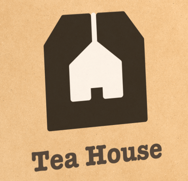
    • After a few tries of the tea logo, I decided it’s easier to make a tea house logo because I can combine different elements. So I chose the last one to develop. It is a combination of a teabag and a house inside it. The string on the house is the string on the teabag and I wanted to show the imagery of hanging house as a teabag.
  • Process & Feedbacks
  1. Mr. Griffin advised me to keep the logo black and white first and try different versions with the shadows. Also, I should look for more typography to see which one best fits.
    • I tried several different fonts like listing them together. And I also tried the different combinations with the black and white lines. For example, the black tea bag and the white house or the converse.
  2. Then, I revised the lines on myself to make it more simple and beautiful
  3. I asked Nan if there’s any place to improve and she advised me to make the shape rounder without the sharp edge on the top.
  4. I put the pogo on the mockup bag, but it turned out weird because I used the white color on top of the black so it is not transparent.
    • there left an ugly white shape
    • I tried myself and asked Mr. Griffin for help and finally it with expanding the strokes.
    • the transparent shape looks much better
  5. I was inspired by the logo Mr. Griffin showed so I made another version of it:
  • draft:
  • final logo:
    1. teahouse_1 
    2. teahouse_2
  •  mockups:
  • poster
  • reflection:
    • What creative decisions did you take and why?
      • As I went through the information on tea, I realized that teabag is an essential symbol of tea. So I began to try representing tea using a teabag.
    • Which design elements and principles have you emphasized and how does this make your logo effective?
      • I emphasized negative space by shaping out a house inside a teabag. This made my logo more interesting as it communicated with two important elements of the tea house.
    • What did you do well in this project?
      • I really like how I used a string to hang the house just like hanging a teabag in the cup for a cup of tea. In this way, I combined the feature of a teabag with the house.
    • What would you improve/do differently next time and why?
      • Maybe I can come up with more versions of the logo?

By

Tea Logo Design

  • padlet
  • Made with Padlet
  • rough ideas
  • draft logos

By

Tea House Logo

  • Tea
  • Background information:
    • Tea is an aromatic beverage prepared by pouring hot or boiling water over cured or fresh leaves of Camellia sinensis, an evergreen shrub native to China and other East Asian countries. After water, it is the most widely consumed drink in the world.
    • The tea plant originated in the region encompassing today’s Southwest China, Tibet, north Myanmar, and Northeast India, where it was used as a medicinal drink by various ethnic groups.
  • Tea House:
  • Audience
    • Who is the target audience of the product or service (age, genders, income, interests, etc etc)?
      • Mainly elderlies in Chinese with high income have the pleasure to enjoy tea.
      • Also, some young people in Asia are starting to get interested in tea now.
    • What 3 keywords would the client use to describe their product/service?
      • relaxing, welcoming, simple
  • Logo Concept:
    • to create a simple logo with combination if tea and house that people can feel the relaxing and leisure of a tea house and be welling to go in.

By

lyrics & type — Wolves

Made with Padlet
  • Evidence of brainstorming and selection of song lyrics (keywords, music analysis), rough visualization sketches (paper, iPad)”
  • Which songs did you consider and what led to your selection?
    • “Wolves” -Selena Gomez (my final choice), “Lose Yourself” -Eminem, “Match in the Rain” – Alec Benjamin
    • I randomly ran through my like list to pick them
  • Show all of your rough ideas – thumbnail sketches and mind-maps
    • I was trying to use the element in the lyrics to replace some of the letters.
  • Detailed development drawings (paper, iPad):
  • Show your top 3 detailed drafts (colour, A4) (with any notes required to describe the concept)
    • I didn’t have enough idea and found it difficult to draw on the iPad, so I didn’t develop the drafts deep. I chose this one to further improve on affinity because I found a reference to help me with the style of it and made it easier to do. The song actually had two sentences and I also wanted to make the wolf at first, but I found there’s no time and I could only keep one 🙁
    • This is my first version referencing the image below.
  • Evidence of peer feedback & response:
  • Document the feedback process (show notes, sketches)
    • Mr. Griffin: after referencing the style and making my own version, try not to look at it again and make my own thing with a variety of colors and elements.
    • Nan: the single lines of the letter seem thin so I can add in another layer.
  • What was the feedback, what did you change in response to the feedback?
    • As I add in more plant and animal elements, it looked much better
    • after that, I accepted Nan’s advice by adding a white outline onto the color and it looked like the final one below.
  • Demonstrate growth in technical and design skills:
  • Typography music styles worksheet with written analysis using type terminology
  • Practicing vector drawings – tracing the logo, Affinity worksheet
    • I traced the letter so that I can change some parts of them easily afterward, I also traced all the animals and plants.
  • Create a high-quality design: 
  • Embed a PNG of your finished poster
  • Include a link to download the full-sized PDF
  • lyric typography_1115
  • Explain the strengths weaknesses of the process and product: 
  • Using design terminology, how does your poster successfully communicate the style of the song?
    • It is a pop song but I don’t really know how to express it with the way of organizing the letter, so I add in more colors in order to make it have a flow on the color.
  • How did you manipulate the typography to communicate?
    • I want to emphasize the JUNGLE, so I used different colors to it. Also, the colors are warm colors which made contrasts with the green cold color. Furthermore, all animals and plants element I added were all living in the jungle so it gives the audience a straight sign of a jungle image.
  • Which design elements and principles are emphasized in your work and how does this help the communication and/or style of your poster?
    • color: I used the color of jungle — green, but for the “JUNGLE” I want to emphasize, I used a completely different color system with the warm color to make the word stand out.
    • scale: the most important “jungle” is the biggest word as ‘the’ is much smaller as a not important word.


By

Lyrics and Type

By

Design Principle — Movement

  • What is the role of elements & principles in graphic design?
    • Elements and principles were the basics of designing. With the combinations of them, interesting artworks were made.
  • What is this design task all about?
    • The design principle of movement refers to the path a viewer’s eye takes through a composition. In an image, the kinds of lines, shapes, and forms an artist uses can affect this movement.
  • Why did you design your illustration this way? (show evidence of your sketching, development, peer feedback & refinement)
    • The movement made me think of the ripples on the water and the small hills. So I created two different versions of both of them.
  • This is a more three-dimensional way of movement which I tried to make the arrows as if they’re going up and down along a small hill.
  • I used the line tools to illustrate all the lines. It took me a long time to make sure the wave of all arrows is actually on the same line so it seems neat which was really really hard and confusing.
  • The feedback for my work was to make the work express more on purpose, so I tries to show the movement with the arrow so that it’s easy to see that it’s going in a direction.
  • The second one is about the ripples in the water, which is a two-dimensional one. This one is more repetitive as the first one is more challenging, but having all those lines done differently was also taking time and effort. I also need to watch out for the pattern in nature to make the ripples spread more naturally.
  •   these are my drafts on procreate
  • Please upload a PDF of the poster to your blog so it can be printed

By

My Design Persona Poster


Made with Padlet

My inspiration:

  • What is Graphic design?
    • It is the designs in two-dimensional on screens or paper. It’s a visual representation of information of symbols, logos, or pictures.
  • What inspires me about design?
    • I saw things in daily life can be designed better, also, some brilliant designing ideas inspired me to try.
  • What are my favorite design examples?
  • Who are my favorite designers?
    • I really like the design of all dimoos in pop mart, so that designer might be my favorite designer.

Me as a designer:

  • What’s my most memorable experience designing (or creating) something? Why?
    • I sewed Tom and Jerry by paper, which turned out really good. It’s so hard to sew through the paper that might break easily and I can’t make any mistakes so that I’m not leaving holes in the paper.
  • What would I like to get better at doing as a designer? (Eg drawing, presenting, digital design, fabrication, photo-editing, sharing, collaborating, etc)
    • drawing skills
  • What do already do pretty well? (Eg drawing, presenting, digital design, fabrication, photo-editing, sharing, collaborating, etc)
    • digital design
Skip to toolbar