Allen

"I have no special talent. I am only passionately curious" - Albert Einstein

Statement of Intent- Mark Mann

Creative Spotlight: Mark Mann | Rotolight

The artist I chose is Mark Mann, Mark’s black and white images possess a timeless quality, drawing attention to the raw emotions and textures within the frame. Learning from Mark’s black and white photography can teach us the power of simplicity, composition, and the art of storytelling through contrast and tonal range.

The social issue that I chose will be focusing on bullying, I will keep the lighting setting up the same as what Mark is doing, making sure at least one side of the face is clearly exposed in the camera. The close up will keep the same as Mark, the things I want to focus on is how the close up and the lighting helps the storytelling. How is only showing up a face can affect other’s emotion and how can I express feelings. One of the easiest thing that can be noticed if someone got bullied, is their injuries. To achieve that, I will make sure there will be scars and models face to easily express the theme that I want others to see. Another type of bullying is cyberbullying, to achieve this at the same time, I will make sure to have words on their face too. These words are usually words that can hurt other’s feeling easily and that can make a deeper connection to other people.

Identity- Mind Map

Street Photography-Contact Sheet and Evaluation

The photographs below are the best 20 photographs that I chose for the contact sheet. Of these 20 photographs, it’s the “green” photographs. From all the pictures below, I chose them because they fit my theme perfectly. What I was trying to do is to make sure that the contrast between dark and light needs to be obvious, also I tried to make the contrast of the colour to be catching people’s eyes. According to what I wanted, I chose three of the best photos.

The pictures below I think show the best that I want to express about my theme. These three pictures show three different contrasts in colours. I used the basic colours yellow, blue and red to express the contrast in colours and also used shadows to represent the contrast between darkness and lightness. Also, the different colours can show people different moods after seeing the picture. Most of the photos in these sets have little kids in it with their grandparents, which also can show another contrast throughout the time.

Alex Webb

This time, throughout the Street Photography Unit, my first set of photographs will focus on the work that connects Alex Webb’s photography.

Alex Webb | Leica Liker  Webb, Alex - Iquitos, Peru - Robert Koch Gallery

From Alex Webb’s photographs, we can see that he is very obsessed with different lighting and shadows that come from different angles. From the photographs above, one of the lights comes from the right, and it is completely shadowed on the left side of it. The way he separates left and right is by the use of people that are walking. From the other picture, we can also see that the lights are coming from the front of the photograph and the person in the middle blocks the lights from going through and becoming shadows It also shows how the photographer like different lighting and shadows. Another interesting object that appears is the funny elements that show in most of the pictures, just like the picture above, we can see the fish head on a person’s head, and it is walking normally. This also gave me an idea of how to make my photography become more interesting and funny.

In my sets of photographs, we will also be focusing on the different lights and shadows. Try to make the contrast easier to see. Colours are another important element I will be working on in these sets, the contrast and the diversity of colour were also shown in the photographs Alex took. At last, I will also try to use funny elements to make the photograph more interesting.

Set 2

These three are my best pictures from set 2, and I tried to make sure that the work in the studio was similar to how the photographer was doing outside. Instead of having the branches on only one side and angles, I used the different angles to express the different sides of the branches.  I also edit the lighting of the picture, Lighting influences the distribution of tones in a black-and-white photograph. The way light falls on the subject determines the range of highlights, shadows, and mid-tones. Different lighting conditions can create varying levels of contrast, from soft and subtle to bold and dramatic.

Set 1

Contact Sheet_Allen Hu

Three of my best:

I chose three of my best pictures, these can definitely express what I want from the structure. This is also what I was trying to do with the photographer, to see different shapes and layers that appeared in one structure. I edited the photo to make the layer clearer to observe. High contrast draws the viewer’s attention to specific areas of the photo. By increasing the distinction between the subject and the background, it directs the viewer’s gaze and creates a focal point. One important thing that I did differently with the photographer I chose is that I used darker parts instead of brighter lighting. Most of my photographs appeared in lots of shadows, that’s one of the things that the photographer doesn’t have.  But the main purpose of making it darker is still to make sure that the texture and the layer are clearly shown either with darker or brighter edit.

Set 2- Martin Vorel


Photography by Martin Vorel (martinXvorel) - Profile | Pinterest

Martin Vorel is a contemporary Czech photographer known for his exceptional work in minimalism, surrealism, and conceptual art. His photographs transform ordinary objects into extraordinary subjects, blurring the boundaries between reality and imagination. With a keen eye for composition and attention to detail, Vorel creates visually striking images that evoke wonder and intrigue. His dedication to his craft and international recognition make him an inspiring figure in the art world.

I personally love this image by Martin Vorel because of its simplicity. The balanced composition, with equal empty space above and below the tree branches, creates a visually pleasing effect. The limited color palette adds to the minimalist aesthetic and evokes a relaxing and nostalgic mood. Vorel’s style inspires me to focus on composition and empty spaces in my own project, while still aiming for simplicity.

Set 1

The title will be “Change the Black and White”

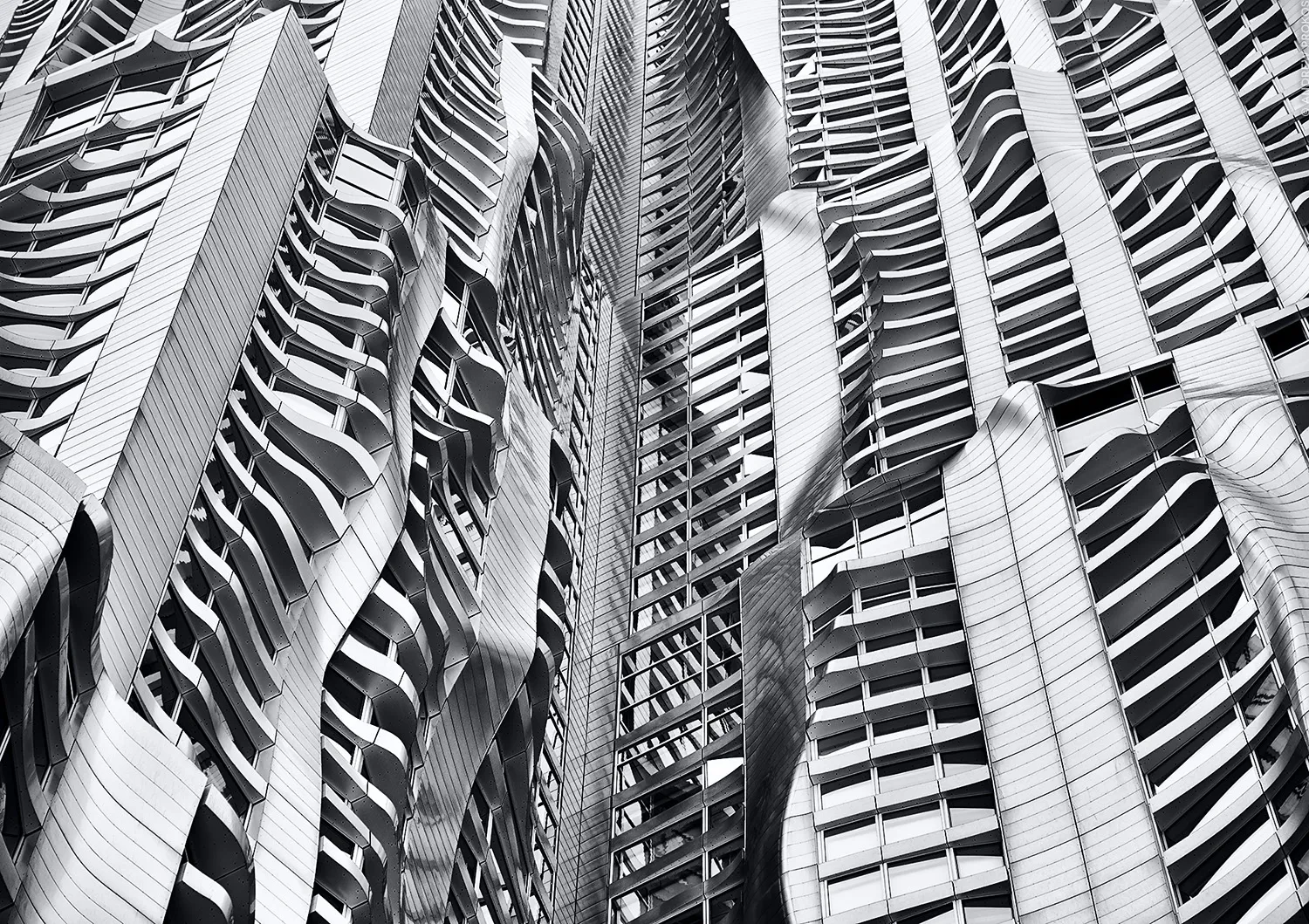
I want to make the audience feel anxious and depressed from the black and white pictures. Most of the pictures will be focused on the walls and structures that feel industrialized. Black and white photography lacks the vibrant colours that we typically associate with reality. The absence of colour can create a sense of detachment from the world and evoke a more subdued emotional response. The theme of this set of photographs is trying to tell others to protect the environment instead of faking black and white.

My inspiration comes from an artist called Andrew Prokos:

Andrew Prokos - New York by Gehry Facade I | Widewalls


Aaron Siskind

Aaron Siskind | Meer

In my analysis of the photograph taken by Aaron Siskind, it appears that his intention was to capture the intricate textures found on tree trunks by zooming in closely. By choosing to present the photo in black and white, Siskind skillfully enhances the interplay between light and shadow, resulting in a heightened contrast and composition.

Elements

« Older posts

© 2024 Allen

Theme by Anders NorenUp ↑

Skip to toolbar