Balance:

Edit:

In my photo, I have achieved balance by placing the main subject, the Hello Kitty figurine, in the center of the green bottle. This central positioning creates a symmetrical balance that draws the viewer’s attention directly to the figurine. The blurred background and minimalist setting further emphasize the figurine’s centrality, ensuring it remains the focal point of the image. The lines in the image are primarily vertical, following the outline of the bottle and the edge of the table. These lines direct the viewer’s eye to the center of the image. The forms are three-dimensional, with the bottle and figurine occupying the space within the frame. The space is well defined, with the foreground occupied by the bottle and figurine and the background blurred to minimize distractions. The negative space around the subject adds to the overall composition. The image conveys a sense of playfulness through the use of Hello Kitty. The composition is simple, with clean lines.
Negative space:

Edit:

In this photo, I have effectively used negative space to highlight the main subject, Hello Kitty. The large expanses of empty space surrounding the figurine draw the viewer’s attention directly to it, emphasizing its importance in the composition. The negative space also creates a sense of isolation and focus, allowing the viewer to appreciate the details of the figurine without distraction. The lines in the image are primarily horizontal and vertical, defined by the red surface and the edge of the wall. The image conveys a sense of simplicity and focus, the use of negative space creates a sense of calm, and the overall composition feels intimate and personal.
Perspective:


In this photo, I used perspective techniques in photography to create a sense of depth and space. By choosing a low angle shot and a high angle shot, placing the Hello Kitty doll on the windowsill makes it stand out and more interesting.
In terms of artistic elements: The window edge and windowsill create distinct horizontal and vertical lines, directing the viewer’s eye to the center. The round head and body of the Hello Kitty doll contrast with the square window frame, adding visual interest. The three-dimensional form of the doll appears very vivid against the flat background. The red carpet in the foreground and the window frame in the background create a sense of layering, giving the picture a sense of depth. The green doll, red carpet, and gray window frame create a sharp color contrast that draws the eye. The delicate texture of the doll’s surface creates an interesting contrast with the smooth glass window and rough carpet. The light shines in from the left, illuminating one side of the doll, creating a contrast between light and dark, and enhancing the three-dimensional effect.
This photo conveys a sense of tranquility and calm. The cute image of the Hello Kitty doll brings a touch of childishness and warmth, while the simple composition and soft tones create a quiet and harmonious atmosphere.
Leading lines:


Edit:


In these two photograph, I used the leading lines technique to draw the viewer’s attention directly to the Hello Kitty figurine. The red carpet acts as a strong leading line, guiding the viewer’s eyes towards the figurine. And the blue lines on the ground lead the view’s eyes into the hello kitty. The red carpet and blue line serves as a prominent horizontal line, leading the viewer’s eye towards the figurine. The edges of the window and the wall also create vertical lines that frame the scene. The shape of the figurine is organic and rounded, contrasting with the geometric shapes of the window and the wall. The three-dimensional form of the figurine is highlighted by the lighting, which casts subtle shadows and gives depth to the image. The negative space around the figurine, created by the expansive red carpet and the blurred background, emphasizes the subject and creates a sense of isolation. The vibrant red of the carpet and the green of the figurine’s dress stand out against the neutral tones of the wall and window, creating a striking contrast. The image conveys a sense of whimsy and playfulness through the use of the Hello Kitty figurine. The central positioning of the figurine suggests importance and focus, making the viewer feel drawn to the subject matter.
Symmetry and patterns:

Edit:

In this photo, I used photography techniques of symmetry and pattern. The symmetrical composition places the Hello Kitty statue in the center of the frame, making it the focal point. The gray fabric surrounding the statue forms a repeating pattern, further emphasizing the sense of symmetry. The three-dimensional form of the statue is well represented in the two-dimensional image, especially with the play of light and shadow. The space in front of the statue is left blank, giving it a sense of openness. The background is blurred, but still has a sense of depth. The play of light and shadow brings a rich sense of layering to the picture, especially the shadowed part of the statue. This photo conveys a sense of tranquility, and the simple composition and soft tones add a sense of tranquility.
Framing:


Edit:

In the second photo, I used framing techniques. I used natural resources to place Hello Kitty on the doorknob, leveraging the curve of the doorknob and the straight lines of the frame to form a natural frame, guiding the audience’s attention to Hello Kitty. By adjusting the aperture size, the foreground and background create a noticeable blur effect. Hello Kitty’s three-dimensional image comes alive on the flat façade. Through a blurred background, create a sense of depth, adding more depth to the scene.
In the first photo, I also used natural resources, this time with green leaves. Place the hello kitty in the center of the green leaves, which form symmetries and a framework around the main hello kitty, creating a clustering effect. Additionally, objects are placed at the bottom of the image, while leaves are above it, creating a sense of space and depth, as well as a sense of proximity and grandeur. I used a macro lens to closely capture the details of Hello Kitty, making it the absolute star of the scene. By controlling the focal length, the Hello Kitty becomes clear and sharp, while the plants in the background become blurry, further highlighting the theme. The light is evenly distributed with no obvious shadows, maintaining the overall brightness of the image.
Rule of thirds:

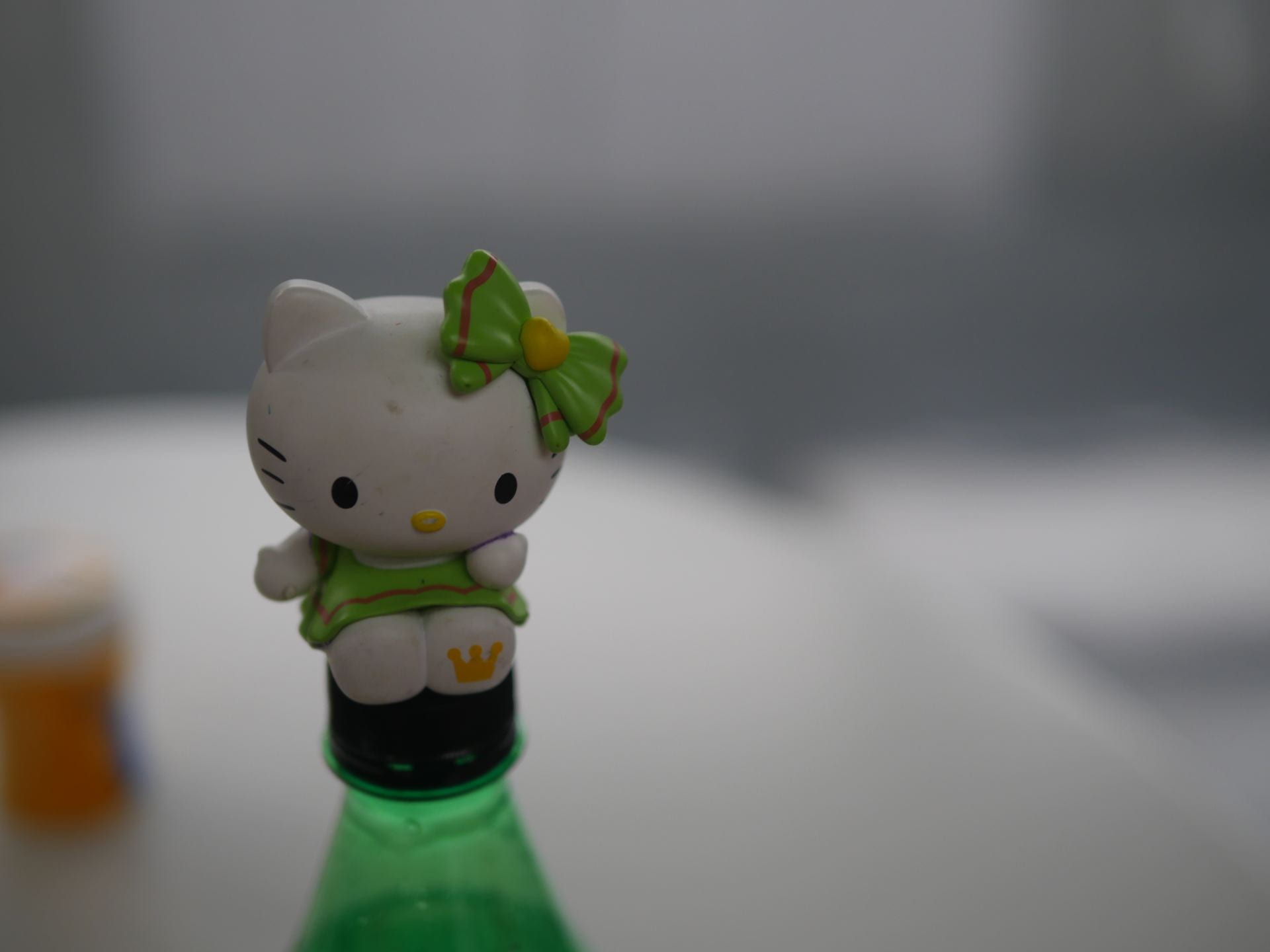
In the two photos I took, I applied the rule of thirds in my photography. In the photo above, I placed the Hello Kitty toy on the left third of the frame, following the principle of the three-point rule. The goal is to create a more balanced and visually appealing image. Focusing on the toy itself while blurring the background, Hello Kitty’s color contrasts sharply with the gray background, capturing the audience’s attention. In the photo below, I followed the rule of thirds and placed the Hello Kitty toy in the left third. The blank part on the right is a bit more. Here, the toy stands on a bottle, adding fun and vitality to the scene. The color of the bottle also harmonizes with the toy’s color. The blurring of the background makes the toy the main focal point of the image, highlighting its importance.
Depth of field:
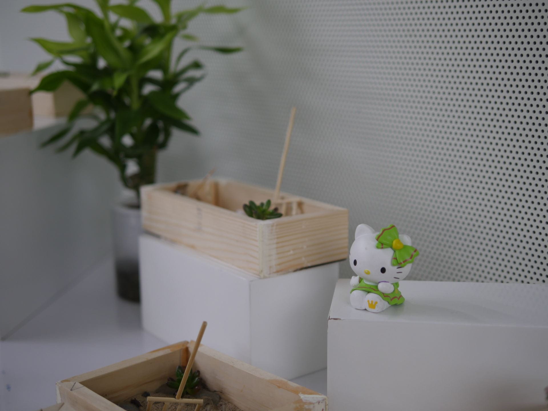
I chose a short depth of field setting so that only the area where the Hello Kitty doll is in focus, while the background and other elements are blurred. This effectively draws the viewer’s attention to the Hello Kitty doll because it is the sharpest part. The Hello Kitty doll is in the foreground, while the succulents and wall decorations behind it are in the background. Since the background is blurred, they don’t distract the viewer from the main subject. I placed Hello Kitty to the right, blending in with the background elements. The outline of the Hello Kitty doll is clearly discernible, while the lines in the background are softened by the blur, making it less distracting. By using depth of field, I created a sense of depth and space, making the picture look more three-dimensional. By adjusting the exposure, I ensured that the Hello Kitty doll had enough light to look bright and vivid.
favorite photo:

This is my favorite photograph because it showcases many photographic techniques simultaneously. For example, depth of field: the background is blurry, the foreground and plants are clearly visible, with the focus on specific areas while other parts become blurry. Tripartite composition: placing the subject at one-third of the image enhances visual balance. Color Contrast: Green plants and white walls create a striking contrast, while lighting: natural light illuminates the entire scene without shadows, creating a warm and bright atmosphere.


Recent Comments