Annie

Loves cats, drawing, and other things.

Intro To Digital Photography — Portraits Unit Blog Post #11: Final Sets and Critiques

With these photos, I aim to fulfill my intent to convey the feelings and emotions that come with the cycle of procrastination: dread, frustration, numbness; but also the emotions when you force yourself back on the right track: determination, resolution, and anticipation. I seek to convey the feeling of losing control, of slipping away with no way to slip back, of fog enveloping your mind as time passes you by, but also the feeling of forcing yourself to face the things you’ve been avoiding, as you rise out of the dark and find your workflow again. I decided to portray my intent with a set of photos telling a narrative, so that I can show the process of how these emotions and feelings came to be.

Some ways I conveyed these emotions are through the lighting and the body language of the model, with intense red lighting for the more emotionally charged photos, dim red lighting for less intense but still emotional photos, and white light for less emotional moments. The red light is great for emphasizing the shadows, while the white light adds another layer of atmosphere. The model is also very expressive in their body language, which helped convey a lot of the messier emotions better.

Set 1: Stages of Procrastination

“Stage 1: Slipping Away”

This photo would be the first in the set, and the blurriness would create a sense of intrigue as the audience wonders why the model is out of focus. Meanwhile, their attention would be drawn to the puppet strings, which is an important symbol in these photos. This photo feels desolate, murky, and represents the first stage of the cycle of procrastination.

“Stage 2: Frustration”

Compared to the last photo, this image is bright, intense, and very high-contrast. I want this image to feel like a visual flashbang especially after the previous photo, and it will be the second image in the set. The contrast between the two would highlight the different emotions in both of them, and make them feel stronger to the audience. One thing that I particularly like about this image is how the tears on the mask blends into the background, making it seem as if the darkness is of the character’s own making.

“Stage 3: Numbness”

This is the third photo in the set, and as a middle ground between the two ends of the spectrum of the previous two photos, it would conclude the first arc of the photo set and create a segway into the start of the next set. This image is messy, defeated, tired, but still with its own level of intensity and emotion. It is the lack of emotion and too much emotion all at once, and I think that is a very powerful visual.

Set 2: Breaking Away

Turning Point

This image is very similar in visual hue and tone to the previous image, although with more dark elements than light. It also features a lot of negative space, drawing the attention to the model. This shows how the mind fog is clearing and giving way to clarity, especially compared to the messiness of the previous photos.

Unmasking

This is the first and only image in these two sets where the viewer makes eye contact with the model directly, and this short moment of connection helps get a lot of emotion across before the next image, which shows the model finally moving toward the light. The eye contact is brief and quickly passes by – just like time. One moment it’s there, the next moment, the world has already moved on.

Returning

This image serves as both a climax and conclusion to the set, where all the audience sees is the silhouette of the model emerging from the shadows into the light. This ending is ambiguous and vague but hopeful for a brighter future, despite the potential hardships the light may bring. It is not the triumphant victory at the end of the story, but merely the next step in a long staircase of growth.

Other strong images

These are some photos that I found particularly powerful, but couldn’t fit within the narrative of my photo sets.


Intro To Digital Photography – Portraits Unit Blog Post #10: Second Set of Photos

Yellow Selection:

portraits yellow 2

These are my yellow selection photos. In my second set of photos, I wanted to put a variation on my theme of procrastination and create some contrast between the two shoots, instead of shooting the exact same type of photo twice. Therefore, this set with the adult model is more focused on breaking out of the cycle of procrastination, compared to the set with the teenage model being about the cycle itself, and the process of sinking into it. I chose to present it this way instead of the other way around, because I imagine that when you’re a teenager, your emotions are going to be more intense and overwhelming (which is good for the first set and especially for the Frustration stage), while after you become an adult, you’re more mature and have more experiences with these situations, and would be more easily able to force yourself to take a step in the right direction. The teenager is lost in the dark, while the adult is stepping out of it – and with hope, one day the teenager can find their way to the light too. It is very important, however, to remember that the light and shadow in this piece do not symbolize good and evil. It is not beneficial to hide in the shadows, yes, but it is also an understandable (if not ultimately self-destructive) reaction to a light that harsh. Similarly, while it is a positive thing to face the light and walk towards it instead of running away, not all of your problems will just miraculously vanish the moment you do that. There is still a long and difficult road ahead, and it will require a lot of effort and perseverance to completely resolve the problem. Overall, I find that the idea of this issue to be more nuanced than simply “light good dark bad”, as there are many, many factors and reasons why somebody might sink into the cycle of procrastination, and I want to try and portray this theme (and the emotions that come with this theme) in an accurate and respectful manner.

Green Selection:

portrait green 2

These are my green selection photos, and I chose them because they have a higher level of clarity in both composition and lighting. One particular photo that I find compelling are the one where the model is holding onto the shadow hand while staring at it resolutely as if saying, “You can’t control me anymore.” It feels like an act of rebellion against the invisible forces that have held them down for so long, and it feels kind of triumphant despite the dark and dim lighting – or maybe because of it. Like the first photo in my red selection, the model is facing the light in many of these photos, both with the mask on and off. There is also a particular sequence of motion in some of these photos, with the model contemplating the mask that they just took off and examining it thoughtfully. This idea of self-reflection is important to my theme, as you cannot completely address a problem until you find its root. If you never let yourself acknowledge that there is a problem in the first place, especially if it is a problem with yourself and your actions, then you’ll never be able to break free and rise above it either.

Red Selection:

Breaking Away

These are my three red selection photographs – contrary to my red selection from my first set of photos, which shows the process of falling into the cycle of procrastination, I wanted these photos to show the process of climbing out of it.

Turning Point

This first image starts at a similar place as the end of my last red selection – dim red lighting, with the model wearing the mask and the shadow arms creeping around. However, this time, the model is facing towards the light, which represents all the things that we are trying to avoid doing when we procrastinate. They are hesitant, and are still shrouded in shadow, but it may be time to stop hiding and face your fears. In this photo, the model’s face (or mask) is the most illuminated by the light, while the rest of them and their body is in shadow. This shows that in order to solve your problems, you have to face them and acknowledge them first, no matter how much you want to avoid it. Another element that is highlighted is the puppet strings, dangling straight down instead of being crossed and messy like the first set. I did this throughout both this photo and many of the other photos in this shoot, to symbolize that the person is starting to regain some control over their actions. This image is meant to convey the feeling of a moment of tentative decision, when you drift out of your mental fog and properly take notice of your surroundings for the first time in a concerningly long amount of time. You’re frustrated with yourself, yes, that you let so much time slip by, but you know that you have to do something or else it really will run out. You want to sink back into the shadows – just five more minutes – because it’s so much easier than facing the thing you’ve been trying to subconsciously escape from the whole time. But you don’t. You don’t want to, but you steel yourself and prepare to finally take off the mask that’s been blocking your view.

Unmasking

In this image, the mask finally comes off, revealing a tired determination. Since the mask is now off, the audience can see the face of the model, and this new element of human connection helps add a new layer of emotion to the photo. I think that it’s fitting that the first time the audience sees the model’s face in both this set and my previous set of photos is when the mask finally comes off, as speaking from my experiences with procrastination, this is when you start to feel clarity again. You snap yourself out of your stupor, and face your problems with tired but resolute determination. You know that the next few hours won’t be easy or fun as you struggle to finish your work in time, but you’re determined to see this through. These images have a strong focus on light and shadow, and one thing that helps enhance this image is the small pinprick of light in the singular visible eye of the model. It could be symbolic of the metaphorical fire relighting itself in the character, and it shows that they have acknowledged their problems and is now ready to start solving them. The puppet strings are still present in this photo, but they have now spiraled their way around the shadow arms instead of the model’s arms, conveying that the shadows aren’t in control anymore.

Returning

This final shot is meant to be an ambiguous, but hopeful ending to the story – the road ahead is long and difficult, but we’re determined to face it despite these hardships. In this photo, only the silhouette of the model can be seen as they walk resolutely towards the light, despite its blinding brightness. The drooping form of one of the shadow arms can be seen hanging limply off the model’s shoulder – Rome wasn’t built over a day, and it too would take longer than one night for the shadows to go away. There would likely be times when the dark would feel welcoming, times when you’re tempted to let yourself rest for just a little while where it’s easy to hide from the harsh light. But the longer you stay in the dark, the brighter the light will be when you finally return.

Intro To Digital Photography – Portraits Unit Blog Post #9: First Set of Photos

Yellow Selection:

Intro To Digital Photography Portraits Yellow 1

These are my yellow selection photographs, and I chose them because they accurately represent the emotions and atmosphere I want my portrait photos to portray. The dark pictures with white lighting are desolate, empty, and still, while the red photos are intense, messy, and very full of movement.

There are several elements of symbolism that I used in these photos: the shadows and darkness are representative of procrastination (a metaphorical “dark side”, if you will) while the light represents the things that we seek to hide from when we turn to the shadows – whether it be homework, a stressful project, or something as simple as washing your socks. This emphasis on the meanings of light and shadow and the model’s pose and relationship to it is something that I learned from the work of Nirav Patel, and in many of my photos with the teenage model, I want to have the model turned away from the light. The mask portrays the murky feeling of the distance you get when you procrastinate when hours blur into mere seconds without you even noticing it at all, which often feels like you’re stuck behind a mask or a pane of glass watching everything go down like a spectator instead of a participant. This is where the poseable arms and puppet strings come in as well, to portray the lack of control you feel over your own actions, and despite how your rational mind keeps telling you that this is a bad idea, you keep on procrastinating anyway – because isn’t it so much easier and less stressful to continue avoiding the things you don’t want to do than to actually face them?

Green Selection:

Intro To Digital Photography Portraits Green 1

These are my green selection photographs, and I chose these because I find them to be some of my most emotionally compelling images after my Red Selection (some might even be more emotionally compelling than the Red Selection photographs). The theme of the strings is particularly strong in these photos, which could be one of the factors that contribute to their effectiveness, as they both break up the image and also give the impression of oppressiveness and messiness and help convey the general emotions of frustration. I also find the posing of the model contributed a lot to these images as well – their movements are emotive and work well with the lighting.

The two images in white lighting have a lot of negative space, and compared to the red photos, they are taken from a larger distance away from the model. This feeling of distance is something that is very prominently present during the procrastination process, specifically during the stage that the white light represents (more on that in the red selection). The strings are also very clearly connected to the model in these images and are straight and rather clean compared to the messier strings in the red photos.

In the red photos, there are a lot of close-up shots of the model’s face, since the stage that the red photos represent is the stage where the most emotion is present. Having more close-up shots creates a sense of connection between the viewer and the model, and the sudden change from white light to red light helps accentuate this, creating a separation between the distant white light photos and the emotional red light photos.

Red Selection:

Stages of Procrastination

I want to use my red selection to represent the different stages of something that I call the “cycle of procrastination,” which is similar to the 5 stages of grief, but represents the emotions and process of procrastination instead.

Stage 1: Slipping Away

This is the first stage of the cycle of procrastination, when you first start sliding down the slippery slope into the metaphorical darkness. The focus of the camera isn’t on the model or their hand, but is instead on the strings that are held up by an invisible puppeteer, signifying the lack of control that you feel over your own body and actions during this stage. I wanted this image to be out-of-focus (or more specifically, not focused on the model) because it can help me accurately portray the fog-like feeling that envelops your mind during this stage. You’re mindlessly scrolling through social media or doodling in the margins of your homework or literally anything that’s not doing actual work, and all the while time passes you by like you’re a sleeping stone in the middle of a river. You never notice how fast the clock is ticking down. The model is reaching out towards something out of frame – their back is turned towards the light, and the shadows obscure their features. One prominent reason why people procrastinate – or, one prominent reason why I procrastinate, at least – is because they don’t want to do the thing they’re supposed to do. They don’t want to face whatever it is they’re supposed to be facing, so they turn away into the darkness so they don’t have to stare into the light, reach out for it, even. It offers them a temporary respite, but in the end, you can’t outrun time.

Something that I would like to improve on in this photo is to maybe adjust the focus a bit more so that the string on the model’s hand is clearer, and maybe move the props around so the string on the wrist is visible too. However, these changes could completely change the tone of the photograph, and the end result would likely have a completely different effect.

Stage 2: Frustration

This photo captures the middle stage of the cycle of procrastination when you suddenly break out of your stupor and glance up at the clock – and it’s way later than you remember it being, later than it has any right to be – since when did time pass so quickly? You’re frustrated at yourself, at your utter lack of control over your own actions, and yet, you can’t stop yourself from sinking into that mindless place once more… if only to avoid your own anger and the now-daunting task ahead of you. I used the intense red light for this image, which contrasts against the dim white light in the previous image of the set, and this contrast shows the two extreme emotions that I generally feel in the cycle of procrastination (and I’m sure many others feel them too) – complete nothingness, and then too many things all at once. The sudden realization of just how much precious time you’ve wasted and let slip away looms over you like the consequences of your actions, which are sure to follow sooner if not later. You don’t like this feeling, no, not at all. I wanted this image to feel intense and a little bit messy, which is why I used the red lighting and also why I decided to do an extreme close-up of the model’s face (or mask, I suppose). I also positioned the arms so that one of its strings would end up in front of the camera lens, which both breaks up the image and adds to its intensity. The way the light hits the string and the way that it blurs in front of the camera helps add that element of messy frustration.

Something that I would like to work on in this photo is to maybe have another string running across the photo on the right like the one on the left, or to make the lighting more intense. The lighting in this photo was actually minorly edited to be brighter, but the result of that was that the photo looks less natural and some areas are also brighter than they should be. Having unedited lighting would help the shadows stay dark and the highlights stay bright and would likely have a much better effect.

Stage 3: Numbness

This is the final stage of the cycle of procrastination, which is a mix of the emotions from the first two stages. After the sudden wave of frustration and anger, you just feel… a little numb. Maybe you’re too sleep-deprived to really do anything about it (in my experience, it’s usually better to just go to sleep here, as you’ll get practically nothing done even if you stay up anyways) or maybe you just don’t really care at this point. Either way, you feel a little defeated. Despite all your best efforts, you’ve still ended up here time and time again. Similarly to the last photo, this one still has the red lighting, but it is much less intense. I did this by lowering the ISO of my camera, so that I can more accurately capture the dim emotions I want this image to have, and also because I wanted to make it look like the shadows are enveloping the model. The model is lying down on the ground, the shadow hands still reaching out for them, but they’re not doing anything to prevent it. The viewer can see the strings still tied around their arms and hands, and the same strings that are sprawled across the ground. Behind those strings, the face of the mask continues to weep silently.

Intro To Digital Photography – Portraits Unit Blog Post #8: Second Specific Artist Study

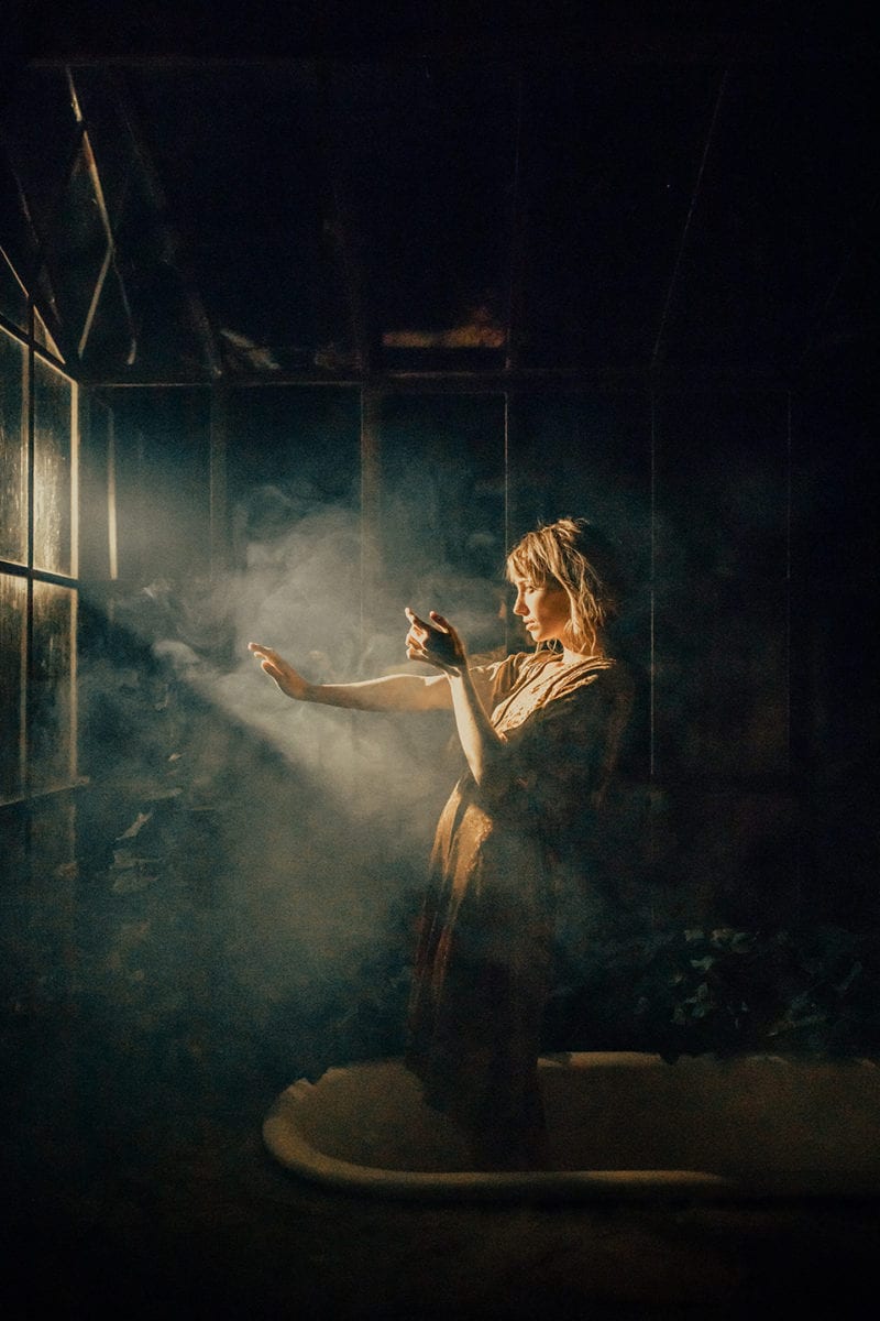
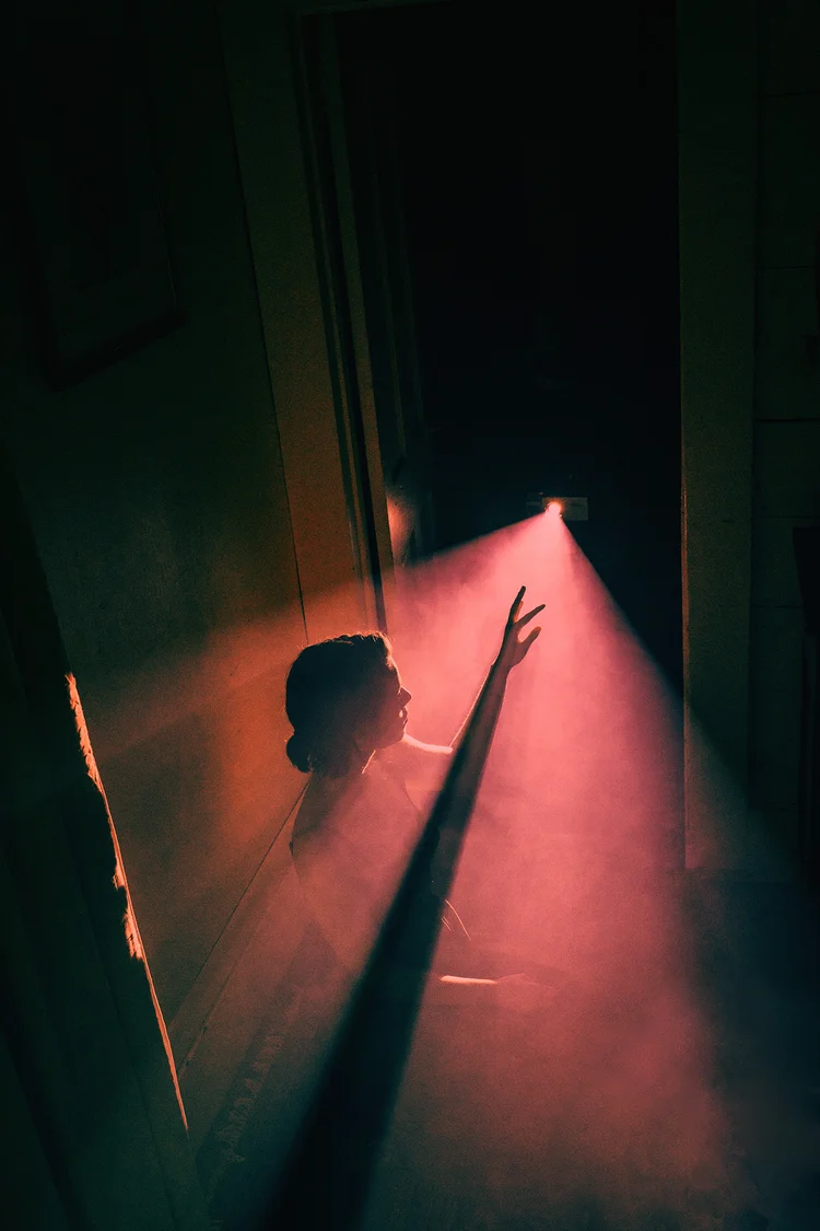
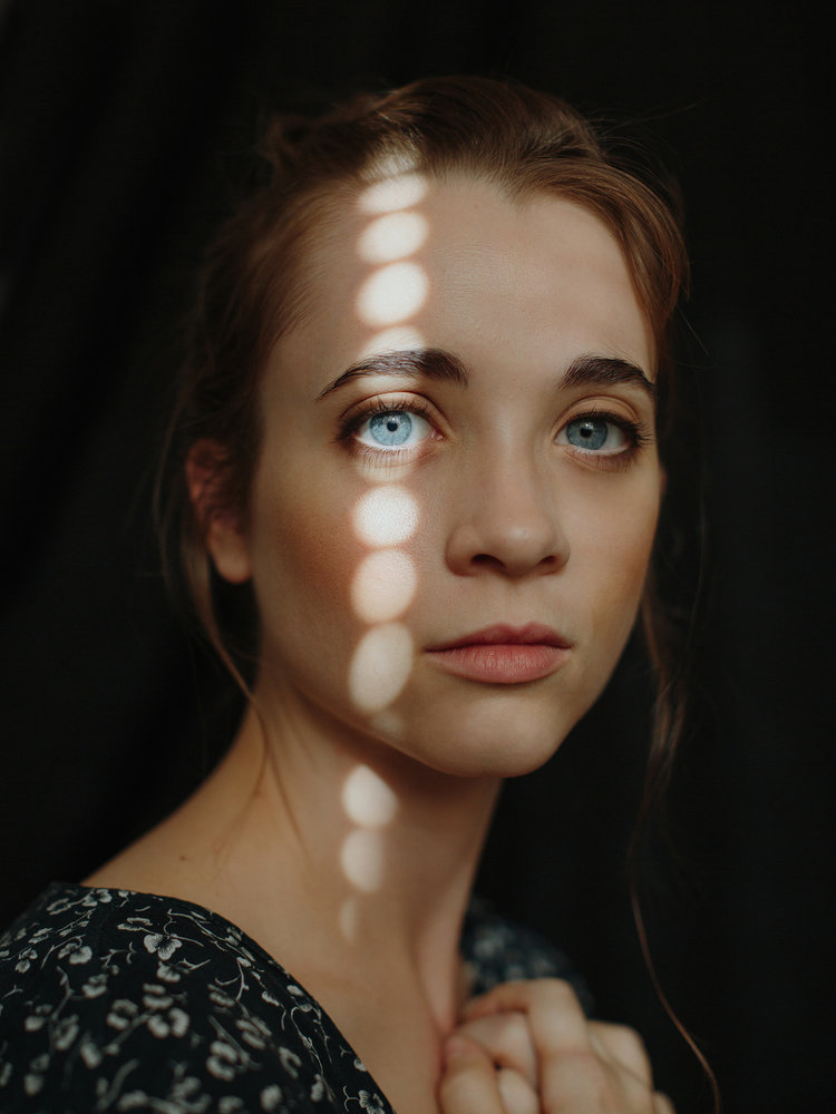
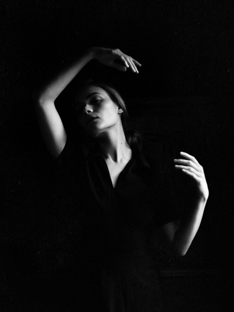
The artist that I chose to study is Nirav Patel, who uses light and shadow to create interesting shapes and forms in his portraits. These portraits are an inspiration for my own portraits because I want to use concentrated beams of light in my portraits, just like Patel. The lighting in my portraits would play a huge role in the final outcome and the general atmosphere of the photos, and since the atmosphere is a key part of my portraits, I want to use my lighting intentionally and effectively. Patel’s portraits have this trait as they also have lighting as a key component, and a lot of his portraits have a similar atmosphere to what I want my portraits to have.

Here are some examples of his work:

In this image, the subject is standing near the center of the image, with the top half of their body illuminated by light from the top left of the image. The swirling smoke, clear distinction between the light and shadows, and the muted color palette all add to the atmosphere and mood of this piece, creating a thought-evoking feel. The background is plain and in shadow, drawing most of the audience’s attention towards the light and the model. The pale warm yellow of the light also contrasts with the dark green of the shadows, and to me, this image gives the impression of reaching out for the light after a long period of darkness. I also particularly like the expression on the model’s face and their body language, as they look intense, concentrated, and about to back down but determined to forge onwards. It really adds a lot of emotion to the photo.

Meghan-02201b.jpg

This image is interesting to me as it is almost entirely comprised of two main colors and a third in-between color, which instantly draws the viewer’s attention and also adds a unique characteristic to the image. Another interesting thing is that the model is facing away from the camera, and we can only see a little silhouette of their head and hand where they reach out to the light, creating a sense of intrigue (light and shadow seem to be a particularly consistent and integral theme in Patel’s work). The use of negative space also helps balance out the bright, contrasting light and shadows and also gives the impression of space, solitude, and introspection. The red color of the light is also directly in contrast with the green of the shadows, and this clash of colors turns what otherwise would have been a calmer piece into something much more energetic.

Eileen-0126.jpg

One thing that caught my attention in this image is the way the pattern of repeating circular lights travel across the model’s face – highlighting their eye in particular. Compared to the last two images, this one is much more focused on the model and their expression and is a close-up that only shows the model from the shoulders up instead of their full body like the others. This builds a sense of human connection with the model, as we are close enough to be able to see the details of their face, their hair, and other features. This feeling is also enhanced by the fact that the model is also looking directly at the camera, which gives the impression of making eye contact with the audience through the photo. Finally, this emphasis on the model’s face and eyes is brought together by the splash of light across their face, and ties all the other elements of the image together to create a cohesive whole.

Meredith-scan1.jpg

This image is interesting because, unlike the others, it doesn’t have a clear-cut beam of light, and instead is much more like what a “traditional” portrait looks like, with a light source that is not actually present in the photo itself. Instead, this image uses its monochrome nature to emphasize the light and shadows. The model melts seamlessly into the background and becomes part of the negative space, while their face, neck and arms are highlighted by the light source. Their pose and expression are also very interesting, as the arms and the tilt of the neck create a sort of flow throughout the image that also balances out the left and right sides and the top and bottom of the image. To me, the model almost looks like they’re in some sort of dance, and combined with the prominent shadows and the monochrome, abstract nature, this image gives me the impression of sleepwalking, hypnosis and other dream-like themes. This is definitely an interesting aesthetic choice and the high contrast and the melting-into-the-background is definitely something that would be cool to try in my portraits too.

Intro To Digital Photography – Portraits Unit Blog Post #7: Experimental Photos

These are my practice photos for my set! In these photos, I tried experimenting with light to get the effects that I wanted – specifically, I tried to get some hard edges on the lighting, so that instead of creating an entire tint on the image, the light would be in a more concentrated beam shape instead. However, as the images show, I haven’t managed to quite get the right effect yet. The same goes for the pale colorless light, as although I turned the light as dim as it can get, the image still appears very bright. I have concluded that this is because the ISO/exposure of the camera was too high, so if I turn the ISO down I would be able to get my dark gloomy effect. However, something interesting that happened due to this high exposure mixed with low light was that a lot of my images were blurred (especially the ones in the red light) as the camera was trying to splice together two images taken in quick succession – during which the model changed positions in the interval. The colors still remained extremely bright and almost burning, and I think that this blurred effect combined with the harsh light would be good for conveying frustration and cloudiness of the mind.

Another thing that I wanted to do but couldn’t do as well in this set was to experiment with the composition – as the camera was stuck onto a pole, I couldn’t move it around as freely as I wished. Thus, there were no close-ups and the direction of the camera was also severely limited. I tried compensating for this through the body language and pose of the model, although I’m not sure how well the emotions can come through with all these limitations – especially since quite a few of my pre-planned compositions involve extreme close-ups and/or far shots. The far shots are also another issue, as the photo studio is definitely not large enough for what my sketches entail. I can think of several solutions to this: one solution is that I scrap the wide-shot composition and replace it with something else that feels similar (for example, I could have the model still be in the same pose, but maybe the camera is above them looking down), or I could find another location to take the image in (like the theatre. The theatre would absolutely be great. However, the problem with that is a) I’m not sure how to book the theatre because I’m pretty sure I can’t just waltz in for like 30 minutes after school randomly and b) I’m not sure how to get all the lighting stuff in the theatre, because operating the theatre lights is definitely way beyond my skill level. Therefore, the first solution seems to be more likely).

To summarize, some of the things I want to watch out for in future photoshoots would be:

  1. To get the dim lighting, lower the exposure of the camera
  2. Use a camera that isn’t physically attached to a pole
  3. Experiment more with the motion blur effect, as those high-intensity blurred images have the potential to convey a lot of emotion that normal still images wouldn’t
  4. Try to find some other compositions that replaces the wide shots

Intro To Digital Photography – Portraits Unit Blog Post #6: Specific Artist Study

The artist that I chose to study is Jovana Rikalo, the photographer who captures her subjects with a fairytale-like style and creates an ethereal feeling in her works. Her work involves the intentional use of props and composition – especially in her fine arts works. This is in line with the type of feeling I want to create in my photos, as although the mood will be darker, the otherworldly feeling is still there. I also want to try and create an almost painting-like composition in some of my photos, the way Rikalo does in hers. The props help enhance the fantasy aspect of the photos, as Rikalo commonly uses elements of nature as her props (such as flowers or feathers), which makes the subject seem more magical and connected to nature.

Here are some examples of her work:

In this image, the subject is framed in the center of the photo by the different props, looking up at a light shining from the top right. The body language of the model gives the image more emotion, and the darker, dimmer colors set an almost bleak tone for the photograph. However, this is contrasted by the warm colors of the trees and the model themselves, drawing the focus to the model. The mist in the light also adds another pop of color to an otherwise duller scene, and the image seems to convey the message of finding a light in the dark (emphasized by how the model is also kneeling on the ground and looking up to the light, like they are about to get up and reach for it.)

In this image, the model is staring directly at the camera, creating a sense of connection with the audience. In contrast to the previous photo, this one places a much larger emphasis on the model than the environment surrounding them. The costume of the model is what mainly contributes to the fairytale feeling in this photo – the soft silk matches the texture of their hair and the color of their eyes, and the intricate golden headdress radiates outwards like beams of sunlight. Overall, these things make the audience feel as if they have caught the gaze of some supernatural, perhaps divine being. The composition of the photo also places an emphasis on the model’s face like a traditional portrait, with the radiating lines of the headdress, the model’s hands, and the model’s flowing hair all leading towards their face. The soft colors, composition, and the fairytale-like aesthetic all make this image feel like it could be a painting.

This image is again placing more emphasis on the model’s surroundings like the first image, and the small size of the model in comparison to the other elements in the image adds a lot of atmosphere to the image, which is this image’s main fairytale style influence. The warm yellows and greens are very cohesive together and mixed with the bit of blue in the background, it gives the photo the feeling of summer sunlight. The sunflowers, the model’s carefree pose, and the model’s floaty yellow dress also help with this effect. In particular, I think that the composition of this image is very interesting, with the plants forming a circular frame around the model in a way that reminds me of some sort of painting instead of a photo. This is something that Rikalo does very well in her compositions, as although she is taking photos, the images themselves look like deliberate illustrations. Although I will not be able to utilize background elements as much as Rikalo in my portraits, I want to try and use the lighting, composition and posing to take more intentional photographs.

This image is intriguing because of the use of smoke and mist. It fills the frame and obscures the face of the model, which is something that I could potentially use to fit into the narrative I want to tell with my portrait photos as well. The smoke adds color to the parts of the photo that normally might not have color, and it also creates an interesting hazy effect that mixes really well with the color palette – I’m kind of reminded of a red sand desert. The masking of the model’s face is also really interesting, The bold red tones of the image mixes well with the overall darker colors, and the light in the smoke provides some color contrast.

Intro To Digital Photography – Portraits Unit Blog Post #5: Artist Study

There are several photographers who have interesting and unique styles that I would like to take inspiration from in my portrait photographs. One of them is Jovana Rikalo, who is most well-known for her fairytale-style portraits.

46 Famous Portrait Photographers You Should KnowPortfolio - Portraits - Jovana Rikalo - Fine Art photographer

Rikalo’s works usually place a large emphasis on not only the subject of the photo but their surroundings as well. She uses many props, decorations and lighting effects to create her iconic fairytale feeling, which is something that I would like to try and imitate in my own photos. Her photos also have really intentional compositions that integrate the props into the photo in a really natural way, and the props add interest and meaning to the photo in ways that would be hard to achieve with just the subject alone.

Another photographer who inspired me is Eugenio Recuenco.

Home - Eugenio Recuenco

His photographs often include elaborate setups and backgrounds, with many props just like Jovana Rikalo. However, Recuenco’s props are usually more focused on the background than the model, although there is still a lot of consideration that goes into how to present the people in the portraits. These photos often have a feeling of abstraction to them, which relates to the abstract way I want to portray the concept of procrastination in my portrait photos.

The next photographer that I want to take inspiration from is Nirav Patel, who uses light and shadows to create interesting effects and patterns in his portraits.

Aesthetica Magazine - Moments of SeclusionPhotographer Profile: Nirav Patel – ONA

These images often use some form of smoke or mist to accentuate the effect of the light, and the different shapes of the light and shadows add an extra layer of visual intrigue to the photos. It’s a really unique style, and to me, it invokes a feeling of solitude (the swirling of the light reminds me of bored afternoons lying on my bed and watching the dust motes in the air while daydreaming about dragons). The dark but rich colors, combined with the lights and shadows and the poses of the models fill the pictures with emotion.

The last photographer that I find interesting is Alessio Albi, whose works have a cinematographic feeling to them.

portrait of a model with head popping out of the sea

One thing that I noticed about Albi’s portraits is that most of the time, the subject of the photo is staring directly at the audience. This, combined with the surroundings and atmosphere of the photo, creates a striking impression on the viewer.

Intro To Digital Photography – Portraits Unit Blog Post #4: Statement of Intent

In my photo set, I want to capture and portray the feeling of looming dread that comes from procrastinating on something important. As a person who procrastinates way too much, I know what it feels like: you know that you need to get this thing done as soon as possible, and yet you keep avoiding it – consciously or not – and the clock ticks on in the background. Part of your brain tells you that you should probably stop scrolling and focus for once. You ignore it and keep scrolling. And scrolling. And scrolling.

All the while, time slips away.

It’s dark outside. In the blink of an eye, hours have gone by. You never even noticed.

You want to get to work now. You have to, there are only a couple of hours left before the deadline.

But your hand moves as if of its own volition, and you can only watch as the clock ticks down while you waste away in front of your screen.


That may be a bit of an overdramatic retelling, but I want to take that feeling of wasting time, of frustration, of wanting to stop but also unthinkingly plowing on ahead despite knowing better. And what better way to convey that in a photo than some good old eldritch horror?

There are many different flavors of the eldritchy-horroresque aesthetic, but I think that one flavor that would work well in particular would be the one related to puppeteers and masks and strings. I want to use the puppet and mask imagery to convey the idea of losing control, especially losing control over yourself and your own actions. The potential designs of the mask (masks, plural, depending on which specific direction I choose to go into) could also help convey the many different emotions that come from the process of extreme procrastination, and take these emotions to the extreme so that they resonate more with the audience. I also want to try and include some clock motifs (and smoke if possible, both to represent the murky foggy feeling in your brain when you’re in that state of procrastination and to connect to the idea of burnout, which is both a common reason and result for such procrastination) to add further layers of symbolism and to connect the photos to the theme of procrastination.

Another thing I want to experiment with is the lighting and background, as they are very important to the atmosphere of portraits. Two different types of lighting that I may use are dim, muted lights to portray the foggy feeling and the blankness in your brain, and also bright, bold lights for the frustration that you feel as the deadline creeps closer and closer. I think that when these different types of lighting are put next to each other in a photo set, the juxtaposition and the contrast between these photos will enhance each other and make them more poignant. It could also help show the pattern of procrastination, where every once in a while you have these moments of clarity where you realize just how much time has passed – you feel frustrated at yourself, because now you’re stressed and you don’t have enough time to do anything – but then you somehow fall back into the cycle. In the end, you’re only more frustrated that you somehow managed to waste even more time.

Intro To Digital Photography – Portrait Unit Blog Post #3: Moodboard

Here are some of my concept sketches as well (it’s very messy, but it does set up some basics for which direction I want to go in):

Intro To Digital Photography – Portraits Unit Blog Post #2: Mind Map

« Older posts

© 2024 Annie

Theme by Anders NorenUp ↑

Skip to toolbar