Annie

Loves cats, drawing, and other things.

Author: Annie (page 2 of 6)

Intro To Digital Photography – Portraits Unit Blog Post #6: Specific Artist Study

The artist that I chose to study is Jovana Rikalo, the photographer who captures her subjects with a fairytale-like style and creates an ethereal feeling in her works. Her work involves the intentional use of props and composition – especially in her fine arts works. This is in line with the type of feeling I want to create in my photos, as although the mood will be darker, the otherworldly feeling is still there. I also want to try and create an almost painting-like composition in some of my photos, the way Rikalo does in hers. The props help enhance the fantasy aspect of the photos, as Rikalo commonly uses elements of nature as her props (such as flowers or feathers), which makes the subject seem more magical and connected to nature.

Here are some examples of her work:

In this image, the subject is framed in the center of the photo by the different props, looking up at a light shining from the top right. The body language of the model gives the image more emotion, and the darker, dimmer colors set an almost bleak tone for the photograph. However, this is contrasted by the warm colors of the trees and the model themselves, drawing the focus to the model. The mist in the light also adds another pop of color to an otherwise duller scene, and the image seems to convey the message of finding a light in the dark (emphasized by how the model is also kneeling on the ground and looking up to the light, like they are about to get up and reach for it.)

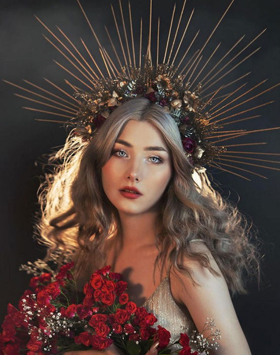
In this image, the model is staring directly at the camera, creating a sense of connection with the audience. In contrast to the previous photo, this one places a much larger emphasis on the model than the environment surrounding them. The costume of the model is what mainly contributes to the fairytale feeling in this photo – the soft silk matches the texture of their hair and the color of their eyes, and the intricate golden headdress radiates outwards like beams of sunlight. Overall, these things make the audience feel as if they have caught the gaze of some supernatural, perhaps divine being. The composition of the photo also places an emphasis on the model’s face like a traditional portrait, with the radiating lines of the headdress, the model’s hands, and the model’s flowing hair all leading towards their face. The soft colors, composition, and the fairytale-like aesthetic all make this image feel like it could be a painting.

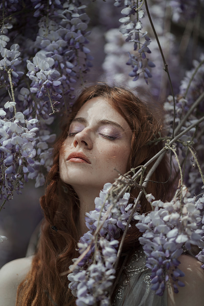
This image is again placing more emphasis on the model’s surroundings like the first image, and the small size of the model in comparison to the other elements in the image adds a lot of atmosphere to the image, which is this image’s main fairytale style influence. The warm yellows and greens are very cohesive together and mixed with the bit of blue in the background, it gives the photo the feeling of summer sunlight. The sunflowers, the model’s carefree pose, and the model’s floaty yellow dress also help with this effect. In particular, I think that the composition of this image is very interesting, with the plants forming a circular frame around the model in a way that reminds me of some sort of painting instead of a photo. This is something that Rikalo does very well in her compositions, as although she is taking photos, the images themselves look like deliberate illustrations. Although I will not be able to utilize background elements as much as Rikalo in my portraits, I want to try and use the lighting, composition and posing to take more intentional photographs.

This image is intriguing because of the use of smoke and mist. It fills the frame and obscures the face of the model, which is something that I could potentially use to fit into the narrative I want to tell with my portrait photos as well. The smoke adds color to the parts of the photo that normally might not have color, and it also creates an interesting hazy effect that mixes really well with the color palette – I’m kind of reminded of a red sand desert. The masking of the model’s face is also really interesting, The bold red tones of the image mixes well with the overall darker colors, and the light in the smoke provides some color contrast.

Intro To Digital Photography – Portraits Unit Blog Post #5: Artist Study

There are several photographers who have interesting and unique styles that I would like to take inspiration from in my portrait photographs. One of them is Jovana Rikalo, who is most well-known for her fairytale-style portraits.

46 Famous Portrait Photographers You Should KnowPortfolio - Portraits - Jovana Rikalo - Fine Art photographer

Rikalo’s works usually place a large emphasis on not only the subject of the photo but their surroundings as well. She uses many props, decorations and lighting effects to create her iconic fairytale feeling, which is something that I would like to try and imitate in my own photos. Her photos also have really intentional compositions that integrate the props into the photo in a really natural way, and the props add interest and meaning to the photo in ways that would be hard to achieve with just the subject alone.

Another photographer who inspired me is Eugenio Recuenco.

Home - Eugenio Recuenco

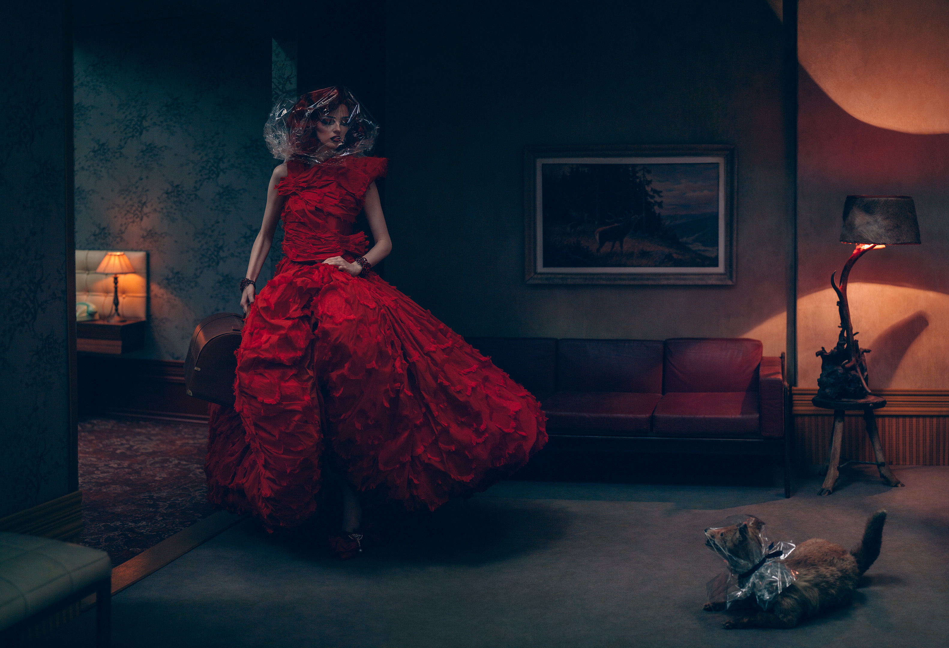
His photographs often include elaborate setups and backgrounds, with many props just like Jovana Rikalo. However, Recuenco’s props are usually more focused on the background than the model, although there is still a lot of consideration that goes into how to present the people in the portraits. These photos often have a feeling of abstraction to them, which relates to the abstract way I want to portray the concept of procrastination in my portrait photos.

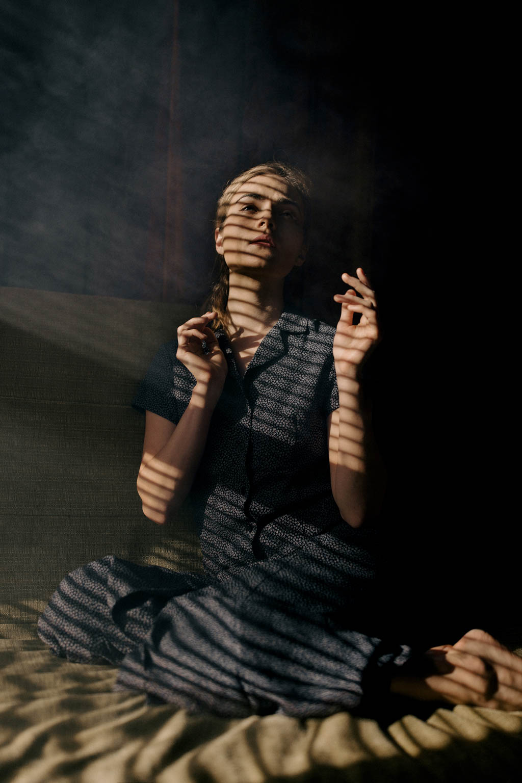
The next photographer that I want to take inspiration from is Nirav Patel, who uses light and shadows to create interesting effects and patterns in his portraits.

Aesthetica Magazine - Moments of SeclusionPhotographer Profile: Nirav Patel – ONA

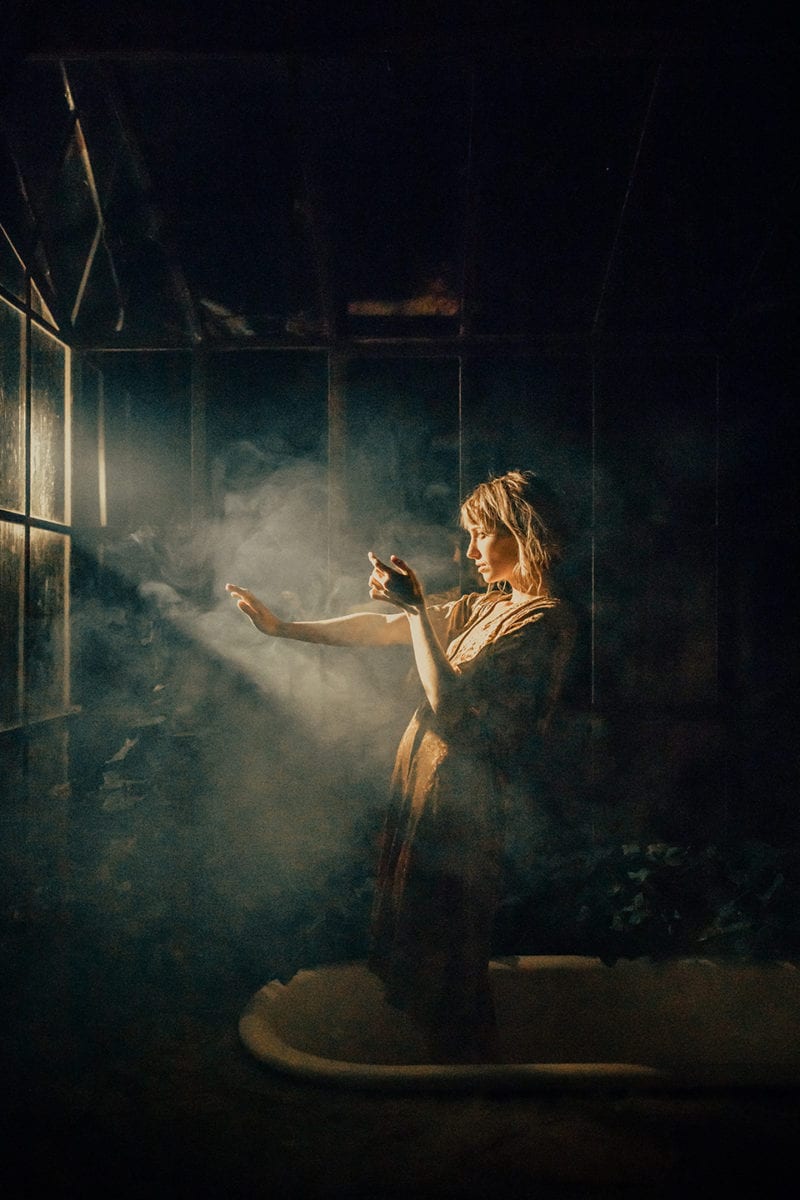
These images often use some form of smoke or mist to accentuate the effect of the light, and the different shapes of the light and shadows add an extra layer of visual intrigue to the photos. It’s a really unique style, and to me, it invokes a feeling of solitude (the swirling of the light reminds me of bored afternoons lying on my bed and watching the dust motes in the air while daydreaming about dragons). The dark but rich colors, combined with the lights and shadows and the poses of the models fill the pictures with emotion.

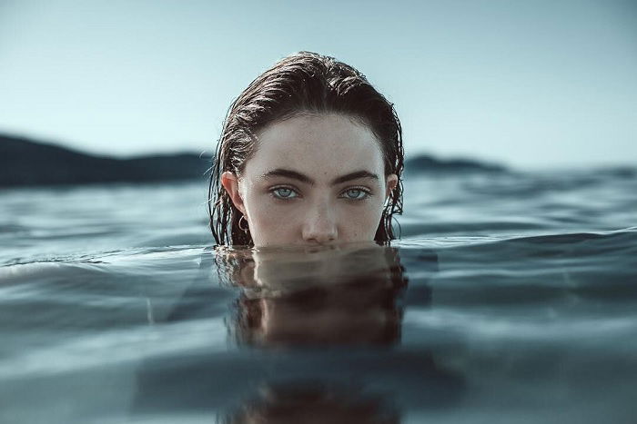
The last photographer that I find interesting is Alessio Albi, whose works have a cinematographic feeling to them.

portrait of a model with head popping out of the sea

One thing that I noticed about Albi’s portraits is that most of the time, the subject of the photo is staring directly at the audience. This, combined with the surroundings and atmosphere of the photo, creates a striking impression on the viewer.

Intro To Digital Photography – Portraits Unit Blog Post #4: Statement of Intent

In my photo set, I want to capture and portray the feeling of looming dread that comes from procrastinating on something important. As a person who procrastinates way too much, I know what it feels like: you know that you need to get this thing done as soon as possible, and yet you keep avoiding it – consciously or not – and the clock ticks on in the background. Part of your brain tells you that you should probably stop scrolling and focus for once. You ignore it and keep scrolling. And scrolling. And scrolling.

All the while, time slips away.

It’s dark outside. In the blink of an eye, hours have gone by. You never even noticed.

You want to get to work now. You have to, there are only a couple of hours left before the deadline.

But your hand moves as if of its own volition, and you can only watch as the clock ticks down while you waste away in front of your screen.


That may be a bit of an overdramatic retelling, but I want to take that feeling of wasting time, of frustration, of wanting to stop but also unthinkingly plowing on ahead despite knowing better. And what better way to convey that in a photo than some good old eldritch horror?

There are many different flavors of the eldritchy-horroresque aesthetic, but I think that one flavor that would work well in particular would be the one related to puppeteers and masks and strings. I want to use the puppet and mask imagery to convey the idea of losing control, especially losing control over yourself and your own actions. The potential designs of the mask (masks, plural, depending on which specific direction I choose to go into) could also help convey the many different emotions that come from the process of extreme procrastination, and take these emotions to the extreme so that they resonate more with the audience. I also want to try and include some clock motifs (and smoke if possible, both to represent the murky foggy feeling in your brain when you’re in that state of procrastination and to connect to the idea of burnout, which is both a common reason and result for such procrastination) to add further layers of symbolism and to connect the photos to the theme of procrastination.

Another thing I want to experiment with is the lighting and background, as they are very important to the atmosphere of portraits. Two different types of lighting that I may use are dim, muted lights to portray the foggy feeling and the blankness in your brain, and also bright, bold lights for the frustration that you feel as the deadline creeps closer and closer. I think that when these different types of lighting are put next to each other in a photo set, the juxtaposition and the contrast between these photos will enhance each other and make them more poignant. It could also help show the pattern of procrastination, where every once in a while you have these moments of clarity where you realize just how much time has passed – you feel frustrated at yourself, because now you’re stressed and you don’t have enough time to do anything – but then you somehow fall back into the cycle. In the end, you’re only more frustrated that you somehow managed to waste even more time.

Intro To Digital Photography – Portrait Unit Blog Post #3: Moodboard

Here are some of my concept sketches as well (it’s very messy, but it does set up some basics for which direction I want to go in):

Intro To Digital Photography – Portraits Unit Blog Post #2: Mind Map

Intro To Digital Photography – Portraits Unit Blog Post #1

What is a portrait?

In my opinion, portraits are images of specific people that show something about them, their personalities, or a theme. Portraits should be able to accurately portray and characterize that thing, and a good portrait should make the viewer feel a certain emotion. Portraits can also be used to tell a story.

However, I think that there are also certain criteria for what is or is not a portrait. For example, a portrait should usually include the person that it is a portrait for – whether they’re facing the camera or away from it. Even if a collection of items could showcase something about a person, it wouldn’t qualify as a portrait since the person themselves is not present in the photo. I think that artistic abstractions could still work for a portrait, like if the photo is ripped or blurred or burned, because these abstractions and alterations could help create more emotion and lead to a better understanding of the theme the photographer wants to portray.

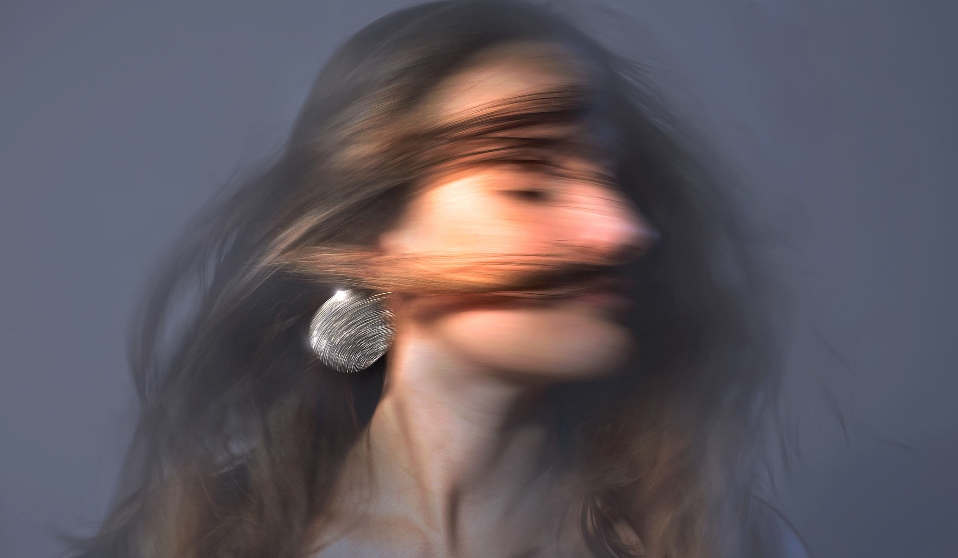
10 Tips for Stunning Portrait Photography | Iceland Photo Tours

For example, in this image, the subject is looking away from the camera, and there is a strong motion blur applied to the image. This creates a windswept look to the image and makes the person appear as if they are in the middle of an action.

A series of image can also work as portraits, as they can show change over time or show a narrative.

Intro To Digital Photography – Abstraction Blog Post #12

Artist Study: Keld Helmer Petersen

Keld Helmer-Petersen : — Un autre monde — Le Bicolore — Exhibition — Slash Paris


Keld Helmer-Petersen | Outline photography, Industrial photography, Water architecture

KELD HELMER-PETERSEN

Keld Helmer-Petersen Artwork for Sale at Online Auction | Keld Helmer- Petersen Biography & Info

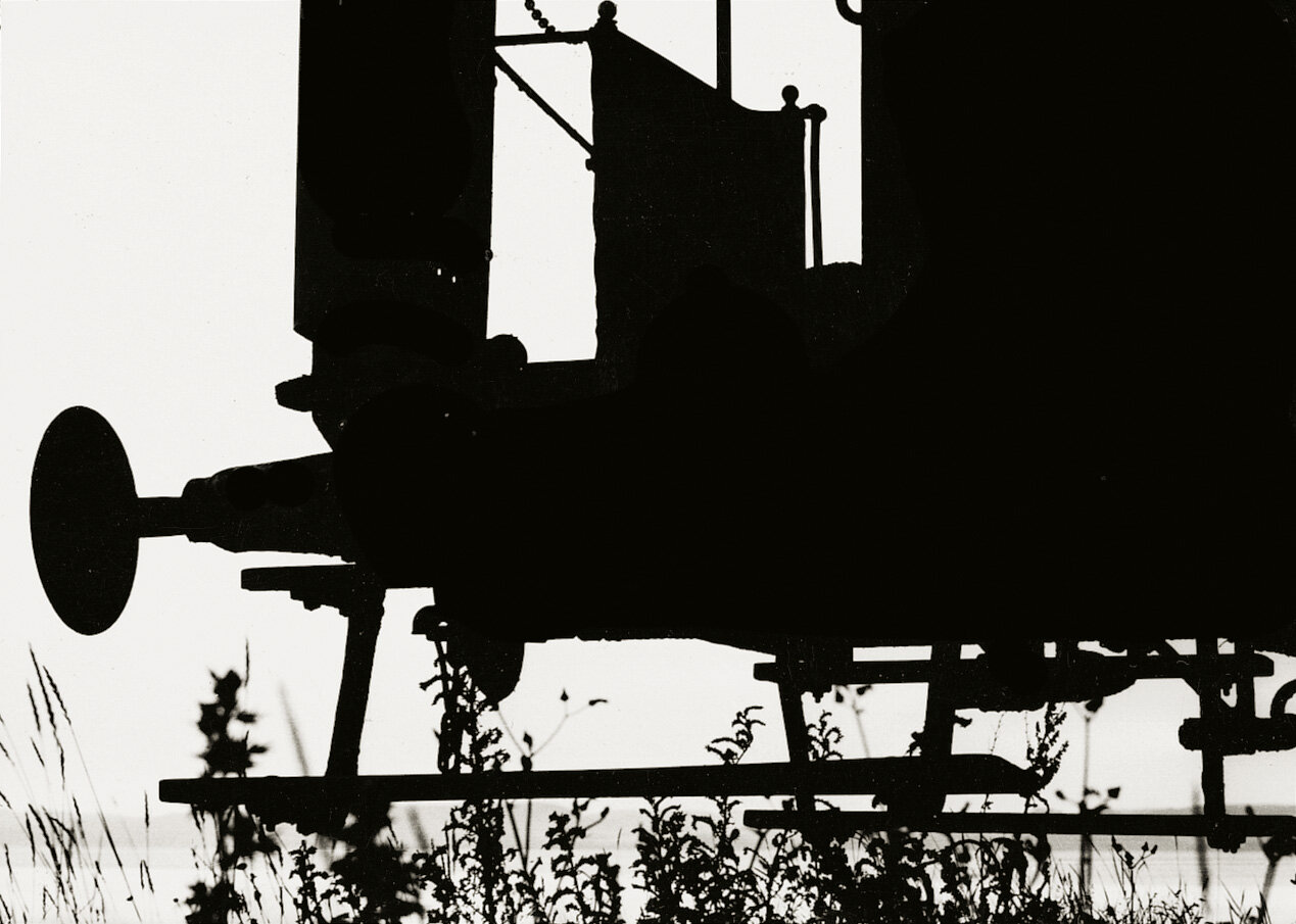
The photographer that I chose for my artist study is Keld Helmer Petersen, who uses a lot of bright backgrounds and dark silhouettes to create shapes and contrast in his photos. This makes the viewers focus on the way the shapes interact with one another instead of their textures or any other such details in the photograph. A lot of his images are related to architecture or other similar human-made structures, with lots of straight edges and sharp angles instead of flowy lines and organic shapes. I chose this artist because this style of abstract photography is very similar to my red selection set, and it conveys a sense of abstraction and emptiness that I want my red selection to convey. Some of Peterson’s work also has more neutral grey tones as well, which matches the first set of my green selection photographs.

Keld Helmer-Petersen gallery 1950-1959 — KELD HELMER-PETERSEN

This image is interesting to me because of the ways the different lines interact and intersect across the white background. The dark silhouettes of the light posts are throughout the image in a way that they don’t appear too cluttered, while still breaking up the negative space. They make a bold statement and provide a place for the viewer’s eyes to rest, as well as support the many lines from the electricity wires. Speaking of the wires, I find the way they move to be very interesting. Although they are non-organic in nature, the way they are almost messily positioned across the image makes them feel a lot more lively and real compared to if they were all perfectly straight and in line with one another. They create flow and movement throughout the image and break up the negative space lightly in a way that the solid silhouettes of the light poles cannot.

Intro To Digital Photography – Abstraction Unit Blog Post #11

Yellow Selection:

Intro To Digital Photography Abstraction Contact Sheet 798

These are my yellow selection photographs. These images range from a greyscale, dreary atmosphere to being warm and colorful and full of life and vibrance, which is something that I find very intriguing. These images are an exploration of how a gloomy day can still hold a plethora of pleasant surprises, and how there is something special to be found in these moments in a drab grey world. Some of these images were taken outdoors, under the pale light from the sky, which gave them their faded colors and soft shadows. In comparison, the indoor images are more colorful, vibrant, and deep in their shadows, and the two types of images together create an interesting contrast. However, it would be good to reorder these images in the contact sheet to create some sort of gradient, as right now the images are all scattered around the contact sheet, creating a sense of discord and chaos. Putting similar images together would achieve some visual harmony, which would help the themes of the images stand out more.

Green Selection:

In my green selection, I will be using three sets of images to tell a story. A story of metal giants dominating the skies, of warmth caged away behind interlocking chains, of life eventually blossoming into light. Although these images could stand alone as individual sets, I feel that they are more compelling when united together for this narrative, which is why I chose them for my green selection instead of my red selection.

Metal Giants

I chose this set of images for my green selection because of its sharp contrast and its dark, serious mood. These images feature various metal structures, with the editing focusing on accentuating their shadows and the silhouettes they make. The buildings take up almost all the space in the images, blocking out the sky and looming over the viewer, creating a dark, heavy, and almost oppressive atmosphere – hence the name, “Metal Giants”.  I want the viewer to feel the somber power of the metal giants, the way they stand sharp and steely (pun unintended) against the blinding sky. The lack of color helps accentuate this point, as it removes distractions and turns the shadows and shapes of the metal giants into the main focus of the piece. It also helps add to the atmosphere and emotion, as saturation and vibrance are usually associated with life and light, while these metal giants are completely devoid of it.

Caged

I chose this set of images almost as a follow-up to the Metal Giants, because I felt that the theme of these images will have a heavier impact after witnessing the heavy weight of the giants. The repeating interlocking element of the chains creates a sense of being trapped – caged, if you will (*ba-dum tss*) – and has a very similar vibe to the oppressive atmosphere of the metal giants. Like the giants, they fill up the entirety of the photographs, filling the view with gray, gray, gray. They are the first things that the viewers see when they look at these photographs; they are separating the viewer from the objects behind the chains. Moving on to these objects, the warm orange colors of the light and the leaf create an interesting contrast against the gloominess of the chains and the previous Metal Giants set, but instead of reinforcing the stark shadowy existence of the Metal Giants, these images add a dash of color and hope into an otherwise dreary world. This could also be seen in the way that although the chains are restricting the warmth and life, they are looping and curving, flowy in their rigidness in a way that the metal giants do not exhibit. These are chains you can bend and climb, chains that allow you to see through to the other side – which brings us to the next installment in this narrative:

Light

I chose these images as a follow-up to Caged, as the hopeful warmth from Caged bleeds out from the darkness of the Metal Giants, and eventually blooms into Light. These images are warm and saturated, full of organic subjects like flowers and wood. The metal and the chains are gone, replaced by these vibrant subjects. The order of these images has meaning too – the flowers are first, full of sunlight and life, to create a striking impact from the bleak but hopeful mood of Caged. They are an explosion of color, almost blinding in their radiance, the flood that finally broke through the dam in a torrential downpour. The brightness of the flowers contrasts against its shadows, overpowering it – and in fact, the shadows actually help accentuate it. Without the dark, the light will be pale in comparison and will not hold as much power and impact as it does here. The next two images are less organic in comparison, but they both possess their own unique sense of life. You can see the light reflecting off the liquid in the second image (is it ink? an image of a freshly-printed book? The page is full of words, words about celebrations, about life. Words come from language, and language comes from life), and the third image purely focuses on the soft glow of the ceiling lights. The final image is rather pale, of a wooden stump full of cracks. The lines and grain of the wood guide the eyes of the viewers throughout the image, creating a vague flow of movement. And despite the tree itself being dead, cut away by a dull world and surrounded by concrete, there are still resilient bits of life clinging to the tree – the fungus and the grass on its sides, accentuated by the soft splash of warm brown that stands out against the rest of the image. And with this final photo of the tree stump concludes the story of this world, where life will soon thrive under the light once more, free from the shadows of metal giants and their cages.

Red Selection:

Sky

I wanted this image to invoke a feeling of bleakness and emptiness in the viewer – the dark silhouettes create a stark contrast against the bright sky, and there is very little tone variation, creating a heavier impact. The lines of the silhouette are very sharp, and there are very few soft objects or outlines in the photo. It is all very, very sharp. There is also a lot of negative space, which helps convey the sense of terrifying emptiness that I want the viewers to feel, and also emphasizes the silhouettes of the birds. The sky is wide open, larger than we might be able to comprehend. If you had total freedom to go wherever you wanted in a vast, empty world, would you? Or will you lose your tether to the earthbound land below amongst the winds, never to return? The camera looks up to the infinite sky and the birds flying above, free to soar in a way that we cannot be. They do not fear the skies, for they have their nests and their flocks grounding them to the earth. And so they fly. There aren’t a lot of significant improvements that may be needed for this photo – I like how the branches and leaves on the trees create a bunch of complex, interweaving, and messy shapes, combined with the different textures of the walls contrasts with the simplicity of the sky and the birds, and helps show that they are very different in nature. Overall, I am quite proud of this photo.

This image is similar to the last one – a bright sky, contrasting against the silhouettes of the structures on the ground. However, unlike the first photo, this image has less sky and more ground. There is a stronger, wider silhouette in this image compared to the frail and thin branches of the tree in the previous image, which helps the photo feel more grounded. It also contrasts against the sky in an almost defiant way, the branches reaching out and encroaching into the bright light. All the branches and the lines in this image are pointing towards the empty negative space in the top left corner, directing the viewers’ eyes. Under these reaching branches, a bird flies below. This image is more about returning to earth, leaving the vast embrace of the skies. Ideally, the silhouette of the bird would not intersect as much with the silhouettes of the trees – some strong lighting would be able to create an outline that separates the shapes – but considering how hard it its to photograph birds in flight, I think I did quite well.

This is an image of home. The birds have returned to their nests, and now the sky is back to being bright and empty. The contrast isn’t as high in this image as in the other images, with a lot more middle tones instead of being completely dark or completely light. This image is the most grounded, with the strong shape and silhouette of the house providing a stable base to the photograph in a way that the other images don’t have. The tree in this image is also sturdier, with thicker branches – it reaches out towards the sky, but is much more like a place to roost and rest. The tree and the house also collectively break up the negative space in the image, so that the sky no longer looks so empty and terrifyingly infinite. The diagonal lines of the house also help direct the viewer’s attention around the photograph, and the different textures make for an interesting image to look at. For further improvements, there would ideally be some birds roosting on the house or the tree to keep with the theme of the set, and I also wonder what would happen if this photo was taken with the same perspective as the others (as although this image is still looking up, the upwards slant isn’t as intense as the other images), which could potentially change the mood.

Intro To Digital Photography – Abstraction Unit Blog Post #10: Experimentation

Yellow Selection:

abstract set 1

I chose these photos for my yellow selection because of the ways they play with color, reflections, and contrast. Some of these images are from the photo studio, with the differently colored lights interacting with the objects in interesting ways. Some of these images were from the outdoors, under the high exposure and sunlight, creating many bright spaces and contrasting with the pops of color. More importantly, these images are all taken in ordinary locations of ordinary things – a simple set of DnD dice, a piece of paper on a table, a snapshot of a hallway or a leaf on the sidewalk – that have gained new life and vibrance under a set of different lens that was willing to take the time to capture their beauty.

Green Selection:

I chose this image because of its vivid colors, and it was an interesting experiment in how I could use them in editing to shape my images.

This image was taken with a high exposure from the sunlight outside, and the brightness helps bring out a hard sort of clarity in the colors, and the entire image feels cold.

This image has a lot of interesting colors and contrast between the bright and the dark, and there is also a sort of gradient from red to blue and draws the attention of the viewer.
This image and the editing helps bring out colors in a place where we normally would not expect there to be any, and these colors are very pretty too! Editing this was like opening a mysterious box, because you never know what secrets could be hiding inside such a normal object.

This image has a very unique angle, and the tilt helps set it apart from the other images by giving it some more movement.

This image was an interesting experiment in low exposure, and the darkness and the light have a nice contrast and creates some interesting shadows.

This image shows the different colors that are reflected on the planes of the dice, and the way these colors interact with each other is very different from what you expect it to be like.

This monochromatic image is intriguing and has a serious, mysterious mood, which the darkness and low exposure also contributes to.

This image is full of geometric shapes and negative space, broken up by the analogous color palette and straight lines.

This image feels dark and dull, which is a very interesting contrast compared to the rest of the photos in this set.

Red Selection:

I chose this image for the final 3 photos because of its vivid colors, which was something that I focused on accentuating during editing. This image was another one of the photos with the high exposure from the sunlight, which might have helped bring out the sharp contrast in this image between the colors and the white spaces, creating lots of interesting shapes. Combined with the colors, it is definitely one of my favorite photos out of this collection. Some room for improvement would be to tweak the settings during editing some more to take away some of the pink blotchy shapes, which breaks up the colors and contrast in the image in a strange way. Another potential improvement would be to turn down the brightness of the image just a little bit, so that it doesn’t burn your eyes as much.

I chose this image for my final 3 photos of this set because I liked the ways the colors interacted with each other without being overwhelming, and it has that “otherworldly” feeling that I was aiming for in my photos, despite depicting a bunch of rather regular dice. The limited color palette, bright colors, reflection of the dice on the flat surface, and the way the colors swirl around inside the dice all add to the overall effect. Some room for improvement or change would be potentially adding a soft (mostly unnoticeable) glow around the dice (maybe with another small light source) to add to the otherworldly feeling, but aside from that, I’m pretty happy with this photo.

I chose this image for my red selection because of its bold colors, and specifically the ways they interact with each other. The bright yellows blends nicely with the reds and pinks and purples, with the green providing a pop of color. The different colors also move in very interesting ways, making a lot of cool shapes and flowing lines in the image. For further improvements, it would be interesting to change the color or brightness of the gray areas so that they match with the rest of the image better.

Intro To Digital Photography – Abstraction Unit Blog Post #9

There are many photographers and photographs that I would like to take inspiration from for my triptych.

One of the main ones is Jackie Ranken’s Other Realities series – I like how otherworldly and almost ghostly the images seem, and I also really like the sentiment behind the photos, which is “the finding of beauty in everyday objects.”

Some key characteristics of these images are the fact that they are all black-and-white/monochromatic, there is often a lot of bright empty space, the subject is usually in the center of the image, the images are usually rather low-contrast, and there is a slight vignette effect around the edges of the photographs.

Another inspiration would be the works of the photographer Ola Kolehmainen:

Sketches of Spain: Hidden Spanish Architecture Through Ola Kolehmainen's Lenses | ArchDaily

Lot - OLA KOLEHMAINEN (FINNISH, BORN 1964) See What You See, 2006

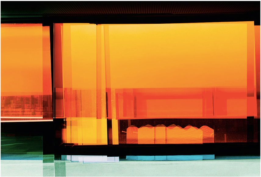
This is a particular one of his photos that I like – Kolehmainen’s photos often include vibrant colors, which is definitely something that I want to try and include in my own photographs, but what caught my attention about this photo in particular is the reflection of the tree in the glass. To me, this image appears as if it could be from a random building on a random street, when the photographer walked by and decided to capture the moment, and I think that’s a really nice sentiment. Some common characteristics of these photos are the vibrant use of color (often ranging from a variety of warm and cool tones), as well as the focus on shapes and lines formed by the objects in the photos – often in geometric shapes.

Another photographer whose works I’m inspired by is Frances Seward:

Frances Seward's Fine Art Abstract Photography Site

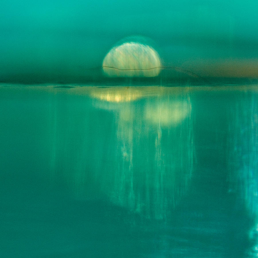
Moonrise Photograph by Frances Seward - Fine Art America

Some key characteristics of Seward’s photos that I am inspired by is the way the colors and shapes flow together to create these images that look like scenes that might exist in real life, but are so unreal and so not grounded in reality that they could also be anything else. Seward’s images often have a rather pleasing color palette, with a lot of analogous, complementary and split complementary colors, and the colors are very vibrant as well.

I chose these photographers to reference for my own photos, because of all of these characteristics that are present in their work. I want to combine the otherworldly feeling of Jackie Ranken and Frances Seward’s photos with the interesting colors from Ola Kolehmainen, and I want to capture the way these photographers all find beauty in simple, ordinary things – Jackie Ranken’s “finding beauty in everyday objects”, Ola Kolehmainen’s architecture, and Frances Seward’s glass.


Out of all the photos above, I find this one particularly interesting. I am drawn to its bright colors and the nice contrast between the vibrant orange and the calmer blues and greens near the bottom of the image, and how it uses the shapes and forms of the objects to create overlapping rectangular shapes, and the darker sections also creates clear divides between the spaces of bright colors. One of the formal elements that are the most integral to this image would, in my opinion, be shape. The dark shapes break up the image and creates divides between the warm and cool tones, and the colors themselves also form some interesting geometric shapes as well – for example, the series of repeated arch-like pointy shapes, or the series of overlapping rectangular shapes that is quite reminiscent of a bunch of highlighter strokes. This repetition of elements combined with the interesting shapes really makes a unique image and plays a large role in making this picture more abstract.

Older posts Newer posts

© 2025 Annie

Theme by Anders NorenUp ↑

Skip to toolbar