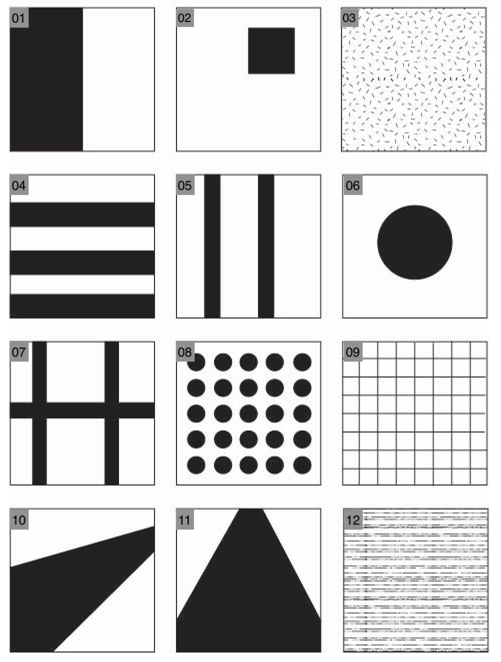
These simple images all demonstrate at least one of the formal elements:
1) Shape, as the main focus in this image is the balance between the dark and the light rectangles filling up all the space.
2) Shape, as this image uses the positive and negative space in the image to draw the viewer’s eyes to the clear shape of the square.
3) Pattern – it could be argued that this image also qualifies for texture, but this really looks more like a sprinkle pattern wallpaper than an actual tangible thing that you could touch, so this image would be more of a pattern than a texture.
4) Pattern – This image might qualify for line or shape, and it really could be all three. In the end though, the alternating dark and light colors are the most defining feature of this image, so pattern it is.
5) Line. The two lines clearly divide the image into distinct sections and are the most prominent element in the image.
6) Shape. The singular circle at the center of the image is the clearest defining feature of the image, and thus this image is best representative of shape.
7) Line. The three straight lines divide the image into several different sections, and is a very defining feature of the image.
8) Repetition & Pattern, from the repeating circles forming a constant throughout the image.
9) Again, Repetition & Pattern. Although the lines could also qualify for line, the repetition is really more important and noticeable in this image than if the lines were the main focus.
10) Line – although it could be argued that this image also qualifies for shape, the clear cut lines that is created by the shapes guides the viewers eyes and creates a sense of perspective, which is a very important part of the image.
11) Again, Line, for the same reason.
12) Texture, as demonstrated by the straight lines of different weights, almost like a fuzzy surface like a carpet.
Here are the images that I took to imitate these compositions!
1)

2)

3)

4)

5)

6)

7)

8)

9)

10)

11)

12)

Some of the images that worked well, in my opinion, would be 4, 10, 11, and 12. 4 and 12 both accurately capture the original image, with the horizontal stripes for 4 and the grainy texture for 12. 10 and 11 also worked well in my opinion, as they not only capture the original composition, the various colors allowed me to edit the images into something that is more interesting to look at. 6 also could have worked well, if not for the random strip of lighter color on the left – I think that just a plain bright circle on a dark background could have made for quite an interesting picture. However, if I can edit out the white strip, 6 would also be up there in the successful photos category.
Some of the images that don’t work quite as well would be 1 and 9 – both images are not particularly interesting to look at, and the weird focus and camera angles don’t really make it better. 1 does have an interesting checkers pattern on the right side, and the way the checkers are positioned could lend itself into an optical illusion, but aside from that, these two images doesn’t work as well as the others, in my opinion.





Recent Comments