Annie

Loves cats, drawing, and other things.

Category: Uncategorized

Intro To Digital Photography – Portraits Unit Blog Post #8: Second Specific Artist Study

The artist that I chose to study is Nirav Patel, who uses light and shadow to create interesting shapes and forms in his portraits. These portraits are an inspiration for my own portraits because I want to use concentrated beams of light in my portraits, just like Patel. The lighting in my portraits would play a huge role in the final outcome and the general atmosphere of the photos, and since the atmosphere is a key part of my portraits, I want to use my lighting intentionally and effectively. Patel’s portraits have this trait as they also have lighting as a key component, and a lot of his portraits have a similar atmosphere to what I want my portraits to have.

Here are some examples of his work:

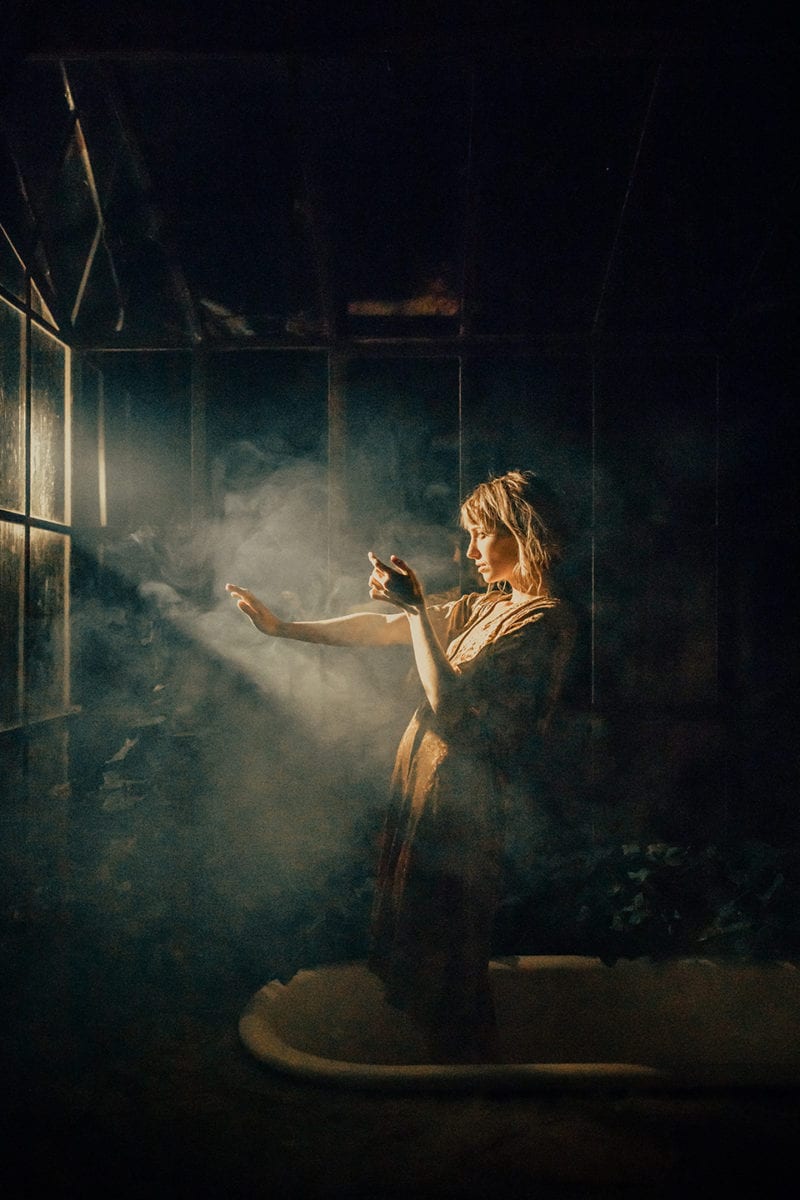
In this image, the subject is standing near the center of the image, with the top half of their body illuminated by light from the top left of the image. The swirling smoke, clear distinction between the light and shadows, and the muted color palette all add to the atmosphere and mood of this piece, creating a thought-evoking feel. The background is plain and in shadow, drawing most of the audience’s attention towards the light and the model. The pale warm yellow of the light also contrasts with the dark green of the shadows, and to me, this image gives the impression of reaching out for the light after a long period of darkness. I also particularly like the expression on the model’s face and their body language, as they look intense, concentrated, and about to back down but determined to forge onwards. It really adds a lot of emotion to the photo.

Meghan-02201b.jpg

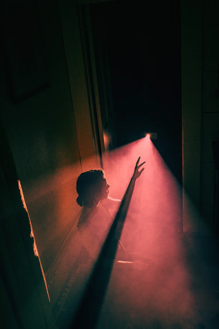
This image is interesting to me as it is almost entirely comprised of two main colors and a third in-between color, which instantly draws the viewer’s attention and also adds a unique characteristic to the image. Another interesting thing is that the model is facing away from the camera, and we can only see a little silhouette of their head and hand where they reach out to the light, creating a sense of intrigue (light and shadow seem to be a particularly consistent and integral theme in Patel’s work). The use of negative space also helps balance out the bright, contrasting light and shadows and also gives the impression of space, solitude, and introspection. The red color of the light is also directly in contrast with the green of the shadows, and this clash of colors turns what otherwise would have been a calmer piece into something much more energetic.

Eileen-0126.jpg

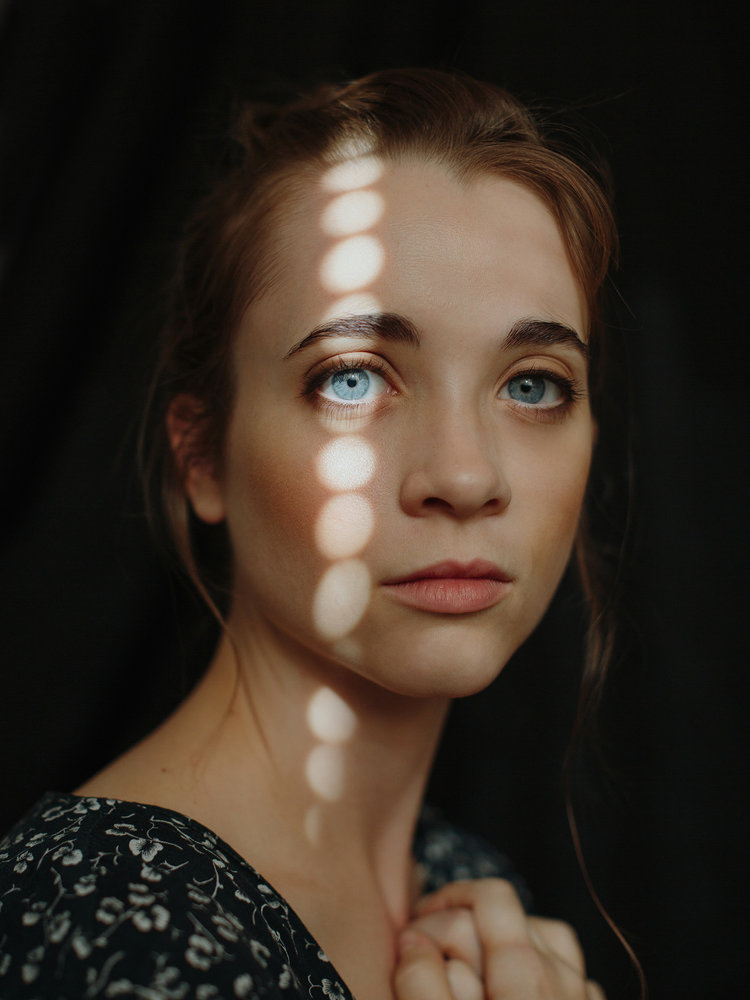
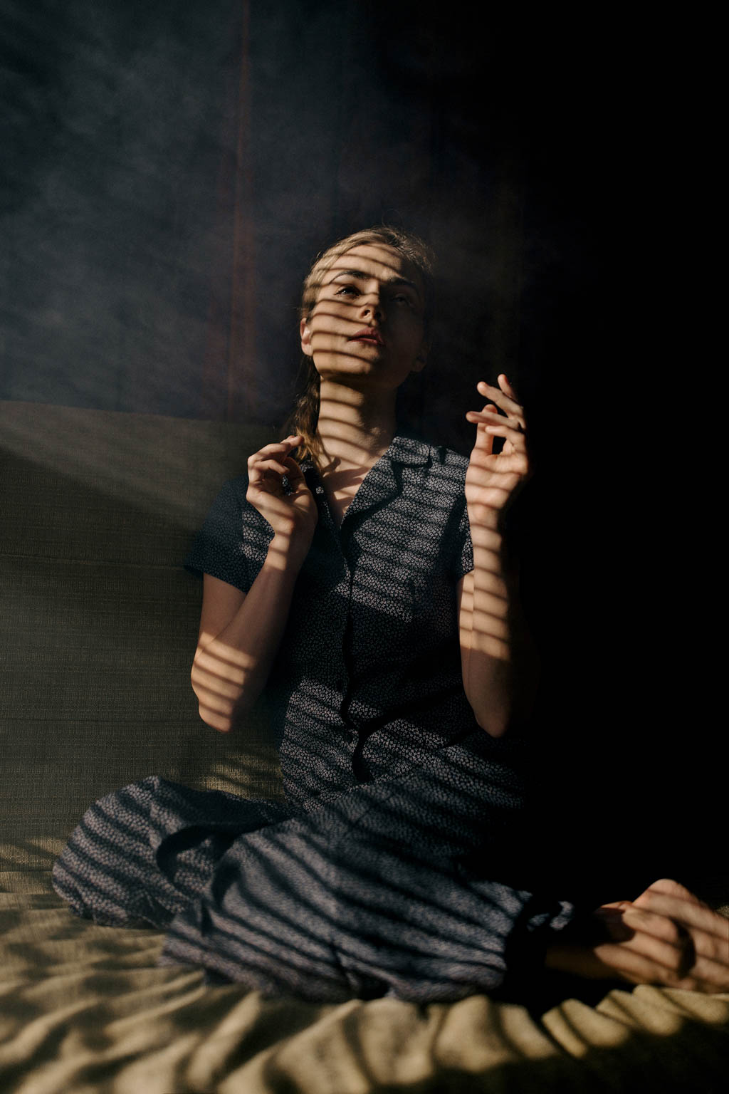
One thing that caught my attention in this image is the way the pattern of repeating circular lights travel across the model’s face – highlighting their eye in particular. Compared to the last two images, this one is much more focused on the model and their expression and is a close-up that only shows the model from the shoulders up instead of their full body like the others. This builds a sense of human connection with the model, as we are close enough to be able to see the details of their face, their hair, and other features. This feeling is also enhanced by the fact that the model is also looking directly at the camera, which gives the impression of making eye contact with the audience through the photo. Finally, this emphasis on the model’s face and eyes is brought together by the splash of light across their face, and ties all the other elements of the image together to create a cohesive whole.

Meredith-scan1.jpg

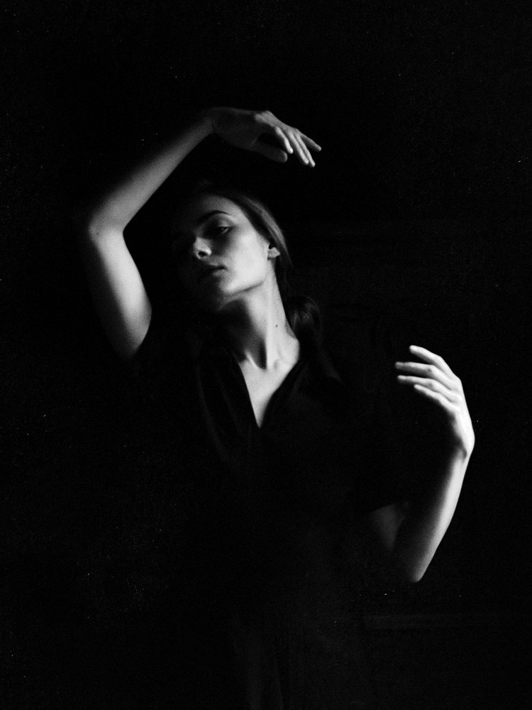
This image is interesting because, unlike the others, it doesn’t have a clear-cut beam of light, and instead is much more like what a “traditional” portrait looks like, with a light source that is not actually present in the photo itself. Instead, this image uses its monochrome nature to emphasize the light and shadows. The model melts seamlessly into the background and becomes part of the negative space, while their face, neck and arms are highlighted by the light source. Their pose and expression are also very interesting, as the arms and the tilt of the neck create a sort of flow throughout the image that also balances out the left and right sides and the top and bottom of the image. To me, the model almost looks like they’re in some sort of dance, and combined with the prominent shadows and the monochrome, abstract nature, this image gives me the impression of sleepwalking, hypnosis and other dream-like themes. This is definitely an interesting aesthetic choice and the high contrast and the melting-into-the-background is definitely something that would be cool to try in my portraits too.

Intro To Digital Photography – Portraits Unit Blog Post #7: Experimental Photos

These are my practice photos for my set! In these photos, I tried experimenting with light to get the effects that I wanted – specifically, I tried to get some hard edges on the lighting, so that instead of creating an entire tint on the image, the light would be in a more concentrated beam shape instead. However, as the images show, I haven’t managed to quite get the right effect yet. The same goes for the pale colorless light, as although I turned the light as dim as it can get, the image still appears very bright. I have concluded that this is because the ISO/exposure of the camera was too high, so if I turn the ISO down I would be able to get my dark gloomy effect. However, something interesting that happened due to this high exposure mixed with low light was that a lot of my images were blurred (especially the ones in the red light) as the camera was trying to splice together two images taken in quick succession – during which the model changed positions in the interval. The colors still remained extremely bright and almost burning, and I think that this blurred effect combined with the harsh light would be good for conveying frustration and cloudiness of the mind.

Another thing that I wanted to do but couldn’t do as well in this set was to experiment with the composition – as the camera was stuck onto a pole, I couldn’t move it around as freely as I wished. Thus, there were no close-ups and the direction of the camera was also severely limited. I tried compensating for this through the body language and pose of the model, although I’m not sure how well the emotions can come through with all these limitations – especially since quite a few of my pre-planned compositions involve extreme close-ups and/or far shots. The far shots are also another issue, as the photo studio is definitely not large enough for what my sketches entail. I can think of several solutions to this: one solution is that I scrap the wide-shot composition and replace it with something else that feels similar (for example, I could have the model still be in the same pose, but maybe the camera is above them looking down), or I could find another location to take the image in (like the theatre. The theatre would absolutely be great. However, the problem with that is a) I’m not sure how to book the theatre because I’m pretty sure I can’t just waltz in for like 30 minutes after school randomly and b) I’m not sure how to get all the lighting stuff in the theatre, because operating the theatre lights is definitely way beyond my skill level. Therefore, the first solution seems to be more likely).

To summarize, some of the things I want to watch out for in future photoshoots would be:

  1. To get the dim lighting, lower the exposure of the camera
  2. Use a camera that isn’t physically attached to a pole
  3. Experiment more with the motion blur effect, as those high-intensity blurred images have the potential to convey a lot of emotion that normal still images wouldn’t
  4. Try to find some other compositions that replaces the wide shots

Intro To Digital Photography – Portraits Unit Blog Post #5: Artist Study

There are several photographers who have interesting and unique styles that I would like to take inspiration from in my portrait photographs. One of them is Jovana Rikalo, who is most well-known for her fairytale-style portraits.

46 Famous Portrait Photographers You Should KnowPortfolio - Portraits - Jovana Rikalo - Fine Art photographer

Rikalo’s works usually place a large emphasis on not only the subject of the photo but their surroundings as well. She uses many props, decorations and lighting effects to create her iconic fairytale feeling, which is something that I would like to try and imitate in my own photos. Her photos also have really intentional compositions that integrate the props into the photo in a really natural way, and the props add interest and meaning to the photo in ways that would be hard to achieve with just the subject alone.

Another photographer who inspired me is Eugenio Recuenco.

Home - Eugenio Recuenco

His photographs often include elaborate setups and backgrounds, with many props just like Jovana Rikalo. However, Recuenco’s props are usually more focused on the background than the model, although there is still a lot of consideration that goes into how to present the people in the portraits. These photos often have a feeling of abstraction to them, which relates to the abstract way I want to portray the concept of procrastination in my portrait photos.

The next photographer that I want to take inspiration from is Nirav Patel, who uses light and shadows to create interesting effects and patterns in his portraits.

Aesthetica Magazine - Moments of SeclusionPhotographer Profile: Nirav Patel – ONA

These images often use some form of smoke or mist to accentuate the effect of the light, and the different shapes of the light and shadows add an extra layer of visual intrigue to the photos. It’s a really unique style, and to me, it invokes a feeling of solitude (the swirling of the light reminds me of bored afternoons lying on my bed and watching the dust motes in the air while daydreaming about dragons). The dark but rich colors, combined with the lights and shadows and the poses of the models fill the pictures with emotion.

The last photographer that I find interesting is Alessio Albi, whose works have a cinematographic feeling to them.

portrait of a model with head popping out of the sea

One thing that I noticed about Albi’s portraits is that most of the time, the subject of the photo is staring directly at the audience. This, combined with the surroundings and atmosphere of the photo, creates a striking impression on the viewer.

Intro To Digital Photography – Portraits Unit Blog Post #4: Statement of Intent

In my photo set, I want to capture and portray the feeling of looming dread that comes from procrastinating on something important. As a person who procrastinates way too much, I know what it feels like: you know that you need to get this thing done as soon as possible, and yet you keep avoiding it – consciously or not – and the clock ticks on in the background. Part of your brain tells you that you should probably stop scrolling and focus for once. You ignore it and keep scrolling. And scrolling. And scrolling.

All the while, time slips away.

It’s dark outside. In the blink of an eye, hours have gone by. You never even noticed.

You want to get to work now. You have to, there are only a couple of hours left before the deadline.

But your hand moves as if of its own volition, and you can only watch as the clock ticks down while you waste away in front of your screen.


That may be a bit of an overdramatic retelling, but I want to take that feeling of wasting time, of frustration, of wanting to stop but also unthinkingly plowing on ahead despite knowing better. And what better way to convey that in a photo than some good old eldritch horror?

There are many different flavors of the eldritchy-horroresque aesthetic, but I think that one flavor that would work well in particular would be the one related to puppeteers and masks and strings. I want to use the puppet and mask imagery to convey the idea of losing control, especially losing control over yourself and your own actions. The potential designs of the mask (masks, plural, depending on which specific direction I choose to go into) could also help convey the many different emotions that come from the process of extreme procrastination, and take these emotions to the extreme so that they resonate more with the audience. I also want to try and include some clock motifs (and smoke if possible, both to represent the murky foggy feeling in your brain when you’re in that state of procrastination and to connect to the idea of burnout, which is both a common reason and result for such procrastination) to add further layers of symbolism and to connect the photos to the theme of procrastination.

Another thing I want to experiment with is the lighting and background, as they are very important to the atmosphere of portraits. Two different types of lighting that I may use are dim, muted lights to portray the foggy feeling and the blankness in your brain, and also bright, bold lights for the frustration that you feel as the deadline creeps closer and closer. I think that when these different types of lighting are put next to each other in a photo set, the juxtaposition and the contrast between these photos will enhance each other and make them more poignant. It could also help show the pattern of procrastination, where every once in a while you have these moments of clarity where you realize just how much time has passed – you feel frustrated at yourself, because now you’re stressed and you don’t have enough time to do anything – but then you somehow fall back into the cycle. In the end, you’re only more frustrated that you somehow managed to waste even more time.

Intro To Digital Photography – Portrait Unit Blog Post #3: Moodboard

Here are some of my concept sketches as well (it’s very messy, but it does set up some basics for which direction I want to go in):

Intro To Digital Photography – Portraits Unit Blog Post #2: Mind Map

Science Energy Transfer Design Project Blog Post #4 – Reflect and Share

This is my final product! Or at least, for the time being. I will paint it in my own time, but for the purposes of the assessment and the project, the wind chime is complete.

These are the photos that I took of my wind chime! I also have a video of it in action:

https://isbdragons-my.sharepoint.com/:v:/r/personal/annie_liu_student_isb_bj_edu_cn/Documents/Backup%20Folder/School/9th%20Grade/Science/A5%202023-03-03%2020.32.15.mp4?csf=1&web=1&e=kdvUsL

This wind chime works by converting wind energy (kinetic) into sound energy. When the wind hits the chime, it causes the chimes to knock against the knocker pieces, as well as other chimes. This process converts the kinetic energy of the wind into the kinetic energy of the chimes, which are being swayed back and forth after being hit by the wind. When the chimes come into contact with one another, as well as the knocker pieces, their kinetic energy is converted to sound energy, which makes the chiming noises. During this process, there will likely be losses of energy as parts of the kinetic energy from the wind and chimes would convert into thermal energy when they hit other objects.

One area that I succeeded in was the create and improve section. Usually, things are a lot easier in your head, and this is no exception. I encountered many frustrations and obstacles during the process of physically making my wind chime, such as the problem of how to connect the string, and I’m really proud of how I managed to overcome these obstacles. I found the process of learning how to use a drill and saw, as well as how to find the radius and center point of a physical circle very engaging, and I had a lot of fun arranging the beads in different colors for the finishing touches on my wind chime. Overall, I would say that this is a successful project.

One way that this project could be better is if it was painted. I originally planned on painting a nice cyan-to-midnight-blue-to-black gradient on the chime, perhaps with some white or gold bits for accent colors, but ran out of time. However, I did manage to include that color scheme through the beads I added as finishing touches. I would also like to find a proper ribbon for the chime, as right now it is just a piece of light-blue paper taped onto the end of a string. Another thing is that I should have made the upper knocker larger, as the wood pieces barely get close enough together to make any wooden noises. A possible solution is to swap the upper and lower knocker pieces so that the wooden chimes could make some noise, and since the metal chimes have more space to move, they would still be able to chime as well. I am also slightly worried about the lifespan of the loop on the top of the chime, where you can hang it up on a hook. The loop is made from the same type of string that I used for the rest of the chime, and it might fray over time and break. I plan on perhaps putting some masking tape over the loop, so that it would not fray, and can still remain somewhat aesthetically pleasing – usually, people don’t look at the top part anyways.

I would consider this project to be made from very environmentally-friendly materials – it does not need batteries to recharge, and the wood and metal parts are very easy to come by. Even if there are no suitable metal pipes available, the pipes could be easily replaced with recyclable materials like bottle caps, bits of tin cans, and more. The string is also relatively environment-friendly, as it is made from a fiber-like-papery material and would likely be able to decompose if left out in the wild. The wind chime is easily customizable to fit the aesthetic tastes of the client and would make a nice addition to a front porch or bedroom. It is also a fairly quiet wind chime, and would not make any annoying noises that would prevent people from falling asleep. In fact, the noise it makes is very similar in style to the sound of rain hitting a windowpane, which is a noise that I find very calming and relaxing. So, to anyone who would like an aesthetically pleasing and relaxing wind chime, this would be a nice product.

Science Energy Transfer Design Project Blog Post #3 – Create and Improve

This session, I started actually making the wind chimes!

The first thing that I did was to use a tool to find the center of my circular pieces, so that I can drill holes there.

Next, I drilled holes in all the places that needed holes! Including but not limited to: the center piece, the big & small knockers, and the individual chime pieces. I cut up the metal tube and the wooden stick, and then made holes on the ends of the chime pieces for the string to pass through. I used sandpaper to sand down the rough edges so that my wind chime wouldn’t become a safety hazard.

Then, I started adding the string! My original plan was to tie on the string and just leave it like that – however, soon I realized that it would make the chime parts rotate in weird angles, and that would likely negatively impact the weight distribution of the wind chime.

So instead I decided to make little loops with the string so that the chimes can still be upright while being connected by the string. I used hot glue to connect the ends of the string for the loops and used the string to connect the individual chime pieces, as displayed below.

I used a similar technique and more string to connect the chime pieces to the top piece. For the knocker pieces, I tied two knots on a longer piece of string and attached it to the top piece. I also decided to connect the extra string above the top piece from the chime pieces to the extra string from the knocker pieces, so that the wind chime would be more balanced. Then, after I assembled all the pieces, I added some beads and a paper tail for decoration, the wind chime is structurally complete and functional!

There are still some changes that I would like to make – namely, I want to add that painted gradient that I originally planned for the chime pieces, and I also want to add some cool patterns to the paper tail (perhaps some cloud imagery, to keep with the theme?). However, this is the last bit of class time that I have to work on my project, so I would have to do all of that in my own time. Even though my wind chime may not look as good as I want it to at the current moment, I am still happy with the progress that I have made, as the wind chime is now functionally complete!

Science Energy Transfer Design Project Blog Post #2 – Develop and Plan

Since I have decided to make a wind chime, I then moved on to actually designing the wind chime.

One of the first things that I did was to hop onto Pinterest for inspiration, where I found many different designs for wind chimes. After looking through some photos, I decided on several things:

First, I want my wind chime to be cylindrical. For clarification, there are many different wind chime designs that are very different from each other. For example, some wind chimes are made with the chimes tied to a piece of log in a straight line, while other wind chimes are made with the individual chimes tied in a circle underneath the top of the chime structure, hence the cylindrical shape.

A wind chime designed in a straight line. A cylindrical wind chime.

Next, I decided that I want my chimes to be arranged in a spiral pattern. It adds a flow of movement to the visual design, and altering the lengths of the chimes means that there will be more variation in the sound produced by the chimes.

I also decided that I want to have two layers to my wind chime, which means that there will be two knocker pieces and two sets of chimes. The heavier knocker piece would be at the bottom so that the weight distribution would still work, and I plan on attaching something to the knocker piece below in a classical wind chime “tail” fashion.

For the aesthetics of the wind chime, I decided on a midnight-blue plus gold accents color scheme. It’s one of my favorite color combinations, and I find it very visually appealing. I plan on painting the top piece, the knocker pieces and the wind chimes to make them blue – perhaps a midnight blue to cyan gradient? With bits of gold/white sprinkled in? If I have time, that is – and the string would provide the color contrast, as it is brown. Not quite gold, but the effect is still there. Additionally, I found that I really like the aesthetic of this particular type of string, so even if it doesn’t match the theme perfectly, I still want to use it.

I spent some time looking for materials that I can use on my wind chime, and listed them below:

  • A circular top piece, for the chimes to attach to (wood)
  • A smaller circle, for the top knocker piece (wood)
  • A slightly larger circle, for the bottom knocker piece (wood)
  • six pieces of cylindrical wood of equal length, for the upper chimes – they may not chime, but they add a different tone quality to contrast with the ringing of the bottom chimes! Originally I planned on using a solid metal stick, but decided against it as it would be difficult to drill holes through that, and it would mess with the weight distribution of the chime. I plan on painting the cyan half of the gradient here.
  • Six pieces of hollow metal tube of different length, for the bottom chimes. They make a very nice sound when rung, so I placed them at the bottom so that they have more space to move. I plan on painting the midnight blue half of the gradient here, as the metal tubes are already black.
  • six pieces of 17cm string, to hold the top chimes
  • six pieces of 10 cm string, to attach the bottom chimes to the top chimes.
  • One – or two piece(s) of long string (measurements undetermined) to attach the knocker pieces.
  • One ring-like object to connect the strings. This will also serve as a hook-able object so that the wind chime can be attached to ceilings on hooks.
  • Small beads to secure the string to the top piece so that they will not fall (hot glue will also suffice, but it looks worse)

I also have several additional decorations that I want to add to the wind chime, if I have time:

  • Decorations made from this really cool spool (?) of golden wire that I found
  • A couple of strange, transparent pieces of acrylic that I might be able to turn into mirrors if combined with aluminum foil
  • Perhaps paper stars? I have a lot of them at home and they would probably look really cool on a wind chime.

In order to make my wind chime, I would first need to learn how to use a drill, so that I can drill holes into the separate pieces for the string to go through. To learn this, I googled up a tutorial, and I plan on asking one of the Design teachers to help me drill some holes so that I can do it on my own.

My plan for the next few lessons is to spend around 2 sessions putting together the wind chime, and perhaps I can ask for feedback as I make the chime if I need to tweak my design. I plan on using the first session to cut out all of the materials I need as well as adding the string holes, so that if I’m behind schedule I can always take the pieces home and tie the string on in my own time. If I have extra time, I can add on the midnight-blue-to-cyan gradient with paint, and any remaining time would be dedicated to adding on extra decorations.

Below are my sketches and plans:

Percy Jackson Analyzation

Percy Jackson has some behavioral issues, but that wasn’t completely his fault, with his ADHD affecting his behavior. However, that does not mean he cannot improve, and he does have some positive influences in his life to help him deal with the stress and make him feel better.  

ADHD impacts Percy’s behavior greatly, as he fidgets, and he tends to blurt things out without thinking. In Percy’s case, fidgeting can be a bad idea, since he can touch the wrong things at the wrong time, leading to disastrous results. A few examples are when he “had an accident with a Revolutionary War cannon”, or the time he “hit the wrong lever on the catwalk”, both examples stated on page 2. Field trips for him can be rather hard, especially when Nancy Bobofit is around. On page 3, when Nancy was being exceptionally distracting, he blurted “will you shut up?!”, which is not only an example of his blurting, but also an example of him “getting easily distracted” because of his ADHD, as it states in Neurodiversity: A different view of ADHD. Even though usually Percy is distracted in school, he was trying to focus when Nancy was being annoying, mostly because he’s interested in the subject being lectured. Mr. Brunner was talking about Ancient Greek stuff, and earlier in the book Percy had stated “he was the only teacher whose class didn’t put me to sleep”. People with ADHD have something called a “diffused attention style”, which means they can focus on many things at once. Even then, it‘s still possible for them to “focus when something interests them”, as stated in Neurodiversity. As it looks like Percy’s interested in Ancient Greek things, a way he might be able to become more focused in class is for the other teachers to try and include instances of Ancient Greece in their classes and subjects, giving Percy a reason to focus. ADHD people “does well in stimulating environments, meaning they like to be outside and moving their body”. Mr. Brunner “lets them play games in class”, and that provides him with a stimulating environment where he can move around. So even though his ADHD tends to make him fidget and blurt things out, there are still ways for him to improve his behavior. 

Percy had some positive relationships with the people around him, and he especially needed these, since he was surrounded by “troubled kids”, but also teachers that hate him. Some positive relationships he had was Grover, and Mr. Brunner and his mom. Good friends can make a lot of difference to people’s lives, like helping them deal with stress or making them feel happier. One example was on page 3, when Nancy was throwing her lunch at Grover. Grover had tried to calm him downbut even though Percy didn’t calm down completely, he did not attack Nancy Bobofit either. In Why Personal Relationships Are Important, the article mentioned that “the support offered by a caring friend can help one deal with the effects of stress”. Having a “redheaded kleptomaniac” throwing peanut butter at your friend can create some serious stress, especially in his current situation, with him on probation. Mr. Brunner also helped. In Having Good Friends Can Improve Our Wellbeing, Especially During the Holidays, an article posted by the Washington Post, experts mentioned that “friendships can help reduce stress, increase happiness, and bolster self-confidence. In an environment where most people hated Percy, Mr. Brunner believed in Percy and that he can do well, as Percy states on page 7 that “he expected me to be better than everyone else”. On page 9, Percy said that “I so wanted to jump on a taxi and head home”. If Grover and Mr. Brunner were not at Yancy, he would have ditched a long time ago. Grover and Mr. Brunner supported Percy in his year at Yancy Academy, and when Percy was about to leave, he said “there will be things I’ll miss at Yancy”, despite of the attitude of his other peers. 

Percy’s behavior was affected by his ADHD, but there are ways he can improve. Meanwhile, Grover and Mr. Brunner provided him with some positive relationships while he was at Yancy Academy and helped him with stress. They also helped him feel better, with some positive influence in his life. 

© 2025 Annie

Theme by Anders NorenUp ↑

Skip to toolbar