


Identity: Post 5


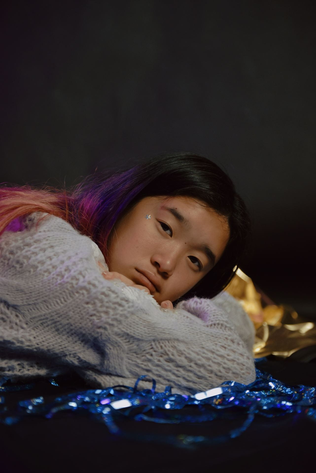
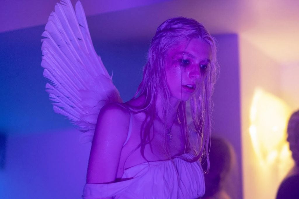
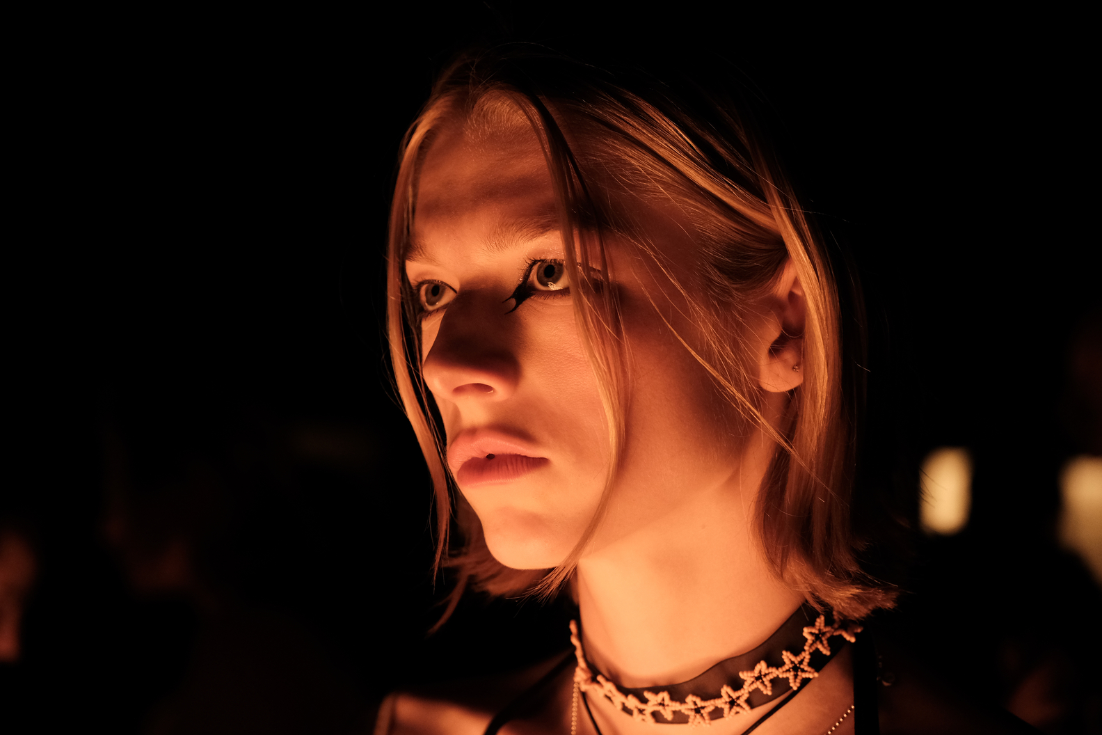
I adopted the style of Euphoria by incorporating similar lighting and compositional techniques into this set of photos. These 33 images are primarily separated into two categories: medium/waist shots and closeups.
For the medium shots, I used a combination of white and blue/purple light to create a sharp contrast, then added filtered and patterned lights to add complexity to the composition. These patterns sometimes permeate the borders between the model and the background, which makes the two components seem to interact more. For medium shots particularly, I tried to demonstrate emotions in a more concrete manner, showing raw feelings through the model’s movements, reflections in the mirror, contrast in textures and colors, etc.
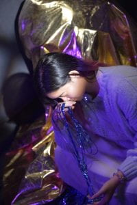
On the other hand, for the closeups, I tried to demonstrate emotion in a more abstract manner. Due to the low exposure of these images (seen mostly at the bottom), there is a blurred texture to them as well. This means that the bright and dark splotches melt together in a more cohesive fashion, and the borderline of the subject against the dark background is unclear. With such features, the emotions of sadness, hopelessness, yearning, and loss are exposed in a less explicit way. It seems more like the general atmosphere of the images that are telling the story.
Some important components that I want to note in order for future photoshoots include:
- The use of a mirror. I really liked how the addition of a reflective surface added complexity and intrigue to the photos. It is as if it made the feelings exuding from the subject more difficult to interpret, as if we are looking at a person’s thoughts through a veil. Of course, it also offers countless interesting angles to shoot from.
- Lighting. We primarily shot using two types of lights: colored lights and the usual warm/cool-toned white lights. For many of the closeups, I turned off the white lights completely, resulting in the blurry texture and the extremely fierce presence of blue lighting on the side of the model’s face. For most of the waist shots, however, I used a combination of colored and white lights, which made the depiction of the scene clearer and the two halves of the image more balanced.
- Patterned/filtered lights. I used two types of filters for the waist shots: scattered dots and more uniform ones. I think the former emits more of a sense of chaos, unsureness, and raw emotion, whereas the latter is harsher, and in a way even more sad. Either way, I will keep this tool in my photoshoot for the final set.
Identity: Post 4
The Euphoria television series is known for its raw depiction of the teenage life, but even more respected for its bold cinematography. It defies the cliches of television photography by presenting more dark environments than light ones, utilizing unusual colors such as blues and purples, and capturing characters at unique angles. With lighting, color, and composition, Euphoria shows characters at their best and their worst, and follows them through a rollercoaster of grief, doubt, fear, loss, anger, and—of course—euphoria.
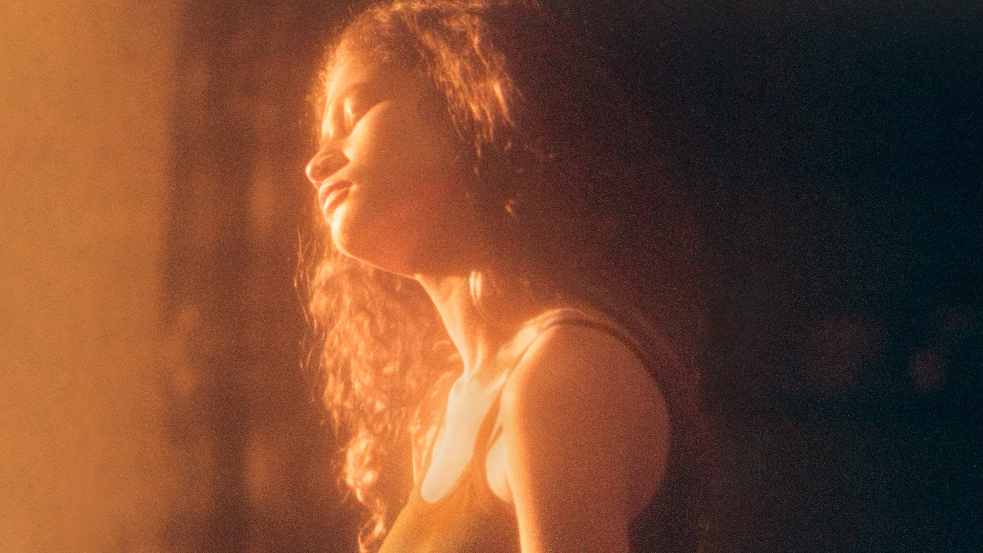
Image 1: This is one of the few stills from the show that uses overwhelmingly warm light. It is representative of a sense of peace and epiphany within the character. This is the moment when the character finally feels cleansed after the storm, and when she comes to accept that this is who she is, this is where she is standing, and this is the future that lays ahead. She is positioned in the middle of the photo, with light in front of her and shadow at her back. Everything about the image is symbolizing her exit from a dark, twisted path and embrace of a difficult yet promising future.
Image 2: The lighting in this image, in contrast with the first one, is suffocatingly cold and blue. It is an extremely saturated tone that makes the viewer uncomfortable; in an environment like this, the character cannot be expected to see many things with clarity, which thus creates a fearful and unsure atmosphere. Furthermore, whereas almost all other faces are turned away from the camera, leaving only the backs of heads and unclear features, the main subject’s side profile is clearly visible. She is positioned in the very center of the frame as well, and she lifts her head slightly, apparently familiarizing herself with this new setting. All of this combines to make it seem as if she is alone and lonely; in this cold, unforgiving light, she tries to find a place for her. The image implicates feelings of fear and doubt very effectively.

 ——————————————————————————————————————————
Photos from a planning session:


Identity: Post 3
Introduction
From losing someone in your life, to letting go of old habits in chase of new ones, loss is never easy. Indeed, explaining the process of grief as an observer or person looking in hindsight is beyond difficult, and can sometimes feel extremely uncomfortable. How are you to feel sincere in “explaining away” someone else’s misery? How could you possibly justify the sleep you deprived yourself of, the days you spent in bed, or the countless relationships you broke off because of the one that you had lost? And it isn’t always about the heavy, suffocating pain either; sometimes, the cold pit of emptiness you feel inside yourself is more terrifying. How can you feel so at your wits’ end when, to everyone else, you seem almost completely normal?
Pain is complex, which is why the statement “you’ll get over it” feels so frustrating. Because amidst all the ups and downs and twists and turns of sorrow, you are never sure if you will “get over it”. Somehow, pain continues to confuse our understanding of emotion, taking it beyond the literal and into a land where only sentimental, romantic, and impractical thoughts persist.
——————————————————————————————————————————
Statement of Intent
This set of portraits will explore sorrow and loss through the famous Kübler-Ross model—also known as the five stages of grief. It is the visual representation of mental processes that occur inside the mind of someone in grief.
——————————————————————————————————————————
Basic Information
Subject: Candy  (thanks Candy)
Setting: Photo studio
Equipment: Colored lights, background paper, makeup
Key themes: Kübler-Ross model, grief, loss, Euphoria aesthetic
——————————————————————————————————————————
The Kübler-Ross Model

This model of grief is well-known in the psychological and psychiatric realms. It traces the complicated footsteps of someone who has just endured a traumatic event, lost someone or something that is deeply intertwined with their lives, or been hurt in any other way that was significant enough to change their outlook on and habits in life.
In my photo set, I will attempt to recreate these five stages in capturing the complete and sophisticated image of a person in grief.
Stage 1: Denial. This is when the pain is not yet fully registered. It’s sometimes described as a state of disbelief or shock.

Stage 2: Anger. One of the unexpected emotions that we gravitate towards when we are in pain is anger. We can end up hurting those around us, or shutting ourselves off from the rest of the world.

Stage 3: Bargaining. “If only I could’ve helped her more.” “If only that one decision didn’t happen.” Bargaining is the stage at which we attempt to be logical—but often fail to do so.

Stage 4: Depression. Perhaps the most commonly associated phase when we think of grief is the long, tumultuous, and painstaking period of depression.

Stage 5: Acceptance. The pain starts to ebb away.

——————————————————————————————————————————
The Euphoria Aesthetic


Euphoria is an HBO teen drama television series that has become extremely popular in the past few years. It is now most commonly associated with the complexities of teenagers’ relationships with their families, cultures, body images, and romantic partners, as well as social media.
Apart from the important themes this series discusses, Euphoria is also known for its incredible cinematography. Defined most prominently by glitter, “euphoric” lighting (especially the use of purples and blues), and the classic teenage characterization (marked by defiance), the Euphoria aesthetic of portraiture holds tremendous power in expressing emotion. It is particularly effective in creating an atmosphere that is irreplaceable by most other types of portraiture.
Whereas the aesthetic is originally used to convey feelings of extreme, most often superficial euphoria, I want to use it to create the exact opposite emotion: sorrow. Indeed, euphoria itself sometimes acts as a mask that covers up deeper feelings of pain and conflict, and these are the feelings that I want to discover through my photo set.


Identity: Post 1
A portrait is defined technically as “a painting, drawing, photograph, or engraving of a person, especially one depicting only the face or head and shoulders”. In the context of photography, portraits are images that show the facial features of subjects; through these features, portraits can also convey deeper meaning such as personality, emotion, experience, opinion, etc.
Interestingly, however, another definition of the term is “an impression of someone”, which I feel actually explains the essence of this type of photography more thoroughly. By taking a portrait of someone, we are focusing all our attention on who they are, what they’ve been through, and how they feel. We utilize the details in their complexion, the way they dress or present themselves, the intensity and direction of their gaze, and the glimpses of their environment in the background—we make use of a combination of all of these subtle traces to discover an incomplete but insightful image of the person. Portraits are all accurate, though none of them are the truth; they might show us the most intense, fleeting, and heated moments in someone’s mentality, or they might do the opposite and capture one of many similar snapshots in someone’s ordinary day.
Despite this, I don’t believe that it is always necessary to portray the maximum degree of detail and sharpness in a portrait. On the one hand, clear images that show every detail possible are able to depict a figure in its rawest, truest “form”. On the other hand, though, certain moods and personas might require using blurred lenses, capturing colors that melt into each other, or even purposefully obscuring part of someone’s complexion. None of these techniques are banned from portraiture; although not all of them are most directly correlated with styles like “real” and “raw”, iff they are used adequately in the correct situations, they can all bring out the truest essence of the subject.
Personally, I think of portraits in a more limited fashion, excluding other types of photos such as selfies,
Shine City Photoshoot: Artist Study
My photo set Industrial:


Without us noticing, our world has been overtaken by architecture. Harsh edges pervade our view, metal structures fill our periphery, and immovable pillars stand proud on our ground; together, they have painted the truest image of a concrete jungle, and are defining not only in their appearance but also in our lives. The cruel refraction of light upon glass panes is unforgiving—it obscures the countless stories of people living just beyond them.
In the first image, the dark blocks of construction block our view of what’s behind, as if proclaiming dominance. We never get to see what’s behind the panes of glass, because our perspective from the ground up spares little information, and the reflective materials do not permit our intrusion. In the last image, the rooms behind the windows lie solemn and forsaken, a mere thumbnail of the substance contained in the building. Only in the wisps of smoke coming out of industrial chimneys can we find a form of release, a source of open air that quenches our suffocation. We see it in the distance, existing but not quite important in this world.
In this set, I utilized a black-and-white color palette to “strip back” the images. Devoid of color, they reflect visually what they reflect practically in the real world: they are cold, hard, and unfeeling. The most noticeable splash of brighter color out of all three pictures is the streak of smoke in the middle, which pulls the viewer’s attention to this element. The architecture, on the other hand, is where most dark patches are collected. Apart from the use of color, I also tried to capture as many straight lines and geometric shapes as possible. For instance, I found corners of buildings where there were obvious, repeating patterns of rectangles and straight borders. Again, the most obvious curved line in this entire set can be found in the chimney’s silhouette. Lastly, all three images included the rule of thirds. This means that there is a comfortable balance in each of the photos, and that they can show architectural structures in a more palatable way. The rule of thirds is a technique quite commonly used in pictures of architecture.
From Gigi Chuang’s Achromatica collection:


https://gigichungphotography.com/achromatica
These images were chosen from the Achromatica collection, created by photographer Gigi Chuang.
There are certain unmistakable similarities between my set and these images. Namely, both the former and the latter are in black and white, with a lot of sharp contrast between the two. As the rule of thirds is commonly used for photographing, it is also present in a lot of Chuang’s images. Both her pictures and mine contain many patterns, especially the repetition of geometric elements (shapes, lines, curves, etc.).
On the other hand, there is an element that appears often in Chuang’s photos that is absent in mine: people. In fact, whereas my set does not include any signs of human life or activity, many Achromatica images have people or transport as their main characters. In this way, it is as if Chuang’s photos show a warmer, more welcoming, and more sentimental side of the cityscape, whereas my set focused on the distance between inhabitants and the architecture.


I love how her photos show the loneliness that I wished to convey, but in a way that does not require architecture to be completely separated from people. Instead, it is the depiction of people standing so close to towering mounds of concrete and compact blocks of geometric patterns—it is this portrayal that shows the isolation. It is the very act of placing animate human beings or transport next to inanimate leviathans—this type of juxtaposition—that highlights just how isolated we are in the modern world. Even on a busy street, each person is on his or her own. We travel through the light and shadows that concrete casts upon concrete, just like we endure the twists and turns of life solo.
Shine City Photoshoot: Post 3


This set of photos was the one that I felt fulfilled the following criteria the best:
- They had the air about them that I had planned out in my brainstorming process, and resembled pieces of inspiration that I took from different photographers. The color, contrast, differences in focus, and “metallic”, sharp feeling all fit in perfectly with what I had imagined.
- They were very complete as a photo set, as they contained tones such as blue, yellow, and green, and presented the contrast between the lack of and extremely clear focus.
- There is something indescribable about these three images, which I can only summarize as a “cool kind of warmth”. There are a lot of sharp edges and reflective surfaces, which should technically make the objects unapproachable, but I still get a sense of the pictures being “inviting” and warm.
In conclusion, this is the set of photos that I feel most confident in titling “Metallic”.
——————————————————————————————————————————
More in-depth descriptions of the set:
If I could, I would give each of these three photos a name of their own.
Reflection
Imagine this as the first phase of entering an urban cityscape: you see yourself in all the cold, hard surfaces of this metropolis, but these translucent, blurred reflections do not show your true self. Instead, you seem to only be able to capture fleeting sketches of yourself—in the elevator, walking down the street, in the taxi.
Disorientation
The slivers of yourself that you collect paint you like chaotic splashes of paint. Eventually, you come to feel as if you are a mosaic of anxiety, hope, stress, joy, self-consciousness, anticipation, and isolation. You enter the phase of disorientation.
Sensitivity
To find the bare minimum amount of security in this city, you hyper-focus. There are routines that each of us build for ourselves so that we feel safer where we are; to control the wide expanse with which we are faced and are terrified by, we limit the area of which we are conscious. It’s a coping mechanism.
Shine City Photoshoot: Post 2
After examining the photos closer, and taking into consideration the photographer whom I did an in-depth study on (Pedro Correa), I have decided on these 10 images as the best out of my previous 30. They all contain a play on colors (such as the repeated use of green, the subdued feeling of sets 1 and 3, and the saturation of set 2), and they fit in one way or another in my vision of combining “architecture”/”technology” with “warmth”.
Possible set 1:


Possible set 2:

Possible set 3:


