Shine City Photoshoot: Post 1
Possible set 1: The element of curtains is used repeatedly in these three photos, and its diaphanous texture makes this set feel almost magical and unreal. The color palette is also generally desaturated and muted; this set can be described as “subdued”.


Possible set 2: These were all taken in the car, and the degree of blurriness gives the set a sense of a “technological fantasy”. The blues and yellows are very saturated, with hints of green making the photos more full and complex.


Possible set 3: On my trip to Shine City, I saw countless red items as CNY is not far behind us. I thought that these elements added the perfect stroke of warmth to the freezing winter day, and made the metallic structures all around me feel less threatening.


Possible set 4: These images all remind me of “industry”. They depict the more traditionally modern sides of architecture. They utilize repetitive patterns and sharp contrast/shapes to emphasize a “metallic” environment.


Possible set 5: The warmth that the ornaments bring to this otherwise chilly setting (the greyish blue sky, the metal pole, and the bare tree branches) is something that I find really sentimental, in a way.


Possible set 6: These are all pictures of figures that look human but lack human emotion. However, their silhouettes still contain a strange type of sentiment that captivates the eye.


Other images:


Abstract Photography: Post 8


Part 1: Basics
5 defining features:
- Use of focus (out of focus, blurry images, contrast in sharpness).
- Warm-toned (oranges, yellows, and reds).
- Contrast between light and dark (especially, the use of lights to create a focus point).
- Interaction between people and architecture.
- Use of straight lines in the composition.
Pedro Correa utilizes these tools to create photographs that emphasize a relationship between architecture/urban features and people. Through the use of warm colors and blurred images (as a result of some type of diaphanous material or an out-of-focus camera), Correa is able to imbue his photos with a sense of warmth, coziness, and comfort. Indeed, despite the city environments his pictures are captured in—which tend to have a lot of metallic material and sharp edges—they still have a feeling of being welcoming and “lived-in”.
This is perfectly aligned with my vision, which is to capture the beautiful and fleeting moments that connect “people” with “places”.
To quote Correa, “It’s my perception of the city that I want to show, the feeling rather than an actual picture”. In this series, I want to document the feeling, the atmosphere, and the “soul” of the city, and I want to do this by putting people in the picture (pun intended).
Part 2: Choose one image
The image that interested me the most was P5. Immediately after seeing it, I was struck by how perfectly this echoed my vision. It depicts a typical city scene, with the object that’s closest to the camera being the cold, rain-stricken glass panes. Turn the lights off, get rid of the misty insides of the windows, and remove all the people, and this image would feel hopeless and unforgiving, but with all of these tiny details—the droplets of condensed water on the window that show traces of liveliness, the bottles on the tables, the conversing customers—this photograph feels warm and welcoming. It is surprising how such features can “bring a place to life”.
One of my favorite things about this picture has to be the colors. In it, we see a lot of black, a splash of blue in the upper right corner, and some white on the left. These darker/cooler tones are in line with the sharpness of the architecture and the sense of city life. However, at the same time, we also find many warm tones. There are yellow/orange lights throughout the restaurant, and the red—which is my very favorite part of the photograph—is absolutely beautiful, because it seems to echo off of walls, glass, and metal structures, bathing the entire scene in a warmth that’s fiercer than yellow or orange. The red seems to emanate a kind of passion and vitality that is so crucial to this snapshot of nightlife.
Part 3: Style
Correa’s photographs are abstract in that—although there are often obvious subjects—the subjects themselves are not the most important aspect. It is the combination of the most essential elements, such as tone, composition, and texture, that makes his images so interesting and full of meaning.
It is exactly this that I love. In the most unexpected places, Correa finds warmth, heart, and a sense of belonging, and he expresses this through artistic elements instead of tangible objects. I hope to do the same with my photos for the rest of this unit, weaving together beautiful structures around the school/798 and cherishable memories or emotions that are relatable to many.
Part 4: Statement of intent (again)
My series of photos will exemplify the modern architectural feats present all around us, from reflective glass panes bordered by hard metal to cement pillars connected to marble floors. I wish to use the interaction of people with such features to reveal their innate “warmth”—indeed, architecture might be much more than cold and “metallic”. Through these photos, I hope that viewers can see what they witness every day from a new perspective, and also be able to project their own emotions onto the locations captured in the images. In the process of creating this series, I will continue to gather inspiration from photos that emphasize the use of color balance, shape, and composition, and those that hold meaning and express emotion beyond the literal depiction.
Abstract Photography: Post 7
Title: Metallic
This series of photos will exemplify the modern architectural feats present all around us, from reflective glass panes bordered by hard metal to cement pillars connected to marble floors. I wish to use the interaction of people with such features to reveal their innate “warmth”—indeed, architecture might be much more than cold and “metallic”. Through these photos, I hope that viewers can see what they witness every day from a new perspective, and also be able to project their own emotions onto the locations captured in the images. In the process of creating this series, I will continue to gather inspiration from photos that emphasize the use of color balance, shape, and composition, and those that hold meaning and express emotion beyond the literal depiction.

Abstract Photography: Post 5
Elements:
My renditions:
 .
.  .
. 
 .
.  .
. 

 .
. 
 .
. 

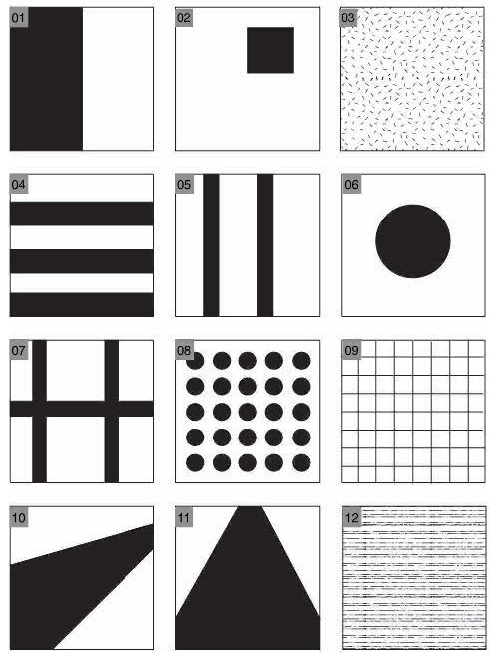
Important notes:
- Contrast in tone between the two halves; utilization of a vertical line in the middle.
- Focus on the square in the upper left corner; other parts of the image are “background”.
- Utilization of pattern to create abstraction; I added a point of focus to this otherwise more flat photo.
- Contrast in tone between each pair of adjacent horizontal lines; I enhanced the feeling of texture by capturing this on a carpet.
- Utilization of two prominent vertical lines to structure the photograph; I chose two more obscure lines when structuring this image, but the effect of balancing the composition is the same.
- Single point of focus in the middle; contrast in tone of the focus point and the rest of the picture.
- Utilization of straight horizontal/vertical lines to separate the image into various sections; I added a component of lighting/tone to make it more interesting.
- Contrast in tone of “holes” and the background; utilization of a pattern for abstraction.
- Utilization of straight horizontal/vertical lines to create a grid in the image; three other components are present in my photograph: the diagonal streaks of light; the white dot of light in the upper right corner; the gray object in the lower right corner.
- Utilization of a trapezoid-like slab to create structure; is more obscure in my photograph because it is used more as an underlying compositional feature than a focus point.
- Utilization of a trapezoid to create a sense of distance, progression, and structure; I used the ceiling to project this, and the image has been flipped upside down to add complexity and better fit the prompt.
- Contrast in tone of various horizontal streaks; I chose a vertical composition instead because I felt that it better depicted the specific scene, and enhanced a feeling of liquid flowing from the top to the bottom.
Abstract Photography: Post 4

Uta Barth, Field #20
The photographer might have been interested in capturing:
- The traffic lights (especially the red lights).
- The abstracted lines from this street scene.
- The contrast between the gray roads and the pale blue sky.
I like the original name of this photograph because it enhances the abstract, removed feeling the image gives off, but if I were the photographer and had to change its title, I would call it “Myopia”…for obvious reasons. In addition to the blurriness of the image, I also think that this name suits it because it evokes a sense of hopelessness, desperation, and discomfort. It makes it seem as it we are looking at this street view through the eyes of a near-sighted person.
Line:
- The most prominent line is the thick black one of the traffic lights. Some thinner, vertical lines reside in the background, providing more detail and organization for the photo. Additionally, there are also curved lines of the pavement and short, horizontal segments of the houses in the far back.
- The complex direction and orientations of the lines make this image more interesting to look at. Since the lines are all blurred, they also strengthen the “pretty” yet chaotic atmosphere of the photograph.
Shape:
- There are very few obvious shapes present in this image. Notable ones might be the red dots of the traffic lights, the rectangular slabs of the houses, and the trapezoid of the building that is closest to the camera.
- These blocks of color make the image more disorienting, and they are part of the abstraction process that lies at the foundation of Barth’s photograph.
Pattern:
- There are no visible patterns, but there is a repetition of the element of traffic lights. We see spots of red in two separate places within this image, which adds a sort of coherence and completeness to the overall scene.
Texture:
- I am not completely sure if this was done purposefully, but there are slight crinkles/creases in this image, almost as if it were a photograph of an already printed image.
- The creases make the image more sophisticated and enhance the generally warm feeling of the photo.
Tone:
- One of the most interesting things about this image is its use of colors and color balance.
- Primarily, one’s first impression of the image’s tone might be “purple”. Indeed, this is because Barth captures such warmth in the colors of the various components in this photo that even the blue sky is tinted maroon. Cleverly, the two colors present that stray most from this “purple” theme—red (lights) and blue (sky)—combine to make purple itself. Thus, the entire image is extremely harmonized and depicts a scene that seems comforting and cozy.
- However, the red traffic lights are noteworthy, for they give a sense of focus to the photograph and add detail to an otherwise “blocky” and very abstract image.
Focus:
- As was mentioned above, the traffic lights are the focus points of the image, not in the sense that the camera was pointed at them, but because they stand out as bright splashes of color.
- Specifically, and very fascinatingly, the clearest shape in the photo is the biggest dot of red light. This is on the right side of the photo, and its presence, in contrast with the indistinguishable features of all other components (the buildings, the streets, the pavement), makes the photograph more balanced in the amount of detail and focus.
Abstract Photography: Post 3
What was the straight photography movement in photography? Why was it popular amongst photographers?
Straight photography is known for its candidacy. Whereas many other types of photography involve editing and manipulation to reach a final product, this movement promotes the rawness and realness of unprocessed images. Thus, straight photography is a movement that emphasizes the camera’s technical capability alone and often results in the creation of “sharp” photographs. This movement is popular for a few reasons.
Firstly, it gave photography a chance to speak for itself for the very first time. Freed from considerations of other aspects such as filtering, editing, and artistry, it allowed photographers to simply focus on the act of using a camera to capture an image.
Secondly, this type of photography upheld that, if you had a clear intention in mind and knew all the settings you wanted to adjust on the camera beforehand, the process of actually taking the picture was “automatic” and replicable. In this way, straight photography underscored the meticulous, conscientious, and systematic approach to constructing an image.
Lastly, many photographers believed that this philosophy highlighted the importance of “decisive moments”, and that it enabled them to capture the most meaningful, purposeful, and significant instances.
What was the Pictorialism Movement in photography?
Arguably the opposite of straight photography, pictorial photography transformed photography into an “art form”. Whereas the former emphasized realism, pictorialism preferred images to look like paintings. It promoted the use of techniques such as adjusting focus, altering tone, composition, and manipulations in the dark room, in order to produce a final image that looked artistic and unique.
How have Edward Weston and Aaron Siskind been influenced by the Straight Photography Movement?
Edward Weston is most famous for taking sharp images that visibly took much effort to compose and prepare for; this is directly connected to straight photography, for his photography stresses “sharpness”, detail, and meticulousness. He also especially favored taking pictures of landscapes and natural features, which is common among straight photographers. An example of his work is Dunes, Oceano (right), an image that does not seem to depict anything out of the ordinary but is still well-known for its use of sharp lines, grainy texture, and contrast in light. It seems almost to have captured one moment in a dynamic setting, which is common in straight photography.
Aaron Siskind is very renowned as an abstract photographer, and his work contributed much to the avant-garde movement in America. One of his strongest beliefs was that photography should be centered around “representation”; in this way, he aligned himself with the philosophies of straight photography. Indeed, he went on to produce many images that “represented” prominent sceneries or iconic natural features. Instead of focusing on the whole scene, he selected the most representative frames and compositions. An example of this is Utah 84 (left).

What makes the work of contemporary photographers Andreas Gursky and Uta Barth abstract? Can they be classified as pictorialists or straight photographers? Explain your response.
Andreas Gursky is known particularly for his large-format architecture and landscape photographs, the latter of which often consist of large blocks of solid color and simple, geometric features (left). One of the traits of abstract photography is its isolation of “fragments” of an untouched, natural scene in order to remove context from the viewer; Gursky utilizes this exact point to capture seemingly unsophisticated and random images of the natural world, so he would most certainly qualify as an abstract photographer. However, I would not say that he is either a pictorialist or a straight photographer. His images are too practical and direct to be described as pictorialist, but they are not practical enough to belong with straight photography—many of his images still involve photo editing and the utilization of artistic elements.
Uta Barth, on the other hand, is famous for her blurry images that convey themes such as optical illusion and perception (right). Again, the abstraction present in her work is very obvious—it is difficult for the viewer to pinpoint the subject or purpose of her photographs. However, I would also loosely associate her with pictorialism, for she uses tools that pictorialists prefer, like adjusting tone and focus, and being mindful of the colors and lighting. Her photos give off an artistic air and are almost painting-like due to their lack of sharpness. It goes without saying that Barth is not a straight photographer; she conveys not practical subjects but abstract ideas.


Abstract Photography: Post 2
line


———————————————————————
shape

———————————————————————
pattern


———————————————————————
texture

———————————————————————
tone

———————————————————————
focus

Abstract Photography: Post 1
“Abstract photography can be defined as capturing images in which the subject isn’t the most interesting element.” Just like abstract photography itself, this definition was discombobulating to me at first glance. If the “subject” is widely known as the “main character” of a photograph, how can one type of photography not emphasize it? It seemed self-contradictory.
However, when we broach the subject from another perspective, this definition becomes understandable. Abstract means “existing in thought or as an idea but not having a physical or concrete existence“. It is a common feature of abstract photography for the image to depict not a solid sense of a “subject”, but an intangible feeling of some sort. For example, instead of depicting a staircase, I might build up a feeling of continuity; instead of including the entire window in my photo, I might choose to emphasize its harsh, metallic lines. Ultimately, abstract photography appeals to broader sensations and sentiments instead of independent and individual subjects.
My definition:
Abstract photography: The use of unconventional and often odd techniques to exemplify a general sensation through an image, instead of a singular subject.
Wrong: Contact Sheet
My descriptions did not fit in the photos contact sheet, so I moved them into a similarly formatted Word document.