Henry

"I have no special talent. I am only passionately curious" - Albert Einstein

Author: Henry (page 2 of 3)

Street: Blog Post 4 – Refined Mind Map

1. DON’T MOVE

  • Stay in one productive spot rather than constantly wandering
  • Let moments come to you
  • Observe patterns and anticipate action
  • Position yourself near janitor closets, security posts, service entrances
  • Wait for workers to enter/exit their spaces
  • Capture repetitive routines (daily arrivals, shift changes)
  • Workers will relax and ignore you if you’re stationary
  • Better understanding of light in one location
  • Can pre-focus and compose
  • Capture natural, unguarded moments
  • Workers become comfortable with your presence

2. FOCUS ON BACKGROUND

  • Background tells as much story as the subject
  • Environment reveals context and meaning
  • Use background to create layers and depth
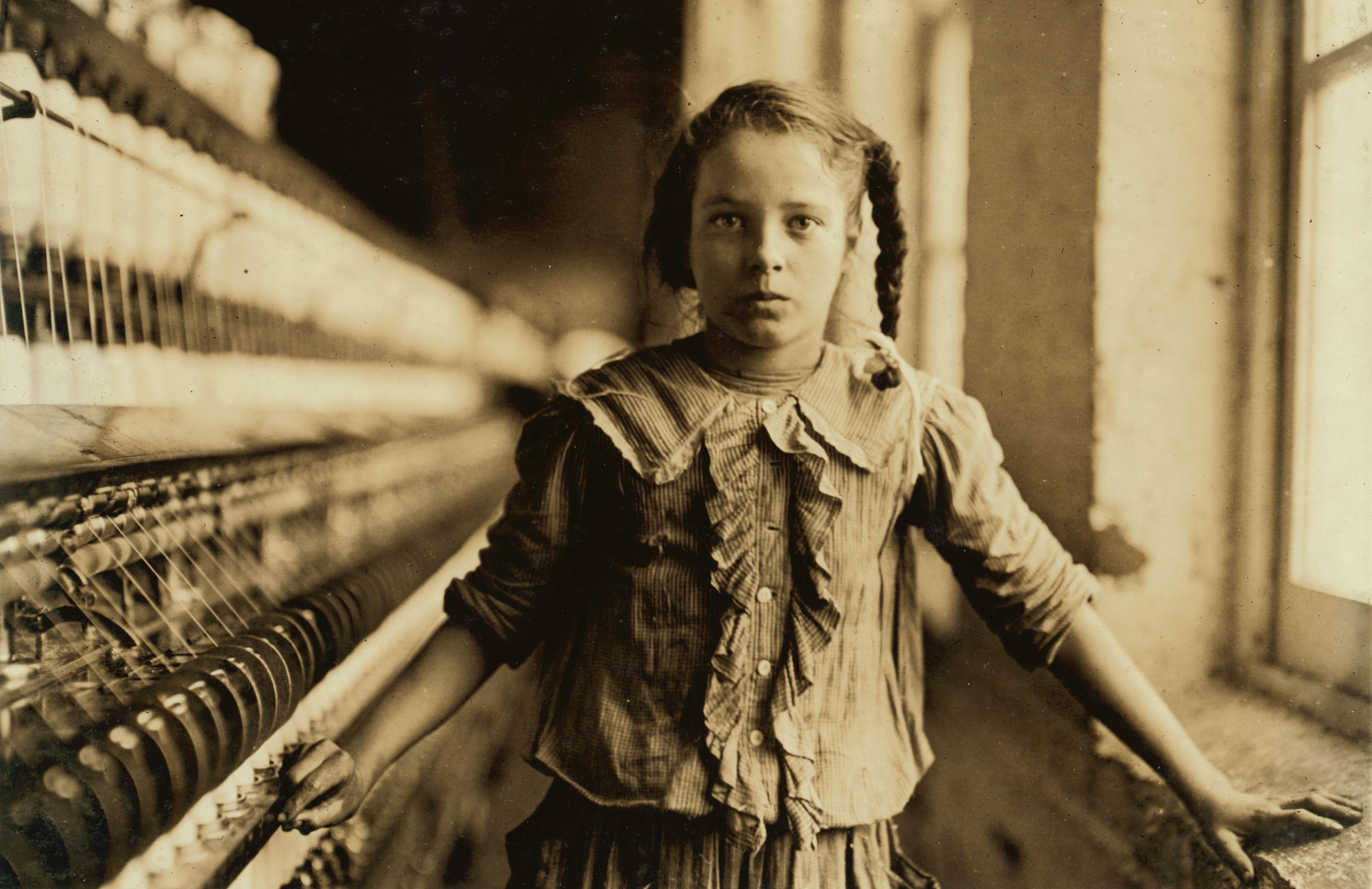
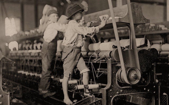
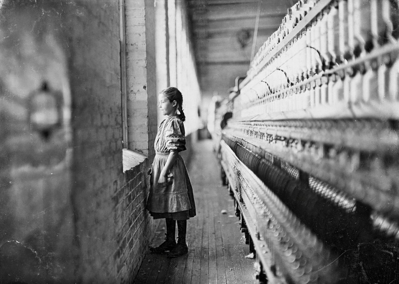
  • Institutional spaces: hallways, service corridors, loading docks
  • Signs and labels: “Staff Only,” “Authorized Personnel”
  • Equipment and tools: mop buckets, cleaning carts, security monitors
  • Architectural mundanity: fluorescent lights, concrete walls, utilitarian design
  • Background shows the system workers exist within
  • Include workplace signage that defines/restricts workers
  • Show scale: lone worker in large, empty institutional space
  • Architectural repetition emphasizing monotony
  • Environmental details that reveal class divisions

3. COMPOSITION

  • Deliberate arrangement of elements within frame
  • Use of lines, shapes, patterns, balance
  • Rule of thirds, leading lines, framing
  • Leading lines: Hallway corridors drawing eye to distant worker
  • Framing: Doorways, windows framing workers in their spaces
  • Rule of thirds: Worker positioned off-center for dynamic tension
  • Symmetry/patterns: Repetitive architecture mirroring repetitive labor
  • Negative space: Isolation and insignificance of workers in large spaces
  • Foreground elements: Shoot through/past objects to add depth
  • Create visually compelling images of mundane subjects
  • Use composition to emphasize worker’s position in space
  • Balance documentary honesty with artistic consideration

4. TENSION

  • Visual or emotional conflict within the frame
  • Something feels unresolved or charged
  • Creates viewer engagement and reflection
  • Scale tension: Small human vs. large institutional space
  • Class tension: Worker in uniform vs. well-dressed passersby
  • Temporal tension: Stillness vs. surrounding movement
  • Visibility tension: Present but unseen, there but ignored
  • Labor tension: Physical effort vs. thankless invisibility
  • Juxtaposition: Worker cleaning luxury vs. their poverty wages
  • Capture moments of isolation in crowded spaces
  • Show workers’ effort contrasted with others’ indifference
  • Uncomfortable proximity between social classes
  • Moments just before or after interaction

5. AVOID DISTRACTIONS

  • Remove elements that don’t serve the story
  • Every element should have purpose
  • Clean, focused compositions
  • Watch edges of frame for distracting elements
  • Avoid cluttered backgrounds that compete with subject
  • Be mindful of bright spots, colorful objects drawing eye away
  • Eliminate unnecessary people in frame
  • Wait for clean moments between distractions
  • Change angle to exclude distracting elements
  • Use shallow depth of field to blur background distractions
  • Wait for cleaner moment (person walking through frame)
  • Move closer to simplify composition
  • Use negative space strategically rather than accidental clutter
  • Worker + their immediate environment = essential
  • Everything else = evaluate if it adds or distracts

6. PERSPECTIVE & ANGLES

  • Camera height and position changes meaning
  • Different angles create different emotional responses
  • Perspective shapes viewer’s relationship to subject

Eye Level:

  • Equality, respect, dignity
  • Direct connection with workers
  • Standard for environmental portraits

Low Angle (shooting upward):

  • Gives subject power, monumentality
  • Elevates overlooked workers
  • Heroic perspective on mundane labor
  • Counters society’s dismissive view

High Angle (shooting downward):

  • Shows vulnerability, smallness
  • Worker diminished by system
  • Emphasizes isolation in large space
  • Use carefully – can feel condescending

Dutch Angle (tilted):

  • Unease, instability
  • System feels off-balance
  • Use sparingly for specific effect

Close-Up:

  • Intimate, detailed
  • Hands at work, worn uniforms, tired expressions
  • Emphasizes humanity and physical toll

Wide Angle:

  • Context and environment
  • Worker within institutional space
  • Emphasizes isolation or scale
  • Shows relationship between person and system

Street: Blog Post 3 – 6 Concepts

  1. Don’t Move

In this image, I sat on a bench in Shine City waiting for a good opportunity to shoot a security guard standing in the corner. I used iPhone’s live feature to capture a person moving in front of the guard, and to me, this image represents how workers like this security guard often are lost in the business of the day, and the blur in the foreground achieves this, barely allowing the viewer to make out the character, dressed in the typical Chinese security guard coat.

2. Focus on Background

This picture was taken of a construction worker walking down the road as I was biking. I like this picture because it just so happened to include plenty of street signs, which I think are correlated to the worker. The green light in the distance seems to invite the worker further down the road, while the split sign symbolizes the worker’s further opportunities. This shows, at least to me, that despite workers in today’s society being undernoticed, they still lead their own lives with their own paths and opportunities.

3. Composition

This images uses composition to frame these workers into the tight space of the crane, and the negative space around them of the wall is crushing, almost pushing in, highlighting how confined society causes workers to be.

4. Tension

I was waiting for a drink order when I saw these two Meituan takeout drivers waiting together, and they looked really close. It was a heartwarming moment and it made me happy, as no matter if they were friends or something more, they share a moment in this image. The perspective of the image emphasizes their closeness, the two almost merging to become a single figure. This photo represents how shared experiences bring people together, no matter in what situation, even for workers that are often undernoticed.

5. Avoid Distractions

For this image, I waited by ISB’s entrance solely to get a photo of workers passing by, and only took the photo when they passed me, as I wanted to capture their backside to show how workers in our society are often faceless and unrecognized, and how they are always moving.


Street: Blog Post 2 – Mind Map & Vision

My inspiration will be Lewis Hine, a photographer whose work emphasized revealing the exploitation of workers in America.

WHO WAS LEWIS HINE?

  • Trained sociologist who became photographer around 1905
  • Worked for National Child Labor Committee (NCLC) 1908-1918
  • Philosophy: “If I could tell the story in words, I wouldn’t need to lug a camera”
  • Believed photography could expose injustice and drive social change
  • Career focus: Ellis Island immigrants → Child labor → Celebrating workers’ dignity

WHAT HE PHOTOGRAPHED

Child Labor (His Most Famous Work):

  • Textile mills: Girls as young as 6-7 operating dangerous spinning machines
  • Coal mines: “Breaker boys” sorting coal with blackened faces
  • Canneries: Children shucking oysters until hands bled
  • Glass factories: Boys working night shifts in extreme heat

Who Was Lewis Hine? In Paris, a Major Retrospective of Social Documentary Photos - The New York Times

  • Street trades: Newsboys, shoe shiners working before dawn
  • Agricultural: Migrant children in cotton and berry fields

Industrial Workers:

  • Adults in dangerous factory conditions
  • Workers dwarfed by massive machinery
  • Long hours (12-16 hour shifts), poverty wages
  • Later “Work Portraits” celebrating laborers’ dignity and skill

Immigrant Workers:

  • Ellis Island arrivals (1904-1909)
  • Families with all possessions, mix of hope and fear
  • Tenement living conditions and sweatshop labor
  • Humanizing immigrants against xenophobic stereotypes

Stanford Professor Sheds New Light on Lewis Hine's Iconic Photos of Child Workers in a Powerful New Exhibition | Cantor Arts Center Press Releases

HOW HE WORKED

Undercover Methods:

  • Disguised himself as fire inspector, Bible salesman, postcard vendor
  • Factories didn’t want publicity about child workers
  • Sometimes hid camera in lunch pail
  • Worked quickly before being discovered and ejected

Documentation System:

  • Hidden notecard in pocket to record details
  • Noted names, ages, hours worked, wages, family situations
  • Combined photographs with detailed written captions
  • Words + images created powerful evidence

Child Labor in America, 1908-1912: Photographs by Lewis W. Hine - Labor History Resource Project

Visual Style:

  • Direct eye contact – subjects look at camera, creating emotional connection
  • Environmental context – shows workspace, machinery, exploitation system
  • Scale relationships – small children vs. massive machines = vulnerability
  • Natural light – authentic conditions, no staging
  • Worked with bulky large-format cameras requiring subjects to hold still

SOCIAL IMPACT

Legislative Change:

  • Photos used to lobby Congress for child labor laws
  • Helped pass Keating-Owen Act (1916) – first federal child labor law
  • Evidence in court cases about working conditions
  • State-level reforms across multiple states

Public Awareness:

  • Exhibitions, pamphlets, magazine publications
  • Made middle-class Americans aware of exploitation
  • Created moral outrage that demanded action
  • Made invisible workers visible to society

Photography History:

  • Established documentary photography as activism
  • Influenced FSA photographers, Dorothea Lange, Walker Evans
  • Created template for photojournalism with social purpose
  • Over 5,000 photographs preserved as historical record

KEY THEMES IN HIS WORK

  • Dignity despite exploitation – Photographed workers with respect, not pity
  • Children robbed of childhood – Innocence stolen by industrial capitalism
  • The human cost of profit – Bodies damaged for economic gain
  • Invisible labor made visible – Society’s dependence on exploited workers
  • Photography as evidence – Visual proof of injustice that couldn’t be denied

HIS PHILOSOPHY

“There were two things I wanted to do. I wanted to show the things that had to be corrected. I wanted to show the things that had to be appreciated.”

  • Photography must serve a social purpose
  • Balance of exposing injustice + celebrating human dignity
  • Empathy and respect for subjects
  • Photographer has moral responsibility beyond taking pictures
  • Visual evidence more powerful than words alone

With His Camera, Lewis W. Hine Changed How We See American Labor

Street: Blog Post 1 – What is Street Photography?

I believe street photography is capturing easily lost moments in real contexts, and in turn making those moments precious by the rarity of said moments. Street photography can show raw, natural emotion without any setup or planning, only through patience and solid vision.

Blog Post 9 – Triptych Eval.

  • I was hoping to create a series of images using reflections that may incite contemplation within a viewer, so that the viewer can only understand the images after thorough examination. For example, I want the connection of the 2nd and 3rd picture to be the staircase, and the gradual transition from left to right is like slowly falling into a mirror.
  • The inspiration for my pictures came from Emma F. Wright, a photographer famous for using reflections in her street or abstract photography, to create detailed shots and create different spaces.
  • My theme was to show another side of the world through reflections, and I think I achieved this through my use of reflection in the first two pictures, but in my opinion, the third photo is an amazing transition after the second picture, showing not only the reflected staircase but the real one.
  • I hoped that these pictures’ connections would not only be seen through the similar color balance, but also the story I am aspiring to tell. I think that I succeeded in telling a story, using similar colors and textures throughout, like the brown of the bricks in the first image, but also the rusted steel of the staircases in photos 2 and 3. The pattern of the brick and texture of the worn stone are present throughout all three images, providing similar elements and connecting the images further.
    • I originally only wanted to capture objects with reflective properties, yet through capturing various images that were reflective, as well as things I found interesting, I was able to construct a more coherent story. I think starting with the water droplet was the best choice, as the mid-splash surface gives a feeling of diving into the image, kind of like the paintings in the game Mario 64.
    • I followed this image with the rearview mirror with the staircase, because to me it gives a feeling of travelling from the further view in the first picture, to a more close-up shot of the reflected world, about to head inside.
    • The last picture is the completed journey, finally viewing what is on the other side of the mirror and seeing the real or reflected world, depending on how the viewer sees it. To me, the final picture gives a sense of resolution to the triptych, completing the journey from one side of the mirror to another, and incites interesting thought in the viewer, as to why the final staircase is behind bars.
  • This work is personal to me because I have always liked viewing the world in different particular ways, whether it be through small spaces, or reflections, whether it be seeing my reflection in a lake, or taking pictures of myself and with friends through mirrors, reflective glass, etc. I think this piece reflects my creative eye for perspective, and I am proud of how it turned out.
  • If I had more time to create my piece, I would have tried to find a better first picture that matches the staircases in the second and third better, maybe using water still, as I had an idea to use a puddle of water, whether natural or of my own making, to shoot a subject through, but my group and I did not have sufficient time to do so.


Blog Post 8 – 798 Trip Statement of Intent – Inspired by Emma F. Wright

Working Title: The Other Side

Message: I want my audience to discover 798’s architecture and atmosphere from a viewpoint that is not their own. Rather than seeing everything through their eyes, I want them to see the beauty of reflection and unique angles.

Audience Response: I want my audience to feel a sense of contemplation and hesitation when viewing my finished product, taking a second to realize the pictures they are looking at rather than immediately understanding them. I wish that just like me, my audience will find different ways to view the world around them, finding reflections and normally impossible alterations from those reflections.

Inspiration: I have always liked to find reflective surfaces and see the interesting things I can accomplish with them, like sticking out half my body to make it look like I am floating, or mirroring hand gestures to make impossible patterns. I really enjoyed Emma F. Wright’s work, and her common use of reflections, which I wish to try to emulate through my photos at 798.

Closing Sentences: Through extra attention to reflective surfaces, I will attempt to capture 798’s industrial yet modern atmosphere through the mirrors of glass, puddles, or windows, showing how the world does not simply have to be viewed in a straightforward manner. I hope my audience can learn to not only use their eyes uniquely, but also their minds, and learn to find different viewpoints to problems, and angles toward life.

Blog Post 7 – 798 Trip Mind Map

Blog Post 6 – Photo Safari

1.

I think that this image does not work quite well for the first element, which I believe may be using lines/tone, yet there are aspects that I also think do work. The metal supports in the window create the divide between the top half and the bottom half, but the subject’s wobbling arms make a blurry, inconsistent line as well. This was the only picture we took that I think worked for this element, it definitely could have been much better.

2.

I really like this photo and the contrast of the white wall with the red corner, and the square window perfectly captures the reflection of a tree. I think this photo works very well because there is not only a blend of shapes (triangle in the top right, square window), there is a mixture of colors. Green, grey, red, and even a little blue from the sky’s reflection in the window. It feels like I am peering into a small dimension inside the wall, and I like the structure very much.

3.

I interpreted the difference between this element and the 12th element to be that this one is more like pattern, as the demo picture has many repeating small lines, while the 12th one is more focused on texture, with more compact, random lines. I chose this picture, and I like it a lot, because of the many chaotic yet similar white protrusions, creating many shadows and highlights, emphasizing the depth of the wall. It may not work as well because it isn’t orderely enough to be considered a pattern, but I can see an argument for the similarities between each protrusion.

4.

We did not take any photos specifically for this element using lines, this was the closest shot we had that worked, the bleachers create depth between the gaps and the seats, this photo is not the strongest but it matches the original image.

5.

This image is of two reflective bars, I think it works well because of the dark curtain contrasting with the reflective silver. I flipped this photo 90 degrees to get the portrait framing, and I like the texture that the curtain provides in contrast to the metal bars’ smooth, reflectiveness. I did not have the bars perfectly centered because I tried and thought it looked much worse, without any depth.

6.

I really like this image because it looks a lot like the Japanese flag, it is of a red sticker in the upper dance studio, and I like how much the red pops with the background. This element is shapes, mainly just the circle, but the way the white rectangle envelops the red adds a lot of contrast. There is some slight cracks and bumps in the wall, which add some texture, while the sticker itself is very flat and perfect.

7.

This image is not exactly like the reference photo, as the reference’s lines are all straight, while the one in the photo are curved. However, I think my photo still captures the importance of the intersections in the reference photo, and mine has considerably more intersections than the original. I think this photo does work because of the parallel black curved lines, and how the two blue lines cut through them. I think the framing and structure could be a bit better, and the glare on the floor is unappreciated, but I like the colors and lines.

8.

I do not like this photo much, but it was one of the only ones with a pattern that fit the reference. The groups of holes are the ones that are meant for the rock climbing holds, but some of them are covered by the holds themselves. The composition feels too messy and not clean like the reference is. If I could have found a spot or time where no holds were attatched to the wall, I could have gotten a much more accurate shot.

9.

I really like this photo, because it not only has the tile pattern seen in the reference, it has abstraction because of the focus not being on the wall, and how the different colors blend into one another. This photo may not work as well, though, because of how unclear the pattern is, and the tiles in my photo are more rectangular than square. Nonetheless, I think this photo is a great example of abstraction and still a decent fit for the reference.

10.

I also really like this picture, it is the shadow of the revolving door leading to the darkroom in the photography area, and it created this really interesting shadow, which I though had an amazing perspective, making it feel like the light part stretches on for much longer than it actually does. It matches the use of lines in the original to create an angled, retreating perspective, and I think it is a great use of shadow to create shapes.

11.

This image was taken of a stairwell, and the reference it is copying focuses on the use of lines, once again, to create perspective and depth. I really like how symmetrical the photo is, and the solid colors creating a canvas for the ceiling light to cast distorted and altering highlights/shadows. This image really shows the perspective of moving downwards, and shows the height of the stairs through the collection of the lines toward the bottom of the stairwell.

12.

Last but not least, this photo is of an almost broken window, and I think the horizontal cracks matches the reference photo, although not perfectly, it is an example of texture, not pattern, as the shapes do not repeat at all. I like how some broken points of the glass make a solid light blue color, while others remain see-through, providing a variety of textures throughout the image.


Blog Post 5 – Aaron Siskind

Aaron Siskind as City Documentarian - The New York Times

I believe that the photographer wanted to use light to show depth, from the doorway where the picture is taken to the long, dark hall where the farthest subject is standing, and even the variously shaped windows on the building. I also think that the photographer wanted to show a contrast in emotion between the two subjects, with one sitting in thought or discomposure, and the other standing casually, relaxed in the hallway, creating a dynamic between the subjects. Lastly, I think that the photographer may have wanted to emphasize the multitude of parallel lines, the ones made by shadows, namely the two diagonal ones formed by the box outside the window and presumably a clothesline, as well as the rectangles of the doorway and windows.

If I were the photographer of this photo, I would name it something along the lines of “Seperation,” as this not only captures the distance and lonely feel of the two subjects, it also applies to other parts of the image, such as the cutoff between light and dark, with shadows crawling in from the left and bottom, opposing the light.

Siskind uses lines to frame his subjects and emphasize light and dark. He uses shapes, mostly quadrilaterals, as a basis for the photo’s structure, and making the round bucket to the right of the door stand out further. There is a pattern in the floor tiles, originally square but seen trapezoidal from the angle, showing further depth. The clearest texture is the brick wall, giving an old and worn feeling. The tone of the picture is completely black and white, with a dark hallway in the building, further emphasizing the depth. Finally, the focus of the image is on the further subject, leaving the close subject slightly blurry.

Blog Post 4 – Formal Elements of Photography

FOCUS – The background of the image is in focus and still, while the subject is moving across the screen, out of focus and blurry. This picture was taken with a lower shutter speed.

TONE – The main subject is enveloped by the blue and white of the bleachers and the wall. The contrast is further emphasized by the subject’s white top and grey pants, making another split of colors in the photo.

TEXTURE – This photo was taken on a low shutter speed, causing the water to look smooth and fluid, yet the rough, porous rocks stay still, leading to a contrasting of textures.

PATTERN – This photo includes a rock climbing wall, where the holds form a dotted pattern that make up most of the picture, surrounding the subject. The subject’s monotone clothing emphasizes the color and placement of the holds.

LINES – In this photo, the dark lines create intersections and patterns, while the wooden floorboards add to the structure showing how the floor is laid out and how the dark lines bend across it.

SHAPE – This photo was taken on low shutter speed, causing the balls to blur. The balls are in all different sizes, and even different shapes. For example, the green ball is warped by the angle of the lens, causing it to become more like an oval.

Older posts Newer posts

© 2026 Henry

Theme by Anders NorenUp ↑

Skip to toolbar