Joseph

"I have no special talent. I am only passionately curious" - Albert Einstein

Photography Set 2, Presenting, and plans for set 3.

Artist Analysis: Anthony Gerace

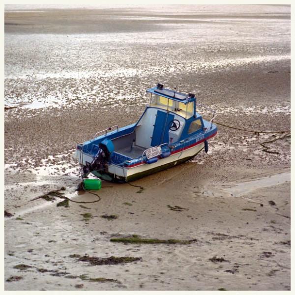
Anthony Gerace is a british artist and a photograph and usually takes photos on discarded items. He also works on typography and draws portraits using repetitive shape of squares as it create mosaics. Most importantly, he focuses on subjects that can cause huge environmental harm and wants the audience to react surprised by the photos. His way of using unique background while taking significant size of the subjects can create his special technique and his own trade mark. Oftenly, he takes photographs from a bright setting , where there are sands and deserts on the background. The color of the background gives the impression of the desolate and the wild situation the human population are at. One thing that I liked from Anthony Gerace’s work was that he does not try to make out the settings we want but he waits until the right timing comes to press the shutter and tries to take photos that were naturally settled. Although I might not create his background, I want to slightly change my vision to show the aspects of neglect to the environment where the audience lives. Similar to the last set but different from Anthony Gerace’s, I won’t limit myself to one specific background, because my point is to tell how much those discarded items can harm the environment.


How does the Photograph from Anthony Gerace inspires me and the visual, technical, and conceptual techniques


First, photos of Anthony Gerace that inspires me to follow his vision:

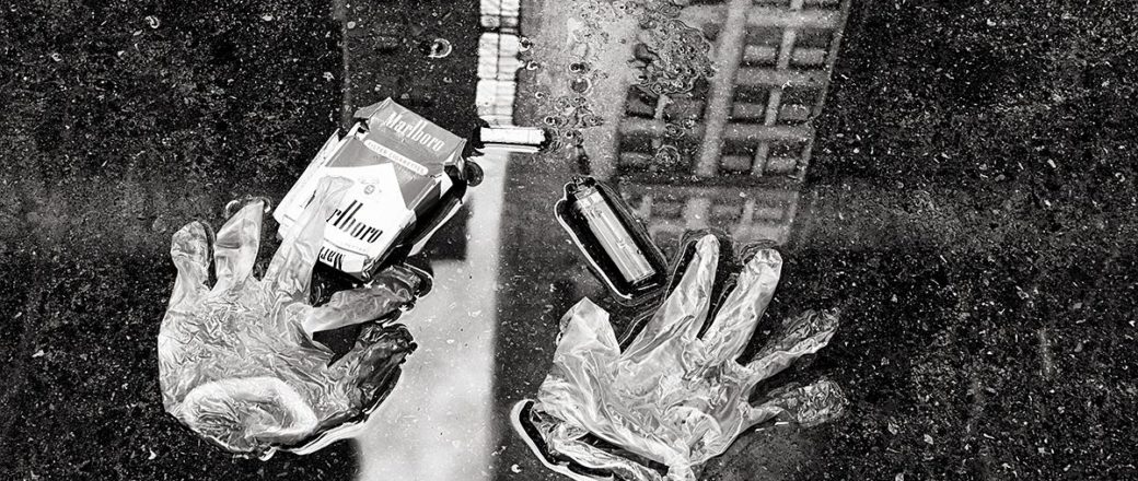
Visual: When you take a look at Anthony Gerace’s photographs, we can visually notice that the subjects are comparatively larger than the ones of Eian Kantor’s work, and the color and the shapes can somewhat create abstract beauty in the photographs. The background, that I have mentioned earlier is somewhat natural and makes the audience to focus on the discarded items carefully.

Technical: The shutter speed and the focus seems just center focused and seems to be normal when taking normal photos one a subject. Background is rather clear than blurred and the exposure and the shutter speed could be low  as these photographs does not capture photos of movements and only non-moving objects.

Conceptual:

As stated above, Anthony Gerace’s work is interesting to me as he uses similar background and attracts the audience. For me, I would try to take the photos inside the background of a school to address what discarded objects that can affect the environment severely. That way, I might point out my unique background.


Critique of Set 2 Image


Yellow Selection:


Green Selection:

Red Selection:


All photos to Yellow Selection:

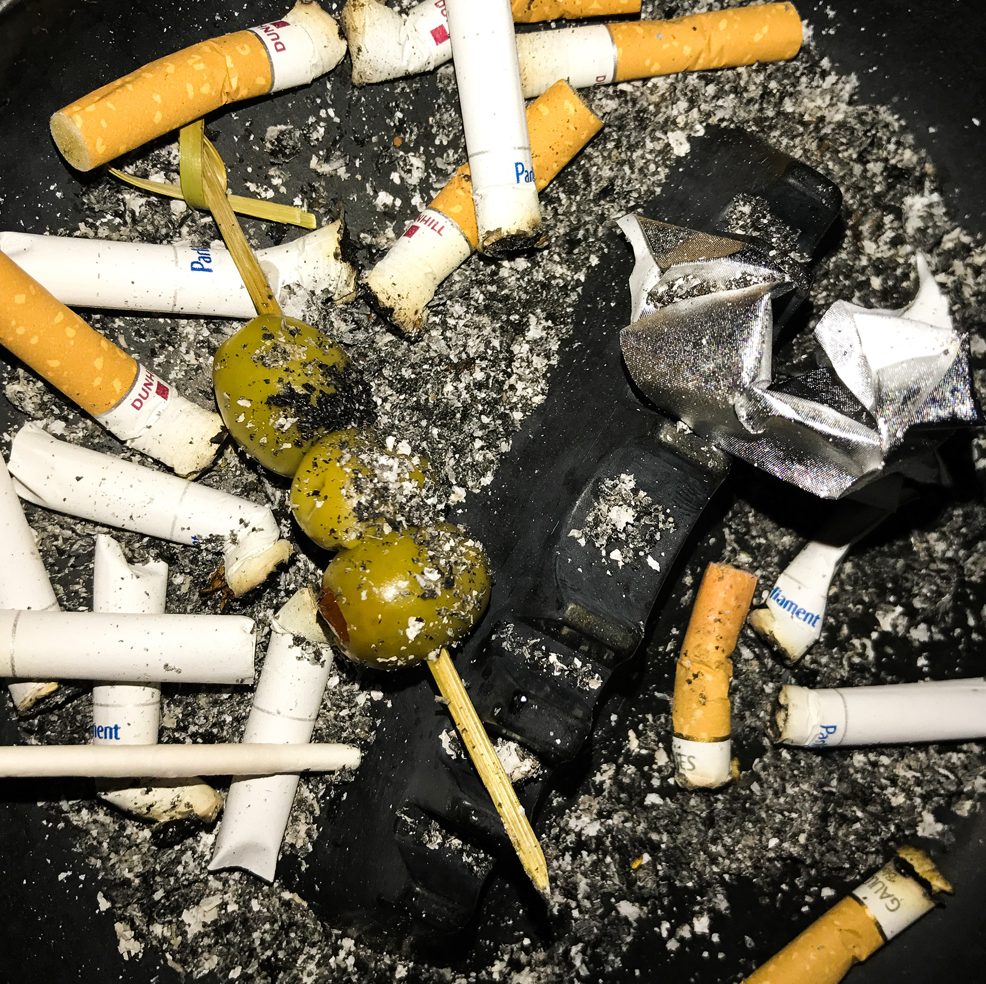
When I had to select the images from all of my photographs, I tried to pick the photos that showed the harmful environmental effects that discarded items can give. That way, I chose many discarded objects that had subjects of general garbage such as plastic and paper waste.  While I picked the images I could conclude that when there was many discarded objects it brought up the massive environmental impact and even created some abstract beauty. For example, if you take a look at photo number 34, we can notice that the number of batteries can give a pattern of repeated subjects that were taken as subjects. It thus gives the audience impression of fear of how many discarded objects are in the school. However, when you take a look at Photo Number 59, there is only a plastic bottle on the cafeteria which does not seem to have a significant impact on the audience.


Yellow Selection to green selection:


After I chosen handful of photographs into my yellow selection and thought what would fit my vision to be in the green selection. I then decided to pick photos that contained the subject of common discarded objects. In normal abstract photography, I would chosen photos that took account of unique subjects that impress the audience. However, I wanted to present all of my photos that combined Set 1 and 2 to create a shape of a trash bin out of photos using Affinity designer. Although I would use the majority of my photographs, I wanted to center the common discarded objects and chose photographs with discarded objects  that all people would encounter those on their daily life.


Green selection to Red Selection

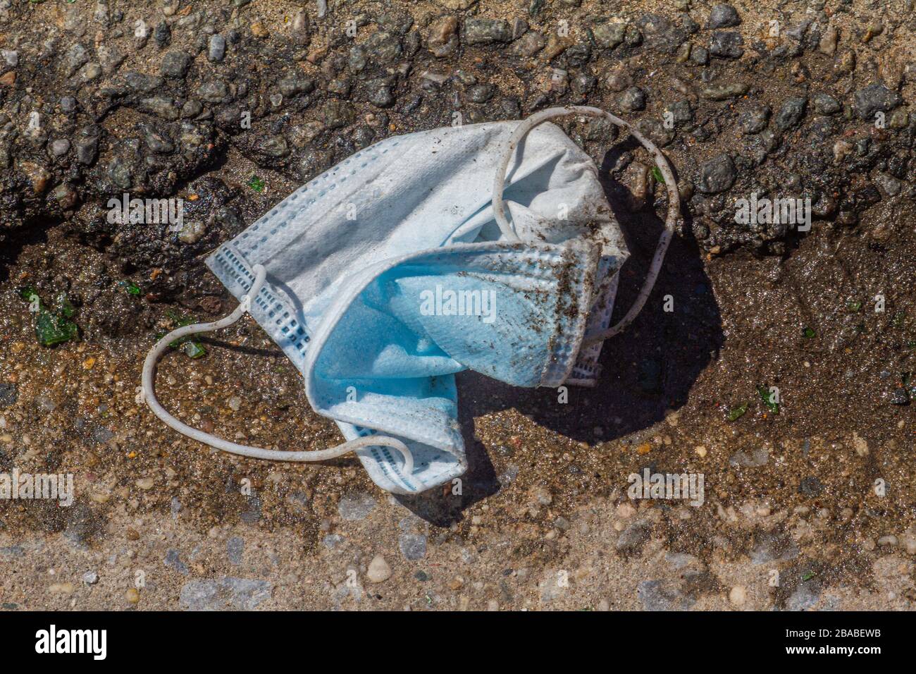
For the last part of choosing my best three photographs, I looked at the aesthetical techniques and beauty that were used in the photograph. As I mentioned earlier, I am planning to present my work with all of my photographs, but the three photographs were the best photos took out of me. First photograph contains the subject of paper objects that were discarded. We could notice a lot of colors of different paper and the shape of the whole bunch is little crumbled. That way, I thought the this photo suited my vision perfectly. For my second photo, it is an image that contains massive amount of batteries in a plastic container. Repetitive object abstractly creates beauty and also gives an impression of harmful effects when batteries rot. The last photo is about two plastic candy wrappers on a table. This was chosen as a red photograph because those wrappers are one of the most common discarded object for students. Additionally, plastic is the most harmful element to the environment as it releases chemicals and takes over 2000 years to rot.

Red photos for better quality

Red Photo 1

Red Photo 2

Red photo 3


Presenting my photographs in Set 1 and Set 2:


After taking all of my photographs of Set 1 and 2, I decided to present my photography into a one list of a paper that could fit in all of the discarded objects. That way, I did not only use my six red photographs but also the photos that were not even in the yellow selection to make a impression of how much discarded objects are in ISB.

This is the outcome of my work using Affinity Publisher:

If you take a look at the screen shot above, the size of each photos are different to give abstract beauty into my work. I originally planned to fit all of my photographs in a shape of a square but I thought changing the size could highlight the different discarded objects that is in the school.

The width of the paper will be 16.4 inches and the height of it will be 31.5 inches.


(Set 3)

Although I could not take photos fro set 3 because I had to prepare for presenting my photos in set 1 and 2, but if I had the chance to work on my set 3 I would still focus on the topic of discarded objects but only focus on only one subject.

For example, I would focus on taking photograph of plastic bottles that were discarded around the school and point out how many plastic bottles are littered. I could have similar topic but have different angles so I could create abstract beauty.


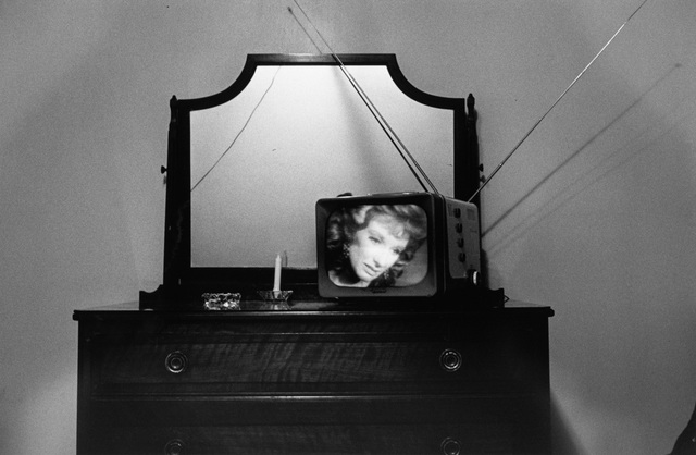
I would have tried to have similar techniques with the work of Morgan Schultz.

Like the image below I could have make the background dark.


Discarded: I on Behance


Street Photography Set 1 Creating

Artist Analysis:

The artist that I am inspired to take photographs are the work of Eian Kantor. Eian Kantor is an artist who have the same vision with me. He does not view discarded items as a threat for the environment but an interesting facet to take photographs. Below is some photographs of Eian Kantor.


As you can see from the work of Eian Kantor, he only take photos on particular discarded items. There are no blurred background, and I cannot describe rather his works are taken in short or long exposure. I could also see that there are specific subject in photos so the audience might not get distracted from other things. When compared with other street photography topics, I think discarded items could be simple because shutter speed and exposure might not matter here since I will be taking photos based on sedentary discarded items. I think these photos can create abstract beauty for the audience, and I really liked the concept because it felt like breaking the prejudice of discarded items that it should be always dirty. Additionally, the concept of taking photos on discarded items are not common technique used by people, and for me I also did not know people can make discarded items beautiful. As I mentioned from the starting point, I am planning to take photos just like Eian Kantor does but on its presenting stage I am going to list my photographs into a line to show its abstract beauty. Eian Kantor’s photographs are like my favorite photos because he does not limit himself on one topic and continues to take pictures. In the last unit, it was a little difficult for me to take photos because the reflection project was little specific. I wanted to take photos based on a broader context, and Eian Kantor’s images will help me to work on my creating stage. Based on those reason, I will relate my vision with the global context of how lot of discarded items are spread out in many places but it can be photographed in a beautiful way.

How does the Photograph from Eian Kantor inspires me and the visual, technical, and conceptual techniques


Eian Kantor’s photographs inspired me to work on my set 1, which was basically running around the whole school and having a scavanger hunt for discarded items. But I did not want to search for trash bins but wanted to take photos that was a little different from “trash”. Eian Kantor’s photographs solidified my vision.

When I take a look at his photographs, I could see that there are not much technical things added to the camera and the shutter speeds looks a little fast. However, it focuses the subject without blurring the background, so I hope to learn this while I am taking photos for set 2.


Critique of Red Images

These are my photos for my Choices choices choices unit:


These are my yellow selection Contact Sheet

These are my green selection Contact Sheet


These are my red selection Contact Sheet


While taking photos around the school, I tried to focus to take images that clearly stated the beautiful aspects of discarded items. I will going to handle the dangerous environmental affects that discarded items can cause in set 2. As I mentioned from the previous connecting part and the starting unit, I am also planning to present my work as a wide, long display of photographs.

All photographs to Yellow Selection

For deciding the photos for the yellow selection, it was comparatively simple for me to filter out the images that did not fit with my vision. I tried to make my projects as the work of Eian Kantor, so I removed the photos that gave me an impression that the discarded item looked exactly like trash and it did not give away any beauty. One example that demonstrates my vision for this process can be explained by choosing photo number 34 rather than photo number 22. If you take a look at photo number 22, you can tell that it is one of the common exmpales of garbage of a food container. However, photo 34 is completely different from photo 22 because it contains both reflection and creates pattern while it is just still plastic bottle caps.


Photo number 34(Please click this link to see photo number 34)

Photo number 22(Please click this link to see photo number 22)


Yellow Selection to the Green selection

Time to choose photos between yellow and green, and it became a difficult decision this time when compared to selecting the yellow selection. This time, all of the yellow selection had somewhat abstract beauty when I looked at them, so I decided to pick out more rare photos by having photos that contain one specific photograph so it did not distract the audience.  For example I did not choose to take photo number 6 to the green selection because the subject of the discarded items distracted even me so much. I thought that two subjects of paper and the shoe was two different elements that should have been taken form different angle.

Photo number 6( Please click the link to see Photo number 6)


Green Selection to the Red Selection


After I have chosen nine photogrphas that have made through the green selection, I had to face myself from the last step to take the red selection. Actually, what I wannt to say is that while I am presenting I am planning to combine photos from some yellow, green, and red selection to create a whole line. Whatsoever, the top three photographs were whether the subject was depending on the size of the photograph. When I took photos toward large subjects, it could easily create patterns, line and shape such as the one for photo number one, as the large metal discarded item was actually creating abstract beauty.


Photo Number one (Please click the link to see what photo one looks like)


Connecting Choices- Discarded Items

The artist that I am inspired to take photographs are the work of Eian Kantor. Eian Kantor is an artist who have the same vision with me. He does not view discarded items as a threat for the environment but an interesting facet to take photographs. Below is some photographs of Eian Kantor.


As you can see from the work of Eian Kantor, he only take photos on particular discarded items. There are no blurred background, and I cannot describe rather his works are taken in short or long exposure. I could also see that there are specific subject in photos so the audience might not get distracted from other things. When compared with other street photography topics, I think discarded items could be simple because shutter speed and exposure might not matter here since I will be taking photos based on sedentary discarded items. I think these photos can create abstract beauty for the audience, and I really liked the concept because it felt like breaking the prejudice of discarded items that it should be always dirty. Additionally, the concept of taking photos on discarded items are not common technique used by people, and for me I also did not know people can make discarded items beautiful. As I mentioned from the starting point, I am planning to take photos just like Eian Kantor does but on its presenting stage I am going to list my photographs into a line to show its abstract beauty. Eian Kantor’s photographs are like my favorite photos because he does not limit himself on one topic and continues to take pictures. In the last unit, it was a little difficult for me to take photos because the reflection project was little specific. I wanted to take photos based on a broader context, and Eian Kantor’s images will help me to work on my creating stage. Based on those reason, I will relate my vision with the global context of how lot of discarded items are spread out in many places but it can be photographed in a beautiful way.

This is the link for my Discarded Item Photography-> https://app.popplet.com/#/p/7377767

Screen Shots Below:


Inspiration from the works of others:

Steve Geer: Discarded | MONOVISIONS - Black & White Photography Magazine

Although Eian Kantor’s subject specific photos in discarded items inspire me a lot, this photo also inspires me. Firstly, the black and white background sets the mood and the tone of this photo dark, and reflection upon water can be seen. There is also a pack of cigarettes and pair of gloves. By setting these various elements, this photo inspires me to combine a lot of factors while taking a photograph.


Statement of Intent

The title of this project is Garbage”?”.  I deliberately added a question mark to rectify my vision to say discarded items are not always an environmental threat but it can be portrayed as abstract and can even become beautiful. Actually, it is not that hard to make garbages to to an abstract structure as I learned a lot from last unit. The question mark also implies the feeling of the audience.

I want my audience to feel amazed. Throughout my last reflection unit, my photos were not as great as other images. For this time, I want to break many biases that discarded items are not clean. It will create a new impression and perception for the audience. My topic would be relatively not familiar, but it would be worth it to try. I also want show without any touches with the shutter speed or exposure (technical things) to express the natural discarded item.

I will get inspiration and develop my ideas by looking for photographs that shows specific discarded items, as I am finding for a variety of kinds. Instead of planning for specific kinds of discarded items, it would be nice to present my photographs as one line to express a lot of discarded items. I will also try to take photos (that focuses on one subject) from a different angle, as the difference of the angle can create significant differences.


Mood Board:

These photos are images I collected because it inspired me a lot. The work is mostly from Eian Kantor and Anthony Gerace.


Anthony Gerace's Seaside Towns Index - Sight Unseen

discarded items - NICKY GCSE PHOTOGRAPHY.

Anthony Gerace's Seaside Towns Index - Sight Unseen

Anthony Gerace's Seaside Towns Index - Sight Unseen

eian kantor - found sculptures


Discarded Items: Street Photography

For my starting point of the Street photography unit, I am planning to take photographs based on discarded items. I do not want to point out the environmental affects of discarded items and want to depict the beauty of discarded items.Those two aspects can be seen as two irrelevant aspects, but I might create some beautiful and abstract photographs. I don’t think that I can successfully focus on what severe consequences of discarded items if they are not discarded properly. I guess that there would be a lot of discarded items to take photographs. For taking the photograph, I want to use a wide angle lense to create a long shot of the photograph. What I mean by this is that when I have to present, I will present a whole line of photographs of a variety of discarded items. I like the topic of discarded item because there are always a variety of discarded items and I can freely creative photographs.

Examples of Discarded Item Street Photography:

Discarded items hi-res stock photography and images - Alamy

99 Examples of Abandoned Photography

As can be seen in these images, discarded items can not only point out the environmental problems but also be symbolic(like the first image, which can be a symbolization for end of covid) or can create abstract beauty like the second photograph. I am excited to go to the field trip and take photos on discarded items. I will try take a wide range of photographs.

Presentation/Final Evaluation

This is the screen shot of my final presentation or a triptych of my reflection unit:

In this unit, I made a triptych based on my photographs in set 2. I did not use photos in set 1 because my focus of that set was too broad and take meaningless photos if it reflected only a little bit of light; in other words, just pressed the button if the subject shined. Triptych is a unique way to demonstrate 3 photos that have very similar pattern or concept with other photos. That way, it can aesthetically appeal to the audience by creating a new, replicated shape and, in this case, effectively show the reflection on light, water, and glass. The use of different subjects per picture might give freshness to the audience so they do not get bored by the repetitive set of same-looking images. I think my overall work fits with the vision of Naoya Hatakeyama as he also uses reflection and creates replica.  Although I used triptych before, I thought it was the perfect process I could input to my images. Next time, I want to make the photos more abstract, or use three photographs that have the same subject and combine it.

Photography 2 Set 2 Artist Analysis/Contact Sheet/ Critique of Red Images

My artist for set 2: Naoya Hatakeyama

Naoya Hatakeyama’s six photographs:


Naoya Hatakeyama is a Japanese photographer who mostly take photos on the intervention on the landscape of the Earth and natural materials. Additionally, he also takes account of reflection on water. As he was born in 1958, his heyday of taking photographs were 1990s to 2010. He presented his work in many exhibitions and awarded of the Photographer of the Year Award from the Photographic society of Japan in 2003. One style that I can notice from Naoya Hatakeyama’s work is that he portraits changes that is happening from the photograph even though it does not move like a video. For example, the waves created from water demonstrates a change, and it reminds me of abstract beauty and reflection.  I generally think that Naoya Hatakeyama both take photos that are reflections of water and light because in order to reflect natural object on water it obviously need light. As can be observed from the photo above, handful of photos have a dark background while it reflects upon water. The lights from the subject can thus create reflection to the water pool. When I look at these images, I feel an impression of majesty and clear reflection. What I mean by the “majesty” of the subject is when a small change is inflicted in this photograph. The first photograph that is posted above, which is incongruous with other images, is actually similar with others since small fragments created by the explosion(?) create beautiful effects like the light and the wave does while it is reflected on water. Since the photo is not targeted on any person, I think Naoya Hatakeyama is trying to create abstractness into his photographs by differentiating the texture. One theory that I can apply to Naoya Hatakeyama’s photos is unique aesthetic value that is not widespread. Hatakeyama intentionally blurs subject, or even take focus of various subjects in one photos. These techniques are hard to find from photography.

Photo analysis

Naoya Hatakeyama-“Ciel Tombé” (Fallen Sky), 2008

Visual: The repetition of water drops that are covering the Eiffel tower is reflected upon the light of the tower and creates a unique pattern of water drops. The water drops are a 2D-shaped  shape in this photograph, while the background, The Eiffel Tower, is 3D-shaped. It is taken from the nighttime of the day, since the background of the Eiffel tower is dark and it lit its light on. Lines are difficult to observe in the image since the water drops are dominant in this image, but the color, mostly orange, of the bright, shining Eiffel tower can be clearly perceived to the audience. The artist uses both bright and dark tone, but it is hard to tell the focus of this photograph since the importance of two substance(objects) apparently seems the same. I don’t think there are rule of thirds applied in this photography, but I am not 100% sure about it.


Technical: One clear thing that can be noticed from this photograph is that the artist utilized great or high intensity exposure to the background so it completely blurs the Eiffel tower. That way, the audience can only predict from its familiar and renown shape that implies the Eiffel tower. The shutter speed seems moderate(250ISO, 1/150) since there are no motions that are demonstrated in this photograph. No idea of the camera type, but it is sure that Hatakeyama used sufficient lightings and exposure to create a photograph like that.

Conceptual:

As stated above, Naoya Hatakeyama’s work is a unique work that gives a feeling of another vision. For this image particularly, it gives me a impression that I am looking the Eiffel tower throughout a window while it is raining. Although the water drops are intentional work made by the artist, the special concept that I feel is that I get a natural feeling and it feels usual.


When I completed set 1, I could not take or think of any ideas that can relate to my concept entirely. That way, I needed a new inspiration l although I wanted to keep taking photographs on reflections on light. I generally thought that reflections upon water cannot be treated as reflection on light since the main “subject translator” comes from the water. However, I changed my opinion and thought again that reflection on water originally comes from sunlight or other sources that emit light. That way I want to take photos like Naoya Hatakeyama, that both uses water and light to create abstract work. In conclusion, I can not wade away from my original starting point, and can take photos that are not theoretically exactly same from the last set, so feel less bored and more motivated.


Contact Sheet Annotations

All photos:


The Yellow Selection:


The Green Selection:


The Red selection:

Annotations:

All photos to Yellow selection:

Although my vision of taking photos that was reflected on light was the same, it was not exactly the same since I also focused on reflection on water so it demonstrated a reflection of an object. The most ideal example I can found from my set of photos is photo 1 from the screen shot above. This photo contains a reflection of my sneakers on a Saturday morning. The bright sunlight and reflective glass window makes another silhouette of my sneakers. That way, it creates a lot of abstract beauty into my project, and it could be selected as a yellow selection. In contrast, photos that were faraway from my vision was removed from the yellow selection. For example, photo 16 did not fit with my vision well mainly because of two reasons: 1, I could not take any signs of reflections, and it could not create abstract beauty. That way, although it is not written on the contact sheet, I crossed out photo 16 and wrote “no reflections, no beauty and can give the audience a big confusion.

The Yellow selection to The Green selection

As stated above, the majority of the yellow selection portraits reflection on something. What decided between the range of yellow or green was the similarity between Naoya Hatakeyama’s photographs. When I observed his renown photographs, it created a replica of a object and the water part of the reflection shone with light. Photo 1,2, and 3 from the green selection fits with Naoya Hatakeyama’s work as it makes another silhouette of the subject, whether it is created by light, water, or both.  Although some reflections were created in photo 14 and 15 from the yellow selection, it did not matched with my artist that I got mostly inspired of. In conclusion, I crossed out photo 14 and 15 and wrote “reflection that is not unique; it does not fit well with my vision that have to match a little bit of Hatakeyama’s work.

The Green selection to The Red selection

This step was the most difficult step to take while I was organizing my photos. The last aspect that I wanted for the photos to be selected as the red selection was beauty. Not only the photos that were selected as red photos had perfect reflection on certain objects, but also it had abstract beauty and pointed out a unique technique while taking a photo. Additionally, another similarity I can found after I collected three photos in the red selection was that there was a specific subject to make audience more focused. In contrast, photo 3 from the green selection have an ambiguous subject that it could not express beauty well as other photos. That way, i crossed out images like photo 3 and wrote “no specific subject, reflection cannot be delivered clearly.


Critique of Red Images

My first red photo, as discussed earlier, portraits my own sneakers that gets reflected by a glass window and sunlight. This photo contains sufficient reflection take take account of two different elements, and creates anew silhouette. I got inspired by Naoya Hatakeyama who similarly created a replica when he used any reflections. Formulating a new 3D-shaped subject is perceived as an unique technique because it is not considered as abstract photography nor street photography. Next time though, I would try increase the shutter speed and intensify the exposure settings of the background to see what would happen if I did that.

My second red photo demonstrates the reflection of water, and the main subject is the building. Although the maximum, vertical point of the real building cannot be predicted, it can be approximately guessed because the reflection can show the audience a wider range. There are four different buildings that are reflected upon water, which creates a diversity of abstract beauty as it create unique shape by each compartment, and the texture of the water generates the audience of a soft impression. Next time, I would try to take photos of the whole building so I can compare the reflected silhouette and the real building itself.

Last but not least, the third photo of my red selection have a lot of subject. The main subject is a person walking down the school hallway. Other photos from above usually utilize water as a reflection tool, but the shiny floor from the school and lightings could create a silhouette of a person even though it was not water. I was very surprised that the floor could reflect the subject very easily, so this photograph made its way to the red selection although the vision was slightly off-wards from Naoya Hatakeyama’s work. If there is a chance to enhance my project, I would try to input more color on the silhouette, so it does not become dim as it is shwon in the photograph below.


Reflect and Share

Give an overview of your design process, sharing the product & your learning

In the three science class time in the design center, me and Alex made the product and learned a lot about energy conversion. On the first class time, me and Alex gathered all the resources we needed to make our model and started to make the main part of the disc launcher. As explained from earlier blog posts,  some resources were replaced to other things because we could not find those in the design center. For example, we decided to replace the top part of the main part that was supposed to be wood to cardboard, since we could not find the precise size and wood was too thick to carve out a space to load the discs. At the last time of the first day, we finished until making the main part of the disc launcher, making a space to attach a rubber band, and sticking two popsicle sticks together to pull the disc and hit them. On the second day of designing, we carved out a cardboard to stick it at the top of the disc launcher, in order to store the discs. Additionally, we connected the rubber band to the popsicle sticks to create potential energy out of elasticity of the rubber band. In my opinion, this day was the most important day while designing this prototype since we tested out the disc launcher before we attached three individual disc launcher into one. We found a huge problem while we tested the disc launcher; the popsicle sticks could not hit the disc very well. Peers and Mr.Landrum gave me tips that were very helpful to improve on next designing class, such as the length of the popsicle stick was too long to pull tightly as I can to hit the disc so we needed a shorter popsicle stick, and the popsicle stick was wavering around the disc so we needed to fix the popsicle stick and make sure it did not move. Based on those feedback, on the third designing class, we used shorter popsicle stick and pasted little pieces of popsicle stick where the popsicle stick moved, and again tested the disc launcher by the peers. After that, we attached three disc launchers into one by using rubber band and popsicle stick. However, the x3 force of the rubber band and the popsicle stick was so strong that it needed a lot of strength to pull the popsicle stick. In general, our plan to shoot three disc simultaneously was failed; we could only shoot the disc one at a time.

Sharing and Learning:

Our model is a disc launcher, originally planned to to shoot three discs at once to hit a wide range of targets. This is a model that converts potential energy to kinetic energy, as the elastic potential energy of the rubber band  hits the disc so that it can be shot to long target. To be more creative than our inspiration, we designed to make three disc launchers.Our plans did not go perfect, as we failed the last step, but we learned that it needs a lot of energy to pull back three different popsicle stick.  Based on the learning, if we have more time to improve on this prototype, we will use stronger and durable substance to attach three disc launchers into one. Additionally, we learned a good way to replace some lack of resources to create our model. As discussed above, we spent a long time to find the exact size, substance, and texture. Although we had some problems, we learned to quickly react and resolve the problem like creating parts using different materials.

Use the rubric & your own success criteria to discuss the strengths and weaknesses of the product.

Explain how and why your toy/device meets the design specifications.

My success criteria while I was developing and planning this model is state below:

  1. Be safe when I am working on this project.
  2. I can combine three different disc launchers into a wide one.
  3. When I pull the rubber band, discs can be shot simultaneously.
  4. Rubber band does not snap
  5. The disc launcher is faster and stronger than the original prototype that we were inspired on but it is safer

I think that our model meets criteria 1,2,4, and partially 5, but does not meet criteria three. For the first criteria, we were concerned about this because we needed hot glue gun and a saw to carve out wood and cardboard to make a variety of parts to create this prototype. We managed to be safe and completed the prototype without hurting ourselves. For criteria 2, we successfully attached three individual disc launchers in to one using a lot of popsicle stick. For criteria 3, we failed on it since it took a lot of force and effort to pull the handle but it could not hit the disc launcher simultaneously. We were also concerned about the rubber band since it could snap after it was attached permanently, so that it could entirely lose its potential energy to hit the disk, but thankfully the rubber band did not snap and managed to hit the disc one at a time. For criteria 5, I think we partially met this one. One change we made while designing  the blueprint was to use cardboard disc so even though it is originally purposed to shoot targets, just in case someone get hit, it could be not painful. However, some flaw I could found while I was testing it to the peers was that if someone poked a finger in to the part where popsicle stick hit the disc, it could damage fingers critically and can impact the audience and the environment.  For improvement, we could have designed a handle to prevent that situation to happen.

Based on these evaluations, one strength I can find on my prototype is that it can successfully convert potential energy to kinetic energy, which was the original purpose. Another strength is that we considered safety problems and creativity, which differs us from the original product where we got inspired from and we could finally create our unique prototype. However, there are a lot of weaknesses that we need some improvement. Firstly, we could not meet all success criteria, which was our small goal to achieve. Additionally, we could not hit three disc at the same time, which was the most important part of our designing process. We did not even resolved all safety problems, that it can lead to hurting the intended audience who are not mature yet, and affect the environment negatively as it can make the audience to carelessly shoot the disc to people.

Other reflections: What are you most proud of? What was most challenging?

I am proud that we managed our time very well that we completed this designing project earlier than other groups so we could improve on our project faster. One challenging part while working on this project was improving on problems, because those were unexpected and we could not reverse the whole process. In conclusion, I think we made a prototype that met most of the success criteria, and I am satisfied with it.


Create and Improve

  1. Reflect on your prototype. What were some strengths? What needs refinement?

Our prototype mostly relied on the blueprint from the previous blog post, but it did not actually completely fits in with it. Firstly, the disc holder (that literally holds a lot of discs) that was purposed to be carved out of plastic was replaced to a card box since I could not found plastic that fitted with the size of the disc. Another change we made from the blueprint was the number of wood plates. To make a space for the disc to stay stable, I needed 2 wood plates per one set of the disc launcher. Again, I could not find two same wood plates, and even there was one, I could not cut the wood to drop the disc in. That way, I decided to cut out the top part of the disc launcher by using card box.

STRENGTHS:

Velocity: One strength of our first prototype was that the rubber band held a lot of elasticity. Since the rubber band was attached on two popsicle sticks, it could maintain huge weights and hit the disc with a high speed.

Durability: The only reason I planned to make the main part of this module was to increase its durability. While we was attaching the top part(Card box) and the bottom part( Wood), the box part was too fragile. However, after it was attached with a glue gun, it became harder.

Safety:

To emphasize the safety of the module, as discussed from the previous blog posts, I changed the plastic discs to a card board disc.  Even though this disc launcher only used to shoot targets, just in case, I took care about safety.

WEAKNESSES

Accuracy: One weakness that was made from the first prototype was the accuracy of the disc. It is not the problem of the disc but the length of the popsicle stick and the area of the space created from the width of the wood plate. That way, the popsicle stick wavered around the disc and could not hit the disc well. Additionally, there were some cases where the disc was jammed inside the module because it was hit on the wrong direction.

Effectiveness:

What I mean by the effectiveness is how many energy to I have to plug in to create single action. For our prototype, it was very difficult to pull three launchers simultaneously because it needed a lot of force. That way, it took a long time to shoot and reload and thus it was very laborious.

Design: Finally, last minor weakness that this module have is design.  Although it converts energy well, it does not seem like a toy. However, this is only a small weakness that other prototype holds too.

2.Outline the feedback you received from peers. Share some changes you will make as a result of this feedback.

As discussed from the last question, when the prototype was tested by other peers, one person mentioned that the disc is very difficult to aim, so it can hit the target accurately. That way, what I am trying to do is to block the empty space of the popsicle stick by glueing another popsicle stick. As can be seen from the photo below, the popsicle stick is now fixed and able to shoot.

Additionally, another problem I found by testing to the peer was that the disc does not launch simultaneously. I would fix this problem by changing the last handle to more durable one so that it is not fragile and can swiftly pull three rubber bands at once.

3. Include photos of your prototype and details of the feedbacks received.

(I could not take photos while I was designing this prototype)


The black circles were refinements we made after we tested with our peers. We cut small pieces of popsicle sticks and stick it to the side of the big popsicle sticks. That way, we could shoot the disc more swiftly and easily since the big popsicle stick did not budged a little.


Artist Analysis/ Photo 2 Contact Sheet and Critique

Artist Analysis: Lee Friedlander

Lee Friedlander is an American artist who took photographs upon reflections on some subjects. He usually takes black and white photos, and is one of few photographers who widely equipped mirrors. His works can be seen in the Fraenkel Gallery. His photos were mostly taken in 1950~1960s, so he took black and white images and sparked to influence future photographers to take photos on reflection. I thinks what is important while I interpret these photographs by Lee Friedlander is that this artist creates so many kinds of topic, so it is very important to not apply theories applied in the past works, and to view his photos as a complete new start.  I learned a lot of things when I was finding my own starting point. I did not want to take photos that other people can easily think of; using water and mirror to reflect something did not interest me. However, I had a solid plan to take black and white photographs. I found Lee Friedlander while I was gathering my initial thoughts. When I searched up Lee Friedlander’s photographs, I was amazed to see that he used light and shadows so well(his photos with mirrors were also impressing)while the majority of his photos were black and white. His techniques were so abstract and even combined some street photography. His photos easily created dark atmosphere and sad emotions; it could be clearly identified when I saw his photos. In the section “Some sub theme ideas to inspire”, I was not that amazed until I saw reflection on landscapes by using  mirrors.  Although I planned to take photos that did not need any mirror, I thought that light can be another way to reflect something. When I scrolled down the page I saw that Friedlander was obsessed with mirrors, and I decided to combine Lee Friedlander’s techniques and reflection on light. In a biographical context, Lee Friedlander is mostly famous for his photographs of various “social landscapes” of America, such as people, streets, and even reflection. One theory I can apply to Lee Friedlander’s images is that these are very aesthetic. In my opinion, Lee Friedlander emphasizes abstract beauty and also reflections.


Lee Friedlander - Artists - Luhring Augustine

Lee Friedlander - 281 Artworks, Bio & Shows on Artsy

Lee Friedlander Represented by Luhring Augustine and Fraenkel Gallery – ARTnews.com


10 Lessons Lee Friedlander Has Taught Me About Street Photography

Lee Friedlander, Photographing the American Psyche

Analysis of the Photograph:

Lee Friedlander, Photographing the American Psyche

[Source: Lee Friedlander, New York City, 1966]

Visual: In this photo, the clearest thing that is clear is the shadow. There are no light since it is a photograph of black and white. However, as stated before, a large shadow of a silhouette of a man can be seen. Although there are no lines that are meaningful, but the shadow creates an outline of one person. Repetition of any objects or subjects cannot be seen in this photograph, but 2D flat, black shadow of a man creates fearful emotion. The texture looks invisible and light; if I touch, it I would feel the soft texture of a jacket that a woman is wearing.  The tone of a shadow is very dark, which naturally creates contrast between the woman and the shadow. A dark color of black magnifies the shadow. No signs of photoshop or image edits can be found.

Technical: The technical use of Lee Friedlander’s photographs can be not accurate, but is expected that Lee Friedlander focused the woman and the shadow. There are no blurry background, which suggests that Lee Friedlander did not make any exposure, only natural focus. The camera used in this photo is Leica 35-mm camera, so it can reflect on mirrors easily. The shutter speed is very fast(120/125?) and it mixes with moderate film(350 ISO?). The image is not cropped nor edited through a program, since it portraits a street photograph of New York City.

Conceptual: The shadow created behind a woman creates an emotion of fear. Low light exposure and full focus on subjects and background suggest that this photograph was taken on a street, New York City. Audience might perceive this image as some one behind the woman is getting near her. I think Lee Friedlander tried to emphasize the evil aspect of the city, as he views the world like that. I think I can develop and can get inspired by Lee Friedlander’s photographs because he easily takes challenges and can make perfect work out of new topics. As I am working on reflections on light, his work can give me a lot of confidence to aggressively take photographs.

(Additionally, the first paragraph about Lee Friedlander contains abundant information about my inspiration on that image and how Lee Friedlander uses various techniques to inscribe a lot of messages to the audience.)

How does the Image Inspire Me?

From my first paragraph,

(“I learned a lot of things when I was finding my own starting point. I did not want to take photos that other people can easily think of; using water and mirror to reflect something did not interest me. However, I had a solid plan to take black and white photographs. I found Lee Friedlander while I was gathering my initial thoughts. When I searched up Lee Friedlander’s photographs, I was amazed to see that he used light and shadows so well(his photos with mirrors were also impressing)while the majority of his photos were black and white. His techniques were so abstract and even combined some street photography. His photos easily created dark atmosphere and sad emotions; it could be clearly identified when I saw his photos. In the section “Some sub theme ideas to inspire”, I was not that amazed until I saw reflection on landscapes by using  mirrors.  Although I planned to take photos that did not need any mirror, I thought that light can be another way to reflect something. When I scrolled down the page I saw that Friedlander was obsessed with mirrors, and I decided to combine Lee Friedlander’s techniques and reflection on light.”)


This is the link of my Yellow, Green, and Red Contact Sheet(It contains better quality than screen shots)

All photos

Annotating my Contact Sheet

When I was selecting photographs from all photos to a yellow selection, I mainly focused on the amount of reflections. Unlike other reflections, the amount of light can be easily perceived through eyes, so I think it was relatively easy to decide from 42 photographs. For example, I eliminated photo 12 and 18 because there was too less reflection on light when compared with other images. I originally thought that these subjects could produce more reflections, but it did not shine. That way, although cannot be seen in the link above, my caption was “too less light exposure on the subject” and crossed these types of photos out.

Photo 12:


Photo 18:

Yellow Photos

When I had to select 9 photos out of my yellow selection, not only I focused on the amount of reflection but also focused on the patterns, emotions, or beauty that was contained there. I think I wanted to select beautiful photographs because I was a fan of abstract photography, and conceptual photographs can attract the audience. It also had similar techniques as Lee Friedlander does. For example, photo 10 from the yellow section portraits an image with a locker lock. Although it can apparently seem to be reflecting sufficient light, it does not have a significant pattern that can make the image more interesting. However, photo 19 is a photo of metal door, which reflects a lot of light and simultaneously creates abstract beauty as there are consecutive horizontal lines. That way , I would annotate photo 10 as “no unique pattern” and cross it out for the green selection.

Photo 10:


Photo 19:

Green Photos

The hardest decision for me was when I had to choose 4 photos out of my green selection. All of the images looked equally beautiful, and there was beautiful patterns on them. So the main point while selecting red photos was how shiny was the photographs. For me, most photographs that contained a lot of reflection in many places looked the most beautiful. It can be repetitive with the first one, but one thing that is different is the strength of the reflection. For example, in the green selection, photo 8 had only small portion of reflection and the strength of it was also weak. The differences between reflection can be seen in photo 7, the fierce red light was so attractive. In conclusion, I would annotate photographs that contains less power of light as “Too weak reflection” and eliminate them.


Red Photos


Red Photos Analysis

My first red photo is a photo of the high school cafeteria. This image contains a lot of reflection on light and its consecutive shape of color creates abstract beauty. These aspects of this image fulfills my vision that it made through the red photos. It also looks similar with Lee Friedlander’s photographs because it takes focus on large subject. The straight lines that the circle light bulbs gives an impression of wideness. I tried to imply the grandness of the reflection by taking photos as many lines as I could. For this image, I did not wanted to create any emotions to the audience but wanted to appeal the grandness of the reflection. However, next time I can blur the background so it can solely focus on the lights, which can create more grand impression.

My second red photo was taken at a staircase made out of metal in the photography classroom. The subject is a handle of the stair. Since it is composed of metal, the handle shines with the reflection of light and it does not seem to be a stair handle. I picked this image because I blurred the background and focused mainly on the subject, so the photo could focus on the reflection of light. I also thought of the abstract beauty implied in this photograph, since the two lines created by the reflection shines.

The third photo was taken from a back stage of the high school theater. The light from the red button glows from this photograph. I personally liked this image the best because the glowing red light mixed well with the dark, black background. Even though I did not blurred my background, audience tend to get only focused on the subject. I was trying to make impression of evil and tried to make it abstractly beautiful. Next time, I want to try to cut or crop the photo of the key since it distracts to concentrate on the subject.

Finally, the last photo portraits an image of a metal door, which was in the theater. One aspect that made this photograph to the red selection was because the reflection was centered in the middle. As can be seen in the photograph, left and right sides of the door have almost no reflection of the light. However, when focused on the middle of this image, a change of color can be noticed. Next time, I want to make the light reflection( increase in light exposure)  distributed throughout the whole metal door.


Develop and Plan

Explain how you used design thinking practices to arrive at this iteration of my device.

I wanted to be creative when I designed a blueprint for the disc launcher, and decided to combine three launchers into one. I thought that I needed longer rubber band to attach all three launcher into one, and considered how many discs I should put in the magazine ( plastic cylinder, in this case).  That way, as can be seen from the photo of the blueprint, I could connect three launchers using high-elasticity rubber band and wood popsicle sticks

Share your design concept.

This is the photo of the blueprint I designed:

Although it can be slight confusing, the materials I need are:

6 wood plates(10cm tall): I need these wood plates to create fortified main body of the disc launcher, the reason why I need six wood plates instead of three is because I need two layers of them in one disc launcher in order to stick the popsicle sticks between them.

9 popsicle sticks(12cm tall): Popsicle sticks have a crucial role in this device because it enables this launcher to shoot. I have to plug in two popsicle sticks between the two layers of wood plate, so I can pull and push the popsicle stick when I want to shoot.

3 plastic cylinder(6cm tall): I need three plastic cylinders to fill and hold the discs. I need a place to hold the discs, like the magazine does in real gun.

9 rubber band: The rubber band is where the potential energy comes from in this device. Rubber band contains strong elasticity and therefore can shoot the discs powerfully. I have to attach the wood plate and the popsicle stick with the rubber band so the disc can be shot. Additionally, when I have to combine three different disc launcher, rubber band can tie them into one.

1 saw: To attach the rubber band on the wood plate and the popsicle stick, I need to make a space to hang it. That way, I decided to cut off some part of the wood plate so it makes a gap to hang the rubber band. I need a saw to cut wood.

1 glue gun: Glue gun is widely used to stick two things together, and in this case it can glue two and three popsicle sticks together. Firstly, I need to fit in two popsicle sticks in one disc launcher to create a space to attach a rubber band. I thought that using a glue gun is a more effective method to combine them together.

Cardboard Discs(0.3cm tall): The cardboard discs are material needed for “bullets”.  I can fill 20 of those discs inside each cylinder.


Develop a detailed plan for creating the preferred design, including success criteria


Firstly, I plan to use materials that are all equal in shape and sizes, to prevent situation where some materials do not fit. My second plan while I am designing this toy is making one disc launcher at a time rather than attaching into a whole. If I make mistakes while I am making the first disc launcher, I can easily revise the problem and  learn how to make it accurately while I make another launchers. However, when I first put in three launchers together, the prototype would not be precise. My third plan is to find a rubber band that contains more potential energy. This means that it have stronger elasticity and can swiftly shoot the disc without pulling it hard as I can. That way, I can reduce the chance of snapping the rubber band. My third plan is to attach the wood plates and the popsicle sticks stronger. I want to make this device that is not prone to damage, simply do not want it to break.

The goal of designing a disc launcher can be considered as a success when I achieve the following criterions:

  1. Be safe when I am working on this project.
  2. I can combine three different disc launchers into a wide one.
  3. When I pull the rubber band, discs can be shot simultaneously.
  4. Rubber band does not snap
  5. The disc launcher is faster and stronger than the original prototype that we were inspired on but it is safer
« Older posts

© 2024 Joseph

Theme by Anders NorenUp ↑

Skip to toolbar