Joseph

"I have no special talent. I am only passionately curious" - Albert Einstein

Category: Uncategorized (page 2 of 2)

Responding

Artist Analysis


Task1

Artist Name: Jose Romussi


Jose Romussi’s message in the photographs is to express different parts in person’s face. What it means that every people are different and those also play with culture. Since my main focus is about my international identity, I can similarly use those techniques to express that every cultures are different. His style is very interesting; peoples’ faces are replaced by colored strings, and some face have horns instead. It is also notable to found out his photos of the people are in black and white, but only their faces are colored. I think what he meant for the audience is to make them focus on colored part, since it is the most important part. Although it could be hard, I would try to use lights to increase/decrease the focus of a subject. These images inspire me because Romussi was the only photographer I could find that dealt with culture.  That way I could see some example regarding with my identity and take photos like him. Cultures are difficult to put those in photographs, and I think Romussi did a great job in expressing those. The content of his photograph would lead me to a correct path to cultures and differences. The photos below are 5 photos that are very similar in content, but it inspires me. As you can see from this photograph, Romussi emphasizes the subject’s musical identity; expressing those with musical notes and words. Although other pictures can seem to be difficult to show identities, I can apply my international identity while using the techniques Romussi uses on face. That way, I can directly show “Me” myself and “Identity” in a photograph, which gives the audience better understanding of my photograph, just like Romussi does.


Task 2- Critique of Images.


The best image of Jose Romussi:

Although the title is undetectable this is my favorite image of Jose Romussi. The main reason why this photograph inspires me is because it describes about the subject’s identity. The subject in this photograph is a male person, with colorful shapes and words included in this image.  What is interesting in this photograph is that it does not look like a photograph. It just looks like a drawing. Romussi states that it is a collage, but although it is closer to the concept of drawing, I want to apply with the techniques and use it when I take photographs. What is noticeable in this image is the black&white color of the subject(person), which controls the light and shadow, and colorful texts and images with a variety of colors. That way, audience can focus on the subject’s identity and creates the mood to wander about the subject’s own identity. The colorful things describe his identity and passion about music; as you can see from this image, there are things like “MUZIK” ,”SING”, and beat drawings in this photograph. That way, I could know that the subject likes music. The setting in this image is undetectable since it only focuses on the identity. Although it could be hard to enable those artistic choices that Romussi did, I will try to make a similar mood to have a clear intention for the audience to feel amused by a lot of cultural identity I have.

Identity-Mood Board+Statement of Intent


Mood Board

(My Mind Map for Part 2 and Mood Board for Part 5 is in the same link)

https://app.popplet.com/#/p/7263890


Statement of Intent

The title of this project is “Parts”. The reason is that my topic is about the world. I wanted to emphasize the different parts of each different countries and there are a lot of cultures to explore. For example, the money each countries use can be different, and the location of the car steering wheel can also differ. I have went to many different countries and found those differences very interesting to me. The cultural issue I want to explore with my photographs is to eliminate all of the cultural discrimination which is happening widely throughout the world. Some people think that some cultures are superior to others and some countries are better than others just because of their wealth and population. I can express that discrimination by controlling light usage, where some cultures get tons of spotlight whereas others are gradually disappearing. I want my audience to feel two important aspects of my photograph: One, variety of cultures, and Two, the discrimination and prejudice towards specific culture. That way, they can have judicial mindset toward all cultures and respect it. I will get inspiration and develop my ideas by looking for photographs that are internationally touching, and, as stated above, variety of cultures to provide new, fresh features.


Unit 3 Identity Mind Map+Focus

app.popplet.com/#/p/7263890


The above link is my mind map


Focus +Image Inspiration:


I want to focus on International, cultural difference around the World. Since I am a diplomat’s son, I have experienced many cultures while going to a lot of countries, and learned that we have to accept those cultures. However, some people think that some cultures are superior than others and treat different races differently. This is cultural discrimination and should not happen. That way, I want to emphasize that every cultures are important and in those cultures we can found out variety of objects that I can take photos of. There are lot of elements to express when I take photos: I can shed light to cultures that look superior, and make other cultures that are negatively viewed dark. Although the topic is different, I want to use photographer Edward Weston’s way of taking photos that is usually black and white to create more focus and make the subject more beautiful. That way, I can easily take photos that can show variety of things that differ because of cultures.


The image I want to focus on is the Color of each countries and cultures. I think the color is the most important when people think of one country or culture. For example, in China, it is red, and in U.S. it is blue.

Abstract Photography Set 3

Triptych

Click the above link to view my triptych


FINAL EVALUATION

My title of this triptych is “The cream of the crop”. I have developed my own individual approach to this title by taking three similar photos that had minor differences with each other. “The Cream of the Crop” is actually an idiom; meaning the best of all. What I tended to emphasize in this triptych was there were one(or more than one) specific features that were interesting. The artist that have inspired me most are Edward Weston and Andreas Gursky. Edward Weston focuses on ordinary main subjects to point out the abstract nature of them, while Andreas Gursky prefers taking a photo of large subjects that contains one simple abstract element (mostly line). That way, I tried to combine the unique vision of two photographers and took three photographs that mainly showed textures. In order to develop my ideas for this project I experimented with the thought that if I had to make a triptych I should make similar but different images. I was so confused in this thought because it seemed so repetitive to put three similar images that had the same topic with the same color. However, suddenly it became interesting to me to point out major or minor differences of the similar photographs. After experimenting, I have brought together the best parts of my previous projects to create my final series of images by determining my direct vision while preparing for this project and examining the three pictures. By examining them carefully, I found the small hole from the first picture, lines on the side on the second image, and consecutive pattern of holes on the third picture. Overall, these pictures created beautiful textures. To create final series of images I worked on various order location I ordered the images using affinity program and trying to crop some part of the image to depict differences of the images. I chose to work like this because that way I can avoid my triptych’s repetitiveness and provide more abstract beauty.  Overall, I think the strengths of the projects are that my photos in triptych are related, not off-topic. I am proud that the three does not look like three separate photos and are a triptych so they share similar and different aspects. The areas that I will need to work on in the future projects are finding different abstract element to focus on. I recently focuses too much on lines and textures that photos that contain other elements seem not good to put them in my “red selection”. In conclusion, I think that I made a decent job trying to take abstractly beautiful photos.


Abstract Photography Set 2

Artist: Andreas Gursky


Andreas Gursky’s best 8 photographs:

.


Andreas Gursky - Space is Time – Sprüth Magers

Stunning new Andreas Gursky show marks reopening of London's Hayward Gallery | Creative Boom


Andreas Gursky is a photographer who takes abstractly beautiful photographs on lines and big subjects. He emphasizes unique pattern of lines in the subject which is unexpected. As stated above, Gursky takes photo on enormous subjects such as buildings, market, or a beach. in order to fit the massive scenery of the subjects, he tends to take pictures from the sky. That way, it is impossible for audiences’ point of view to take pictures like that. Likewise, Gursky thinks that “More bigger, more better” and keep taking pictures that are enormous. One aspect that I like of Gursky’s technique is that the subject is not narrowly limited. Gursky only focuses on the size of the subject and one abstract element: lines. He does not care about whether the photo is colorful, plentiful in terms of abstract elements, or blurry. Consequently, that mindset gives Gursky a thought to take many pictures(whether good or bad) which increases his opportunity to have a lot of abstract photos.


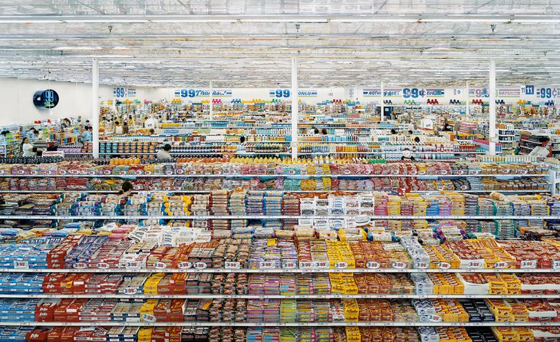
Andreas Gursky-“99cent I”2001


One photo that is most interesting out of my vision is 99cent I. This photograph is a photo of a common grocery store. Audiences might think that this photo does nothing with abstract photos. However, it is shown in this photo that there are a bunch of patterns and line. Commonly, grocery stores organize the product horizontally or vertically, which makes a line that have the same shape and color. As a result, it creates a beautiful array of patterns every column. In my opinion, the author might have chose the title 99cent because on the top of the photo there are a sign of discount, with the word 99 cent in it. The title is also abstract because there are three signs. What I found unusual about the photo was that the subject was ordinary and large. Grocery store is too common; it can be found anywhere, but it was special to express beauty through an ordinary and large subject. By the way, 99 cent is one of the most expensive modern photograph ever sold. In this photograph, I think pattern is the key in this photo. In every column, there are same products organized one way. It creates a variety of colors and patterns which are not repetitive but unique one by one. What I like about this style is that the photo was slightly taken high. I want to adapt to his unique location of the camera to make my own photograph way more abstract. This image inspires me and gives me confidence to take pictures with ordinary subject. It also inspires me about how would I take photo from the sky.


Photographs:


All photographs(31 photos)


The Yellow Selection(20 photos)


Out of 31 photos, I selected 20 out of those. My main vision in set 2 was to focus on big subjects and think free of elements while taking pictures. Although there are several small-subject pictures, the majority focuses on buildings, roof, floor, or wall. Although I did not focused on formal elements, I suddenly realized that there were unique patterns and lines in the photo, making me feel relieved that I was taking abstract photographs. There were a lot of situations like that, abstract elements coming out from where I not expected. For example, in this selection, there is a photo of a road. This was taken from the school bus, trying to fill the photo with its massiveness. However, the bus was too fast and my phone was shaking. I took the photo anyway, and then abstract nature followed. Shaking phone actually blurred the lights  can created consecutive pattern of red headlights. That way, that inadvertent photograph made it to my yellow selection.


The Green Selection (9 Photos)

Out of 20 yellow photos, I chose 9 out of them. My visions did not alter. What differentiated between the yellow and green was the abstractness of the photo. Although my vision was very similar to the artist I chose from this set, Andreas Gursky, I realized that it is important to take abstract and strange photos. That way, it can be seen that the subject of the green photos generally decreased in size. However,  the abstract nature of the photo it contained led me to choose more beautiful abstract photos rather than only large ones. It was so hard to choose between the snare drum photo and the leaf floor photo. The floor was way more massive than the drum, the element the drum contained(circular lines and patterns, or even texture) seemed so beautiful to not be chosen in the green selection.

The Red Selection(4 Photos)


The red photos are my best four photographs from my entire set. That way, I will write about why I chose these photos individually.


The Building Photo

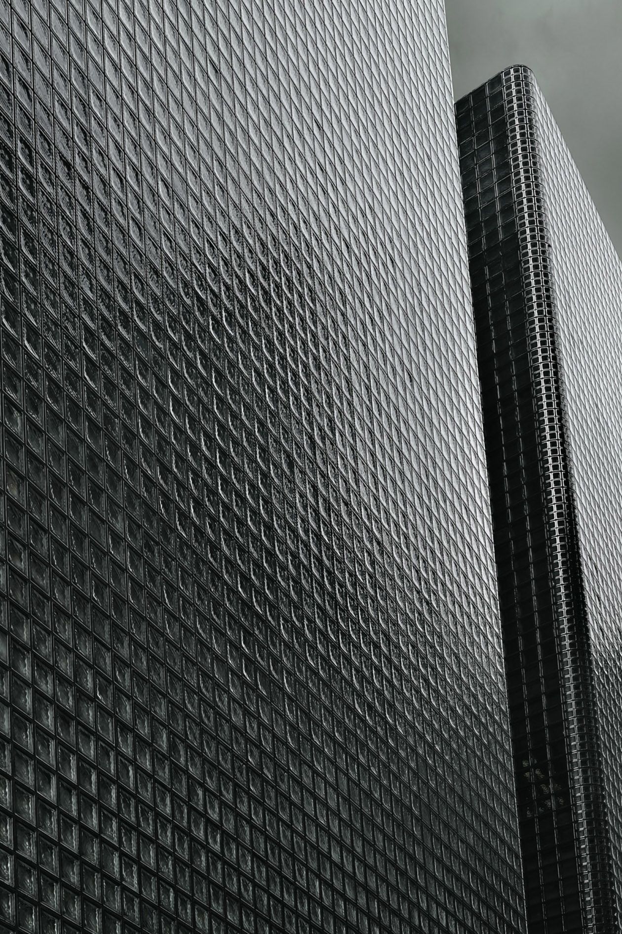
This photo had the strongest correlation with my vision. My set 2 artist Andreas Gursky often takes photos on buildings that contains unique lines and patterns. I had no time to take photos; making me to take the majority from the school. Likewise, his photo is a outer layer of the school, near the dome. The sharp, versatile lines were all  pointing to the sky, creating abstract point in the photograph.  Additionally there is another yellow layer of lines from the second section, providing new abstract beauty to the audience. The subject was large, and the element was clearly and gracefully showed in this photo. I think this is the perfect photo that fits with my vision.


The RGB

RGB is hard to observe from our naked eyes. What we see from the Macbook is made out of RGB pixels. However, as I zoomed my phone on my computer, RGB showed up. What makes this photograph more beautiful than other one despite the simple repetitiveness of the photo is that out of an ordinary subject, there is an abstract pattern inside.  This RGB photograph can be expressed as rare because it is impossible to observe with bare eyes. That way, the speciality of this photo made its way to the top four red selection.


The Radio Plate


The main subject of the third photograph is a radio plate. I took this photo in the theater. When I took the photo, it correlated with my vision since it was huge, however, I disliked disorganized elements jammed in to one object. What I mean is that from set 1, I found myself to get more attracted when there is only one, specific element in the photo. That bias led to me to the thought of not including the photo in the red selection. Nevertheless, I gradually realized that the elements here were well organized and actually was a good photograph.


The Water Droplet


This photo absolutely have no relationship with my vision. The subject is a tiny water droplet from a 550ml water bottle, although I tended to take big photos. However, the white background occurred by the white wrapping paper and reflection of the light added abstract nature to the water droplet. Furthermore, there is a consecutive pattern of lines at the top and the bottom of the photograph, reminding the audience the existence of a formal abstract photo element.  In my opinion, this is my best photo when regardless of the vision I focused on this set.


In conclusion, my main focus was to have similar vision as my set 2 artist: Andreas Gursky. That way, I took photos that contained large subjects and lines. What I really liked about this vision was the loose focus as I mentioned at the top. It actually gave me a broad way of taking beautiful abstract photographs, for example the water droplet photo. In contrast, I really need to improve on narrowing my vision for my next set. I will learn how to fill the large subject  in a tiny camera, and how can I edit photographs. That way, I can produce better photos.


Mind Map+ State of Intent

Statement of Intent:


Dark glasses


My message of this triptych means that the abstract photographs can be observed different, depending on the place audiences are looking at. Many people perceive the information from the photograph too directly, which became a “stereotype” while observing the photographs. I want the audience to look at this triptych and go on, “What is that?” to improve their skills on observing abstract photography in a more unique way. For my inspiration, “Pepper” from Edward Weston was so interesting to me that I did not even think of it being a vegetable. In conclusion, first watching how to observe pictures more abstract may lead to being an effective photographer.


Mind Map Popplet Link: https://app.popplet.com/#/p/7210560     (In case the link doesn’t work, there is a screenshot bottom )


Photo Safari

(The contact sheet is submitted in other attempt. I could not post it into this blog because the size was too big. Sorry)


  1. 1: line, shape2: shape3: pattern 4: shapes 5: lines 6: shapes 7: lines 8:pattern 9: lines, shapes 10:  shapes, patterns11: shapes, patterns 12: lines

2.


Paul Strand(Respond)

1

2. Paul Strand focused on patterns, shapes, lines, tones; pretty much everything in the elements in abstract photography.  The photographer did not focus on one thing.  He used light and shadows to make shapes and patterns

3.  “ The Gap” because the shape produced by the gap and light creates a beautiful combination of elements.

4. One thing that seems unusual is that the photographer did not had a clear subject. My opinion is that Paul Strand thought having an unclear subject would be more better to express the photograph more abstract.

5. Paul Strand used many features such as lines, shapes, patterns, tones, and focus. By depicting multifarious facets, he provided more beauty in to the photograph.

6. One thing that I like from this photograph is that he took a photo of the most foundational elements in abstract photography, which created a simple beauty.


Elements

  1. Formal elements are ways to emphasize the photograph  such as lines, shapes, pattern,  texture, tone and focus. Using those elements artists can express beauty in abstract photos.

2.line: element that can horizontally or vertically expresses movement or direction of a photograph

shape: The most fundamental element to convey the nature of the subject and answer  questions about how does they interact with the surroundings.

pattern:  is a repetition of shapes or textures that creates an organized rhythm.

texture: the feel, appearance, or consistency of a surface or substance

tone: the brightness of a photograph

focus: the sharpness or the dullness of the subject

3 lines-> from masterclass.com

Shape:

from camorabug.comPlaying with Shapes - Camorabug


pattern:

Done for the Season by Andrew Morrell Photography

How Patterns Can Have an Awesome Impact in Your Photography | Light Stalking


texture:


Claire Woollam Brick.jpgClaire Woollam from The Digital Iris.

tone:

moneymakerphotography.com

How the Right Tones Effect Your Photographs | Will Moneymaker Photography

focus:

Harold Davis from photo.net


4. A lot of different elements can be used in every photographs, such as lines and textures, or shapes and patterns. Actually, it is even more difficult to only use one of the elements one at a time. For example, a photograph of a building would naturally contain  lines, shapes, and textures.  By using a lot of elements, the photograph could contain more beauty.

Researching the Starting Point

  1. Photography can change out relationship to things by expressing beauty to things that we thought it was not as impressive to be utilized as a photo.
  2. Pictorialism is an approach to photography that emphasizes beauty of subject matter, tonality, and composition rather than the documentation of reality.
  3.  Abstract photography is an absurd but unique and beautiful way of art. Abstract photography is so difficult to comprehend for the viewers and even impossible to perceive what the subject is. However,  viewers cannot deny the fact that the photo is attractive.
  4.  Albert Renger-Patzsch was a German photographer associated with the New Objectivity.
  5. Albert Renger-Patzsch preferred taking photos of many repetitive subjects.
  6.  Maybe he thought that there are so many things in World are beautiful to take photographs
  7.  Because he thought that straight photography would depict  a scene in sharp focus and can emphasize the photographic styles.
  8.  Cabbage Leaf,  Pepper
  9.  He took pictures that emphasized textures and lines which showed gracefulness in straight photography.
  10. Uta Barth, Andreas Gursky
  11.  Those artists’ made their work abstract by making the whole photograph blurry. That way, their photographs can be stated as straight photography.
Newer posts

© 2025 Joseph

Theme by Anders NorenUp ↑

Skip to toolbar