Joel Meyerowitz is a famous American photographer who is known for pioneering the use of color in fine art photography at a time when black and white dominated the art world. The unique style of photography had helped Joel Meyerowitz to vividly captured the energy and diversity of the life in New York City during the 1960s. These photos were being shown with different colors, which had helped to present a powerful and beautiful visual effect comparing to the black and white photo.
The photography style of Joel Meyerowitz’s was mainly focusing on the masterful use of natural light and color; the unique style had supported him to capture fleeting, candid moments of daily life, especially the scenes on urban streets. Joel Meyerowitz’s street photography reveals on the subtle details, humor, and the dynamic interactions of people, which often described the sense with eroticism and mystery, he emphasizes the importance of multiple focal points within a frame, allowing the audience to explore through every detail rather than focusing on a single subject. Overall, Joel Meyerowitz has worked in various styles, from quick street shots to large, detailed landscapes and city views, showing his adaptability and deep connection to his surroundings.
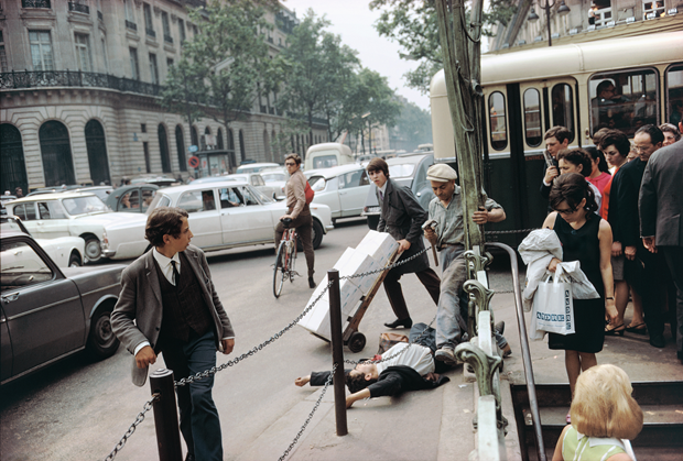
The photograph above captures a dynamic scene on a bustling street, where individuals exhibit a range of actions and expressions. The center of the composition is a figure dramatically sprawled on the ground, drawing immediate attention and creating a striking and surprising atmosphere. The surrounding background, characterized by a busy thoroughfare filled with staggered cars, reinforces the sense of urban activity. Moreover, the color palette further enhances the visual impact; the background features lighter hues, while the foreground is dominated by darker shades of gray, black, and red. This contrast not only highlights the central figure but also evokes a complex emotional response, merging the vibrancy of city life with the gravity of the moment. Overall, the image effectively conveys the interplay between individual experiences and the broader urban environment.
PHOTO SET 1
CONTACT SHEET
The set of photographs that I captured during the Shine Hill trip and school scenes depict the daily lives of people. Through this series of images, I aim to draw connections to the work of the photographer I researched, which is Joel Meyerowitz. The pictures showcase various elements, such as movement, posture, and the different style of color within each scene. Additionally, I had incorporate different techniques into the images, which was what I had practiced during my classes, allowing me to convey deeper emotions and highlight the nuances of daily life in Shine Hill.


Yellow Tag
From the original contact sheet, I selected 20 images for further consideration, marking them with yellow tags to create this contact sheet. The yellow tag contact sheet mainly indicate as a curated visual narrative, which can be present by the composition to convey a cohesive story through deliberate framing, lighting, and perspective. Each photograph contributes to the broader context by highlighting the key visual elements and important details. The photos not only documents the daily life of Shine Hill but also engages with the stylistic influences of Joel Meyerowitz, specifically through the observational depth and use of color. 

Green Tag
Furthermore, I selected 10 photographs and marked them with green tags to create a separate contact sheet. Through this contact sheet, I am looking forward to the focus on the composition and dynamics within each image, analyzing how these elements shape the emotional tone and narrative intent. By examining structure, movement, and visual storytelling, I aim to refine the mood and uncover deeper thematic layers within the photographs. The images emphasizes the moments of interaction and environmental relationships, which reveals how subtle gestures and spatial arrangements contribute to the overall narrative. This highlights technical execution and strengthens the conceptual foundation of the series, allowing me to explore and build on interpretations of daily life in Shine Hill.
 Red Tag
Ultimately, I selected 3 final images for my last contact sheet, which I marked with red tags. This curated selection focuses on the emotional resonance and chromatic qualities present within each photograph. By using the editing tools that is available on my iPhone, I applied subtle filters and vignettes to enhance the images’ atmospheric quality. These adjustments serve to intensify the emotional depth and visual cohesion of the series, which support me to conveying a more somber perspective on daily life in Shine Hill.

Evaluate 1 Image
Overall, by reviewing all the photographs I captured during this unit, I have identified one image that stands out as the most compelling. The composition centers on a male figure with his hands pressed to his temples, his posture conveying clear distress and anxiety. Beside him, a woman gazes forward, her expression and stance suggesting deep contemplation. Both of the two character project an unmistakable tension, reinforcing the photograph’s somber tone. Additionally, the image’s color palette further amplifies this mood. Dominated by cool tones, the photograph evokes a sense of unease, while the left half introduces a subtle contrast through warmer, lighter colors. This deliberate chromatic tension not only enhances the visual dynamics but also deepens the narrative undercurrents of apprehension and concern.

PHOTO SET 2
Vision
The vision I have conceived for this series of photographs aims to depict a positive and tranquil atmosphere for the people of Shine Hills. This will create a deliberate contrast with my previous collection, which employs brighter and warmer tones to convey its message. Additionally, this vision aligns with my selected photographic approach by highlighting the subjects’ actions and evoking emotion through color palettes.
Yellow Tag
For this contact sheet, I’ve chosen multiple shots with the same moments. Through these photos, I aim to emphasize the characters’ dynamic actions and postures, the various poses shows a strong visual appeal, which can effectively conveys the emotion through movement and enhancing the storytelling of the scene.
Green Tag
For this contact sheet, I aim to select photos that can convey deeper meanings and ideal scenes. The ten photos I chose each feature unique an lighting that highlights the main subjects within the images. This lighting effectively reflects the emotions present in each scene, which helps me to determine the images that I need. Moreover, through this round of the selection, I also focused on the different techniques that I used through this trip, the various techniques allows me to capture the images in different angles, which may also creates a unique focus point.

Red Tag
For the final round of selection, I chose these three photos to represent my final photo set. I aimed for richer and brighter colors, as they help create a more positive atmosphere. This choice not only connects with the research on the photographer’s unique techniques and color palette but also portrays a more dynamic and engaging scene for the audience, reflecting a sense of peacefulness.

Evaluate 1 Image
I identified the image above as the most satisfying in this photo set. It presents a harmonious composition, with the child positioned on the left and the doves on the right. The child’s engaging posture, as they feed the birds, effectively conveys emotions of happiness and peace. Additionally, the lighting in this photo enhances its overall representation. The natural light coming from above creates a sunny atmosphere, highlighting the subjects and enriching the colors. This vibrant color palette emphasizes the characters, giving them distinct personalities, allowing the image to present an vivid effect.


 Composition / Technique – Do all the elements of the frame support the subject, or are there distractions that take away from the strength of the image?


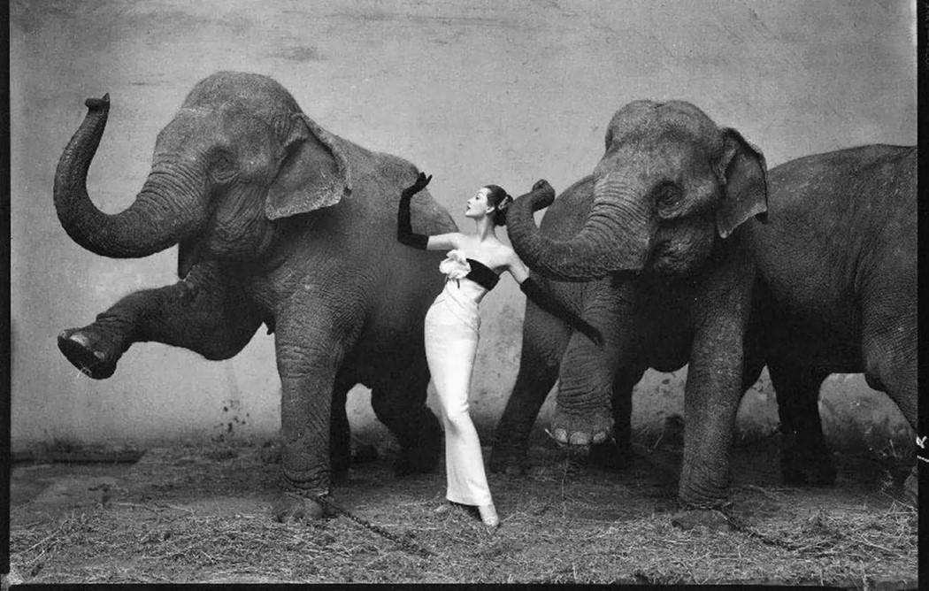
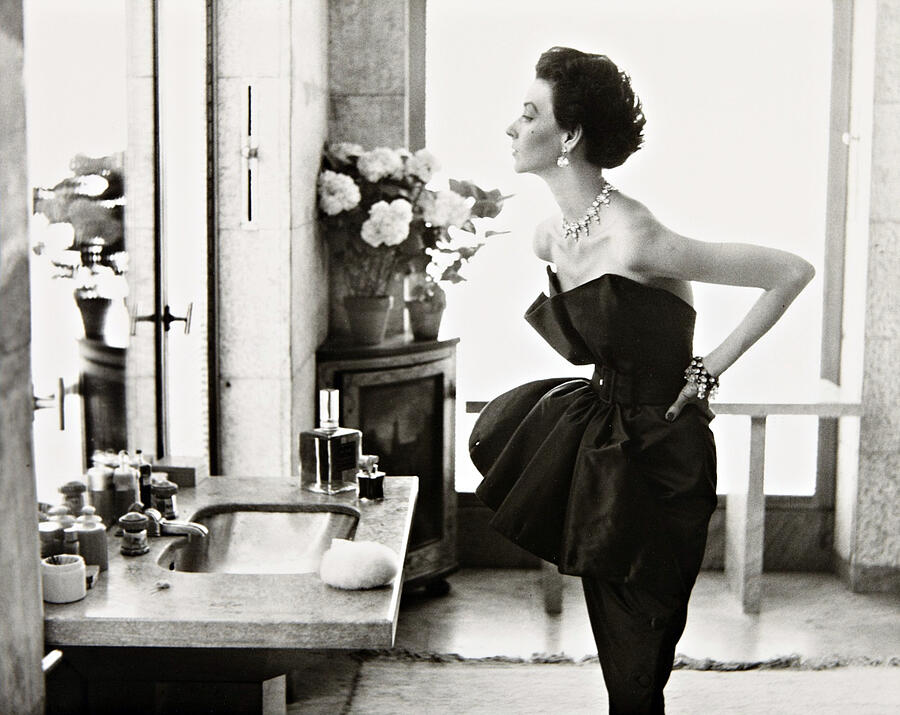
 His portraits shows on both celebrities and daily people, by using different techniques he can reflect on the harsh realities behind various images.
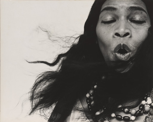
Recent Comments