We went on a second photography trip a few weeks ago to the Hutongs to explore street photography! It was delightful, and I got to take many lovely photos.
Full contact sheet: Hutong Photos
I took 141 photos and appended an edited version of another picture to the contact sheet, totaling 142 images. I focused more on getting the theme of my statement of intent through than emulating the style of anything on my mood board while we were taking photos, which resulted in the full contact sheet having many pictures of people doing things but fewer pictures with the dark lighting or even color palette shown in my mood board. Finding subjects and taking photos was also tricky since I was unused to street photography, which led to a smaller photo output than the 798 trip.
“Yellow” contact sheet (includes final chosen photos): Hutong Photos – Y/G

I chose these photos because I felt that they fit the theme of my statement of intent the best and because some of them are just lovely photos (e.g., photo 6, which is more abstract than street photography, but I really like the little touch of irony it has). Things like playing cards, fishing, and exploring an iconic destination with someone you really like are all things that don’t change much throughout different cultures.
Final selected photos: Hutong Photos – Final (Part of the exporting process went wrong, and the images display their filenames on their captions instead of their dates. Please look at the previous contact sheet for information on when these photos were taken.
I’ve chosen these three photos from the previous contact sheet since they fit the statement of intent’s themes the best, and they’re the best photos from the ones I took during the trip. Let’s briefly look at each individually and do some editing in Photoshop to make them fit the visual themes in the mood board better.
Picture #1: Explorers Of Yourself
In larger cities like Beijing with famous tourist attractions, like the Hutongs, where I took all these photos, it’s easy to find young couples like the one in the image adventuring together. However, when one navigates an attraction like the Hutongs, it’s quite different from something like an art exhibition where there’s art everywhere for you to look at – instead, there are roads and gaps between the historically important stuff you came for, full of street food and shops. This means that, for a decent portion of the time they spend exploring, people who come to places like this aren’t actually absorbing any of the main content they came for and are rather navigating through roads and shops to find their next interesting stop. While they are doing that, most people like to talk and learn new things about each other. Though which famous tourist destination one goes to will differ per country, one thing will never change: the opportunity to explore yourselves.
In comparison to the pictures I’ve selected for my plans, I find this picture too chaotic and vibrant.

To fix this, I’ve made the background completely black and white, which clearly shows the couple as the main subject in this image. Not only does this make the lady’s jacket fit into the gray colors of the background, but it also visually represents my previous description of how people focus on talking with each other on parts of an excursion like this.
Picture #2: Gone Fishing
This image, unlike many others that I took on the Hutong trip, evokes a very serene feeling as opposed to a lively one. The horizon is flat and the angles are small, especially when viewed against my affinity for Dutch angles. It has a bit of context to it – the motorbike hiding in the left corner shows a little about how the fishers got here and the design of the railing coupled with the willow tree reveal a bit about their location (when presented to an unknowing viewer). Though not everyone can be in their same scenario, the feeling captured in this image is definitely not exclusive to the subjects of this image.
The composition here is very nice in my opinion but the colors are too light.

To fix this, I upped the saturation of the image significantly, and added a light blue tint to the image to make the water’s color more vibrant. This makes it easier to differentiate the water from the sky, and I also really like how the trees in the background look.
Picture #3: The Card Players
In all of Cézanne’s series of paintings titled The Card Players featuring more than two players, we can see an interesting dynamic which I’ve mirrored in this image. Every man at the table wears tall hats, heavy coats, and poker faces, slightly hunched over their cards, whereas the spectator of the card game gazes down at the players from above, appearing not enthusiastic, but definitely interested in the game. This is mirrored in the image I took – the four players, all intently staring at their cards, appear disengaged and almost bored, whereas the man in the background looks quite interested, likely since the players have to focus on winning and he doesn’t. This, coupled with the offset angles of the exercise equipment in the background and the diagonally placed table, give the image a sense of tension akin to that of Cézanne’s painting – a piece of art in another medium and from another part of the world, which reflects my theme of similarities across different cultures.
I’ve already made some edits so I was mostly satisfied with this picture, but I decided to go back and see if I could make it better.

 Emma, on the other hand, said that she’d just sleep through the end of the world. It’s a really simple answer but I think it still turned out great. Rather than presenting a diptych or triptych, I think a singular photo would work better since emma_4 has the best angle, lighting and pose. For this photo, I decided to apply a black-and-white filter to it.


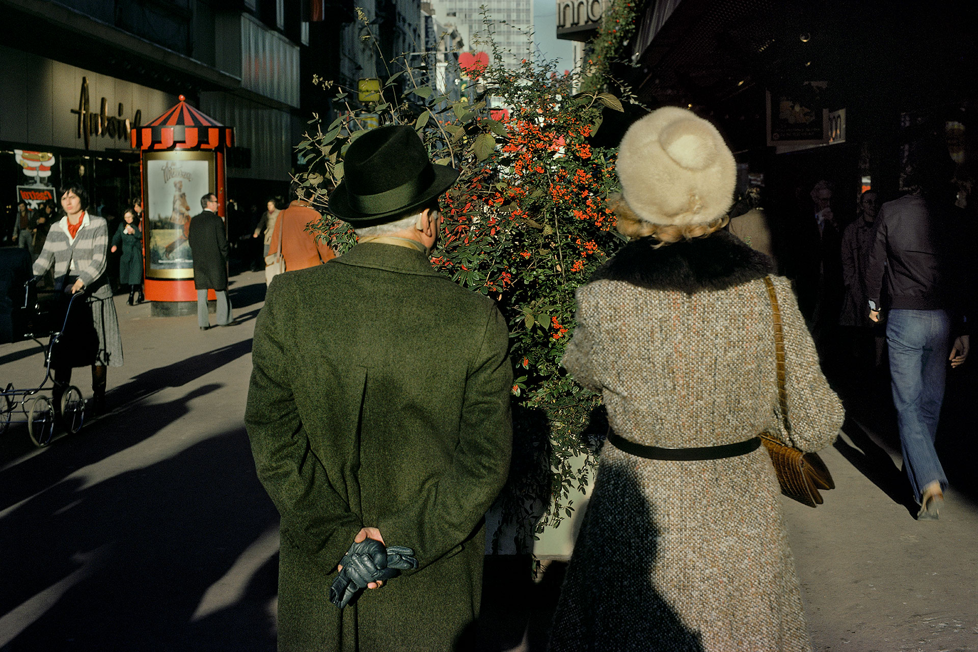
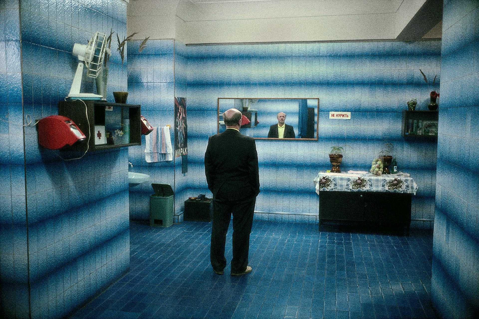
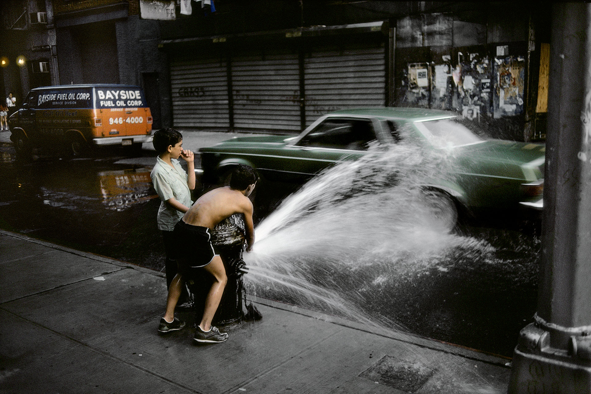
 Photos featured are by Ernst Haas: https://ernst-haas.com/bw-portraits/