Leo

"I have no special talent. I am only passionately curious" - Albert Einstein

Page 2 of 4

Statement of intent

The title of my project is Lack of opportunity.

The societal/cultural issue I want to explore with my photographs is the lack of opportunity.

I want my audience to feel empathetic and sad when they see my photographs.

I will get inspiration and develop my ideas by looking for photographs that emphasis features of the face. These features might include smile lines, wrinkles, and grey hair.

Mood board

what is a portrait

For a photograph to be considered a portrait the photograph must focus on a subject and that subject must dominate the photograph. Selfies would be considered portraits because a subject normally dominates the image. also, selfie stands for self portrait. A portrait should have a main subject and the background is not focused on. A good portrait uses interesting composition to make the subject stand out. As long as a portrait focuses on a subject and does not prioritise anything else the subject can be anything, a jar, hand, dog, vase. A photograph ceases to be a portrait when the focus of the subject is lost in the background. A subject can be blurred, faded, or ripped and the photograph would still be a portrait. But as soon as the subject is not the main focus it ceases to be a portrait.


I want to tackle unequal opportunity in my photographs.  I will show unequal opportunity  by emphasising the smile lines and the cracks and crevices on my subjects face.  to show unequal opportunity  I will hide those cracks and show a face that looks sincere and young.

Avier Rupérez Is a photographer that takes photographs with great detail. He manages to show the individual hairs of the spider. I want to capture the same amount of detail in my photographs in order for me to convey my theme and message.

Javier Rupérez | Flickr

Peter Jackson directed the lord of the rings. He did a lot of close up shots to the characters in the movie The Lord of the Rings that emphasises the emotions in the characters facial features. It also shows the audience the hardships that they have been through with debris and dirt scattered across their face.

Some close-up face shots worthy of Peter Jackson's LOTR movies :  r/LOTR_on_Prime

Whos Lila is a game that focuses on changing and altering the main characters face. You (the player) are in full control of the face that the main character makes during the different scenes that happen as the story progresses. throughout the game you have the freedom to make what ever faces you like, but even if you try to make the right face for the moment it comes off as unnatural and weird.


Who's Lila? - Who's Lila? Demo by Garage_Heathen


Mind Map

Red Selection

For this photograph I found a bit of red graffiti that stood out in front of the basic walls. The red graffiti was already bright but I decided to edit the image so that it stood out even more. I did this by changing the background into one color with different shades and enhanced anything red in the image. The red really stands out because its the only color that different in the photograph. This connects to my statement of intent because it emphasises a bit of graffiti that would normally be over looked. When a viewer looks that this image there eyes immediately go to the middle where a star surrounded by different squiggles. This could be a message about pro Israel. the star could also symbolize positivity and happiness. It stands out in the damp looking background giving the viewer a feeling of hope. the squiggles could be the spread of happiness and it is starting to cover the surrounding areas.


I found a interesting looking wall that consisted of 2 colors. What amazed me was the different shades of the two colors, making it seem like there was a abundance of different colors. the cracks look like there leaking and the wall is obviously decaying. This relates back to my statement of intent because it finds color in the most unlikely places. Most people would have been disgusted by this wall and thought that it needs to be painted over, but I found an opportunity for a cool image. This photograph is meant to make the viewer feel a sense of pitiness. the wall is obviously falling apart and is very close to ruin. The cracks are slowly getting bigger and they look like they are building up mold.

I found this tree covered by what I thought was a sweater. the colors of the sweater look similar because they are all different shades of each other but each shade is a lot different from each other. the 3rd last and last color are singles out to make the sweater look like an ugly sweater. Something that your grandma would knit you out of care. This is meant to give the viewer a sense of compassion. The photograph is meant to show the Chinese communities love and caring for all things. They would even make a sweater for a tree so it won’t get cold.


Green selection

these were the images selected for my red selection. I chose these 9 photographs because they had a large variety of colors that had different tones and values. I felt like the viewer was able to appreciate the different colors and they were able to come up with some sort of meaning to them. As I was taking these photographs I was focused on the different colors and tones that they each had. I  was also looking for different shapes or images that would stand out in the photograph. This relates back to my statement of intent because I said that I wanted to capture the beauty of colors and I tried to do that with these photographs. I tried to capture images of things that people might pass without appreciating the variety of colors. Things like a sign or a graffiti on the wall, those are things that people will glance at or ignore. With these photographs I wish to inspire the viewer to look at their surroundings more and to go outside.

Yellow section


I selected these photos for the yellow selection because they were all pretty basic. I tried to capture a large variety of colors to match my statement of intent but it didn’t work out. I chose these photos because they were my attempts that I think failed but are still better then some other of my photos that only have one or two different colors or shades. They were all pretty boring with the same failed attempt at replicating Uta barths. I tried to take blurry images but with no avail because they always came out less blurry then I thought they would. the photographs also had some parts of it blurry while others weren’t which lead to a lot of inconsistent blurry splotches.

Artist Selection

Uta Barth: Recent Photographs - The Polygon Gallery

Field #21 | All Works | The MFAH Collectionsartmap

  1. color
  2. shape
  3. space
  4. texture
  5. value

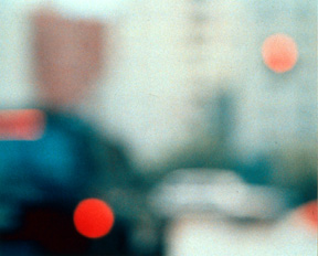
These photographs show a unique perspective by using the formal elements of color, shape, space, texture, and value. As you can see in all of her photographs, she predominately uses a blurring technique of color that mostly consist of warm, harmonious colors that consist of different shades of red, orange, and yellow.


“A deeper level of reality exists beyond anything we can articulate.” Uta Barth

From this quote we can see that she encourages viewers to engage in their own contemplative experiences. She also thinks that no perspective is right and she believes that her photos have a deeper meaning then what most people think.  She also believes that some photographs have a meaning that transcends our human thoughts and what we can comprehend.

I chose this photograph because I think that it has a really nice color contrast between the red and the background black. This caught my eye first because of the sharp contrast between the different values of red and black. The photograph uses white lines to create the letter “H”, splitting the photograph into 4 different parts. I like how on one side of the letter “H” its less chaotic and there are shorter shapes and shades of red  but on the other side of the letter “H” the red shapes are longer and only one shade. I think that this relates directly back to her quote when she said “A deeper level of reality exists beyond anything we can articulate.” No-one really knows what she is trying to show the viewer, I don’t think she knows but both the viewer and Uta Barth know that there is a meaning in that photograph.

I think that the most important formal element in this image is the texture. with the the blurry texture it looks like it would have been a road with cars driving down it. But because it is blurry the viewer isn’t sure what it is. the blur also managed to capture different shapes and shades of red. This probably inspired Uta Barth to add the letter “H” in the middle because she noticed that the photograph was organized  in such a way where on one side of the photograph there was a theme that looked different on another side.

I think that this image is important because it effectually uses a blurry texture to  create an abstract image that catches the viewers attention.  the image is abstract because it leaves the viewer wondering where the photographer took the image. They probably think they know they are inevitably unsure.

I like this photograph because it is so eye catching. when it first catches your eye the viewer thinks that its a cool burry image. But as the viewer starts to look more closely and they notice more details that they would have missed if they had just skimmed through it, the viewer starts to wonder about the photograph. They aren’t sure what the photograph is and where it was taken from.


Red Selection


Next time I do this I would probably experiment more with the corridor of light. I found out about the black room when I was nearing the end of the amount of time I had to take photos. This led to me rushing around and taking badly taken photos that were blurry and not very straight.  I like the background because I can manipulate the reflection and it looks very mysterious like a dessert. It makes the audience feel a sense of mystery and it makes them wonder what is beyond that door.

Green Selection

To make sure that most of my images were dark and had a clear contrast between the light and the dark. To do this I made the Iso of the camera darker. When I walked out I just took a snap shot of the corridor and it turned out really good. So I decided to do more and this was the best one I took.

I took this photo because I saw that there was a clear contrast between the light coming out of the door adn the rest of the room. Also, the chair acted as a silhouette and the bean bags color was really cool.

Since I wanted to incorporate lines into my photograph and I saw this as an opportunity. there was a hole that was letting in light and surrounding it was some interesting shapes. I used positive space to direct the viewers attention to the hole. Fan Ho often utilises the different shapes and capture the viewers attention. I took a photo of this because I thought it would capture the viewers attention and the viewers eyes would linger on it because of how bizarre it looked.

I was inspired by the silhouette in the chair in the other photo. I used a hot that I found and made one of my friends pose while I took a photo. I was inspired by Fan Ho because he used a lot of silhouettes in his photos to make them look more mysterious. Fan Ho also uses a lot of negative space to draw the viewers attention. I made sure that there was no light coming from anywhere so that it was just that one ray of light coming out of the door.

In this photograph I stacked a bunch of chairs together in an attempt to create a shape. in doing so the reflection was changed and it looked like a sand storm. I tried to create something out of a bunch of chairs because I was inspired by Fan Ho Photographs. He used lines to create a image that had multiple meanings using silhouettes that are made of up different things and I tried to recreate that.

In this photograph I decided to alter it using the different filters. The filters made the image more like a painting then a actual photograph. It also emphasises the different colors in the photograph which I really liked. Fan Ho often uses a range of shades of the same color to emphasis his photographs. He often uses black and white, but for this photograph I decided to use black and red. Red is a vibrant color that stands out when surrounded by black. I chose not to use black and white because I thought that it would stand out more if it had more vibrant colors.

Since the other photo looked better, I decided to also edit this photograph. The filter emphasises all the different colors and shades of colors. This emphasises the lines and the color coming out of the light. Most of Fan Hos work looks like a painting.  He edits his photos after he takes them to enhance them. I decided to make this photograph into a painting.

Before I added filters to this it was really dark and there was nothing to really see. the viewer could see glints of light but that was it. When I enhanced the contrast between the different colour it made it clearer and easier to see.


« Older posts Newer posts »

© 2025 Leo

Theme by Anders NorenUp ↑

Skip to toolbar