Steven

"I have no special talent. I am only passionately curious" - Albert Einstein

Page 2 of 3

Photography Analysis 2

I chose this image particularly due to its interesting composition and the use of color. Unlike many other abstract photographs, no special lighting was set purposefully for the photographer to capture, but instead, Yasuo simply demonstrated some plain shadows. Furthermore, he chose not to focus on texture or pattern, but only used some lines to show the shape of a door. This is definitely some very uncommon design to appear on abstract photography, and the contrast between the blank background and the colored spots beneath inspired me a lot. This use of shapes would be something that I try to focus on in the future

Yasuo Kiyonaga


These photos focused on the shapes  and textures from the wall. The abstract lines formed a variety of images that are colorful and mostly, unique.


I liked how the photographer used aged walls as the background, and focused on the elements in front of it to form patterns or random shapes. The idea of capturing elements next to the wall really inspired me, and I will try to do the same thing in 798.


Although there isn’t a specific quote that Yasuo wrote, but the description “for dream and reality” gave me a good idea of what type of image he tried to create. However, this is not a topic that I want to focus on right now.

Photo Safari


This abstract photo follows the pattern 2, and I liked this image because it presents audience with a simple detail, so its definitely a successful photo for me.

.

These lines represents the 5th pattern, however, I didn’t exactly make the lines straight, and instead, they were curved like how they originally were.

The stairs for pattern 4 was captured from a down-to-up angle, and the yellow stripes matched the grey patterns fairly well. Although its not the best, this photo definitely did not fail.

The holds from the ES playground did not have a specific pattern to follow pattern 8, but the dust formed a fine comparison to the colorful holds.


The cloud and the sky formed pattern 11 in a coincident way, even though the boundaries were quite unclear. The lighting was natural, so I believe its not a photo of success nor failure.

These leaves all grew into different colors, and i captured this shot an interesting way, where I didn’t zoom in but placed my phone near the plants. In this case, more details were presented.

Although the grids were perfect, I did not include interesting details, so overall the photo was plain. This is definitely a failure photo.

I tried to create interesting shadows from placing objects above the camera, but clearly it was to blurry, so I failed this photo.

This blurry photo was created by accident, but the blur element made the photo more interesting for sure. This is also one of my favorite success from the 12 photos.

I did not use any of the elements for abstraction in photography, but the pipes and all the lines were still fun to examine, so this one is rather a success.

I actually created the setting on purpose myself, but it still failed as one of the worst in my photo safari. Its simply bad, but I cannot find another circle to replace it.

Mind Map

Analysis of a Photograph

Silver Gelatin Paint, by Aaron Siskind

-I believe that the photographer captured this photo because he is interested in the patternless shapes, the obvious textures and the clear comparison of tone (between wall and wall paper).

-If I was the photographer of this photo, I would name this photo “Wallpaper to the Crumble”.

-The photographer presented interesting shapes of the wall paper, which matches the lines (cracks). These unintentionally formed patterns are great details for audience to examine, which furthermore, allows people to analyze ideas that the photographer hopes to present. Also, Siskind managed to show a clear texture of the fragile pieces of the dark wallpaper, which showed great contrast against the bright wall, forming a tone. However, none of the wall paper could be in shape of a pattern, therefore the photographer could possibly be showing abstraction through a comparison between items either are in the state of forming a pattern or not.


Aaron Siskind, Lumiere Gallery, Copyright 2021 Lumiere LTD, “lumieregallery.net/202/aaron-siskind/”

Formal elements are the 6 techniques that allow images to include simple objects and turn them in to great photos, especially when photographers are trying to make their shots abstract and special. The formal elements are lines, shapes, textures, focus, tones and patterns.


  1. Lines

In this photo, the railroad is in the middle of the photo, and it forms two straight lines. The lines are reflecting sunlight as it points to the direct center of the whole image. However, the background environment presents a very calm mood, and no movement is shown.

2. Shapes

There are many similar squares that were laid next to each other, but one of them were removed. The removed square stands out as the shadow, creating a good comparison with the lighting around it.

3. Pattern

The rectangles in this photo are organized as columns, but a thin line was also captured across the photo. The strong rhythm of the rectangle does seem rather outstanding from other repeated items.


4. Focus

The photographer separated the photo into two parts, where the center was a zoomed-in area with high clarity under the’ wheel’ and the surrounding followed up the same sight under a blurry filter.


5. Value

In this photo, a clear range of light and darkness was developed. The closed up matter, which is the tree, was shot as the darkest element in the whole photo, followed up by the forest behind it. The far sight, however, was somewhat misty and white.


6.Texture

In this simple image, the photographer allowed the surface of the water to form a very calm sight for the audience, where people could easily feel the soft, wavy texture of water.

Abstraction Definition

I think that abstraction in photography is a way to express the photographer’s ideas in an indirect way. In these forms of art, photographers tend to hide their own perspectives in photos that seems awkward or boring, and by achieving this, they try to capture images that doesn’t have direct association with our daily life. For example, they might take photos of very plain items (maybe a furniture or a device), and use techniques such as duplicating or changing the lighting to grab the audience’s attention. Another helpful example of abstraction could possibly be taking photos that are often unexpected. This include photos that are rather blurry or abnormal (in size or angles).

Abstraction Phrase

I believe the phrase “abstract photography can be defined as capturing images in which the subject isn’t the most interesting element” explains how people can create abstraction by taking photos that seems uninteresting on the surface but represents special ideas when audiences take a deep examination at it. For example, the photographer might take photos of elements that are seen in our everyday lives such as furnitures, devices and sculptures. The photos might look plain and boring when one takes a skim at it, but hides other thoughts or feelings that only can be found if someone points it out or if someone really thinks and tries to figure it out

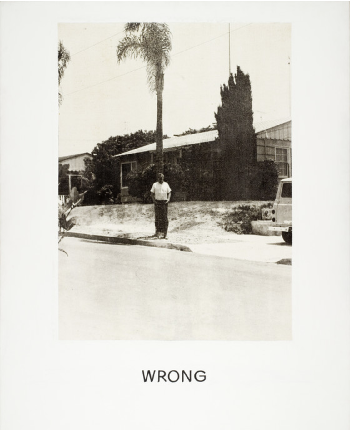
WRONG: Can ‘Bad’ Photos be Great?

In 1967, American artist John Baldessari exhibited his ‘wrong’ photography series, and the most famous image is shown above in the blog. The photo shows a man standing in front of a tree with an awkward background, while the word WRONG sits below the photo. After publishing this series, he then stated, “You don’t want any one to say, ‘you can’t do that! ‘” to show how photos that break the rules of photography can also be great. When I learned about this event, these ideas also influenced me, whereas since then, I believe that we don’t always need to follow rules, and sometimes what people identify as ‘bad’ photos can also be great when they include important contexts.

We all know that photography is a form of art, which means that it’s a way to express enlightened ideas and fascinating beauty of nature and humanity. Under this circumstance, photos shouldn’t be defined as good or bad (when they each represents their photographers thoughts). Thats when context becomes important.  Context and themes are what gives the photo purpose, for which photographers express thoughts, hide perspectives and separate them from plain good looking images.  For example, the photo ‘WRONG’ itself is obviously a bad photo, but when John Baldessari explained how he was trying to show people that rules can be broken (which is the context), ‘WRONG’ then became a great photo.  This explains how once a photographer place meanings and context into any image, he (she) could possibly create a great series (image) even if the photo itself is what people define as a ‘bad’ one.

Wikepedia, John Baldessari, Last edited on 21 August 2024, Wikepedia Content. “en.wikepedia.org/wiki/John_Baldessari”

Wikiart, Wrong, 1967, Published 2013, Last edited 2020 Nov 4, Visual Art Encyclopedia. “wikiart.org/en/john-baldessari/wrong-1967”


WRONG Photos

« Older posts Newer posts »

© 2025 Steven

Theme by Anders NorenUp ↑

Skip to toolbar