Contact Sheet


My final set to present:

Contact Sheet


My final set to present:

Mark Galer is a very established photographer. My set will take inspiration from his set in Melbourne, where he captured the life of a homeless man living under a bridge, through his portrait photography, sharing a depth of this mans life, or “world” to the audience in doing so. In his photographs, he tends to focus on a single person’s face and significant features of them, a detailed view of a specific environment, or both at the same time. He tends to use a variety of formal elements in photography, such as tone/value, texture, line, shape, especially focus and rarely but occasionally, repetition. While he uses focus in a majority of his photographs, in more of his environmental photographs, he shows a focus on value/tone and repetition, like in his photo of the Fushimi Inari Shrine in Kyoto or his photo of a bay in Australia while on a yacht. On the other hand, he tends to use more of the elements of texture, line and shape when focusing on people and their faces, like some of the photos he took in Sweden and Italy. In my portrait photography Identity set, I want to create photos with a main focus, being my dancing, while objects and settings in the background stand out enough to be recognized but not recognized as the main idea, especially like the last photo of his I chose as an example below.


This is a photo taken by Mark Galer that I will critique.

This is a photo Galer took in Italy of a man reeling a small boat onto shore. In the foreground, we as the audience see a older man in a raincoat with blue paint stains pulling on a thick rope cord connected to a potential boat, which we can infer from the line of other boats in the blurred background atop of worn sand with nets and umbrellas. By the man’s face, we can see that though he is focused, he is not struggling, most likely due to being seasoned in the service, almost acting on second nature. It is in strong color and has low contrast, using a blurred background and in focus foreground for a contrasting/focus effect. Because of this, though there is a lot of colors and objects in the background, the audience’s eye is drawn to the man in the center. While the most obvious use of the element of line is the rope, there are many other examples such as the wrinkles in the man’s face and the lines that separate his fingers, as well as the wrinkles in his jacket and the net in the background. The net also shows a use of shape and repetition through the repeated squares. The lighting within the photo also contributes greatly, because the sunlight directly above illuminates the man’s features from above and demonstrating the element of tone/value with the gradual darkening downwards. This photograph has a thriving mood due to this feature showing that his hard work is connected to the soft brightness of the sun it coexists with. I think the Mark Galer intended on making the photo this way and I want to take inspiration from this with my photo set, by setting a main focus of my dancing while incorporating the details of the background to the “story” my photos tell.
My Portrait Photography Set will surround my hobby and passion, Irish dancing, by capturing the different moves of one of my dances in different settings throughout the process of the competition. Some of these settings will be my room and practice room for the training and packing stage, the airport and parking lot for the traveling bit, etc.
A photograph becomes a portrait photo when it describes who you are. A selfie can be a portrait if it expands on more than just your physical form. A portrait should include details that describe certain aspects of you in a creative way. A portrait can be a sequence of images because it can reflect the many different aspects that make up who you are. Portrait Photography is all about your identity, and showing the audience who you are.
Examplesss:
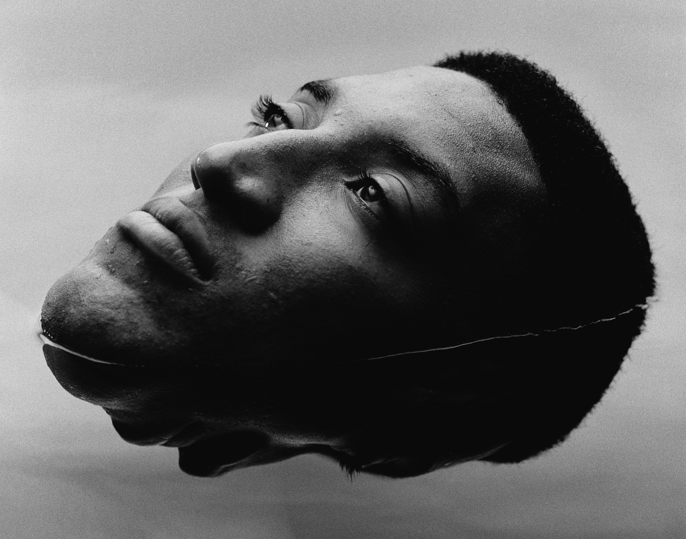
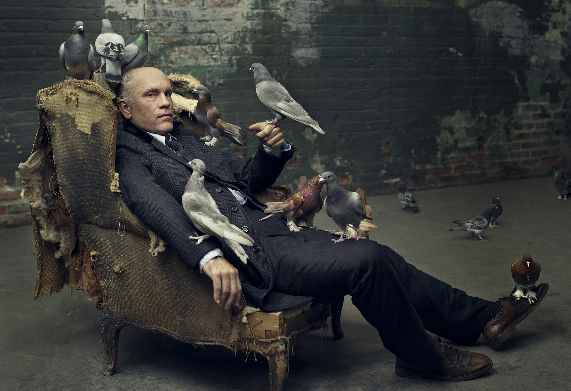
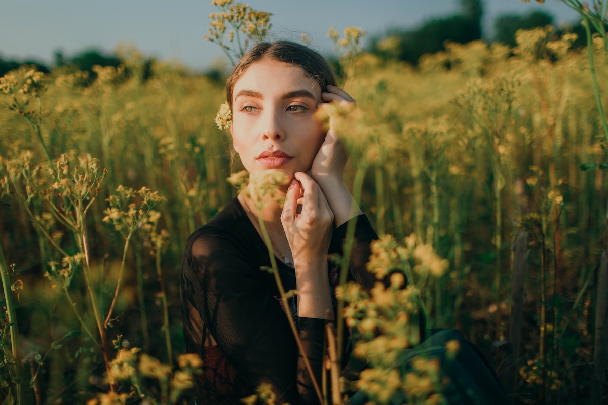
Singular Photos:


Triptych Form:

Contact Sheet of All of my Photos:


Yellow Photos
These are my yellow photos. To put together my yellow set, I eliminated photos with more focus on the background rather than the people, ones where the faces of people are unclear, double/repeated photos and ones for fun. I also tried to specifically include photos with multiple people, but still with strong emotion in their faces. Though there are some with stagnant people, I tried to narrow down to people in movement. I also tried to keep photos that utilized the lighting of the area.

Green Photos
These are my chosen green photos. For these, I tried to narrow the set down to either very old or very young people to emphasize both the different textures in people’s faces and the way they view the area, or, life due to their ages. I further dove into the use of light to emphasize certain parts or themes of the photos, such as the lamp lights in the fourth photo or the natural sunlight of the rest. I also took advantage of the lighting to emphasize tone/value in certain photos. As the original main focus for this project, I looked into the variety of facial expressions throughout the photo group, ranging from fatigue in the first two and last, to excitement or joy in the third and ninth, confusion in five, seven, eight and ten, and to the disgust of six.

Red Photos
These are the photos I chose to be my red. To put it bluntly, I failed to follow my statement of intent. But, despite that, I think I failed very successfully. Rather than using black and white like I’d planned, I kept color in my photos. I only got as close as I originally wanted, like Tatsuo Suzuki would, for my first listed red photo. And the debatably worst, I lost sight of my original intent, capturing the various emotions on the “Faces of China”. Instead, I changed the intent to center around how significant pieces of Chinese culture connect its people, choosing to focus on the traditional snack táng húlu and how it connects Chinese people of a variety of ages. Táng húlu is essentially a candied fruit kabob, usually made with Chinese hawthorn, but can be made with strawberries, orange slices, grapes and more, and it is prominent in all three of my photographs, being eaten by a very young boy in the last, a couple young adults in the second, and an older woman in the first. This shows how Chinese people, no matter the age are connected through the appreciation of rich Chinese culture, such as the sweet traditional treat.
Another part I thought added to the “story” of these photos together is how the lighting gradually gets dimmer from the last up. Where as the bright sunlight swallows the entire frame in the last photo with the child, the bright light eliminates only the background in the second and the entirety of the first seems rather dimmer altogether. I think this represents the aging of the people in the photos, how the life of the young boy was very bright as it was the start of life, then in the second showing how the surrounding area of the people are still bright, as if to show though the people are aging they are still adding to the “life” around them, then duller in the first representing getting closer to the end of life. Through this, the táng húlu as a symbol also shows that all throughout the course of your life your culture is a beautiful sweet part of you and your life that is to cherish.
Some features that I thought added to the connection of these photos is how they all use the triangle method, the middle line and the use of the formal element of line as well. Along with the satisfaction of three people creating a triangle in each, the middle line follows through using it. The formal element of line is prominent in all three, especially in the táng húlu and people’s arms. The vertical line of the treat in the first, the horizontal in the last and the V-shape of the sweet angled and mirrored use the element of lines, as well as the arms to make an angle in the first and last, pointing upwards in the middle towards the middle line in the first and directing your attention towards the boy and the snack in the last. One thing I would change about this set is the order of the photos, which I would change to be in chronological order of the story, going third, second, first, but overall I am very happy with this set.

This is the photograph I will fully evaluate.

As I previously mentioned in my analysis of my red photos, this photo contains many elements and street photography techniques. This includes the decisive moment, the triangle method, and the middle line, as well as the elements of lines, shape, texture, repetition and focus. Lines were used in this photo through the angles that direct your attention to the boy and táng húlu in the center. For example, the body language and arms of the women next to him angling like arrows towards him, the indent in the horizontal line of the top of their heads due to the young boy’s height creating a downwards arrow towards him, as well as the shadow gap between his legs which point up to him. These are the many different ways lines are used to direct the audiences attention to the center, which also demonstrates the element of focus in the photo. Some other elements this photo shows is texture within the rumpled jackets and the smooth reflective surfaces of the windows in the background and the candied surface of the sweet. It also shows repetition with the shape of the people’s circular heads as well as the circular fruits in the táng húlu, along with the window designs in the background and the rectangles of the wall next to them. The street photography methods clearly depicted in this is the middle line and triangle method. The middle line passes through the center of the boy, guided by the line of the window design above him and his jacket zipper through him down, of which the composition I was able to capture with the technique of the decisive moment. The triangle method, or the rule of threes was used also with the heads of the three people, creating an upside down triangle if they were connected with a line. Overall, I think this photo came out very well.
The definition of Street Photography is “photography that captures candid, unposed, and often spontaneous moments of everyday life in public spaces, such as streets, parks, and urban environments”.
Vision/Intention: The title of this project is “The Faces of China”. At the Hutongs, I will focus on zooming into and getting up close and personal with the faces of the people on the streets to capture their unique facial expressions and the feelings that create them. I want my audience to feel like they’re seeing and passing by the people I capture on the streets of China themselves. I want my audience to feel familiarity, reminiscent and slightly like an intruder via how close I get to the people in my photos and how familiar their facial expressions feel.
Mind Map
Hutongs Research – key words:
My 6 Chosen Techniques:
🔥Mood Board🔥

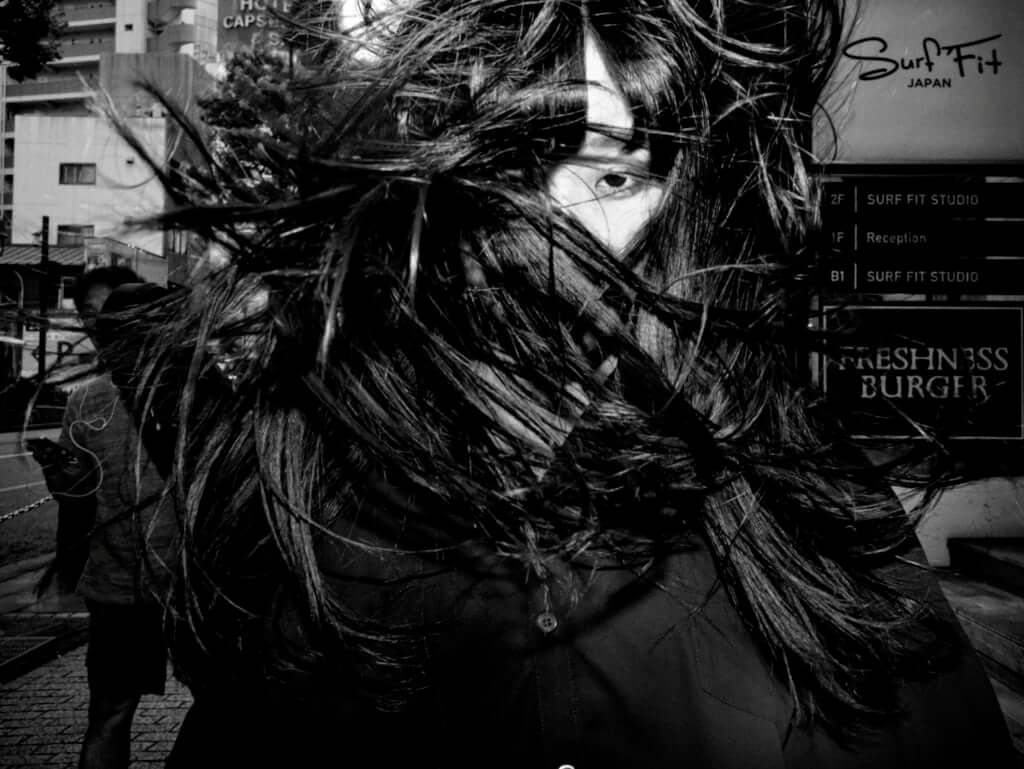


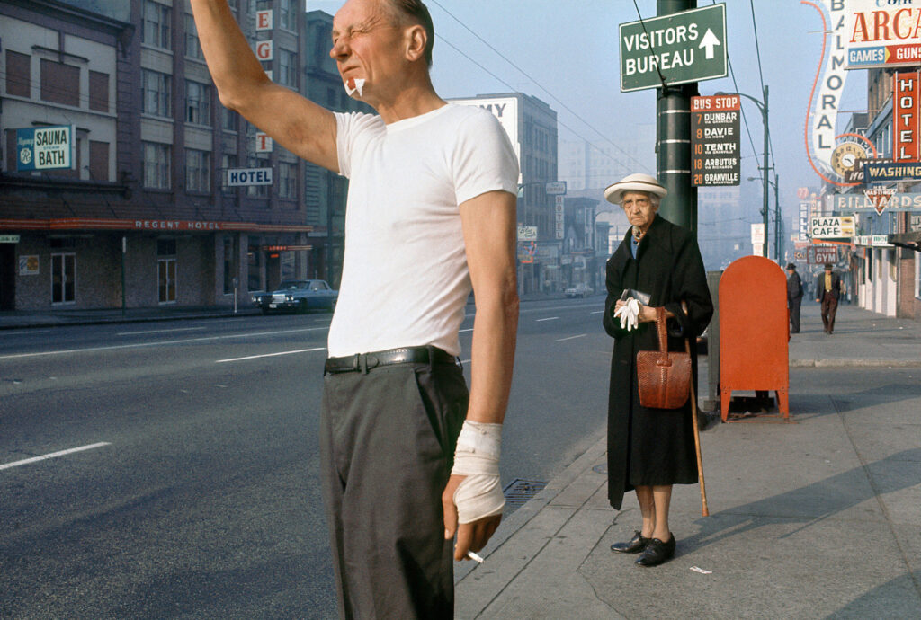


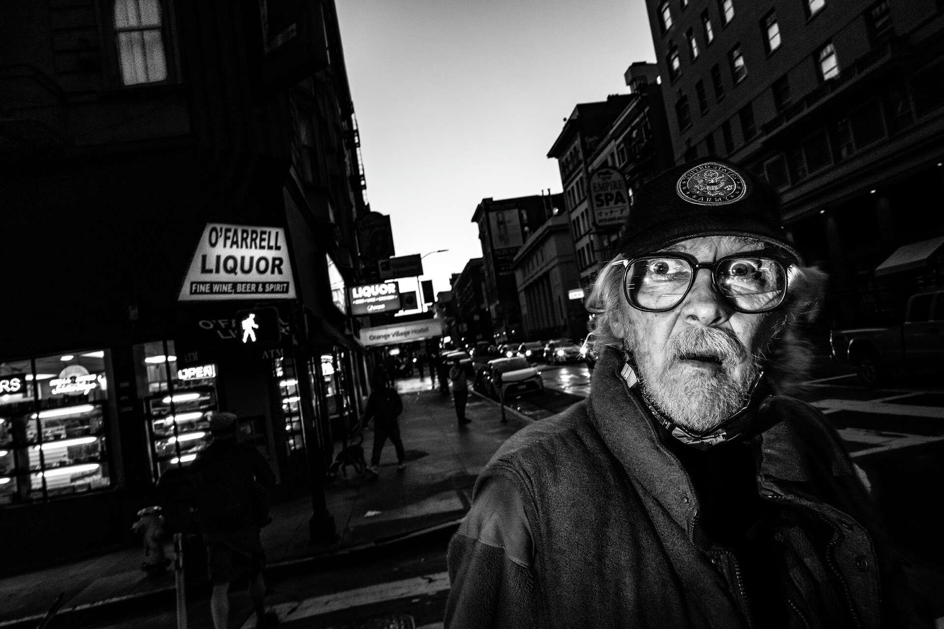
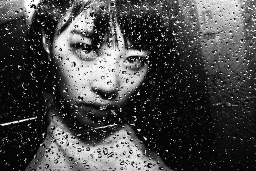
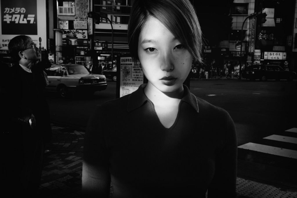
Tatsuo Suzuki is a Japanese street photographer that captures life in busy cities through close up photos of people’s faces in black and white. Because of the lack of color, her photos emphasize texture, especially in people’s faces or in architecture. She also uses this to emphasize tone/value of the lighting in the area. The focus on the texture in people’s faces also draws attention to the unique facial expressions within.
Here are some of her photos:


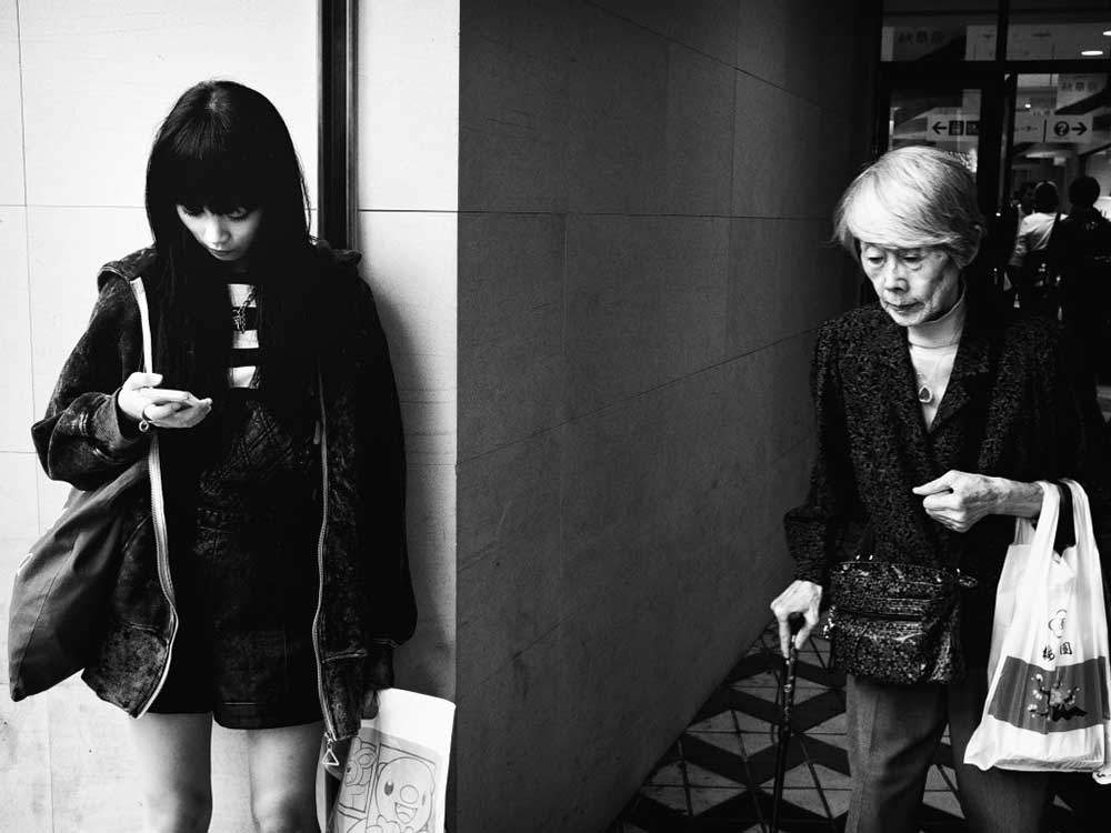
This is the photo I will fully evaluate.

This photo is an excellent example of Tatsuo Suzuki’s photography style. Like all of his photos, this one is in black and white to isolate the audience’s focus on the many elements he centers in his photos. For example, the element of light and tone/value is emphasized by the choice of black and white because it isolated the contrast of light and dark within the photo, where as having color would take the focus away from those elements and would be harder to see, understand and appreciate. Suzuki also went very up close with the main person in the photo, capturing the man’s very strong facial expression and the lines and texture of his face as a product of it. Some example of this is his facial hair and wrinkles, but also the glassy texture of his eye. The last element I think influences Tatsuo Suzuki’s style, probably most, is the element of focus. Whether it is the facial expressions of people, the number of them or the way they are connected to or contrast with their surroundings, people are almost always the main focus of his photos and I plan on taking interesting photos the way Tatsuo Suzuki does.
Linelights

This is my final triptych. I named it “Linelights” as a play on the word “Limelight” because the vibrant colors and use of lines can catch the audience’s eye quickly. The artists Ola Kolehmainen and Andrew Prokos inspired my photography style heavily, specifically with the use of bright colors and the use of light. While both used light and bright colors a lot, Andrew Prokos inspired the use of symmetry in some of my photos like in my second one and my composition in my first by centering the wall corner, Ola Kolehmainen influenced my use of architecture in the majority of my photos, including all three that made it to my triptych. In order to develop my theme I experimented a lot with patterns and texture, but ultimately landed on the specific emphasis on light. I think I was successful in keeping my theme of light against architecture centered when creating the photographs because they are a prominent part of each photo and are very recognizable through the contrast, values and tones created with it. Though I tried to add more elements to my theme like the use of lines and texture, the main focus of all three photos are still lighting against architecture and the audience can clearly understand that from the get-go. Overall, I think I could have done better creating one other photo besides my third to fit the other two for the triptych and finding a bigger variety in texture and other elements. Though I do think my third photo still fits with the theme of light, architecture and lines, the center bottom circle and the lack of variety in color and heavier influence of tone compared to the other two photos set it apart. I also think that my triptych would be more interested if more elements like shape and texture were incorporated. Despite that, I think overall my triptych was a success and I’m excited to make more in the future.
© 2026 Amelie
Theme by Anders Noren — Up ↑
Recent Comments