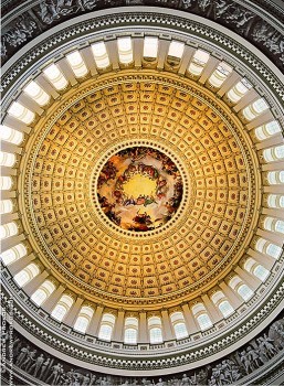
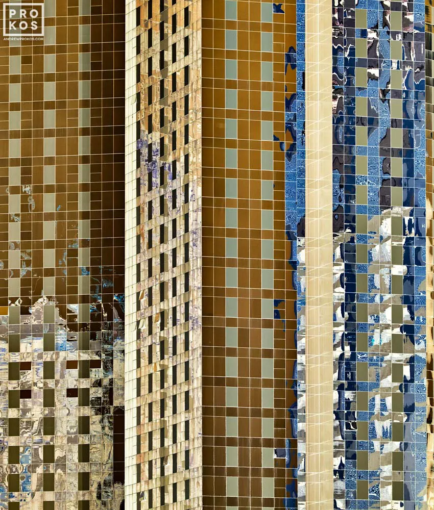
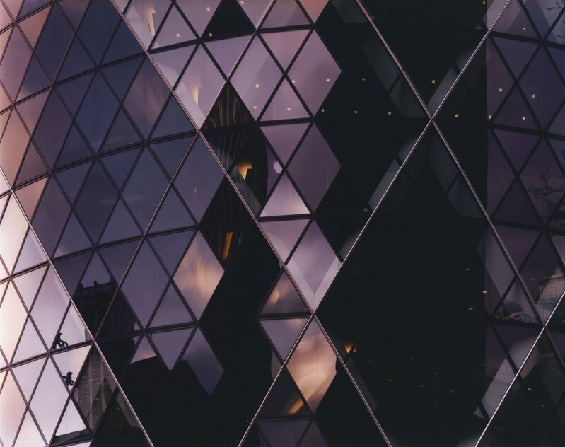
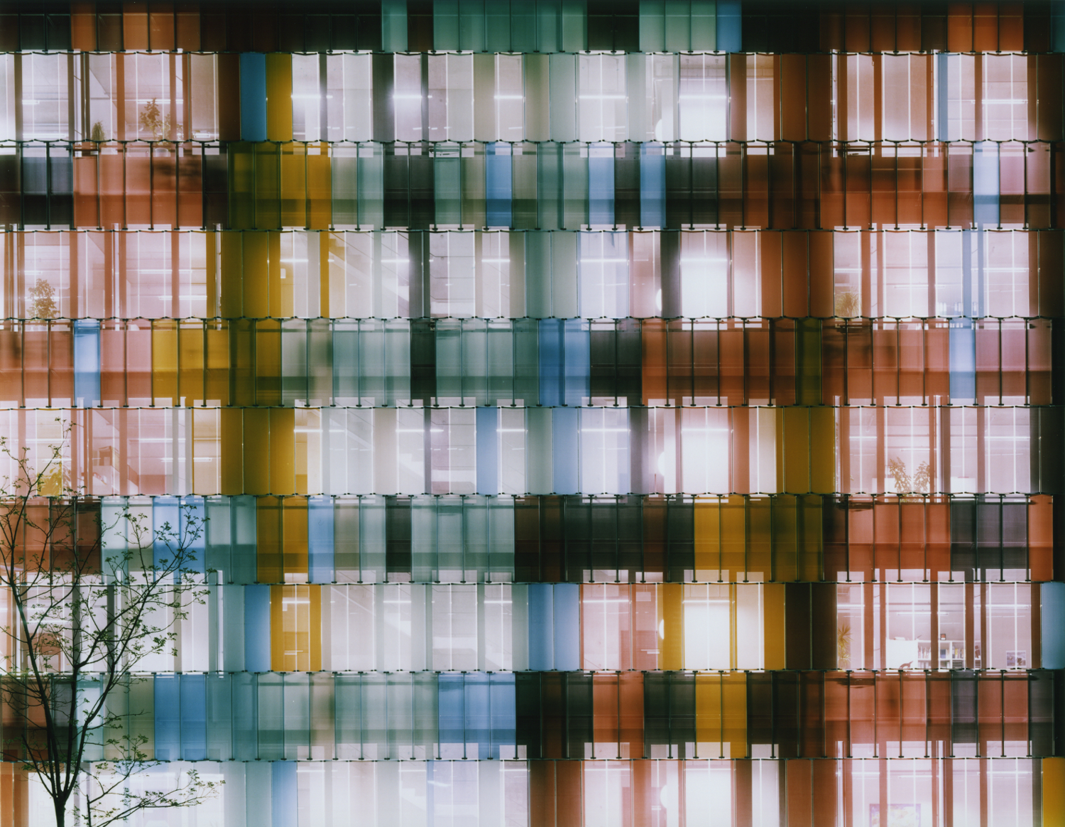
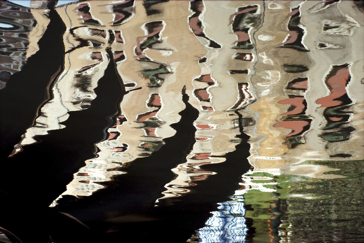
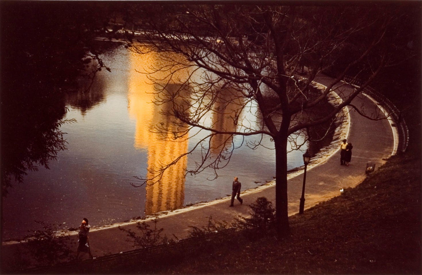
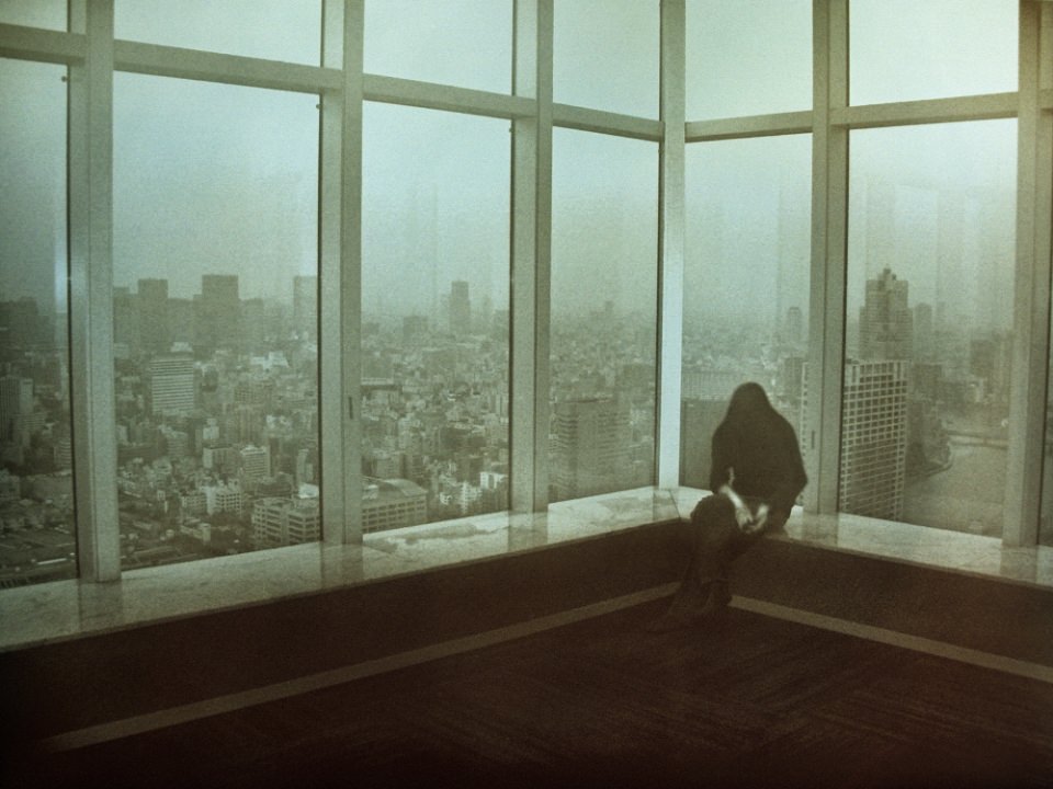
My vision-wise, I would like to keep it the same. I still want to create photographs that emphasize light and its relationship with architecture and will be the idea I focus on for this set as well. The artist I will now use to inspire my new set is Andrew Prokos. His photography doesn’t always align with the use of architecture like Ola Kolehmainen, my original chosen photographer had, but he also reflects the use of light against large spaces and structures, as well as an inclusion of vibrant colors.
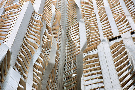
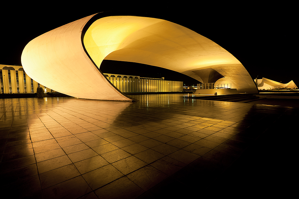
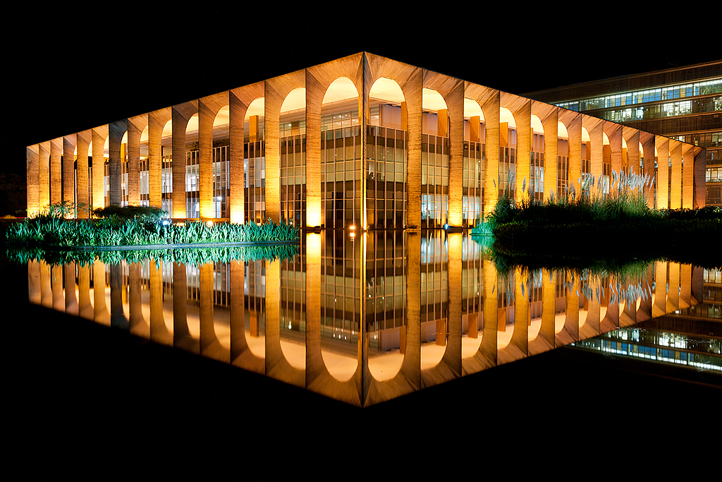
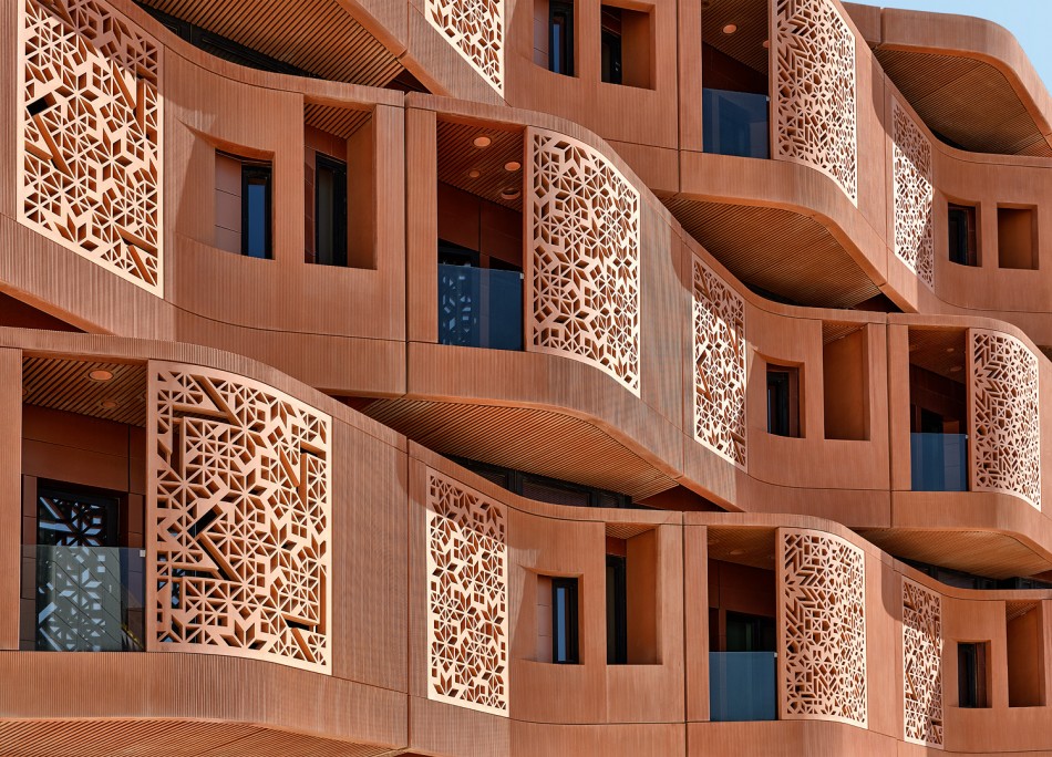
Here are some of his photographs:


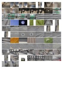
These are all of my photos for Set ii


Yellow Photos:
For my yellow photos, I focused on lighting and shapes. All of my yellow photos have either one or both of those elements, occasionally with the use of line. I specifically took away photos that notably looked the same or didn’t have the specific lighting that I liked. I also eliminated any that had solid specific objects. I also took out any that mainly focused on repetition or pattern because my new artist, Andrew Prokos, did not focus on patterns as much as my previous inspiration Ola Kolehmainen had.

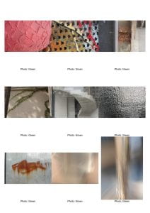
Green Photos:
For my green photos, I chose photographs that not only used a lot of light against architecture, but also a variety in tone and value through it, as well as a diverse range in colors. For example, my second, third, seventh and eighth used an emphasis on value and tone, but my first, fifth and sixth had a bigger emphasis on colors, wether it be how bold they are or how much they contrast. I also used an emphasis on lines in my second, third, fourth, fifth and seventh, as well as the eighth using shadows of the arms of a chandelier. These all fit my vision because they utilize light and it’s affect on surfaces.

Red Photos:
These are my best photos from my second set. They are connected in their use of light, line, contrast and flamboyant colors. While the first photograph uses line through the repeated columns in the handrail. The second use the element less, but still it still uses lines to separate panels of color. The third use line through the shadows of the chandelier arms that are emphasized with the bright light at the center of the chandelier. Light was also an essential part of my second photo, where warm light from the right met the darker, colder light from the television on the left at a corner in my house. This created panels throughout the photo with different levels of light, with pure warm light on the right, a shadow on the left of that column, a light purple shadow of the corner towards the center, a vivid blue beside that, and the pitch black of the dark room on the left. My first photographed used light similarly, where the warm light shone on the columns of the hand rail, illuminating it and giving it a heavy contrast against the dark shades of purple, black and blue in the room behind it.

This is the one photograph I will fully evaluate.
This is my favorite photo of the ones I took this set, for not only the light, contrast and color, but the texture and slight blur as well. As I explained in the red photos, this photo uses lines in the repeated columns, but it also uses lines in the horizontal designs at the bottoms and tops of them, making them more uniform and interesting. I also previously analyzed how much I liked the contrast between the warmly lit hand rail against the darker, cooler toned background, but I also liked how in the background of this photo there is a range of color in that it gets gradually darker and more “red-leaning” in shades of purple towards the left, starting from the bright “blue-leaning” purple on the right. I also liked the texture in this photo using the slight blur. I liked that with the blur, the edges of the color in the hand rail isn’t so defined, so the warm color stands out because of its color more than through the shape of the rail. It thus helps the audience focus on the colors and lighting of the photo and the contrast within them.


 8)
8)


 1)
1)  2)
2)  3)
3) 
 5)
5)  6)
6)  7)
7)  8)
8) 
 10)
10)  11)
11)  12)
12) 

Recent Comments