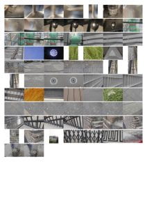
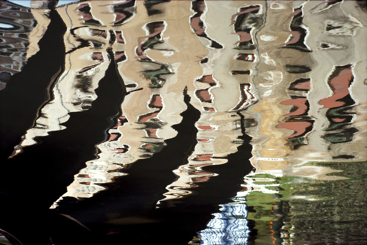
All photographs:


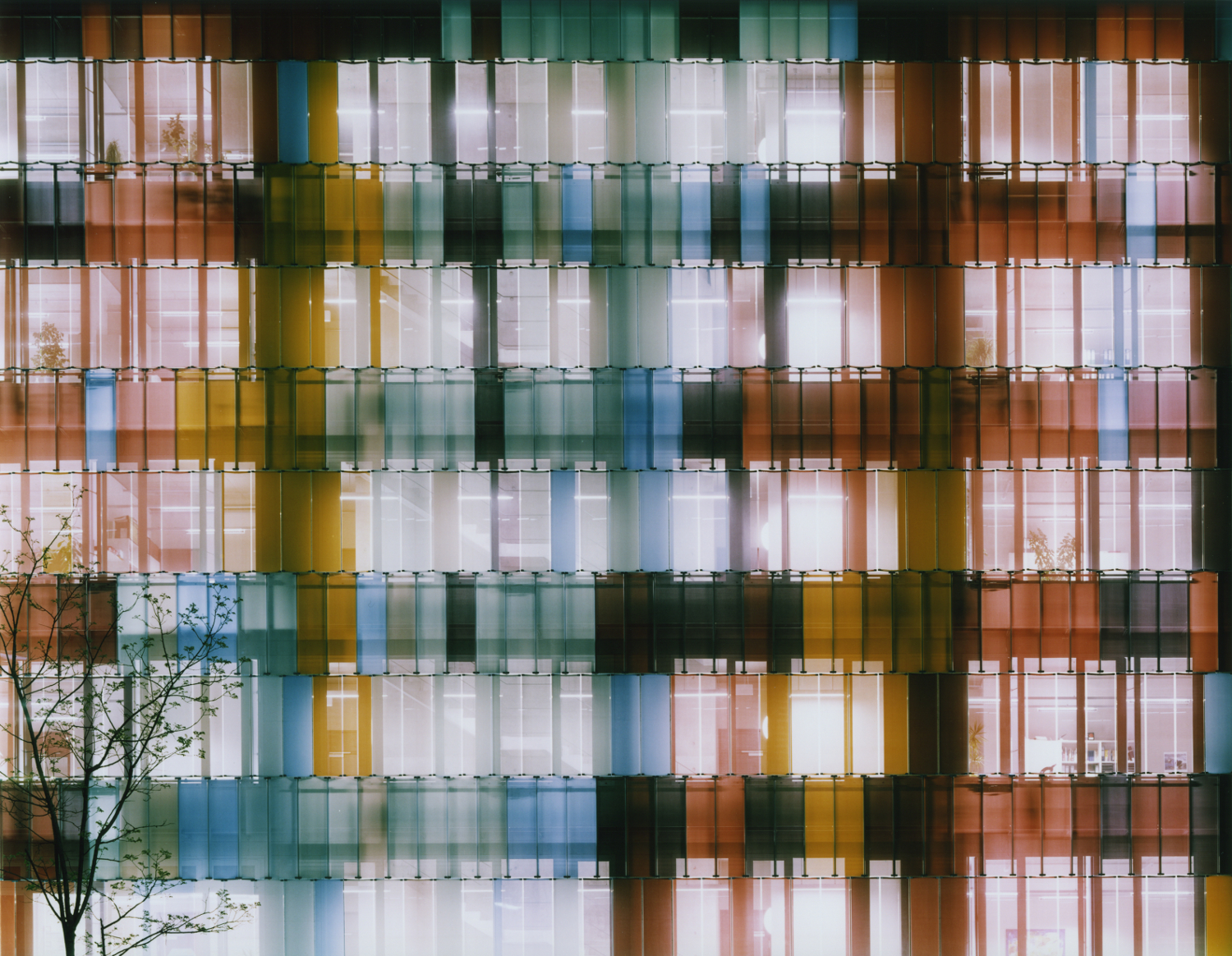
Yellow Photographs:
These are my yellow photos. I focused on patterns, architecture and a little bit of light, with the formal elements shape, repetition, texture and tone in mind. I chose photos I thought had stories behind them by leaving out the rest of my non-yellow photographs that had a single focus. I picked photos that had direction and repetition with emphasis on both specific and broad details, such as gradual change in lighting, or repetition of big shapes.

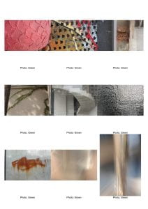
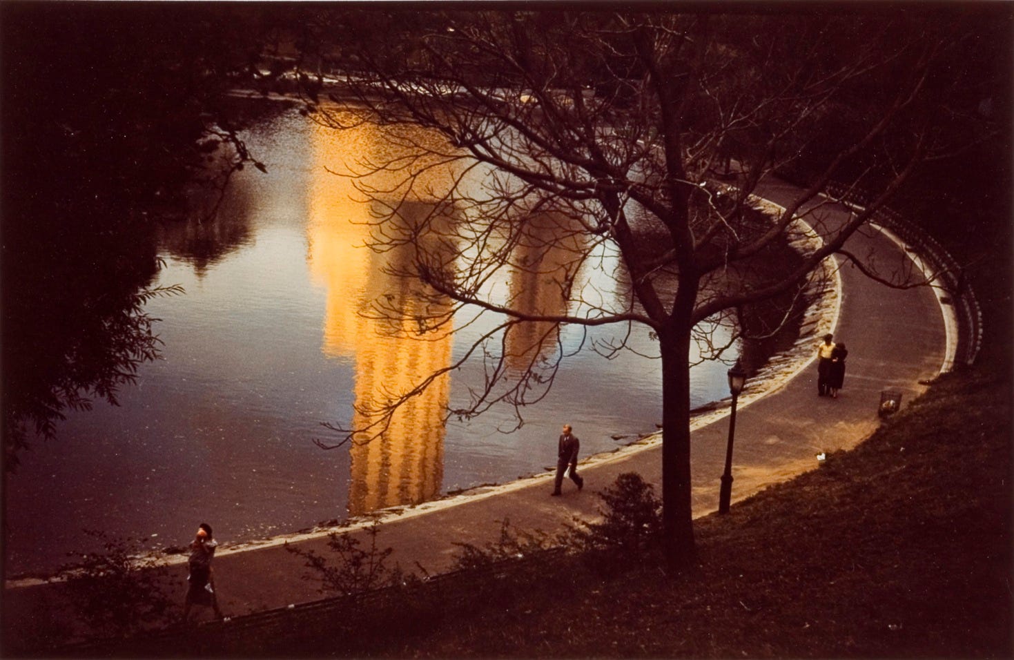
Green Photos:
These select nine are my green photographs. I eliminated most of my yellow photos that had duller or a less variety in color, along with ones that focused on patterns. For these photographs I mainly chose ones with focus on bright, vivid colors, metals and light against them and other architectures. While my first, third and seventh photos had vibrant colors, my second photo had a variety of colors that made it stand out. My fourth photo, alike to my third and seventh, used different colors that contrasted with the background to create direction and shape which made that stand out despite it being duller colors. Light was used in many photos, ranging from being used for value or tone, like how the image gradually goes from darker to lighter in photos one, six and seven, to reflecting off of metal or glass surfaces like in five, seven eight and nine, and even through the sunlight spilling between the gaps of leaves from a tree beyond the photo onto the background in photo four. Each and every one of these photos demonstrate my vision and reflect my chosen photographer, Ola Kolehmainen’s style, either by using light against architecture or the use of vibrant colors.
Red Photos:
My red photos are my favorite of my 798 set. They have vivid colors, lots of texture, and use light to make tones and value in the photos. All three give a rough texture, from the thick layered paint in the first and the second, to the spreading rust of the third. I think each demonstrated my vision and mostly reflected my chosen photographer, Ola Kolehmainen’s style. For my next set, I would like to improve the quality of my photos by further eliminating any distracting factors, especially in the background to make it more interesting. I would also like to use a larger variety of architecture like glass to better demonstrate Ola Kolehmainen’s style. For the next shoot, I will be more careful in my composition so as to limit the distractions in the photo, and will also try to emphasize the use of light against pieces of architecture.

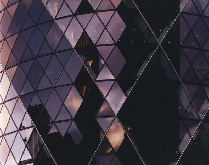
This is the single photo I will be fully evaluating.

This photo is of a vivid colored piece of architecture in the 798 art district. It reflects my vision in that the though there is only one color, it is a very vibrant eye catching one that makes the photo interesting. It also uses the formal element of value and/or tone through its use of light. The angle of which the sun hit the piece of architecture creating an image of darker shades in the bottom left corner gradually becoming lighter towards the top right. The light also emphasized the use of pattern in the photo, creating focus around the carved semi-circles resembling a fish’s scales in the paint. Another feature that made the photo was the thick layers of paint on the building, creating a thick texture in contrast to the typical smooth metal building you see in everyday life. These attributes of this photo are the reasons why the audience can see my intentions as a photographer and how I was inspired by the abstract photographer Ola Kolehmainen especially through the use of light against architecture.


 8)
8)


 1)
1)  2)
2)  3)
3) 
 5)
5)  6)
6)  7)
7)  8)
8) 
 10)
10)  11)
11)  12)
12) 


Recent Comments