Diego

This is for my photography

Final Set of Photos for Identity – Portraiture

My theme for the portraits is to show sharp definition close up portraits of subjects holding an inanimate object in focus to capture the importance humanity symbolised by the subject, holds for items.

Image 1:

  • Evokes a Mother Mary type silhouette using the towel to mimic a robe, which creates a sacred effect towards the object
  • Blue layered light reflects the control of the object on the subject as he is wrapped in shades of blue, as the orange light represents the call to help to break the trance he appears to be by his muted expression
  • Centered symmetry and triangular framing is at use here with the face and wrists forming the triangle of details in the portrait surrounding the object to highlight its importance
  • Shallow depth and contrast lighting creates conflict of complimentary colors to highlight the sharp portrait of not the face but of the item
  • The colors are more saturated only to draw more light and brightness out of the lighting to refer to how the pull from both figurative forces is strong

Image 2:

  • Shadows are used to mimic monsters within the plushies how personal issues and fears can follow people like their own shadow
  • Blue shades of tone are used again, but for this image as a color of cool innocence and protection from the muted greys and purple in harm’s way as a theme
  • Crisp detail of the face contrasts the soft lines of the objects and soft feelings they hold when felt
  • The image is composed into off centered halves with close framing to crop out the other details in the background
  • Tight composition and the light hitting the subjects face refer to what hes looking at might be the guiding light to safety

Artist Analysis on Nadav Kander

Thom Yorke VII,  Nadav Kander 2019. Accessed December 1, 2025,

Nadav Kander creates his portrait in this example by using;

  • Moody directional lighting,  displaying two different light sources to create duality of tones and conflict
  •  Low saturated colors and different shades of blue
  • a controlled body posture, often symmetrical with both wrists in frame
  • a sharp rendered face with soft lines around the body and background
  • layered lighting to create different colors, referencing different emotions one can feel at the same time

This portrait conveys the themes of isolation as the man is surrounded by the dark abyss and loneliness, captured by blue and the cooler tones similar to the feeling of being alone underwater. This portrait conveys the message that anyone can be isolated based on the man being at the center like a symbol for humanity as a whole.

This portrait is an example of what type of sharp portraiture I want to capture in my work for the final sets. I want to make use of blue lights and layered lighting, as a symbol of emotions coexisting together. I aim to also mimic a controlled body posture in my subject, directing the subject to hold items and to show a neutral face expression to draw attention away from primarily the face. The focus in contrast to this photo, will be placed on an item held by the subject to capture the essence of value people hold towards inanimate objects. This portrait however makes good use of colors and shadows to show different emotions just by capturing shades that compliment a subject’s expression. These factors of visual blend is what I appreciate about this work.


Reporter, Guardian Staff. “Nadav Kander: 30 Years of Portraiture – in Pictures.” The Guardian, 26 Mar. 2020, www.theguardian.com/artanddesign/gallery/2020/jan/13/nadav-kandar-30-years-of-portraiture-in-pictures.

Mind Map on Sharp Portraiture

First Set of Photos – Diego Laguda

Q1: For the first image, my eyes are immediately drawn to the subjects face and the plushies around him, since  the image is cropped closely and the background is blank.  It is clear that the focus of the photo is the shadows behind the subject and the boy since their outlines are so clear and defined without being too strong that it is too bright. For the second image, I’m drawn t the subject and his expression but the shadows are not as clear and there is no real theme and story in the shot because of the angle being too high and low resolution.

Q2: There are no distracting elements in the first image as everything is composed properly, showing clear intent and composition techniques like direction of the subject and props as the subject is mostly in the photo. His shadows are also very clear and cropped well with a background with one tone to prevent the viewer from interpreting anything unnecessary. The second image is not too distracting but the angle could be cropped better to hide the black sticking out of the bottom left, with the shadow of the second plushier being concealed out of the shot.

Q3: The exposure is great as you can see the difference in shade and lighting around the subject as the light hits the right of his face. The face is not to bright and saturated, making use of soft tones. The second image has weaker exposure in terms of skill because the lighting is not showing any depth in the face with different tones of light, resulting in a lower quality looking shot.

Q4: The shots both near the same focal length would look a little better looking more directly at the expression of the boy with his shadow right behind him as it would make it clear that the boy’s expression is key to the idea and story.

Q5: The background is doing nothing as it is one shade, but because there are no details it acts as a blank space for the shadow to be clear without bumps or distortions for both photos. This creates a better focus on the shadows and helps compliment the portrait more to the vision.

Q6: The balance of the shot is well composed because the image uses the rule of halves, as the subject is within the second half of the photo. The intent of the shot is clear with shadows being captured without unnecessary details and with a cool color scheme, it is clear that the photo had directions and a vision.  The second image does not follow any form of composition and  looks awkward due to the angle of the shot with the cut off of the shadow and other plushie. This makes the image feel unorganized and uneven.

Q7: The color is accurate to the shot without looking too over-edited because of the simple changes to contrast, showing cool colors to compliment the entire theme of a dark and spooky mood. The second shot uses an unedited shot with a more random assortment of colors since this is a practice shot.

Q8: The depth of field suits the first photo well, concealing most of the unnecessary details and backgrounds, capturing a full shot of the boy’s expression, shadow, and plushies in the frame from a low angle since at lower angles, looking up towards something creates the effect of dominance towards the subject.


MORE PRACTICE SHOTS on Portraiture with Poses and Sharp definiton:

Statement of Intent – Portraiture – Diego Laguda

In my project titled Lurking Shadows, I want to capture a photo that uses shadows to symbolize the fears, anxieties, and the constant emotions that follow people throughout their lives. The concept I aim to convey  is based on peoples general lack of awareness that many of their constant fears arise from the unconscious mind or the sequences and environments that surround their life. Through light placement and framing, I would like to visually represent how these struggles remain behind us, just as a shadow does. In order to achieve this visual representation, I will frame my subject against a dark background,  and I will utilize one strong light source at an angle to capture the shadow against the wall, which will be directed at the subject, but out of the frame. The angled side shot of the frame will allow the subject to be illuminated by the light from the front, while dramatic by editing, harsh shadows will be cast behind the subject in the dark. The subject will appear more alive and less motionless while in contrast to the deep shadows accentuating internal fears that always follow. The theme I will convey in my photograph is the emotion of fear and the theme of elusiveness as the subject looks out of the shot towards something out of frame as a shadow follows them. I aim for the viewer to feel worried yet curious to why certain elements and objects in the photo make them feel fear despite it only being present in the shot, this curiosity will retain their attention to the portraiture.

I aim to compose in portrait framing and tilting the camera to achieve a view of both the subject and the shadow while remaining hidden from view of the actual light source. I will crop out anything that is unrelated, and any bright colors or distractions such as other people in the background, there will be no distractions, so the viewer can focus completely on the subject, the emotion, and the meanings created through the shadows. My intention for this project is to create an emotionally expressive, photographic image that conveys the vulnerability of the subject in the expression,  the tension between the objects and the subject, and the skills using various technical photography choices, including lighting, composition, framing, and contrast.


Introduction to Portraiture – 1

A portrait is a photograph that aims to capture a person/group’s essence and being in a shot, to represent what they look like and who they are as people.  Selfies can be portraits but only if they are thoughtfully captured with different studio elements like lighting, tones, symmetry and framing. A casual selfie may not be considered a portrait due to the lack of creative control and the clear self-expression. Portraiture should typically include a subject (person) that stands or follows some form of composition whether it is using halves, thirds or close up angles. The portrait should also make use of intentional effects and editing. This would be in the form as studio lighting, perspective, framing, colors and shadow. Cropping out background noise like people and buildings can also add and remove unnecessary themes pictured in the original photo.

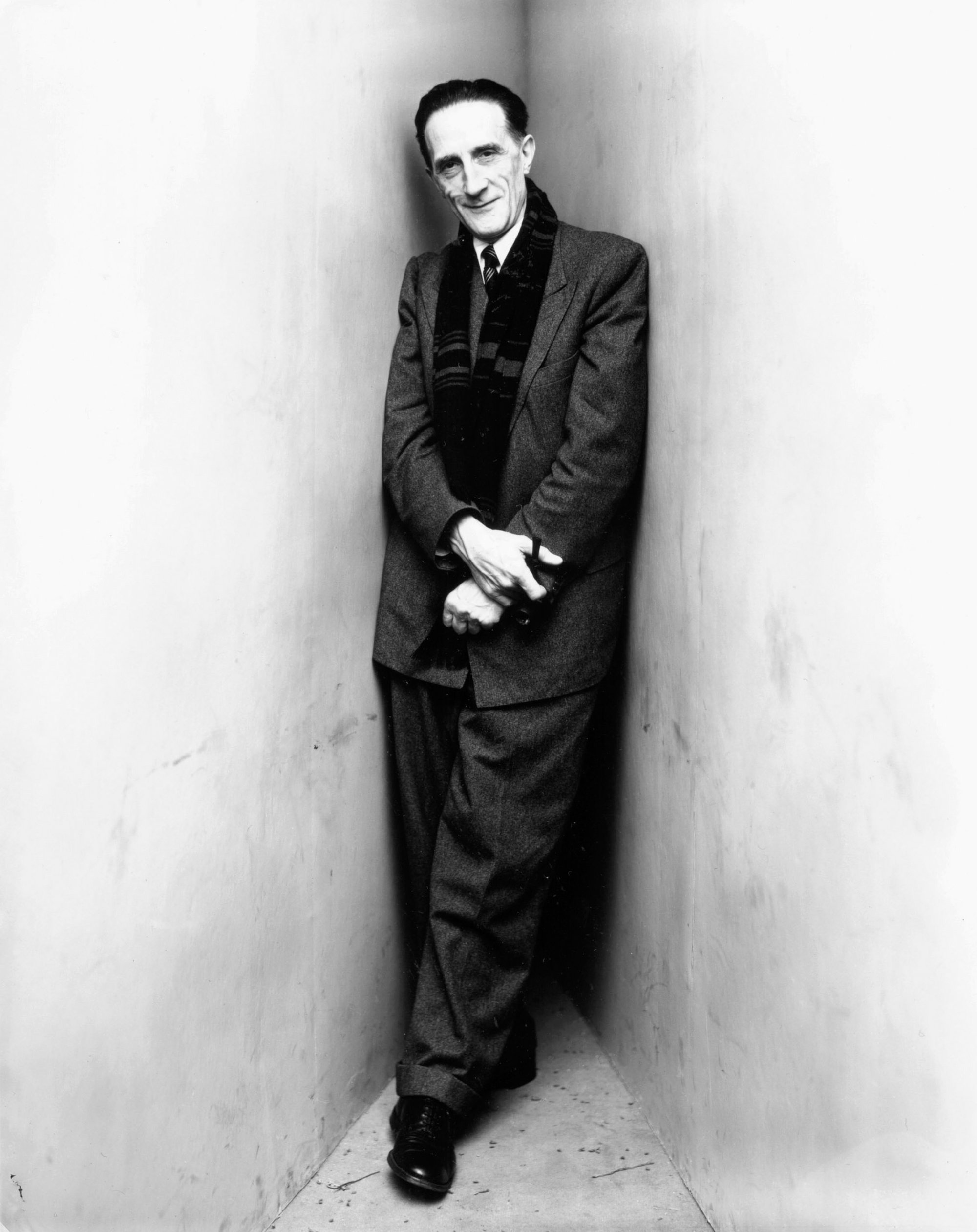
A good portrait like this from Irving Penn makes use of different photographic elements not only to show intent, but to convey an idea of contrast and lighting between the man’s suit creating shadow and contrast from the blank white wall. Good portraits make use of connection to humanity and the subject, showing emotional vulnerability in their expressions, colors and poses to tell all kinds of themes interpreted by the viewer instead of a plain and straightforward picture with text saying what you should interpret or nothing at all.

109523.16.jpeg

(Irving Penn, Marcel Duchamp (2 of 2), New York, 1948, gelatin silver print,)

Art and photography may not always show a person’s face or identity to communicate a person’s identity. In some cases, simply incorporating one detail, such as an article of clothing, part of the body or a gesture, can represent emotion, character, or experience. Photographers such as Dorothea Lange were clearly able to convey a human story simply by photographing a person’s weathered hand. Likewise, abstraction can still be portraiture. Abstract work that uses motion blur or torn images, for example, clearly provides evidence of human presence and emotions. Abstraction, or motion blur, still supports identity when the viewer understands the implication of the person behind the picture. Portraiture becomes abstract when identity or personal essence disappear.

(Man and child, Dorothea Lange, 1952)

Even if you don’t capture a person, you can also depict a person through objects, or personal belongings, spaces, or open areas regarding that person’s human condition. This includes the work of  Sophie Calle. Portraiture may even take place as series rather than a single photograph, as in Zanele Muholi’s Faces and Phases, in the series, images, when mushed altogether present a fuller pictorial narrative. All even though these examples, portrayals compose of symbolic meaning regarding identity and communication. The act of photography, or creating art, is not confined to a specific form, nor is it socially conveyed or accepted from one image to the next. Instead, the gesture to shape a story about a person, through the lens of the camera, is what defines portraiture, whether in a more abstract form or seemingly as a more conventional full framed posed portrait.

(Zanele Muholi Qiniso, The Sails, Durban 2019)

Works Cited

“Dorothea Lange – OMCA Untitled (Mother and Child, San Francisco).” Dorothea Lange Digital Archive | OMCA: Oakland Museum of CA, 15 July 2020, dorothealange.museumca.org/image/untitled-mother-and-child-san-francisco/A67.137.7548.

Fraenkel Gallery. “Sophie Calle | Fraenkel Gallery.” Fraenkel Gallery, 2 Oct. 2025, fraenkelgallery.com/artists/sophie-calle.

      Irving Penn | Pace Gallery. 5 Feb. 2021, www.pacegallery.com/artists/irving-penn.

Tate. “Zanele Muholi | Tate Modern.” Tate, www.tate.org.uk/whats-on/tate-modern/zanele-muholi.


Photography Blog Evaluation – Street Photography Triptych


1st picture:

This is a scene of a man exiting the subway passing a crowd of people. The subject is captured in a close up square portrait shot. The image is highlighted in very soft grey tones, reflecting a feeling of exhaustion and nostalgia as if came from an old picture.  This is important to the story of the image because it details the connotation people associate with work and being on the subway, which is usually negative and dreadful. The photo feels very active as on a subway things and people are always moving around trying to get from one place to another. The subject who is framed surrounded by people looks focused yet frantic trying to move across the space. It feels chaotic because of the number of people to compliment the theme of work and exhaustion as similar ideas. There is a close lens in this photo to create a perspective that draws our attention to only the man’s face. The other faces and people are concealed but not blurred, showing how the framing wants only the man to be seen. The surroundings inside the train are also hidden and cropped out possibly to take focus to the similar tones in this picture. This image gives me the impression of a man who just wants to go home but has to pass through all the obstacles around him. This could make the image feel relatable and as mentioned earlier, exhausting. The low contrast of the image makes all the soft tones feel so similar to one another and creates this element of unity and repetition in types of shades and color. This scene portrays a theme conveying how no matter how difficult all your problems will be at the same time, you just have to get through it, as the people blocking the man represent the unified issues.

These elements of framing, tones, low contrast and soft saturation create a nostalgic shot that feels as if it was pulled from an old movie to capture the fast paced actions of a man passing by a crowded space in the subway as the perspective of the camera displays a shot across all the people, giving the viewer a glimpse at the ideas of exhaustion and how work and daily life can be tiring.

Before shot:

2nd picture:

The second picture displays a man on the warm side of a scene, spotlighted by the harsh light as people in cool colors in a softer scene walk by. Color is important in this photo because the use of orange and blue shades captures the theme of complimentary colors and how the contrast one another. The harsh orange also differs in the softer saturation of the blue tones in the other sides. The composition of this image makes use of the idea of halves and dividing two themes like warm and cold across from one another. The framing of this image originally is more focused on the brick wall and the man, but it was cropped to create a rule of halves between these two sides. This photo gives me the impression that the man in isolation is waiting for someone or something to happen. Under the warm tones, these shades to me are associated with the feelings of impatience, stress and worry. The man’s behavior seems worried as well because of the expression he makes and the hands in his pockets showing his nervousness and his inability to wait. The immediate impact this image has on me with the two contrasting shades gives me ideas relating to the saying how the grass is greener on the other side. The man waiting and seeming worried portrays the idea that under the intense light he yearns to be with the others who are not seemingly isolated in this image and are under cooler tones.

These elements of tone, contrast and framing work so well together to capture a story of a man under warm light, perceived as a person who is struggling to hold together under the warm lights as he looks out in comparison to the abundance of people in the cool seemingly more peaceful light.

Before shot :

Before Shots

Photography Working the Scene 10 chosen photos – Diego Laguda


  • use of lines
  • clutter and comparison to the focus and focused expression of the man
  • strong focus of the man
  • background blur
  • close up cropped shot
  • dramatic warm tone to encapsulate nostalgic feel
  • the toned down colors creates a mood of grit and determination associated with hard work and desaturated colors

  • repetition of chairs
  • element of shadow creating depth in shot
  • low angle shot
  • cropped composition to only capture chairs
  • shape
  • dramatic filter to create nostalgic feel
  • the emptiness of the chairs creates a sense of loneliness

  • bright saturated colors to highlight different shades
  • highlight and focus on surprised expression
  • texture of all the items create visual noise
  • the shot feels busy but the subject looks shocked and ironically frozen
  • square composition to capture the box stall
  • bright lighting

  • composed at a close angle to zoom in on an empty space with a man looking at his phone
  • his expression looks sad and down reflecting on what he might have read
  • high background blur to make it clear on who you should look at
  • texture of the leaves behind create a distinct background
  • shadow and light composed to make the surroundings of the man feel darker
  • close up shot

  • spotlight on the man
  • cropped to where only he is shown at the center
  • texture and shape found in the background
  • his shadow covers his full expression
  • lighting feels very dramatic and harsh reflecting on how life might feel for him based on expression
  • warm tones and lighting

  • close up shot
  • dramatic cool filter and lighting
  • reflection in window of the lights
  • night life and empty street characterized as quiet yet gleaming with lights
  • couple in dark shades as their shadow is not seen due to the dramatic lighting
  • expressions are not captured clearly
  • distanced angle
  • boxy shapes

  • symmetrical lines across the top and bottom
  • people crossing the side walk in formal wear
  • composed at a distance
  • landscape shot
  • lines are straight
  • dramatic warm filter creates nostalgic and early morning feeling

  • focus among crowd creates visual noise and clear focus on subject
  • close up shot without blur also allows for viewer to clearly see all the elements in the photo
  • dramatic warm tone to create the effect of business on the subway
  • texture in the filter
  • blur slightly on the mans face to replicate motion
  • composed at an angle where only the man’s face is clear and visible between many people

  • high focus portrait filter
  • blur on background
  • low angle shot
  • expression on man’s face is candid but glaring
  • dramatic filter to highlight the feeling of exhaustion
  • shadows create a lot of texture and rim lines on the silhouette of the subject
  • repetition of pose between the two people

  • high angle shot
  • symmetry between two city sides divided by a river lined up at a leading path perspective
  • dramatic high saturation to mimic the intense feeling of being in a busy district
  • boats passing by also creates symmetry
  • lines and shadow creates details in the building at a distinct level
  • distance shot from far away
  • no clear main focus aside from view of river


Blog Post 6 – Row of Practice Shots – Working the Scene

High focus with layering to capture texture and depth

close up shot with a half and half composition to conceal setting and focus on subject

blur of background at a low angle to show power in the object

far distance high angle shot to capture all the repetition of the chairs

high angle close up shot to display intrigue and contemplation

blur and low shutter speed to capture motion and silhouettes

« Older posts

© 2025 Diego

Theme by Anders NorenUp ↑

Skip to toolbar