Blog Post 6 – Photo Safari

Ms. Stride – exemption given (in only doing 6 photos out of 12) due to the completion of Blog Post 4. 

01:
– This image best shows tone/value because it is split into a dark side and a light side. I took this at the ISB Commons when I saw a fake cherry blossom tree filled with Chinese New Year red envelopes. The contrast between the bright flowers and the darker background made the value change really clear, so it matched the drawing well.
02:
– This image best shows shape because the small black square in the upper right corner is surrounded by empty space. I tried to take this from the ceiling because it looked similar, but the angle was too hard to capture and it was almost impossible to make it look clean and well-placed like the drawing.
03:
– This image best shows pattern and texture because the repeated marks fill the whole square. I took this from the cafeteria chairs, and it worked because the small details repeated naturally and created a similar textured pattern like the drawing.
04:
– This image best shows line and pattern because of the thick horizontal stripes. I couldn’t find one that felt interesting enough, since most stripe patterns I saw looked too basic and boring compared to the other photos.
05:
– This image best shows line and pattern because the vertical stripes repeated across the frame. This one was also difficult for the same reason as 04, because the examples I found felt too simple and didn’t seem interesting enough.
06:
– This image best shows shape and value/tone because the dark circle stands out clearly. I took a photo of a random ceiling light in the Design Center, and if you look closely you can see another circle created by the bright glow. That extra circle made the tones and shapes of the image more interesting.
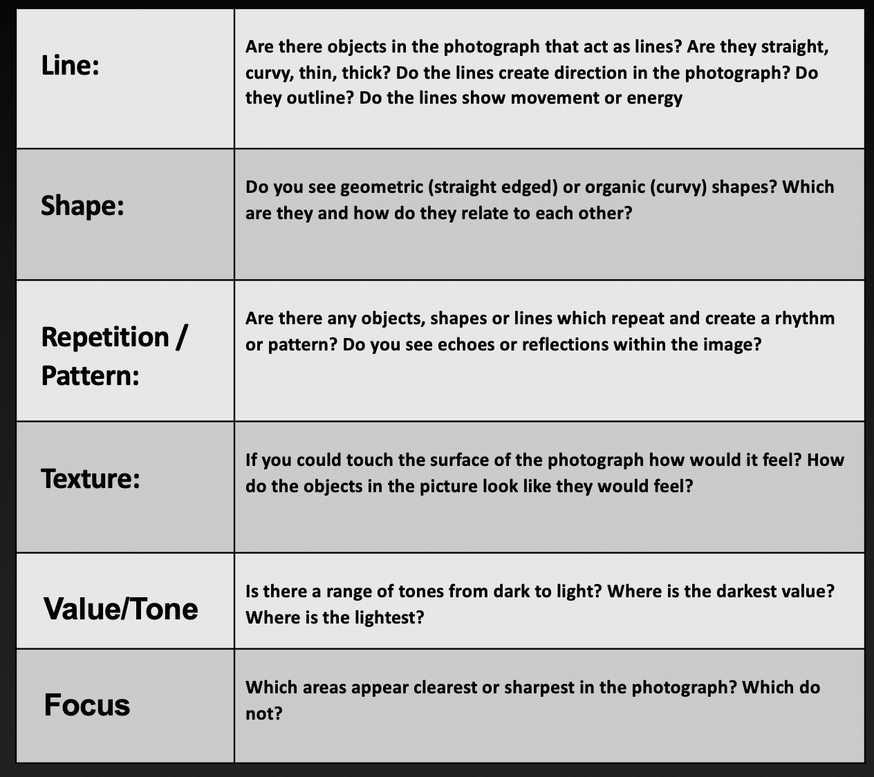
07:
– This image best shows line because the thick lines created a bold grid. I took this image at 798 during our field trip, and it worked well because the lines were strong and matched the drawing almost perfectly.
08:
– This image best shows pattern because of the evenly spaced dots. I struggled with this one and couldn’t find anything that looked close enough in real life.
09:
– This image best shows line and pattern because a thin grid creates an organized look and the only thing I could think of was a Rubik’s cube, but I didn’t end up capturing a photo that matched the drawing clearly.
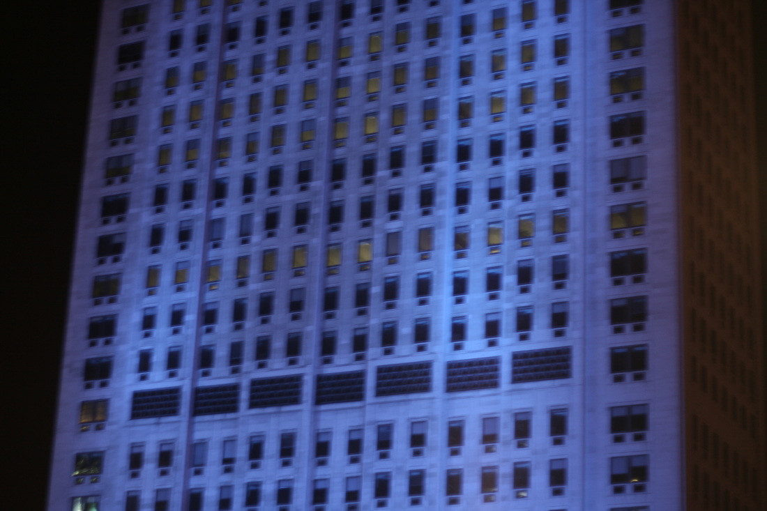
10:
– This image best shows line and shape because the diagonal shape leads the viewer’s eyes and I took this in the library using the book return box, and it worked because the diagonal line was strong and simple.
11:
– This image best shows shape because the triangle is centered and bold. I took this at 798 as well, during our field trip, and it matched the drawing because the shape was clear and filled the frame.
12:
– This image best shows texture and line because the messy horizontal lines create a rough surface look. I couldn’t find a good example, and the only idea I had in mind was breaking an electric device and photographing it.

Blog Post 5 – “Left by the Tide”

Shell, 1927 - Edward Weston

“Shell” (1927) by Edward Weston

Edward Weston may have been interested in showing the natural beauty of simple objects. He may have wanted people to look closely at the shape of the shell instead of seeing it as just something from the beach. He may have also been interested in light and shadows and how they make the shell look more three-dimensional and abstract.

If I were the photographer, I would title this photograph “Left by the Tide.” I chose this title because the shell looks like it was left by the ocean after the water moved away. The empty opening of the shell show something has passed through it, while the curved inside shows how the sea shaped it over time. The title connects the photograph to the beach and helps explain the contrast between the hollow entrance and the full detailed inside of the shell.

This photograph by Edward Weston uses line through the curved lines inside of the shell, which guides the viewer’s eyes. The shape is natural which makes the shell look more like an abstract form. There is a pattern made by the repeating curves inside the shell. The texture seems smooth, with some rough areas shown by the light and the tone goes from light to dark which helps the shell stand out and look deep. The focus of the photograph is clear, so the details of the shell are easy to see.

Citations:

“Shell, 1927 – Edward Weston – WikiArt.org.” www.wikiart.org, www.wikiart.org/en/edward-weston/shell-1927-1.

Blog Post 4 – Formal Elements of Photography

The Formal Elements of Photography are parts used to make a photograph. There are six types of Formal Elements of Photography and they are line, shape, pattern, texture, tone, and focus. These elements are often used together and how they are organized in a piece determines what the finished product will look like.

Line

Line is the most important and influential element out of the Formal Elements of Photography. This is because, without line, there is no shape. Without shape, there can be no form. Without form, there can be no texture and there can be no pattern. This makes line a starting point when thinking about Formal Elements. The straight line we are most familiar with isn’t the only type of line talked about in the Formal Elements. There are different types of lines. One type is known as leading lines. Leading lines are lines that can guide the viewer through your shot or to a specific focal point. Lines also don’t necessarily need to be straight, horizontal, or even vertical. They can also be curved, angular, or random. Angular lines converge into a central point which is commonly known as the vanishing point that adds perspective to your image.

Shape

Shape in photography usually means by a 2D subject outline. Shape on your composition can turn objects, landscapes, and figures into defined striking focal points in your image. By using various lighting techniques, such as backlighting, silhouettes, and paying attention to shadows, it will help elevate the shapes in your shot.

Pattern / Repetition

Patterns in photography can be aesthetically pleasing and draws attention to a photograph. Some important aspects of patterns are Rhythm and Symmetry. Rhythm is when a shape is repeated in a photograph. Symmetry is when a photograph looks like it consists of two objects that are mirrored images of each other. Symmetry can also be subverted so the two objects are similar but not quite alike. These draw the viewer into the photograph and make the photograph more interesting.

Texture

Textures in photography conveys the tactile surface quality of a subject. These include rough, smooth, soft, hard which stimulates the sense of touch. It adds depth, detail, and interest to the image which is often emphasized by using lighting to create contrast and shadows.

Tone / Value

Tone in photograph focuses using variables of contrast, light, and dark areas in your image that brings depth. Tone is fundamental in most black and white photography in where it should guide the viewer through your image where there is no color present to focus their attention on.

Focus

Focus in photography is the process of adjusting the camera lens to make a specific subject or the area of an image as sharp, clear, and detailed as possible. Focus determines which parts of the image appears in focus and which appear blurry (out of focus), which serves as a crucial tool for guiding the viewer’s eye to a focal point in an image.

This photo emphasizes the Formal Element of Line, mainly through the building’s structure. The windows and frames in this building fills the image with vertical and horizontal lines that repeat across the entire structure of this building. The vertical lines makes the building appear tall and draws the viewer’s eyes upwards, while the horizontal lines add stability. These repeated lines also create a pattern that gives the photo a sense of rhythm and structure. the bright blue color lighting in this image makes the lines stand out against the darker pitch black background, making them the main focus of this image. Since the lines are so clean and consistent, they guide the viewer’s attention and highlight the overall building’s geometric shape. This photo also emphasizes the Formal Elements of Shape and Tone because for shape, each window forms small rectangular shapes that build the larger shape of the building and for tone, it is visible in the contrast between the bright blue building and the darker pitch black background. So overall, this photo emphasizes four Formal Elements which are Line, Pattern / Repetition, Shape, and Tone.

This photo emphasizes the Formal Element of Focus, by using shallow focus which makes the front books seem sharp while the background is blurred. This draws attention to the main subject and creates depth in the image. This photo also emphasizes the Formal Element of Tone, since this image uses warm tones like brown and red which creates a cozy and calm vibe which makes the image feel soft. You can also see the Formal Element of Texture in the book covers and pages, which adds detail and makes the objects feel more realistic. So overall, this photo emphasizes the Formal Elements of Focus, Tone, and Texture.

Question: Can an image show just one element at a time?

In my opinion, an image cannot show only one formal element at a time because I think that images naturally contain several formal elements at the same time. For example, even when a photographer tries to highlight one element such as line or tone, other elements like shape, texture, or focus will be present. This is because strong lines in a photo will also create shapes and changes in tone will reveal texture and depth. However, this does not mean that one element cannot stand out more than the other. One element can still stand more out more than the others and become the main focus of the image. I mean that while a photo may emphasize one formal element, it almost always will include multiple other formal elements working together.

Citation:

“The Formal Elements.” Luca Nembhard, lucanembhardphotos.weebly.com/the-formal-elements.html.

Focus: Understanding the 7 Formal Elements of Photography. focus.picfair.com/articles/7-formal-elements-photography.

Blog Post 3 – Abstraction in Photography

Pictorialism Movement

The Pictorialism Movement in photography emerged as a photographic style in the late 19th century. It emphasized artistic interpretation over literal representation and made use of soft focus which created  dreamy, atmospheric images.

Straight Photography Movement

The Straight Photography Movement in photography made use of large format cameras producing highly-resolutioned images. It employed small apertures which created a deep depth of field and also practiced precise exposure and the development of techniques. The Straight Photography Movement also explores abstract compositions and unconventional perspectives.

Pictorialism Movement vs Straight Photography Movement

The difference between Pictorialism Movement and Straight Photography Movement in photography is that Pictorialism Movement is aimed to make the photos look like paintings by using soft focus and manipulation while on the other hand for Straight Photography Movement, it is aimed to embrace sharp focus and unaltered images.

The Straight Photography Movement became popular amongst photographers in the years of the early 20th century because it focused on capturing sharp, clear images that captured reality directly. This was contrast to the Pictorialism Movement which used artistic manipulation to soften photographs. Photographers likeAlfred Stieglitz and Edward Weston moved away from the manipulated, soft focused part of photography and looked for clarity in their work since they believed that photography should highlight the ability to present the world directly.

Since I did not see any photographs of Edward Weston, I went to search what photograph he was most known for. One of Edward Weston’s most famous photograph is called “Pepper No. 30” (1930) and one of Aaron Siskind’s famous photograph is called “Jerome 21” (1950). These two photographs are well-known examples of Straight Photography Movement. “Pepper No. 30” shows a close up of a pepper capturing its texture and shape in sharp detail.  Aaron Siskind’s “Jerome 21” focuses on a weathered wall, turning its cracks and peeling paint into abstract art. Both photos highlight everyday objects with clarity and shows the influence of the Straight Photography Movement.

“Pepper No. 30” (1930) by Edward Weston

Aaron Siskind Pleasures and Terrors of Levitation 94Art Blart _ art and cultural memory archive

“Jerome 21” (1950) by Aaron Siskind

The works of contemporary photographers Andreas Gursky and Uta Barth is considered abstract because they focus on how we see things rather than showing clear subjects. In Andreas Gursky’s photograph “Rhein II” (1999), the photograph of the Rhine River is made abstract by its simpleness. The lines and colors are controlled, and the river looks more like a geometric pattern than a natural landscape. Uta Bartha’s photograph “Ground #57” (2002), uses soft focus and blurred details to create an abstract image. The photo highlights light and texture instead of showing a clear object. Both contemporary photographers make their viewers think about how they see the world, rather than what they are actually looking at.

A photograph of the Lower Rhine river flowing horizontally through green fields under an overcast sky in Germany

“Rhein II” (1999) by Andreas Gursky

Uta Barth. Ground #57. 1995 | MoMA

“Ground #57” (2002) by Uta Barth

In my opinion, Edward Weston and Aaron Siskind are more aligned with the Straight Photography Movement which focuses on capturing clear, sharp images of the real world without manipulation. Edward Weston’s work, “Pepper No. 30” and Aaron Siskind’s word, “Jerome 21”, emphasizes texture and form with a direct and realistic approach while on the other hand, Andreas Gursky and Uta Barth don’t fit into either the Pictorialism Movement or the Straight Photography Movement. I think this because Andreas Gursky’s work “Rhein II”, and Uta Barth’s work “Ground #57”, are more abstract photographs, using manipulation and blurred focus to explore perception and form rather than clear representation like Edward Weston and Aaron Siskind’s work. This makes their work more modern and conceptual rather than rooted in the traditions of Pictorialism Movement or the Straight Photography Movement.

Citations:

Fiveable. “Pictorialism Vs. Straight Photography.” Fiveable, 22 Aug. 2025, fiveable.me/american-art-between-1865-1968/unit-5/pictorialism-vs-straight-photography/study-guide/unaVDAajgeJA7MlH.

Luntz, Holden. “Edward Weston’S Pepper No. 30.” Holden Luntz Gallery, 31 Oct. 2020, www.holdenluntz.com/magazine/new-arrivals/edward-weston-pepper-no-30.

Wikipedia contributors. “Pepper No. 30.” Pepper No. 30 – Wikipedia, 25 July 2025, en.wikipedia.org/wiki/Pepper_No._30#/media/File:Pepper_No._30.jpg.

Aaron Siskind | Jerome 21, Arizona (1949) | Artsy. www.artsy.net/artwork/aaron-siskind-jerome-21-arizona.

“Uta Barth | MoMA.” The Museum of Modern Art, www.moma.org/artists/7827-uta-barth.

Blog Post 1 & 2 – Starting Point of Abstraction

Abstract photography can be defined as capturing images in which the subject isn’t the most interesting element. Albert Renger-Patzsch and Aaron Siskind photographed the ordinary to reveal their beauty. Uta Barth reversed the typical use of the camera, shooting out of focus and Andreas Gursky photographs the repetition of elements. During this unit, you will investigate appropriate examples of abstract photography and respond in your own way.

Question: What do you think is meant by “Abstract photography can be defined as capturing images in which the subject isn’t the most interesting element”?

I think that it means the background of the image is more interesting than the main subject. What I mean is that the background may be something unusual and unrecognizable objects that seems like we had never seen before. Meanwhile, they are everyday objects just being shown in new ways that makes them unrecognizable.

Something I learned in the video we watched is another definition for the word “Abstraction” is “Non-representational” and “Unrecognizable'”. Another thing I learned in the video is that  people use objects in our daily lives but use them to make unrecognizable or non-representational images like in the video when he was talking about how a photographer made an abstract photo using only paper and sunlight, and in my perspective, it seemed like something unexplainable.


Blog Post 2 – WRONG!

Blog Post 1 – WRONG!

This photo, taken by John Baldessari, is a famous piece called Wrong. This photo shows a man standing directly in front of a tree, while the photographer is on the other side of the road. Like the photo is named after the word “Wrong”, we can see that John Baldessari had this intention in mind since this photo contains bad composition, poor focus, and does not follow the rule of thirds. Since this shows that John Baldessari was not trying to present a beautiful photo but was highlighting what photography rules consider mistakes and then questioning whether it really matters, since an idea cannot be right or wrong as it is executed as a personal response.  

This suggests that Baldessari was aware of the photography rules and intentionally chose to break them. I think that he wanted the viewers to notice the “mistake” and question why it was made, rather than simply viewing the photo as careless.

To answer the questions, “Can a ‘bad’ picture ever be ‘great’?” and “How important is context in photography?”

I believe that a ‘bad picture can be ‘great since I hold the belief that the thing that matters most in a picture is the theme you are going for and trying to present to the viewers. Although this photo by Baldessari may seem like a bad photo, the purpose behind the photo is very creative and revolutionary.  

Context is important in photography, since it can ease the photographer’s burden of conveying a specific message and elevate the viewer’s willingness to see the picture’s beauty. However, a photo with or without context does not determine whether a picture is good or bad. A picture without context can also be a great photo since it stays mysterious and questions the viewers to think, “Why and when was this picture taken? What message is this photographer trying to tell us?” 

When viewers try to figure out the message behind the photo, they are placing themselves in the photographer’s perspective. This connects to the theory of mind, because the artwork encourages understanding another person’s intentions and thoughts.

Citation:

Baldessari, John “Wrong Photograph. Dragon’s Exchange, ISB, 22nd August 2024. https://dx.isb.cn/dash/#/classroom/648607/sections/lesson/344114/page/344116/edit, Accessed 22nd August 2024.

“Context – its about the title – Blog Post 1” ISB, https://dx.isb.cn/dash/#/classroom/648607/sections/lesson/344114/page/344116. Accessed 22 August 2024.

The Edelweiss Pirates Who Resisted The Nazis

《Flowers in the Gutter》 By K.R. Gaddy is a documentary novel based on the true story of the Edelweiss Pirates, teenagers who resisted the Nazis. This book is based on three teenagers, Fritz, Gertrud, and Jean, living during the Second World War when Hitler came to power. All three of them joined the group of the Edelweiss Pirates to rebel against the Nazis.  

Below are my notebook pages that show further understanding of my book.  

In Lesson 1, we explored hidden figures in the book and how the author might hint at central ideas, social issues, and themes. The first two pages show my thoughts at the start of the book about what the author is trying to tell the reader and how the author is giving hints to help the reader understand the book further. The first two central ideas I came upon with my book club group were that a corrupted government/society would force young people to rebel and that even teenagers did not have freedom in Nazi Germany. 

To answer the questions in my notebook: 

  1. When Jean’s house was bombed, what did she do to deserve this?  

– To answer that question, it is not whether he deserved it or not; it is just that during the time of WWII, bombs dropped on houses often happened. 

2. When Jean’s family fell apart, how and why did it fall apart when Hitler came to power? 

– To answer that question, Jean’s family fell apart when Hitler came to power because Jean’s father was an official in the Communist Party and was taken away. Jean’s mother struggled to support both children, so he and his older brother were sent to separate places. 

In Lesson 9, we explored complex causes and effects in the book, how they affect the story, and what the characters do about it. The page below shows the causes and effects of Jean’s life. From Jean’s separated family on page 26, “that would never be put back together again.” One of the causes I found in the book is when Jean’s hatred of Hitler and the Nazis started when on page 33, it was mentioned that “Hitler had come to power promising employment and a better life, but his family hadn’t experienced that.” This quote shows that Jean dislikes Hitler for lying and ruining his family. This page relates to one of the central ideas mentioned at the beginning of the blog, which was that even teenagers did not have freedom in Nazi Germany. This further explains Jean’s life and the events going on inside.

When I got further into the book, I learned more about Gertrud and her perspective towards Hitler and the Nazis. In the two pages below, I have written down many important quotes and explained why they are important to Gertrud’s life. Gertrud is the only female character among the three teenagers mentioned at the start of the blog. She has a family story similar to Jean’s but also slightly different. I wrote the quote on page 91: “We have to do something,” in the middle of the page because when Gertrud’s father was arrested for being a Communist, she noticed that she seemed less and less of him, and she did not like how the Nazis were touching and harming every part of her life. It got to her when, on page 97, Pater, the man Gertrud’s father knew from Esterwegen, came to her house and announced that Gertrud’s father was dead. This relates to one of the central ideas mentioned at the start of the blog, which was that a corrupted government/society would force young people to rebel.


That’s the end of my blog. Thank you for reading.


Humanism Infographic

My Side of the Story

This found poem was created with the words of Adam Bagdasarian. In the story, “My Side of the Story”.  In this story, it mostly focuses on a person vs person conflict. This is because on page 2 paragraph 13, when the protagonist said, “when I saw my father, most of the color drained from my face.” This showed that when the protagonist saw his father in his mother’s room, he felt extremely anxious and scared, making him unable to speak clearly without stuttering. 

« Older posts

© 2026 Wanyi

Theme by Anders NorenUp ↑

Skip to toolbar