(I don’t know why some of the pictures are black but if you click into it it shows the logo, they are all from the same website.)
Important inspirations:


- I think the sun fits well with yoga so it inspired me to do a logo resembling the sun.
- It looks like a plant with three leaves, connecting to nature. It is very symmetric, which gives off a very still feeling because there is no movement, connecting to yoga.
- Very simple and clean and represents the product/company/brand its designed for.
- I like how it manipulate the letters to represent horizon, I might not be able to do it, but it is something I’ve never thought of before so it’s very interesting.
This project is to design a logo for a Yoga studio called Kindred Yoga Studio.
Yoga is still, deep, calm, free, and should reach a state where the person is separated from the loud, busy, outside world and reach inner peace. In this case, the logo should represent this in some way in order it to fit and represent the yoga studio. Yoga is usually seen connected to nature (as seen in the pictures above), because nature is peaceful, quiet, and lively. Also, Yoga is used widely for both physical and mental health, and nature is a good place for a person to zone out, focus, and relax, so that’s the direction I want to go for designing the logo.
A good logo should:
- Be clear and recognizable.
- Others can redraw it.
- Will still look good and make sense in black and white.
- When sliced in half, still recognizable.
- Eyecatching and unique.


30 different ideas plus 6 variations of 5 out of 30 ideas. I chose to make variations of these five (cat, spiral, sun, sky, and jellyfish) because I felt inspired and knew that it was possible to make different variations of each. I also thought they were all connected with yoga in some ways, such as the movements of cats and jellyfish, the peaceful state in the sky, reaching up to the sun, and yoga mats (spiral).

Deeper variations of specifically the sun.
I chose the sun in the end because it symbolize positivity, reaching, perseverance, peace, etc. so I thought it would the best fit for yoga and it’s not immature or too boring. Yoga is also normally done with the sun shining, usually in the morning. Overall, yoga people could connect with the sun.
I started with 6 groups of 3 dots, but each group was too long and it looked very awkward. Next, I deleted one dot from each group, then deleted another until I got to only one dot. However, with 6 dots it doesn’t really look too much like a sun so I dragged the dots longer to form ovals, which looked nice to me because it sort of shows the sun is projecting sun rays.
I was satisfied with the fourth version of the sun so I felt like there was no need to make others.
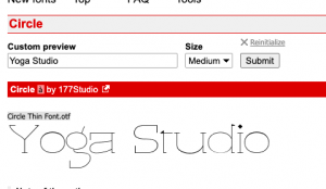
Typography:
I want to have letters saying “Kindred” in one font and then “Yoga studio” in another so I tried a wide variety of fonts:


Teacher Feedback:
I was having trouble deciding so I asked Mr. Griffin, who helped me decide that Corraline is the best fit for “Kindred” and then I could try out Danis Handwriting and Long Story Short for “Yoga” and see which one fits best. Mr. Griffin also recommended me getting rid of “studio” to make it more simple and more visually appealing so that’s what I did. (I did try both fonts for “Yoga” but I forgot to screenshot and my computer decided that it wanted to restart itself so it deleted all of my unsaved work.)
Positioning:
Next, I had to decide how the three parts would go together (the sun, Kindred, and Yoga). I quickly decided that the sun and Kindred should both be centered or else the logo would be largely out of balance, so all there’s left was where to put “Yoga”


I settled for the third one in the end because the first two looked weird off-centered, and to my eyes, the third one was the most comfortable to look at.
Growth in Technical and Design Skills:
![]()
Logo from Panda Book Award
This was the logo I designed for the Panda Book Award.
I made this using Procreate while I made Kindred with Affinity. This panda was drawn by hand so the lines weren’t smooth and the sizes are a bit weird. I was determined about the fact that logos has to be circular so I drew this logo based off a circle. I didn’t know how to insert fonts and didn’t know the criteria of a good logo. This logo was way too complicated (for a logo) and won’t be readable when zoomed out. Also it is not eyecatching and unique. Now, for this Kindred logo, which I made after learning about logo making, has neat vector lines, doesn’t look bad in black and white, simple but still pretty, and it fits well with the two fonts I picked. Overall, my logos went from a complicated, unbalanced, too-detailed logo to a simple, clean, recognizable logo.
In affinity, I used the circle tool to make the circle in the middle and the rays around the circle to make the symbol which was pretty simple. I also explored the stroke and fill to change colors, during which I learned how to make the fill invisible. Next, I downloaded fonts from dafont.com and imported them into the font library which was interesting seeing fonts I personally downloaded from a different website pop up in the library. To center and move the three parts (symbol and two fonts), I used the alignment tools, which were convenient and way more accurate than eyeballing it. Most importantly, I learned how to use mockups: downloading a psd, opening it in affinity photos, selecting a layer, edit document, copy&paste, make adjustments, and then the logo magically appears on the assigned object. This was something I would never have learned outside of graphic design and it was fun to operate that whole series of actions.
Mockups:


Final Presentation:

Reflection:
The design brief was to design a quality logo for a Yoga studio called “Kindred.” The logo I designed was an effective response because the symbol, the sun, represents positivity and zen, which connects with yoga; the fonts used fit well with the symbol, making it more appealing and more complete. When sliced in half, the logo is still recognizable. The logo makes sense in black and white. The logo is simple enough so people who only saw it once could still redraw it. Along with the typography, the logo is unique identifiable.
What I would do next time would be to coordinate typography into the symbol so they would be together as a whole instead of two separate or three separate parts. I would also try a couple more versions or ideas in affinity so I could have more options even though I knew which was the one I’d use already. Thirdly, I would ask more feedbacks from peers so I can get new perspectives and ideas on the product so I’d know more of what “the people” thinks and design a better logo. Lastly, I want to TRY to make a little more complicated versions to see how they look in a certain context because some products fits better with simple ones and some look better with more sophisticated ones so the more explored, the better.


Recent Comments