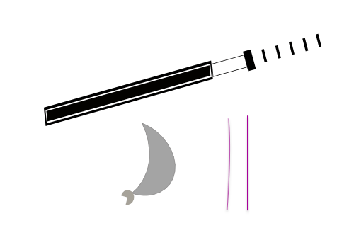
Client Name: Japanese food truck
Background: The background of this design is a fish being chopped,
Audience: people who buy stuff from the food truck
Context: this would be used on food trucks and food boxes
Key Words: easy, fantastic, and good
The eleventh logo is the final logo, for now, I chose this as my final logo because the whole design suits the idea of having a black and white theme.
Japanese food is supposed to be white and blended, meaning that it has no favors and the only source of the favor comes from the fish is self, depending on the current status of the fish. so that is why my logo is black and white.
PS: this is a food truck for sushi
after spending a lot of time on this spectacular design, I have come up with another version, this time, I’ve used typography and added the words, Japanese food truck on the bottom, because the design is very thick itself, I felt like the words are too skinny, so I made the words extra thick.
What creative decisions did you take and why?
I have made the decision of adding a single Japanese word because the words in Japanese are easy to see, I feel like it stands out, without a logo word, nobody would notice it.
Which design elements and principles have you emphasized and how does this make your logo effective?
I have used the space principle in this design, when creating the whole logo, I made sure the size between them is proportional and nice-looking
What did you do well in this project?
i think that I have successfully developed something that would be used in real life, I have tested out the Instagram method and the turn-it-small-and-place-it-somewhere-weird method.
What would you improve/do differently next time and why?
i would improve on making my logo into a more simple shape, It could have been two rectangles together with a fish on the bottom saying RAW.
Mr. Griffen mentioned putting your logo into an Instagram account avatar, which I did, I should have made more improvements on the logo, but due to time constraints, sadly I can’t. I think that the exact problem is trying to create a frame for my logo so that the logo would be suiting for any avatar of something that is round.
i would also improve on the font that I am using, if I had more time, I would like to create italics on my own and use them for the font. which would be elegant but not rude. by creating my own font, I can further demonstrate my thinking using the steps that the unit has taught me.
using the specialty of the Japanese Samurai sword, using the long sword to cut raw food, which leads that logo towards the words, it means raw but in Japenese, since this whole food truck is based on sushi and raw food. the sliced “rectangles” are pieces of food that were cut by the sword into food. the circle was meant to be the rail, but the product does not look like a rail. I still like it.


Recent Comments