Candy

"I have no special talent. I am only passionately curious" - Albert Einstein

Category: Uncategorized

Choices Choices Choices

Initial thought

my initial thought for this project is to advocate the protection of ocean animals through messages. I will be taking my photographs in the studio, and i will be using props, lighting and camera techniques to achieve my purposes. I was then inspired by the photographer Mandy Barker who spent years focusing

on ocean plastic debris and the ocean animal protections. However, i dont have access to ocean and therefore, i decided to use my model to represent ocean animals and i will be taking pictures in the studio.


What will my message be?

for this project, i want my audience to feel like being inspired and are motivated to stop wasting resources to better protect the ocean animals. The audiences should be able to interpret lots from my images and are eventually inspired and advocated to protect the animals.


How will i show this in my photograph?

For this project,  i will be using a “model” to repre

sent a ocean animal, who is suffocating and dying from the ocean debris(plastic, rubbish etc.) I will be using a blue lighting and reflect it to the white background, and this is to achieve the feeling of ocean. I will also be utilizing a slow shutter speed, which is to make the floating plastic more vague whereas the model being clear.


Artist research – Mandy Barker

these are some photographs from Mandy Barker, who is an photographer that demonstrates the plastic debris and the pollution within the ocean. These debris formed cool shapes that made the construction of the image looks fascinating. I was fascinated by the images as it does not only limit to ocean debris but can also be related to space debris. This inspired me to take pictures of how the ocean animals are suffocating under the extremely large amount of plastic floating on/in the ocean. Furthermore, my purpose is also to advocate and promote ocean protection to save animals.

Analysis of a particular picture

this is a picture took by mandy barker that illustrates plastic debris. All the plastic together forms a shape of circle, which is really cool and gives a feeling of being stared by eyes. The colour is really light, which contrast with the black background colour and emphasize the colourful plastic. This also indicates how despite being so colourful and beautiful, it is still dangerous and venomous to ocean animals.

Yellow Photos

these are my Yellow

these are my yellow photos for set 1. I have carefully used props (plastic bags and rubbishs) and adjust the colour to create a sense of feeling like ocean. The reason why i chose these photos are mainly because that they’re in focus, and the atmosphere in these photo tend to fit in the theme of what i want to present. In the pictures that were took later, there is a tattoo on the model’s face. This is because that oringially except for the background colour which could be a representation of ocean, nothing else is used to indicate the “ocean animal” part. Therefore, i asked art teacher to made a tattoo on the model’s face, which is a whale in ocean. This further contributed to letting audience better understand what is the topic of the photograph and added more aesthetic towards the picture.


Green photos

these are my green photos for set 1. The way i selected these photographs is by eliminating the ones that does not have a clear focus point or are shot badly. For instance, i’ve elimated all the ones that are a bit blurry, since my shutter speed in quite low and when the model moves, the picture becomes blurry. Then, i’ve also elimated those ones where others are in the photograph. This is because during the process of taking the picture, I’ve asked several people to help with throwing the plastic bag, and some people photograph accidentally included those poeple inside.


Red photos

these two are my red photos. I chose these two photographs specifically because they are the best demonstration of my topic – ocean animals’ sufferation. These pictures are clearly in focus, and there is no others included in the pictueres. For both of the pictures, i’ve used a quite low shutter speed in order to capture the vagueness of the plastic bag. However, the mdoel is kept static so she can be in focus. Furthermore, the emotion presented by the models are all suitable. The emotion in picture one is more like upset, worried and sad. Whereas the emotion in the second picture corresponds with the image’s title “let us breathe” as the model looks suffocating and dying.


SET TWO


artist research J Henry Fair

J Henry Fair is a photographer who is interested in taking pictures of pollution. In his photograph, there’s trait of air pollution, water pollution, ocean pollution etc. Among all these pollution, the one that inspires me the most is ocean pollution, as i want to make connection between the first set and the second set. Therefore, after researching about him and his photography, i’ve discovered that he did an amazing job at utilizing the colour to create a sense of mixture that conveys the meaning of pollution. Therefore, i further developed this idea into my own set. However, what’s different about our pictures is that his photograph are taken mostly in reality and abstract, whereas my photograph is created through the utilization of studio lighting, colour mixtures and others.
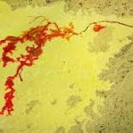


2

this is an example of J Henry Fair’s photograph. In this picture, we can clearly tell that he conveyed the meaning “pollution” through the utilization of colour mixture and structure. In this picture, the background colour blue represent the ocean, and the light red represent the pollution. The bright red contrast with the dark blue behind to emphasize the pollution, further indicating how damaging the pollution is to environment. Furthermore, this photograph is not fully straight, making it more like a 3D photograph. This on the other hand can let the audience think of earth, which has the same colour and shape.

This picture inspired me to use colour mixture to represent pollution


Yellow Photos

.

these are my yellow photos for set 2. In this set, i planned to use a box that is fulled with water and place it under the studio light which is adjusted to ocean-like colour. Then, i borrowed black paint from art and pour the pigment in, the black pigment is used to represent the pollution. I have elminated all the test shots, which are token to see the colour. And i’ve also eliminated ones that are out of focus or the ones that are repreated. (because these pictures are taken with continous shooting)


Green photos

these are my green photos for set 2. For the green photos, i’ve eliminated ones that have bad focus. And because that this set is shot is continuous shooting, there are a lot of identical pictures, so i eliminated them all. Furthermore, my aim is also to select pictures that have captured the pouring process and also when it is slowly dissovling in the water. And i’ve also eliminated ones that are bit blurried due to slow shutter speed.

Red photos

These are my red photos for set 2. I’ve eliminated all the ones that cannot convey my topic clearly, which is ocean pollution. And i’ve utilized 3 pictures to show the process of ocean being polluted. With the first image the pollution being poured, the second image the pollution being spread, and the third image the pollution has contaminated the ocean.

set 1 blue and green photos

These are all of my blue photos, i took them in around 20 places. Therefore, they are very different than each other and allowed me to have various of selection. My main subject of these photos are mostly nature, small objects and human. These subject are also closely related to my vision – the beauty of the ordinary since i have not added any filter or photo editing. This is also the reason why i’e choice these photos. During the process of taking photos, i developed my photo taking skills and photo editing skills.  They also allowed me to have various selection when it comes to green photos. The value of these pictures are also different, this is because i decided to not keep my photographer’s black and white style into my own work. During the process of taking photos, i developed my photo taking skills and photo editing skills.


my blue photos are as follow:

Candy-Photograph (1)

red photos

This image is inspired by the work of Edward Weston. In his masterpiece, he used only simple colours such as black and white, I was inspired by the use of colour, but I decided to use some other colours such as red and brown. I am also willing to focus on the symmetrical shape of the chair and the tone behind it. I think I’ve successfully created a similar work as Edward Weston’s photography, due to the use of shape space, and tone. The use of shape in this photo is just a chair, and it is closely related to my topic “the beauty of the ordinaries” in several ways. First of all, the chair is not a fancy subject that people will get fascinated by in real life, but something that is often getting ignored. Secondly, I’ve not used any specific technique to emphasize its characteristic but just an ordinary photo. The use of shape in this photo is also editable, you can crop out the left part and highlight the chair, it will also work if cropping out the right side and highlighting the value on the left. The use of tone in this photograph is mainly black and white, however, there is plentiful transition colour such as grey and light black.


This image is inspired by the work of Edward Weston, and the Covid-19. In his work, he used straight photography to emphasize the beauty of the subject, therefore I decided to follow his steps. I am also willing to show the beauty of the ordinaries by using the mask as the main subject. Under the current virus, many people are focusing on the virus however ignoring the importance of the mask. Thus, I used to tone, shape and lines to present my initial topic. The use of tone in this picture sort of symbolized the sky, it is also exposed to light and I used cool colours. This also highlights the chair since it has a contrast in colour. The use of shape in this photograph is just a mask, which symbolized the virus. I’ve also used vertical lines to fortify the mask.


This image is motivated by the work of Edward Weston. In his work, he used black and white colour and a subject to show the beauty of the ordinaries. I was inspired by his use of colour but I decided to add some colour and movement. Therefore, I used tone, and texture to represent the beauty of the ordinary in this work. First of all, the tone in this picture does not include a transition colour, however using the contrast of the dark background and the light subject. The background was designed to be dark, therefore I used dark blue. Which further creates a contrast to the subjects (book, hand, and the spray) in front. Secondly, the texture used in this image can be discovered from the reflection of light on the chair. By the light reflection, we can tell that the chair has a smooth surface.

Candy- Photograph

analyzing Edward weston’s photography


  1.  1.close up 2. black and white 3. texture 4. smoothness 5. light reflection
  2. .all the photos above used close up so audiences can observe the texture and the subject more closely and precisely.  In  picture 4, 5,6 and 8,  by looking at the light reflection, we can clearly tell that the photograph mainly focused on the smoothness of the surface. In page 1 and 7, the photographer specifically pointed at the leaf’s texture, and number 2 and 3 focused on an aspect of an animal (or person). In all the 8 photos, the photographer didnt add any other colour rather than black and white. The photographer also didnt use long shot at all, but mainly focused on the the characteristic of the ordinary subject.
  3.  The reason why i chose this photographer is because he’s photograph are closely related to my vision.  The purpose of my vision are to let my audiences find the beauty of the ordinaries by enlarge the subject and only use two colour. Similarly, Edward Weston’s photograph of pepper has attracted me, this is because it has truly presented what i was trying to show.
  4. the quote “The camera sees more than the eye, so why not make use of it?” by Edward Weston inspired me with the interpretation of his work by a lot. This has also further proven my idea of if people can’t pay attention on the ordinary things in real life, photographer should make use of the camera and capture it to let the audiences realize the importance.

responding to an image

  1. the reason why i’ve chose this image in particular is because this photo has presented what i was trying to show in my vision.
  2. What’s surprising or unusual about this photograph is that the photographer didn’t use much of techniques or skills to represent straight photography. He simply used black and white, and texture to let the audience found the ordinary beauty.
  3. I believe that in this photograph value matters a lot. In the photo shown above, not much of colour was presented, however the audience can still find out the usual part of it. The reason for that is mainly due to the use of value/ tone, a pepper in real life are mostly red or green, but the photographer only used black and white. The black pepper and the white plate had made a big contrast in colour to emphasize and make the focus onto the pepper. Even though the photo is fully focused, which means that there is no such a place that is blurry, but the first thing that i’ve saw is always the pepper. I believe that is due to the use of value / tone to make the contrast in colour.
  4. The photographer used straight photography, which is one of the technique in abstract. He has also included tone, value, light, shape, texture and focus.
  5. I really like this style because it has fully fit my vision “the beauty of the ordinary”. This is because my initial idea for the vision was to let the audience pay more attention onto the small and usual thing beside them instead of fancy things. This photograph has truly expressed my feeling by using its own way (as shown in question3) to let the audience focus on the pepper first.
  6. I will adapt this style to my own photography by using similar technique but different subject. For instance, i can choose to take pictures of an apple and use the same value and texture as the picture shown above. This artist has strongly inspired and influenced me by mainly his quote and his photograph. The quote “The camera sees more than the eye, so why not make use of it?” made me realize that one of the biggest use of photography is to let my audience see whats beyond thir eyes. It has also inspired me to take more photos of subjects that are usually not being realized.

paul strand

  1. Copy the photograph into your portfoliio


  1. List 3 things the photographer might have been interested in capturing in this picture?

three things that photographer might be interested is light, lines and pattern. The light in the photo creates a perfect shadow for the shape, and there is no such a transition colour, but directly from dark to light. The lines are all vertical in the photo, the black line and white like are similar in shape but different in colour. The pattern outside the photo is in a perfect angle that makes the shadow this clear.

  1. If you were the photographer, what title would you give it? Explain why.

if i am a photographer, i will name this photography “shadow”. Because the main element in the photo is shadow and it is in a perfect way.

  1. Name one thing you think is unusual about the photograph.

i was wondering what object made the shadow

  1. Describe the use of line, shape, Pattern, texture, tone and focus

the lines are all vertical, and they look really similar except for the colour. The shape outside of the camera must be something like a chair, otherwise there is no such a shadow shown in the picture. There are some repetition included in the picture, the white and black line all goes from small to big together. The texture is not obviously shown in the picture, but we can tell that the surface area is smooth. The tone is just mainly black and white, since there is no transition colour included. I think the photo is fully focused.

  1. What do you think is the best thing about this photograph?

I feel like the best thing about this photo is the use of tone,  the atmosphere wont be thing perfect without it. This is because showing a picture of shadow require some technique of using tone, and thats what the photographer did. The photographer decided to use dark and light as the only colour that exist in the picture and let them interact without any transition. Which i think is great since it deeply reflect the shape of both the object outside of the camera and inside the picture.

© 2024 Candy

Theme by Anders NorenUp ↑

Skip to toolbar