Behind the Scenes

How do theatre-makers think like designers?

Theatre makers utilize a similar method of producing props as designers following the design cycle do. They derive inspiration from a variety of things, in addition to creating and revising solutions to their problems


Independent Project: Residence Design

Independent Project:

During this unit, I decided to produce architectural design concepts for a residence, from houses to apartments to mansions and homeless shelters, that people would consider purchasing, or satisfy a specific demand.

Final Presentation:

Design Studio House Poster

Padlet:

Made with Padlet

SWOT and Design Brief:

Before this unit began, I was required to produce a design brief, which documented our criteria, our goals, and our constraints. Although the brief is completed now, it went through multiple revision stages. The first stage was considering the strengths and weaknesses of each project and deciding which to pursue: the SWOT analysis.


SWOT analysis:

Wooden airplane strengths: It provides a product which I can truly appreciate.

Weakness: highly complex, designs difficult to draw.

Opportunity: Learn significantly more in fusion and illustrator, and challenge my skills in laser cutting.

Threat: Too ambitious, won’t complete the product in time.


Residence Design

Apartment, mansion, house architectural design strengths: simple concept, easy to complete.

Weakness: nothing is being produced out of this project.

Opportunity: Learn more about the architecture of an apartment, mansion, and house. Pursuing this project may also enhance my sketching and designing skills.

Threat: None at the present moment.


Design Brief:

After careful selection, I decided to devise an architectural design for a residence. Following the SWOT analysis, I produced a design brief, which recorded all necessary information to conduct this project.

First Draft:

Shortly after submission, I received feedback from Rachel:

Design Problem – How will the amenities differ when you’re looking at people from different social classes or looking at different locations or different types of residences?

User/Audience – How will you make the price as well as aesthetic/design appeal to the whole general audience with such a wide range? Would you be able to specify more if you had a specific audience (e.g., billionaires) that way you’d be able to align the price, quality, size and maybe even location?

Goals – Will there be enough time to have designs for mansions and apartments etc.?

I really like how you are planning to create a physical scale model of your design (if the circumstances allow), it’s a really cool way of showing the product, even if it will be constructed at home. Your brief is very clear overall, I can see the direction you want to pursue. Nice work!

Second Draft:

Following the feedback provided by Rachel, I elaborated on the amenities given to each social class within the same amount of space. In addition, I also managed to align the general audience and narrow the range to the middle-upper class. Although I didn’t achieve my desire of constructing a scale model, I developed several architectural designs for houses, apartments, and homeless shelters.

Variation 1: House

The first design variation I developed was a house, following a modern architectural aesthetic and contemporary window layout. Although I was eager to produce architectural designs utilizing different styles, the majority of the examples I found had geometry which was beyond my capability of designing. The first three designs which are featured here were inspired by houses of similar style along my neighbourhood street in Vancouver, Canada. After I became accommodated with the style, I developed the final three, which I am quite satisfied with. Because I selected my audience to be within the middle-upper class range, I wanted to invoke comfort, stability, and artistry in this regard. These houses are stylish, their windows are large (natural light was proven to increase happiness), and most houses here feature gardens and driveways.


Variation 2: Apartment


The second design variation I began developing was the apartment. Because people residing in the middle-upper class range who dwell within an apartment like this generally live in the city, I similarly want to include as many windows as possible. The metropolitan landscape is devoid of nature, I want to encourage the residence owners to sustain plant life. I also imagine living within a cramped apartment within the city may be unsatisfactory to some owners, so the inclusion of windows and balconies provides the illusion of increased space. In many of these designs, I also incorporated methods of preventing flooding on the apartment, after realizing the flat roof designs, although stylish, were inadequate. Most of these designs contain overhangs, and the second and third design includes an angled roof. The fourth design didn’t include these features because it was a concept for an earthquake-resistant apartment. The structure is embraced by a steel birdcage frame, supported by concrete and rubber shock absorbers, and held firm by shear walls and hysteric dampeners. Although the design certainly isn’t pretty, the concept seems functional. These apartments were mostly inspired by a stack of books in my room.


Variation 3: Homeless Shelter

My final design variation involved the homeless shelter, constructed to facilitate large volumes of people. The first design concept was illustrated to invoke safety and stability, which I believe homeless people will probably lack. The columns, the stylish parapets, and the solid rectangular shape all contribute to providing an atmosphere which satisfies the demands of homeless people. In addition, I included a large amount of windows to increase ventilation, because more people requires more air to breathe. However, the building appears too unwelcoming, despite my attempt of utilizing a billboard. My second design addresses this issue, by introducing a new, geometrically complex design concept. Similar to my previous design, the structure incorporates more windows, although in this scenario, this design feature seemed unbeneficial, because in my opinion, it decreased the overall sense of stability and safety. The complex geometric design also does not achieve the structure’s primary goal of supporting large numbers of people. Thus, I believe the first design was the better of the two.


Final Design: House

After careful consideration, I decided to produce an architectural design of a house. This house was originally solely the main structure. However, after discussing the architectural design with Lucas, I received feedback to include a garage and attic, in addition to lamps. Following that feedback, I included a driveway which connects to the garage, and a garden along the perimeter of the main building, containing a garden gate and garden fence. In addition to developing a design with basic measurements and labels, a perspective drawing and level breakdown was provided alongside. Overall, I believe I responded successfully to the design problem of producing a functional architectural design with necessary amenities, and additional amenities regarding the social class. All information is well documented, and the design concept appears functional and attractive, something that satisfies the demand of the audience. This project was definitely challenging in its own right, restrained furthermore by our current circumstances. The design concepts were fun, although difficult to develop, and several other designs were discarded in favour of better ones. If I had the chance to receive more feedback, and fewer limitations that restricted my project, I’d be more satisfied. However, I’m still pleased with the result, and throughout this project, I’ve enhanced my architectural design abilities. However, this project still requires a more detailed presentation, which I certainly could’ve achieved if the situation allowed. Although I never managed to construct a scale model as I anticipated, this project was still a major success.


Design Studio Wearable Project

Wearable design poster is found here

Unit objective: produce a wearable product that the audience would consider using

Padlet:

Made with Padlet

Design Concepts:

Design 1.

The concept behind this design is simple: a shirt which contains two shirts, one on the surface and another which can be revealed when you fold the shirt inside out. Although this provides more variety in style and colour than a conventional shirt, I didn’t like the concept for its dull nature, especially since I didn’t place much thought into it. However, that isn’t to say that such a design would fail to succeed in the real world.

Design 2.


My second design concept involves a hat which has the capability to retract slits along its circumference,  revealing expanding sheets of nylon powered by servo-driven, unfurling aluminum arms, becoming an umbrella. A handle concealed within a pocket inside the cap functions as the umbrella handle, which is just a segmented plastic rod which has the ability to bend into the shape of a handle. Although the concept behind this design seems simple, producing it in the real world would be an unreasonable and absurd task. Furthermore, I didn’t spend much time thinking of this idea, so this design feels inadequate, and thus, was not selected. This design was inspired by the heat-shield mechanism which is contained within the James Webb Telescope. It’s a tennis court-sized heat shield contained inside a small box a fraction of its size.

Design 3.

This concept illustrates clothes composed of individual pieces which can be customized by their user. Each piece is a component of an item of clothing (e.g., sleeves, torso, collar, hood, etc.), and can be connected via zippers sewn into the cloth. The components each have standardized sizes, and are available in a variety of colours and fabrics. This way, if clothing sustains damage, becomes tarnished, or if seasons change, the requirement to purchase completely new clothes is eliminated. If the thought of zippers sewn into fabric seems disturbing, another alternative involves embedding nickel or cobalt mesh into the cloth, and charging it with electricity, allowing the metal to become magnetic and the separated components to attach. Using nickel or cobalt mesh has the added benefit of being more flexible than zippers, however, this option didn’t compensate for my lack of sewing skills. Thus, this design was not selected as well.

Design 4.

This design concept displays a fabric which suppresses and heals wounds the moment one appears. The cloth is composed of several layers. Between two layers of fabric lies sedative pads to numb the pain, a layer composed of individual, segmented bags of disinfectant and water solution, and a wound protection pad which functions similarly to a bandaid, which adheres to the wound after the other layers are depleted. This product was inspired by the ammunition canisters contained within the American Sherman tanks of WW2, which were protected by layers of rust inhibitor, which would cool and quench bullets on impact, and prevent the tank shells from exploding. This product was within my ability range, and I was considering using this concept as my final design. However, this piece on its own felt like far too little for this project, and I instead pursued larger ones.

Design 5.

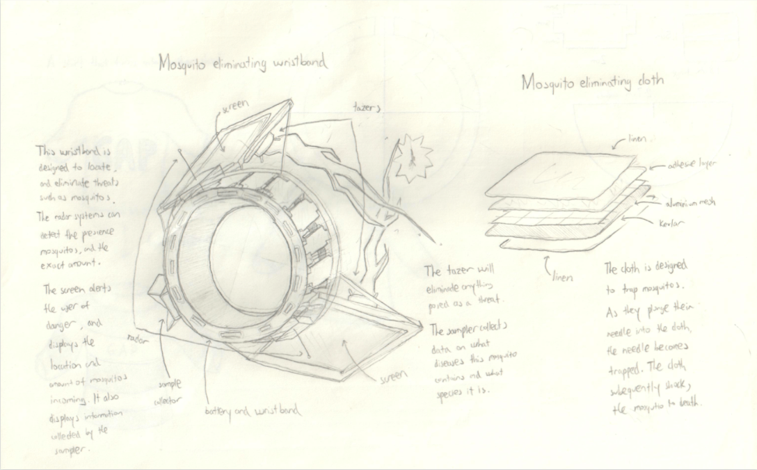
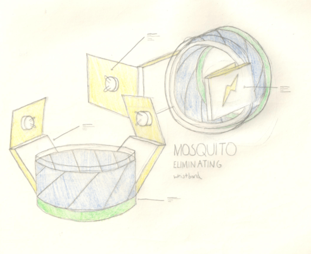
This design concept involves cloth which has the capability to passively kill mosquitos, and a wristband which actively does. The mosquito-eliminating cloth is composed of several layers similar to the previous design. I selected this design concept as the final design because it was the clearest cut, and also because I was capable of creating it. The fact that there were two also felt like the right amount to create during this unit in the time limit we were provided. However, this last statement turned out to be false, and I didn’t produce the final product in time.

I later abandoned the sampler entirely because I couldn’t find a method of incorporating it into the wristband, which was composed of wood. The screens also were not screens, the finished product would instead have laser-etched areas where the screens would supposedly be, and neither were the tasers, which would instead be cylinders glued to the screens.

Feedback:

[8:59 a.m.] Sophie Bai [STUDENT]

great drawings and detailed description

[9:00 a.m.] Kanglee Park [STUDENT]

i really like how you added all the descriptions next to the drawings

[9:00 a.m.] Theo Koh [STUDENT]

I like how you made specific detail on your draft

[9:00 a.m.] Joy He [STUDENT]

I like the well made drawing and the descriptions in material and details

[9:01 a.m.] Rachel Fung [STUDENT]

I really like the drawing, and the labels of broken down drawing of the mosquito eliminating cloth makes it really clear. Consider the colour because it could make it stand out more

Following Rachel’s suggestion, I made a refined version of the sketch which would be presented on the design poster. This version is bolder and features colour.

During this unit, I used adobe illustrator to produce the vector drawings for this design. I was also considering using Fusion 360 to produce the wristband, however, I thought building it out of wood would be a far more interesting and engaging challenge. Although I produced a vector drawing, I didn’t get the chance to laser-cut the components, or piece the parts together. Neither did I get the chance to create a sample of the mosquito eliminating cloth. Although I didn’t complete the designs within the time limit, that’s not to say this design was not successful in responding to the design problem. I think these two concepts in conjunction with each other could establish a reasonably effective barrier against mosquitos attempting to sting the user. Modern day mosquito protection clothing, although protects the user against the threat, simply does not remove the source of the problem. This product however, plunges the knife into the heart of the issue, instead of taking a defensive position like most other mosquito protection products do. However, this product does come with the drawback of being exceptionally more expensive than its contemporaries.

Overall, I think that this project was not very successful. Although the design concepts are very thorough and well thought, the final product did not come to fruition, and thus, the primary goal of this unit was not achieved.

Next time, I’d try to focus more on creating my product, instead of focusing the majority of my attention on the concepts.


Design Studio Pavilion Project (Updated)

Presentation is present here: Pavilion

The main principles I decided to follow in building a pavilion were:

  • Shelters a person from the elements
  • Facilitates socializing
  • Relieves stress, increases calmness

My first design was made to facilitate learning of different cultures, positioned within an outdoor museum. This pavilion, although not small, allows an audience to see many different kinds of architecture from different parts of the globe. However, due to its immense scale, this design could not be incorporated into the ISB campus, as a result, not being selected as the final design.

I took inspiration for this design from Mongolian yurts, French chateaus, and Japanese shrines. The overall concept of having an outdoor exhibit came from Swedish open air museums.

The second design was constructed for libraries, a building positioned outside with open interiors that both sheltered its inhabitants and facilitated socializing. This building incorporated Tibetan, Khmer, and South-eastern Chinese architecture. However, since this deviated from pavilion design, and wasn’t a candidate to be a final design. In addition, this building would fit poorly onto the school campus, as it dominates a large area of space, and blocks a large amount of sunlight.

This final design was a candidate for the scale model since it followed all the criteria I stated previously. The pavilion was constructed to facilitate social interaction, provide shelter, and also serenity. The open spaces and (although not illustrated in this picture) trees, give a natural shade, contrasting the concrete and steel of its surroundings, putting those below at ease, increasing their relaxation.

I took inspiration from the Temple of Heaven and Temple of the Earth here in Beijing, which include elevated platforms/podiums in which people would hold ceremonies and speeches. The main pagoda also took inspiration from the Vault of treasures in the Temple of Heaven. The overall concept took inspiration from the Agora, a descendant of the famous Library of Alexandria, where the great thinkers of the time held debates, lectures, speeches, and held experiments, but also where they and their students lived and relaxed in, and where books and events were held.

This is the scale model I made for my design.

Bellow is the feedback I received from students on my work.

As following the feedback I received, the pavilion is built primarily of wood and stone, very traditional materials, which were specifically picked because they contrast with the bustling metropolitan landscape, letting students escape to a more simple and familiar place. In addition, wood and stone help people feel more in touch with nature, which is a principle often followed by Chinese and Japanese architecture, and often ignored in our present age with the use of concrete, glass, and steel.

Wood and stone will not break because they are tried and tested materials, which with some paint and ceramic roof tiles, should stand against the elements. Although this pavilion would likely be successful in its design, it certainly won’t be cheap, most likely too much to afford for this school.

This pavilion will be positioned in the high school courtyard, outside the middle school / high school library. I chose this location because it’s both the closest to the students inside the main building, and also far enough away from the streets that they can enjoy relative silence.

The Pavilion is positioned here at the 7:

Science Blog Post 1-4

Blog 1, Design and Inquire

Our objective for this engineering task is to conceptualize and produce a product that demonstrates a bulk force in action, following the design process.

Although I could select a completely new design idea, I already have projects which began in 6th and 7th grade, but were abandoned, remaining untouched for years, that could potentially be the design I pursue during this unit.

These unfinished projects include: Solar-recharging battery bank, Bluetooth speakers, and a humidity and temperature measuring device.

1.

Solar-recharging battery bank capable of 10,000 mega-amp hours or greater.

A tutorial on the design process can be found here

This product not only demonstrates the energy transfer of chemical / radiant energy into electrical energy, but also provides a benefit to both myself and the environment, considering that the batteries contained inside can charge solely from solar rays, and that this product is both practical and convenient to use. In addition, many of the electronic parts required are already in my possession because I had ordered them in 6th grade. However, the downside is that I already own several battery banks, and another isn’t required. In addition, homemade designs are generally heavier and less efficient.

This product was designed to function as energy storage for people living in cloudy, sunlight-lacking environments, where solar panels can’t function every day. This battery bank could also be used in the outdoors where electricity is inaccessible. In addition, this product could provide energy to communities without the infrastructure to facilitate electricity.

The target audience are campers/hikers, people in poverty, or people living in the far north or south.

Evaluating all this information, this product will likely be the one I select.

2.

Bluetooth speakers

The tutorial on the design process can be found here

This product demonstrates the energy transfer between electrical energy into sound energy. Considering that completing this task is quite ambitious, and that the completed product probably won’t provide any benefit to myself or others, this project likely will not be selected. In addition, the speakers require high amounts of energy, which don’t exactly follow the criteria of this design project being “environmentally friendly”. However, I’d already ordered the electronic parts required for assembling a Bluetooth speaker, including the audio board, 12v Speakers and Bluetooth piece, alluding that building this, with extra effort, could be possible. It’d also be extremely fun and challenging to build.

The target audience of this product is people without the required audio ports or wires for speakers, or people who want sound amplified.

This product solves the issue of using cables, because Bluetooth removes the need for specific wires and plugs. It also solves the problem of having too small of a speaker to broadcast sound at an intensity desired by the user.

3.

Humidity and temperature measuring device


The advantage of pursuing this project is the fact that I’ve already created a design in 7th grade which I still have yet to improve. The wires and sensors are all laid out, although I’m missing a proper encasement. However, other projects remain in their infancy, whilst this project is nearing its end. Although this design follows much of the criteria needed for this project, I think pursuing it is far too easy for a 5 class unit, and I’d rather finish on my own time.

The target audience of this product is people who want to know the humidity and temperature, but don’t have the infrastructure to find out, such as campers/hikers, or people living in poverty.


Blog 2, Develop and Plan

I have selected my first option, which was the solar-powered battery bank. This design will require me to solder and laser-cut utilizing adobe illustrator, skills with which I’m already very familiar. I can also 3D print with fusion 360, another piece of software that I’m also familiar with.

As stated previously, I’ve made designs for this battery bank in 6th grade


First design (6th grade)

Good Attributes: Waterproof, a capacity of 16,000 mah, charges to full capacity in 16min at full power, medium size

Bad Attributes: Complex configuration, utilizes large amounts of plastic, Heavy


Second design (9th grade)

Good Attributes: Capacity of 15200 mah, two charging ports, medium weight.

Bad Attributes: Slow charging time, prone to fire, extremely large.


Third design (9th grade)

Good Attributes: Capacity of 34,200 mah, fast charging time (capable of attaching to detachable solar units), two charging ports.

Bad Attributes: Extremely heavy, extremely large, prone to fire.

After I had some advice from Dan, I decided to build two designs, one built for the metropolitan environment, and one built for the wilderness. The MK 3 would be built for the city landscape, where sunlight is generally difficult to access. As a result, it has an extremely high energy capacity and detachable units which can collect sunlight from several areas. The MK 4, as displayed below, would be built for survival purposes. Since sunlight is aplenty outdoors, I decided that the battery bank could only function if there was a constant source of sunlight.


Third Design detachable solar units.


Design Four (9th grade)

Good Attributes: Capacity of 15,200 mah, medium weight, size, and charging time, two charging ports, ability to remove batteries.

Bad Attributes: Prone to fire, requires constant sunlight to function.

Schedule:

First Class: produce the design sketch.

Second class: create detachable solar units, solder the battery bank module.

Third class: complete detachable solar units, complete prototypes.

Makers Club: solder batteries.

Weekend: produce MK 3 laser-cut files.

Fourth class: complete soldering batteries.

Makers Club: assemble the MK 3.

Fifth Class: complete the MK 3.


Blog 3, Create and Improve

First Class:

Design sketches shown above.

Second Class:

First laser-cut design failed

Second laser-cut design, success

A picture of the completed pieces (Taken on the 5th class)


Third Class

I’ve produced one working detachable unit, however, the others are yet to be made.

Prototypes of the MK 3

I built some prototypes of the design using fusion 360, to demonstrate that for my final encasement, everything is in working order.

Fourth Class:

No photos to demonstrate my progress, I completed the battery circuit, however, it was short-circuiting in several locations, shocked me multiple times, and never ended up functioning as intended. The circuit was eventually scrapped and thrown in the garbage, thus, no photo.

After some advice from David Nam, I began to test the capabilities of a pre-made battery pack of 6, which through multimeter testing, has shown that it functions exactly the same as my previously thrown-away circuit, providing 9 volts. However, a pack I used caught on fire during soldering because I installed the batteries inside whilst I was doing so. As a result, the pack was no longer functional, and yet another battery pack was thrown in the garbage. Yet again, no photo.


Fifth Class

Completed circuit (Still doesn’t function as intended, the screen is damaged)

After some help from Jun, I deducted that the problem lay in the screen or the module itself, where a previous solder had damaged part of it. However, everything else was in working order, the batteries was providing the correct amount of electricity, and the regulator was reducing the right amount as well.

Testing video:


Blog 4, Reflect and Share

My final product, as shown above, provides 5 volts of electricity, however, due to unresolved problems, the battery bank doesn’t function as intended. The batteries provide 9 volts of electricity since their arranged in a series circuit, dampened by a 5-volt regulator, reducing the voltage to 5 volts, which is safe for phone consumption. Although it’s not displayed in the video, the led occasionally switched on for a brief period, before going dim again, which suggests that the module I’m utilizing might be damaged. In addition, I never got to the point of demonstrating the transfer of energy between chemical energy, which represents the sun’s nuclear fusion, to electrical energy, where the chemical energy is converted to electrical energy through solar panels, and eventually powers the batteries, which later powers whatever is connected to the charging ports. One area of improvement is definitely building the housing, which I didn’t complete. Furthermore, I didn’t link up all 18 batteries as shown in my MK 3 diagram, nor the electrical cables to which the detachable solar units could link up to. If this project had functioned as intended, it would have made a great impact on the environment, saving precious electricity, and producing green energy for everyday consumption. Not all electricity is green, a large portion remains made by generators fueled by fossil fuels, so using a solar-powered battery bank can help relieve the amount of fossil fuels a person is consuming. The solar panels would also be extremely appealing to those who are often outdoors, lacking the infrastructure to provide them with energy. Unlike geothermal, ocean current, or wind energy, the sun is a source of energy that lies everywhere. To campers and hikers, a solar-powered battery would be of extreme benefit, not only to them, but to preserving the environment and reducing fossil fuel consumption.

DS Building Solutions

Design 1

Volkswagen

Design 2

Volkswagen 2

Design Problems

Made with Padlet

Logo Design

Made with Padlet


Client: 一点点 Boba tea company

Context: 一点点 is a popular Chinese boba tea company recognized for its convenience, modest prices, and exceptional customer control over their drink, including free additional add-ons.

For this project, I proposed to produce a logo design for 一点点 that better illustrates the company and its strengths. The initial logo of 一点点 has no association to Boba tea, representing only the company name. Furthermore, although the number “1” symbol is recognizable, the other figures are not, and they’re unattractive. As a result, this makes interpretation by new customers an issue, and I intend to solve this problem by making it more attractive, more recognizable, and more coherent, in addition to still keeping in touch with the original logo style.

    Original Logo Design

Feedback and Iterations

Before the designing process began, I asked Lucas to critique 5 of my initial ideas before the holiday would begin, I came to the conclusion of using logos 1 and 5. I chose 1 because the design, although obscure at far distances, was very different compared to the other designs. I also chose 5 because it fits well with my criteria: it’s coherent, attractive, and to some degree, recognizable.

Logos 2, 3 and 4 were not selected because they didn’t comply with my criteria. Logos 2 and 4 although recognizable, weren’t coherent, and 3, although attractive, was not recognizable. Although the original logo had the older, traditional version of writing the 一点点 figures, I will not continue it, because this version of Chinese is no longer widely prevalent, and would not appeal to most customers. I substituted it with the modern counterpart as you can see displayed below.

Logo thumbnail sketches (30 Ideas)’

First 5 designs (Before holiday)

Last 20 designs (During holiday)

Ideation Matrix


The individual logo illustrates a Slab-serif figure “1”, and the remaining figures are Sans-serif. Although the initial logo only uses letterforms, I think objects will greatly enhance the coherence and attractiveness.  Because the main colours used in the original logo are shades of green, wellbeing and sophistication are a reasonable choice. I selected primary and natural colours because those were the ones presented in the initial logo, and I plan to continue its trend.

First Logo Design

The first logo design was based upon a hand sign for “a little bit”, which is recognized across the world, no matter what culture or language. However, there is no association with bubble tea, but I ignored this for the time being because my later logo designs would address this.

I produced the first design following the thumbnail sketches. Although not recognizable from long distances, it was simple and coherent. However, Lucas suggested including what I had marked for keywords in my ideation matrix: wellness and sophistication. In addition, he suggested that I also add the brand name.


Following the feedback, I added two black and green slashes above the hand. Now the logo was more recognizable, although, this wasn’t attractive, so I included greater sophistication into my logo design.

This final design seemed to downgrade from my initial design. The colours, although a triad, was not effective. I decided to revert back to my original design because this was far too sophisticated. I also changed the 1 to “一” because the presentation is more direct, which is debatable whether it’s better or worse.

Mockups, Logo design 1

Second Logo Design

The second logo design incorporates a boba tea drink and the company brand. I included the hand so that from a visual perspective, the audience would naturally be drawn towards the drink. The circle functions in much the same way, focusing the attention of the customer upon the drink before the company brand. Initially, I decided that this logo design will not include any iterations, because it seemed that most of my required criteria have been satisfied. However, that opinion would later change.

The final product didn’t feel completely satisfactory, the hand and drink bottle didn’t appear organic. . However, the design was coherent, recognizable, and attractive to some extent. Although I wanted to make iterations, I didn’t want a repeat of the last attempt, so I didn’t. Overall, this logo was mostly a success, and I’m happy with its results.

Mockups, Logo design 2

Third Logo Design

Throughout the design process, I selected a number of criteria that I hoped to achieve in the final design, and narrowed it down to a few points: The design should appear organic, attractive, and coherent. The illustration should be recognizable and comprehensible regardless of the customer’s language or culture. Finally, the logo should be simple and reflect the strengths of the company. I already had a design in mind which would be the final: number 10. Although this design is extremely sophisticated, it follows the criteria listed above. I originally chose number 9, but this design seemed much more fitting.


Typography Poster

Made with Padlet

The song lyrics I decided to illustrate were from “Say Can You Hear?” by Oncle Jazz.

I chose to display a marionette doll splayed across an empty stage on two ropes because the song is about grief and scapegoating, and having hope in difficult situations. The typography poster had gained inspiration from the “Peace on earth” poster, “Paper cutout affect” poster and the “Who needs the economy” poster. Ropes would have been intertwined between the words, similar to how laves are incorporated into the design of the font in “Peace on earth”. The “Paper cutout effect” poster had white text contrast against an intense and vivid backdrop, drawing more attention towards it. This affected the fact that my text is white against black, although the empty stage is not as radiant as the other poster. The text on my poster is not yet completed, although the intended purpose was for some text to be toppling downwards, similar to how it is displayed in the “Who needs the economy” poster.

The initial sketch had intended the marionette puppet to be hazy on the edges, and dripping black ink. After some feedback from Lucas, I opted for more solid and rigid details, and (although not yet incorporated) delicate lines.

I associated scapegoating with marionette puppets (cannot retaliate, powerless), and thus chose to illustrate one. The blank empty stage is to represents nobody to turn towards, which in the song, seemed to demonstrate that.

Using Design Terminology:

I decided to use serif because it felt confined and restricted, like how the song tells the listener. I used even distancing between the letters and the borders of the poster (X and Y cap heights and length). I also decided to wrap the text around the puppet because then the effect looks less organized, and deliberately made it more out of place. I decided to make the background black so the overall hierarchy would be more obvious, and so the first thing the audience notices is the central piece.

Element Poster

PDF version found here: https://blogs.isb.cn/24ryanq/files/2021/10/Form-Poster-Final-2.png

(Just drag the picture from the page to your desktop)

The role of elements and principles in graphic design is to organize and categorize types of art, and also be presented as a foundation for any piece of work. This design task is to create an educational poster on an element or principle of graphic design, that displays and describes the element or principle clearly.

The first idea was to seamlessly blend colours, although during revisions, my partner  commented on the fact that it wasn’t the correct representation of form.  The other was to make squares within squares, although it seemed too simple. However, during the revision phase, the squares were actually the most approved of, and almost became the final piece, although the design was not complex enough, and thus was phased out.

The second idea was an abstract drawing of Phineas from Phineas and Ferb, which was then elongated. However, it didn’t illustrate depth in a way that was attractive. During the revision phase, this piece was phased out.

The third idea was the final idea. I received inspiration from igneous rock formations, which I thought represented the element of form well (constantly repeating chains of octagonal prisms (3D octagons) that potruded from the floor. ) During the revision phase, my partner said to make it less disorganized and chaotic, and rather neat protrusions from an angle, rather than from the center, which would look more attractive.

The fourth idea was to illustrate a hamburger with only potruding squares, although time ran out before it was finally completed, and was rushed into submission. This was phased out during the revision phase.

First idea Phineas and Form (Second Idea) Third Idea (Final presentation) Fourth Idea (Incomplete)

« Older posts

© 2024 ryan

Theme by Anders NorenUp ↑

Skip to toolbar