Will

"I have no special talent. I am only passionately curious" - Albert Einstein

G9 Science Project Reflect & Share

How successful are we:

  1. We completed the project in the time limit.
  2. The turbine functions properly and can at least generate 3.8 volts.
  3. The circuit functions so the turbine can use the stored electricity to charge.
  4. The final product did not break after being used for the first time.

How the device operates:

  • the wind turbine spins to generate kinetic energy which gets transferred into electricity by the dynamo, which has a specific circuit board design that allows it to power the battery and we could use a USB type line to charge an electrical device.

Reflections on decisions:

  • The decision of not attaching the wind turbine in the center was a  really good innovation we made during the process because it had been attached to the center of the PVC pipe the turbine might no have spun so fast because the C shape of the wind turbine is going to block all the wind blow that easily around the wind turbine.
  • Changing the shape of the central stem plate only subtly affected the performance of the final product, originally the central stem plate is a circle, but instead the central stem plate was reduced to a hexagon within the circle, this is because the hexagon relatively weighs lesser than a circle plate, and it also saves more wood, furthermore the six sides of the hexagon could be used to align the turbine fans.
  • Assembling a ball bearing piece for the dynamo is probably one of the most important improvements of our product because if the central dwell had been directly inserted into the dynamo the high friction of wood will most likely cause the wind turbine not to rotate.
  • 3D printing a sleeve base for the ball bearing piece and the dynamo is a very smart way that can both support the turbine and reduce the total weight of the final product.
  • The decision of adding two additional wood bases to stabilize the wind turbine is not a really effective way of thinking of it now, because wood increased the total weight of the product by a lot.
  • wedging popsicle sticks into the gap between the dynamo and 3D printed sleeve was not the best way to lock the dynamo in place. First of all, we had to cut off the extruding part of the stick, and even if we cut it off it there are still a bit making the base unbalanced. Sponge or cotton could have been used better stabilize the dynamo.
  • A small detail that unnecessary detail was making an inverted spacing for organizing the cables and circuit board, however, after changing the batter I realized it was not able to fit inside the spacing, so instead of utilizing space efficiently, it made the base of the turbine light on the front.

Impact of the product on the environment and potential client:

  • This small-scale wind turbine is a really good model that demonstrates how actual wind turbines on a much larger scale generate electricity.
  • Furthermore, the wind turbine is environmentally friendly, generates electricity with the wind (sustainable energy source), and does not produce any type of pollution during the process.

G9 Science Project Create & Improve

February 21st:

  • Attempted to assemble the complete circuit system together.

The circuit did not operate as it was supposed to do.

February 23:

  • Cut out the wood pieces and PVC pipe for the turbine fans.
  • Assembled a few turbine fans together.

February 25th:

  • Completed assembling all six turbine fans.
  • Drew and cut out two identical hexagons to hold all the fans in place.
  • Used wood glue and nail gun to attach the turbine fans to identical hexagons.

March 3rd:

In school:

  • Completed assembling all parts of the wind turbine.
  • Soldered the USB type A port.
  • Tested how much wind would be needed for the turbine to spin.
  • Sawed the dwell piece that is appropriate for the dwell piece.
  • Drill pressed a hole in the turbine cylinder stick.

Outside of school:

  • 3D modelled the sleeve and base of the wind turbine.

March 7th :

  • Completed final product.
  • Fixed the circuit and re-soldered it.
  • attached the ball bearing piece to the  turbine.
  • super glued the 3D printed base and reinforced it with two more extra wood bases.
  • Tested out our final product.
    • Feedbacks:
      • The sleeve and central dwell of the wind turbine could have been shortened to make it more stable, so it doesn’t wobble that much when the strong wind blows it.
      • The fans of the wind turbine are also a factor that could affect the efficiency of the wind turbine, so if the fans were lighter, maybe it could spin faster.
      • If the scale of the device is smaller, maybe it might have been more efficient.

      Improvements made to the prototype while making our device:

      • The wood piece is not directly nailed to the middle of a half PVC pipe because we thought if we put nails through one of the sides of the piece. The design might be more aerodynamic to generate more electricity.
      • The shape of the middle part was changed, which is used to hold the wind turbine fans in place. In the beginning, the central plate is a circle piece to let it serve as a surface for the fans to be glued to. But instead, we decided to cut out a hexagon because it can save wood, and second, we can easily place the fans on each side of the hexagon, so it is more manageable for us to align the fans and keep the fans the gap between them identical.
      • Instead of directly attaching the dynamo to the wood cylinder, it was decided to make a device to help the wind turbine spin around the dynamo with less friction. A ball bearing device was created to reduce the friction and last we made a sleeve and base for it by 3D printing.
      • Since the 3D printed sleeve was not able to fit the metal ball bearing inside, and due to time restrictions, we had no choice, so we forced the dwell in the sleeve with force, and even though it cracked the already fragile sleeve, we were able to cope with it by using rubber bands and zip locks to tied it in place.
      • The 3D printed base was not strong enough to hold the turbine in place, so we had to use two extra flat wood pieces to stabilize it, with dimensions of 15cm by 15cm and 18cm by 18cm.
      • The last issue that had to be fixed was that needed to have something fill the gap between dynamo and sleeve, so the turbine does not make the dynamo spin along with it, but bring the stick on the dynamo to spin which will generate electricity for the battery. At first, hot glue was going to be used. However, the hot glue might seek through the sleeve and glue cables together, which we did not want. So instead, popsicle sticks were used to wedge the dynamo in place, and the extruding part of the stick was cut off to make the base flat.


G9 Science Project Develop & Plan

Generating concept sketches:

Detailed composition sketch:
Fan blade concept model


Additional research:

This video talked about the main difference between a vertical and horizontal wind turbine. It also explained the advantage and disadvantages of vertical turbines compared to horizontal turbines. It also recommends making a vertical turbine for people who are interested in DIY, because vertical turbines structure is relatively easier than the horizontal turbine, and it performs better than horizontal turbines in low to a ground environments.


Materials & Tools:

DC Motor

Diode

Battery box

Fan

Phone charger

USB type-A output circuit board

Wood

Thin circular metal plate

Drill

Screws (dimension at least 10mm)

Copper wire

Schedule for making:

Before making:

Buy materials that the school does not provide.

February 23rd:

  1. Cut out the necessary wood pieces and drill holes in them.
  2. Assemble the middle part using a metal disk and the wood pieces.
  3. Attach the fan blades to the middle part using screws

February 25rd:

  1. Solder the positive and negative line of the rechargeable battery box to a DC motor.
  2. Modify the battery so it can be soldered to the circuit board.

March 1st:

  1. Assemble the finished circuit compartment with the fan structure.
  2. Connect a USB-type charger line to the battery and plug it in on a phone.
  3. Go to a place with wind and test out the device.

Success Criteria:

  1. The wind turbine can at least generate 8 volts power so it is able to charge a phone.
  2. The device has a high duration rate  (could be used for at least 4 weeks).
  3. Final product can be later modified or improved.

G9 Science Project Define & Inquire

Ideas for making:

  • Windmill-powered battery bank.  (Convection & electricity transfer)

Pros: The concept for the device is very simple.

Cons: The device requires some knowledge about circuits and based on the timeline for the project it may be difficult for me to make.

Precedents:

https://www.instructables.com/Portable-Wind-Generator-As-a-Cell-Phone-Charger/

Audience: People who want to charge their phone outdoor without a charging socket.

Similar concept to my project, it could be used as a model for me to imply some of the design ideas into my project.


  • Oil wells (Kinetic energy & electric motor)

Pros:  Educational Purpose, not time-consuming.

Cons: The device is relatively harder to build, because of its operating concept.

Precedents:

Video clearly shows the concept of the oil device and how operates. A possible model for the device I am going to make.

Audience: Kids, students, teachers, and possibly adults. For educational purposes, it could serve as a small functional prototype to let people understand how it operates.


  • Solar water heaters. (Conduction & electric thermal transfer)

Pros: Easy to make, and contains educational purposes.

Cons: Hard to get the materials needed.

Precedents:

It gave me the basic concept I need to include in my device to make sure that my device will work.

This precedent gave me an idea of how the thing would turn out if I made it on this scale. However, due to time constraints, I don’t think I have time to make a device as big. This is why I am only using this precedent as an innovation video for my final device, if I have time to make additional changes I might implement some of the designs in this to my own.

Audiences: This design idea informs people of a sustainable way to heat or create thermal energy using solar panels.


  • Desktop terrarium:

Pros: Easy to make and interesting gadget to play with, while it still has educational purposes, such as a representation of a greenhouse and shows how photosynthesis is being applied.

Cons: Hard to acquire the plants.

Precedents:

This is a really demonstrative video that guides the audience step-by-step on how to make a DIY terrarium.
It provided really good information about what would be needed for this project.

Audience: Kids, adults, especially office workers can have one to bring in some plants to their workspace. Students & teachers can have it in the classroom and everyone takes turns taking care of it as a class plant.

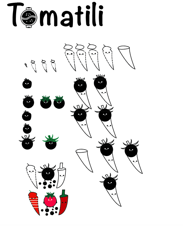
Food Truck logo design

Client Name: Hot-pot food truck

Background:  A traditional Chinese hot pot company wants to have a appealing logo that can let them easily let them have popularity when they enter food truck market.

Audience: Restaurant,  Food truck

Context: Banners, stickers, badge and posters.

Key Words: Organic, Tomato, Chilli, Vegetable, hot pot.

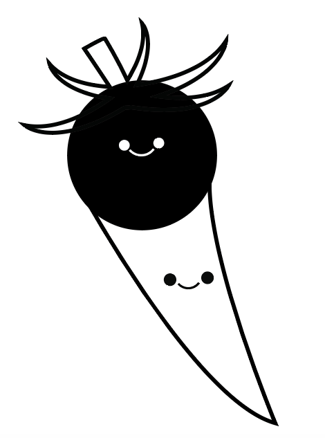
Logo 1:

This logo was very simple. It is is basically a combination of a tomato and a chili. Ice cream cone inspired me, because the shape of the chili looks like an ice cream cone, which made me realize that the tomato represent a ice cream ball. These two ideas ultimately lead me to combine the two elements together to look like an ice cream cone.

Process:


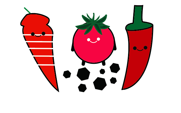
Logo 2:

I came up with this logo after logo 1. the main feeling for this one is more symmetry formed by multiple objects, rather than a integration of two objects to form  one complete object.  I decided to make it symmetrical, but not a perfect reflection, because it would have lost its natural organic impression that vegetable give off. Which is why, I made the two peppers on the side slightly different to make each figure look more independent.


Logo 3:

Logo 3 is basically a variation of logo 2. I combined the path of two different chilli and added two varied tomato behind it to give sense of far and near. One deflect that this design has was the chilli stem,  it seems kind of abstract and does not seem to fit with the double chilli.  I would remake the stem to make it fit the chilli better. I could definitely apply more detail to the stem to make it look more natural and realistic.

Type & name:

The word logo of the food truck “Tomatili” is the combination of the word tomato and chilli.

Final logo:


At the end, I chose the tomato chili cone version with the “Tomatili” as the brand name. The logo is very successful because contains a lot of the elements of the food that the food truck make, and it still preservers the impression and color of the spicy hot pot as its main theme. The text originally did not have the little fire symbol on it at first. It was later added to give the logo a sense of hot, because hot pot usually require a lot of heat and if I did not apply it as one of the design elements the logo would be missing a huge part. I did not add any additional detail to the chinese characters, because the mandarin letters will look natural and original If I leave it as ST Kaiti font type. Furthermore, leaving the chinese character concise and original will give the Chinese customers that the brand is well known and old.

Why is it a good logo:

It contains the representing theme of hot pot. Also the logo it is very distinguishing from other similar brands.  Even when the logo is cropped in half, majority of the  people who have seen the logo before could still identity it.  In addition, the Chinese characters in ST Kaiti font also has a major purpose.  In the past traditional hotpot restaurants all have this type of joined-up-writing font and gradually this became a trend that most hot pot shop would follow to gain more popularity.

Reading Reflection #2

I am now halfway through the novel. I got to page 124. The main plot progressed a bit by the autopsy done  by Margaret Campbell. She analysed the  possible cause of death for each corpse, and provided to the Shanghai detectives that the  murder couldn’t be done by one person and that this wasn’t simply a organ theft case. I noticed that the author chose his verbs, adjectives and nouns very creatively, it created a very good atmosphere and mood for the environment that the character is in.  One of the literary techniques I saw the author use was Verbal Irony to show the attitude between each character, An example of this would be the quarrel that happened between Li Yan and Margaret in the backseats of a taxi that was sending them to their rooms. Li Yan stated that Margaret is definitely not being a paranoid and overthink about his relationship with the deputy Chief of Shanghai, Mei Ling. This sentence shows that Li Yan communicates exactly the opposite of what he said.

Reading Reflection #1

FIrst of all, I can make multiple predictions for the rest of the text, because the author applied a lot of omniscient to tell us what each characters are feeling and experiencing. This would help the readers better understand the inner thoughts of a character, and based on that make predictions about what will be happening next.  Even though, the novel is about murder which doesn’t relate to my life. However, I am able to identify that I also experience some of the feeling and mood that the character is currently going through.  Such as, anxious, envy, greed. These are all something that people go through in their lives. Which is why, this book is very real.

Lyrics & Type project poster

One of the major design elements in my poster is  line. I applied this to my letters to make them have a sense of motion.  This is also for the effect of providing the letters some characteristics.  The lyric letters and background color all came from a template I downloaded from adobe colors. later on when I decided to add some extra details to my work, I purposely made colors in the color pad that matches  and have a good combination with the template.

Which songs did you consider and what led to your selection?

I originally have three songs as my options. The first one is Mask Off, which is the one I ultimately made my poster based on. I chose this song as one of the options because it doesn’t have a complete lyric.  Its lyric is basically just a few phrases and words joined together, and it doesn’t form complete sentence, it is more of a sentence fragment. But I still chose it as one of my options because I think it will be interesting for me to make a poster for a song that only has a few words as its lyric.  My second option was 画离弦. its a classical ancient Chinese type of music.  I had planned to do a poster for this part of the lyric 你抚琵琶奏琴弦 我坐戏子楼台前. It creates a vivid scenery in the listeners mind, and in English these two sentences are saying that a person is playing a Chinese lute ( 琵琶  ) for the other person that is sitting in front of actors tower.  The lyric provides a perfect tone of a night time Chinese archaic scenery. The third song I had for my lyric poster was Come & Go by Juice WRLD and Marshmellow.  I chose this song because one of the sentences in the lyric is very motivating, and it is I try to be everything I can.  Which is why I think it can also be inspirational poster at the same time.

At last, I chose Mask Off’s lyric for the poster I made. This was a really hard decision, because it means that I will have to find a way to put all those different words or phrases into a poster that illustrate the tone of the song. But I realised  later on that this wasn’t the case. And I elaborate on that later in my reflection. So, the main reason I chose Mask Off was because it seems pretty fun and challenging to create a poster for a song that doesn’t have a complete lyric.

Detailed Development

I started off by quickly sketching out different versions of the poster.  I tried to make each poster as differently as possible in terms of style.

I got most my inspiration from the padlet sample 1. I really like the style that the poster had chosen, and it looks very simple which is why i selected as the style I am aiming for when I made my poster.

In the feedback I received from my peer on my draft for my final piece. The biggest problem in my work is that it is kind of hard for m people to see the style it is trying to show.

I combined the style of pop and ambient text to create to form the style in my poster.

My strength during the process of creating my poster is that I applied a lot of design elements to my letters and focused and focused on the quality of every details on the whole poster.

Weakness during process:

My weakness during the process of creating my poster is that I kind of got off tract with the overall style of the song I  had chosen. And the whole poster might be hard for the audience to identify the style song I had chosen based on the lyrics.


Draft:

The draft of Mask Off’s lyrics was very clear and simple. I used procreate to hand write the letter and casually drew lines and shape on the poster to give it a chill sense.

Final work:

I changed a lot of the elements in my final piece. Every word had a different theme.  I also used adobe colors to make my letters and set a style for my poster.

Made with Padlet

Design Element Poster

The element of design I was assigned to is Point, this element’s role in design is very simple but it is usd a lot in various ways. It could be used to create pattern,  it could also be adjusted to form a different shape. Which is why I think this design element can be really fun, because it’s features are really flexible. This task is about using a ISB template to create a poster about either the design element or principle you are assigned to, with minimum text telling, and show that with your vector drawing. I did my illustration this way is mostly because I was inspired by our solar system model, because I can see that it was made up of multiple layers of circles. In addition, I decided to throw in some color, so I used outer glow technique on the planets orbiting on the trajectory so the poster will look more vivid. I also used gradient to make my artwork to have more tone and three-dimensional feeling.

Persona Poster – Will Zhao

In my opinion, design is a subject where you can learn how to inquire about something and then based on that you can create a project of your own. My interest in design is to learn how to use adobe illustrator to draw complicated 2-D image or icon. My goal for this year in graphic design is to complete at least learn two new techniques that is related to the Pen Tool. One of the skills I have in graphic design is  Pen Tracing, which is using a Pen Tool to trace out or construct a figure based on a original object.

Made with Padlet

The style of my portrait reflect me in a way that shows the simplicity and directness, which are two of the most conspicuous features of my personality.  If you look at the nose and eye part of the persona poster, you would notice that I had kept it quite simple on the way how it looked like, and there is two reasons for this specific design, first if I drew it in too much detail it wouldn’t fir the rest of my  five features, and I don’t want  my portrait to have a great sense of contrast, so at the end I just drew my eye,nose,and mouth quite simply. The second reason for this is because, since I am new to Procreate, I am not as familiar drawing with an apple pencil as I am with a mouse. So in someways my skill of sketching kind of limited my execution toward the portrait details. I think overall my persona poster is a success, because considering its my first time actually doing a art piece on a iPad; I am already satisfied with the general looking of my portrait. Something I would do differently next time is that I would like to be more creative about my portrait, and what I mean by that is maybe I can crop out a part of my face and then use a element from something  else, perhaps a robot eye to fuse into my work to add a layer of creativity to my work so it won’t look too plain and ordinary.


« Older posts

© 2024 Will

Theme by Anders NorenUp ↑

Skip to toolbar