Client Name: Hot-pot food truck
Background: A traditional Chinese hot pot company wants to have a appealing logo that can let them easily let them have popularity when they enter food truck market.
Audience: Restaurant, Food truck
Context: Banners, stickers, badge and posters.
Key Words: Organic, Tomato, Chilli, Vegetable, hot pot.
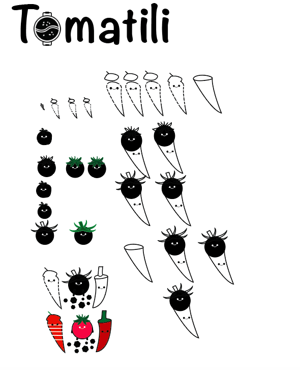
Logo 1:

This logo was very simple. It is is basically a combination of a tomato and a chili. Ice cream cone inspired me, because the shape of the chili looks like an ice cream cone, which made me realize that the tomato represent a ice cream ball. These two ideas ultimately lead me to combine the two elements together to look like an ice cream cone.
Process:


Logo 2:
I came up with this logo after logo 1. the main feeling for this one is more symmetry formed by multiple objects, rather than a integration of two objects to form one complete object. I decided to make it symmetrical, but not a perfect reflection, because it would have lost its natural organic impression that vegetable give off. Which is why, I made the two peppers on the side slightly different to make each figure look more independent.
Logo 3:

Logo 3 is basically a variation of logo 2. I combined the path of two different chilli and added two varied tomato behind it to give sense of far and near. One deflect that this design has was the chilli stem, it seems kind of abstract and does not seem to fit with the double chilli. I would remake the stem to make it fit the chilli better. I could definitely apply more detail to the stem to make it look more natural and realistic.
Type & name:

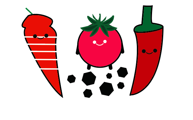
The word logo of the food truck “Tomatili” is the combination of the word tomato and chilli.

Final logo:

At the end, I chose the tomato chili cone version with the “Tomatili” as the brand name. The logo is very successful because contains a lot of the elements of the food that the food truck make, and it still preservers the impression and color of the spicy hot pot as its main theme. The text originally did not have the little fire symbol on it at first. It was later added to give the logo a sense of hot, because hot pot usually require a lot of heat and if I did not apply it as one of the design elements the logo would be missing a huge part. I did not add any additional detail to the chinese characters, because the mandarin letters will look natural and original If I leave it as ST Kaiti font type. Furthermore, leaving the chinese character concise and original will give the Chinese customers that the brand is well known and old.
Why is it a good logo:
It contains the representing theme of hot pot. Also the logo it is very distinguishing from other similar brands. Even when the logo is cropped in half, majority of the people who have seen the logo before could still identity it. In addition, the Chinese characters in ST Kaiti font also has a major purpose. In the past traditional hotpot restaurants all have this type of joined-up-writing font and gradually this became a trend that most hot pot shop would follow to gain more popularity.
January 5, 2022 at 9:17 am
Hi Will,
Your finished logo works well, although it is quite busy with multiple competing elements. I would recommend some simplification, eg the flames, lantern shape, 4x vegetable mascots, Mandarin characters and typography are a lot of different components for a logo. You should remove 2-3 of those things!
There are some areas of your design process that are lacking – you haven’t shown much evidence of inspiration/research or design thinking and you also didn’t show a context for your logo (eg the food truck, t-shirt, etc).
Let me know if you make improvements.